Jerry Cao is a UX content strategist at UXPin — the wireframing and prototyping app. For practical advice on design collaboration in large companies, download the free e-book Design Collaboration in the Enterprise: Building the Foundation of Brilliance.
It doesn’t feel good to hear the things that are wrong with something you created with heart and soul. And when you’re stuck sitting down and listening to everything listed out by different people for 20+ minutes, it’s even more painful.
Source: SharpSuits
So what’s a sensible designer to do? Stiff upper lip? Grin and bear it? These wouldn’t hurt, but these don’t address the obvious question that’s being overlooked:
How can we make design feedback more effective?
Critiquing, both giving and receiving, is a skill that can be developed and improved for better results. There are certain strategies, restrictions, and considerations that, when implemented, lead to a better end product…not to mention make the process less painful for the designer.
Below are six of the best practices for feedback that will bring you to a better product, but not at the cost of the other designers’ sanities.
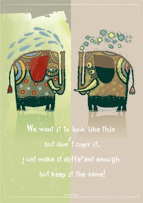
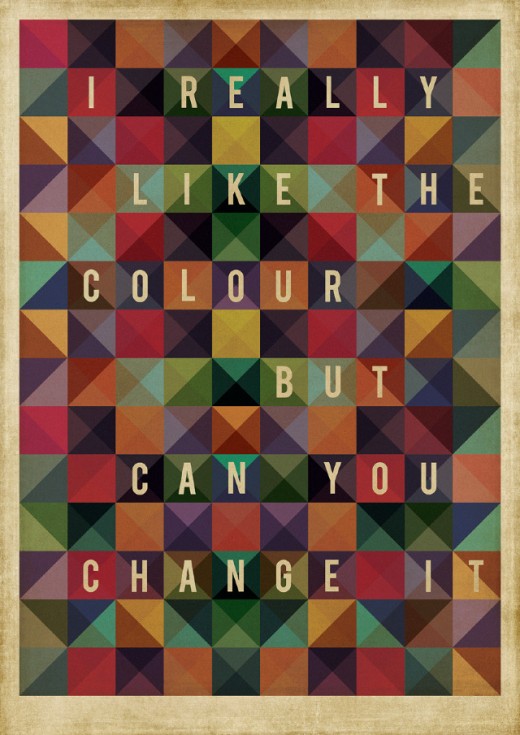
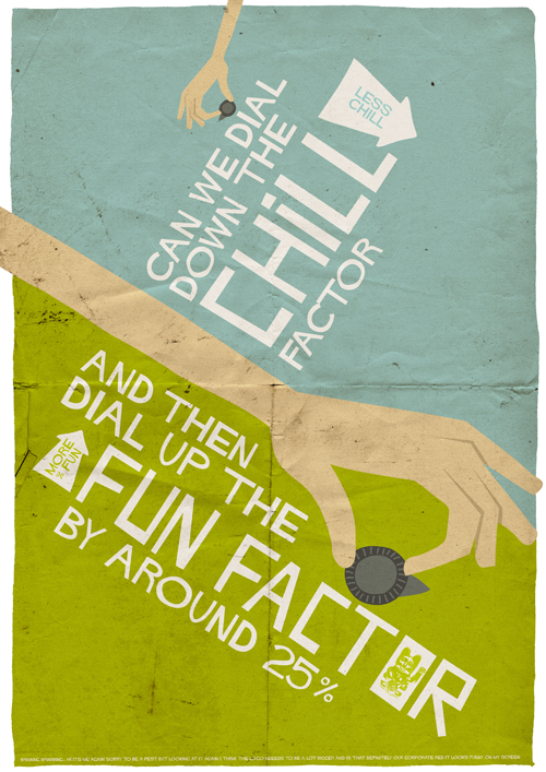
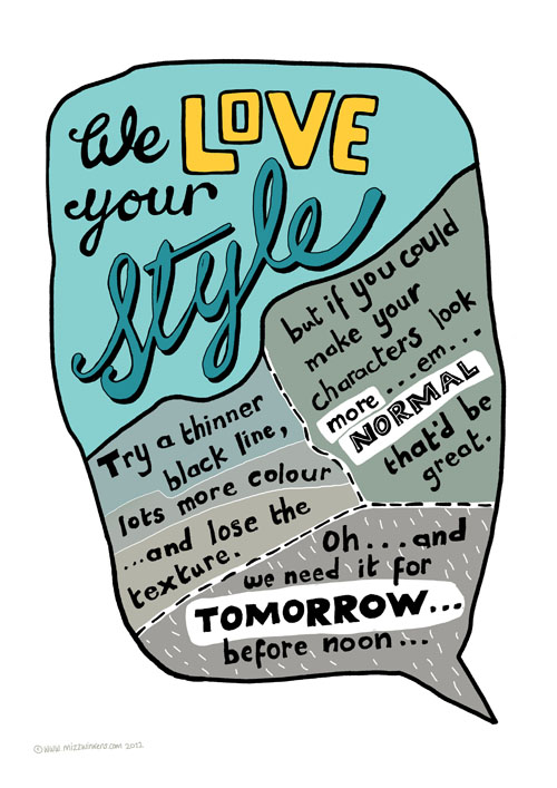
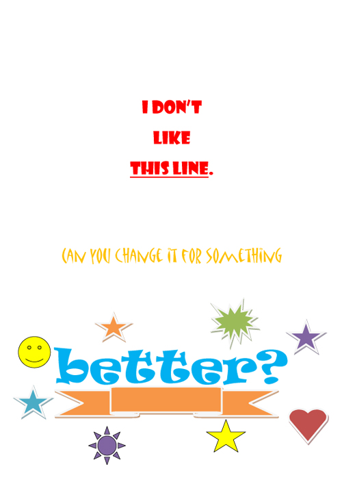
All images are from the Bit Rebel post 72 Posters of Ridiculous Design Feedback from Clients, images made by designers Mark Shanley and Paddy Treacy from actual feedback they have received.
Source: SharpSuits
1. Data Trumps Opinions
“I don’t like it,” just isn’t good enough. This isn’t some art house discussion, this is business, and as such must lean against facts.
Whenever possible, reference usability research, user data, site analytics, or scientific design principles. Not only will this eliminate doubt, it will also bring wasteful, opinion-driven debates to a swift end.
Granted, design relies on a lot of artistic principles, but these two have some backing in science. For example, you might reference the Gestalt principles (outlined in Web UI Design for the Human Eye) as justification for some of your visual designs.
Source: SharpSuits
This isn’t to say you should ignore your emotional responses – quite the opposite, as there is no substitute for your designer gut feeling. The point is that these emotions should be explained in a functional light. How you feel isn’t enough.
2. Phrase Feedback as a Problem, Not as a Solution
How the critique is phrased goes a long way in how it’s perceived. All too often, you’ll hear critique like, “this should be like that,” or, “that should be like this.” No matter how well-intentioned or even insightful this kind of criticism is, unless it’s phrased as a problem, you run the risk of being overly prescriptive.
For example, an appropriate comment like, “the surrounding elements make the search bar difficult to find” is far more helpful than, “the search bar should go there instead.” Phrasing this as problem opens up the discussion to multiple solutions – for example, maybe the better solution is actually removing distracting elements around the search bar, or maybe someone else has an even better idea (like removing a few elements, then deprioritizing others by playing with contrast/gradients).
Source: SharpSuits
The “problem-first” rule benefits the provider of feedback, too.
If the critique is presented as a solution, it runs the risk of being rejected or ignored simply because the solution is inadequate, whereas the heart of the critique remains neglected. Following on the above example, let’s say someone says “the search bar should go there,” but everyone agrees it should not, and the discussion moves on to the next point. If there really was a problem with the search bar location, it would never be acknowledged simply because of the way the feedback was phrased.
3. Discuss, Don’t Command
There’s a world of difference between mutually agreeing on feedback, and implementing it because you’re forced to. If history has taught us anything, it’s that democracies with a strong leader yield better results than dictatorships.
Source: SharpSuits
You shouldn’t think of feedback as something you issue like an order, then wait for the results. Feedback must always be the starting point for a discussion. For this reason, it’s not always the best idea to send your feedback in a one-way medium like email (unless it’s a minor issue that doesn’t warrant debate). It’s much better to provide feedback either in-person, by phone, or in video chat – any medium that enables a back-and-forth dialogue.
This allows the designer to defend their choices, or at the very least explain them. Perhaps there’s a piece of information that the critic is unaware of or missed – this can be quickly cleared up in a discussion.
Consider also the option that, when discussing a piece of feedback, a new, hybrid solution arises naturally from the discussion. Assuming that both the feedback provider and the feedback recipient are both experts in their respective fields, it makes sense that, when they share their expertise, they jointly stumble upon a solution that works better than anything each could have created on their own.
4. Probe With Follow Up Questions
When we discussed our first point, we said that it’s not enough to just state your opinion. Here we’ll dig a little deeper.
Feedback is best when it is specific. Sometimes, though, this requires some probing in order to fully flesh it out. Some people are more articulate than others, and just because someone can’t adequately express what they’re thinking, doesn’t make their sentiment invalid.
Source: SharpSuits
Don’t be afraid to ask follow-up questions and challenge the critique. “Why do you feel that way?” “What about it would you change?” “How would you feel if we did this instead?” Piercing the vague or superficial outer-shell will get you closer to something that you can actually use.
5. Set Aside Expectations
Sometimes people have a very specific image of what they’re looking for in their head. Knowing what you want is a good thing – it’s specific and will streamline the design process from start to finish. But having tunnel vision of what’s acceptable and closing off your mind to other possibilities…that is the fuel of design nightmares.
The amount of problems that arise from this is directly proportionate to the degree of trust between designer and stakeholder. Ideally, the stakeholder will understand that, of the two of them, the designer knows the subject best, and any snags that occur are the result of some miscommunication of goals and desires. However, in the real world, stakeholders might be hindered by their own egos, and designers might deliver less than they promised (not to mention, designers aren’t immune to egos either).
Source: SharpSuits
Likewise, don’t get so caught up in what other sites or apps are doing. Rejecting an idea because “it’s not what Facebook does,” is silly. Every revolutionary idea was new at some point. If all other logistical concerns work out and it seems likely the users will accept it, don’t shoot down an idea just because other sites don’t do it.
Of course, as we described in Interaction Design Best Practices, your design should still be familiar and consistent enough so that users don’t experience a steep learning curve. The key is that you follow proven UI patterns for user-focused reasons, not just because you hope your design will magically be cool by association.
6. Respect
… it’s all everyone really wants, but when giving and receiving feedback, it’s what everyone needs.
As we’ve mentioned before, everyone is considered the expert in their respective fields. Acknowledge that. Don’t assume you know better than someone else, and don’t assume someone else knows better than you. Collaboration means each team member’s strengths negate each other’s weaknesses, creating a better end product than any one person working individually. But this only works with respect.
Source: SharpSuits
Listen to everyone’s opinion with an open mind and consider their comments without bias. If your judgement is clouded, you may mistake a million-dollar idea. Of course, we’re not saying that the design should be compromised for the sake of appealing to everyone. Listen, acknowledge other’s opinions, but don’t bend to their will.
Likewise, respect others’ feelings. Be forthright, but don’t be cavalier and write it off as “telling it like it is”. Remember that when critiquing, it’s hard not to take things personally. A little courtesy when delivering an unpleasant message is always appreciated.
As for the person receiving criticism, Andrew Follett suggests getting into the habit of thanking the critic, no matter what they said (or how they said it). This will leave a positive impression on all witnesses, and may win favor in case of a debate – but more importantly it will empower you at a time when you need it most.
Conclusion
Design is a team sport, especially as the company size increases.
That means you’ll be able to accomplish more if you spend a little extra time on improving how you work together. Incorporating these six guidelines for feedback will do more than just spare people’s feelings – it’ll make the entire iteration process run smoother and ultimately deliver a better product.
For more advice on collaboration without compromise, download the free e-book Design Collaboration in the Enterprise: Building the Foundation for Brilliance. Learn the techniques to building collaboration into your existing processes based on best practices from top companies like Amazon, Hubspot, and Venmo.
Read Next: The secrets of successful kickoff meetings
Image credits: Shutterstock, Sharpsuits
Get the TNW newsletter
Get the most important tech news in your inbox each week.
