Love ‘em or hate ‘em, QR codes are here to stay and seem to be popping up just about everywhere you look. According to ComScore, 20 million Americans scanned a QR code in October 2011. Whether it’s wedged in the corner of a billboard, consuming the entire ad space, or even a language learning tool, the advertising and marketing world is quickly recognizing the benefits of instant stats and a measurable ROI.
Case in point, a display ad in a retail store might catch a user’s eye, but to be truly effective, they then have to jot a URL down, or have an incredible memory, as they’re most probably exposed to multiple ads per day. How do you truly measure the effectiveness of this ad campaign? Even if the ad made an impact and planted the seed in said viewer’s mind, you’re still asking this viewer to recall your brand, and more specifically, what you wanted them to do at a later date. Enter the QR code. This graphic effectively removes the time gap between, “Cool, I should check that out!” and “Damn, what was that thing I saw at the store today and wanted to check out?”
 Any phone or tablet equipped with a camera and a bar code scanning app can read and display QR code data. As noted above, QR codes have evolved since their introduction in 1994 (Thanks, Toyota!) and can now correct for errors in the graphic display. But who wants errors you say? Graphic designers for one. By utilizing QR code’s ability to auto correct data loss, designers have much more freedom with exactly how and where they embed the QR code.
While QR codes aren’t specifically aimed at landing pages, as they can be used to push an almost limitless array of data to users’ phones or tablets (vCards, text, a web page, etc.), the most common application of a QR code is to bring a user to a customized landing page. With that in mind, let’s take a look at making the very best of the QR code experience, for both you and your end users.
Making the most of mobile
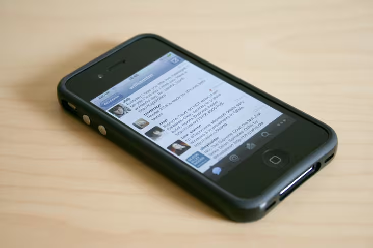 It should go without saying, but if your users are accessing your landing page via a QR code, said landing page absolutely must be optimized for the mobile experience. But what exactly does mobile optimized mean?
Your QR code targeted landing page should be scaled to render perfectly in user’s phones or tablets, regardless of horizontal or vertical orientation. In other words, if a user has to pinch and/or squeeze your page to view it properly, you’ve already lost them, and all your planning has crumbled beneath a poor design.
Target it
 With the ease of generating QR codes, there’s simply no excuse for having a generic landing page. Besides, how do your segment your measurement if you’re not creating specific, targeted landing pages that compliment those specific, targeted QR codes you’re pushing out the door?
As viewers are still relatively new to the QR code experience, marketers and designers need now more than ever to meet and exceed expectations. Create targeted landing pages that invoke, if not copy, exactly the format to the physical ad that users will see. This not only provides context to the browser based experience, but gives you the opportunity to further enrich the experience through interactivity. If users have no common point of reference, they’re like to be confused, and click, bang…they’re gone.
One ping only
 Borrowing cues from social media, your QR codes should ultimately be focused on bringing the entire experience back to a conversation. Ads are usually a one sided conversation, and QR codes give you the opportunity to further lead your new visitors to the entire point of your campaign – make it easy for them to find and act on it.
Whether it’s getting them to watch a video, fill in a form, or cash in on a coupon, be upfront and clear on your landing page. That’s not to say your landing page should be all about the action, but remember, you’re dealing with mobile visitors, who are most likely on the go. Don’t overly complicate your targeted landing page, and avoid the scroll if at all possible. Stay focused and relevant to the offer that was promised in the ad, as delivering on a promise is the fastest road to a conversion.
Catch ya later
 Let’s be honest, the last time you scanned a QR code, did you follow through all the actions at that very moment? Me neither. To be honest, I sometimes end up scanning a bunch of different codes and then either saving them to Evernote or simply leaving the page open in the background. If I’ve done it, and you’ve done it, chances are there’s a plethora of other users doing the same thing.
If your call to action is a simple form fill in, you might catch a user right then and there, but if you’ve got something a bit more involved, watching a video, perhaps, don’t forget to include a couple of “catch ya later” options on your landing page. Still trying to avoid the scroll, is there any open screen real-estate for a simple “contact us” or “bookmark us” option? If so, it needs to be included in your landing page. If not, reposition some other assets, as you absolutely need to make it easy for viewers to find you again.
Zoom, zoom!
 Tied to optimized for mobile above, remember who you end users are and make sure that your targeted landing page is as fast as it can possibly be. Test, test, and retest your pages before they see the light of day. Also keep sub-optimal internet connectivity in mind. Case in point: 3G connectivity while on the ground can deliver a decent experience, but when accessing your page on the subway, that experience can drastically change.
Remember, users who take the time to scan your QR code are probably in the middle of doing something else, and you’ve caught their interest enough to take the time to scan. Don’t make them wait for your message.
Bonus – Get creative!
 Sure, QR codes are great for marketers, and we absolutely love the data they provide, but let’s be honest, initial adoption rates weren’t exactly stellar. Why? To be fair, there are a number of reasons, but my personal belief is that there are still a number of marketers that are in love with the data, but have yet to take the financial leap of faith of design and experience. Sure, it’s relatively easy to set up some targeted landing pages and reap the data rewards that they provide, but what’s in it for the end user?
Which would you rather enjoy? A rundown on this year’s new BMW 7 series via a fact sheet, or a few rapid fire shots of said 7 series ripping it up around the Nürburgring capped off with a quick virtual tour of the cars finer points, concluded with a “Schedule your personal tour today.” call to action? Hello Beemer!
QR codes are one to the fastest and easiest ways to convert an offline experience into an online one, and reap all the tracking and measurement benefits the online experience has to offer. Not to mention, a far more immersive (and impressive) experience for your end user. As long as you’re employing the simple tips above, delivering on the promise or action stated in the offline ad, and creating memorable, interactive experiences, you’re well on your way to maximizing your QR code experience.
image: Worakit Sirijinda via shutterstock
Get the TNW newsletter
Get the most important tech news in your inbox each week.

