Jason Pamental is the co-founder of h+w design and author of ‘Responsive Typography.’
The explosion of new devices — phones, watches, health and fitness monitors and other wearable gadgets enabled by the Internet of Things — is yielding an increasingly interconnected set of user experiences. Even our cars have smarter, more integrated displays that tie into application and phone ecosystems.
Until recently, many of these devices (if they existed at all) had rather basic interfaces – with even less sophistication when it came to typography. This was due in part to the relatively small physical size of the devices and resulting limitations in hardware and memory. Cost has also been a driver.
But the rise in popularity of smartphones, with their increasingly high-resolution displays and powerful processors, has triggered a spike in consumer demand for better design, more polished graphics and the ability to connect and extend visual language from one device to another as part of a seamless experience.
There’s not only a huge demand for these design changes, but a tremendous opportunity if we can overcome some key limitations that have hamstrung efforts thus far. Good typography will be key; small screens don’t have much room, and information-intensive displays like automobile instrument clusters depend on clarity and “glance-ability” to quickly convey critical information in the most effective manner.
Here are five typographic considerations designers should keep in mind when creating their next interface.
1. Typeface quality and breaking out of the bitmap box
To date, the typeface quality on low-cost, lower-resolution displays typically has suffered — mainly because the processors and memory limitations on these small to mid-range devices meant that typeface enhancements have been out of reach.
Why? Often, these environments have been able to support only a small number of size-specific bitmap fonts with limited character sets rather than the scalable type supported by even the most basic smartphones. Without better type rendering capabilities, our ability to design more engaging and cohesive experiences was stunted, while at the same time engineers and designers were limited in what they could use to design more sophisticated and engaging interfaces without significant increases in cost.
Typographic hierarchy in design is generally how we convey what information is most important and portray it in a highly “glance-able” way. Meaning, with the quickest flick of an eye towards the automotive display console, a driver should instantly see the next turn direction, the song title, the station name, etc.
Since these displays can utilize only a small number of bitmap fonts at fixed sizes, there’s little leeway to create that visual hierarchy with dynamic content. The functionality questions are compounded by the introduction of smartphone apps tied to those automotive systems and other devices.
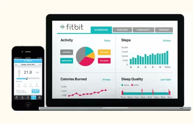
Think of BMW’s “My BMW Remote” app or FitBit’s app: does the typography on the dashboard or the display of the wearable device relate to the app? And does the typography coincide with the company’s promotional advertising campaigns?
2. Engaging experiences begin with type
The increasing ubiquity of smartphones and prominence of responsive Web design have taught designers about how critical typeface selection is — especially as screen sizes shrink. Not only does this influence usability, it’s often the only way to preserve any kind of brand voice throughout the experience continuum. And now that the continuum includes other connected devices, that experience has become even more important.
With small wearable fitness trackers and medical monitoring devices connecting to apps used on smartphones and data portals on the Web, typeface selection is one of the only ways available to connect those experiences.
Once we have better font rendering on these new kinds of devices, the door is open to extending our knowledge of design and our ability to create visual hierarchy from the desktop all the way down to our wrists and through to our dashboards.
3. Selecting the right typeface for the job
Just as we have the Clearview typeface for US Interstate signage and the DIN typeface in Germany, there has been extensive research into what makes a typeface easy to read and understand from inside the vehicle. Unfortunately, because of the limitations in resolution and available memory, typeface selection for use in automotive instrument clusters is just as highly constrained as it is for wearables and other smaller devices.
Whether for readability on a dashboard or for consistent branding from a fitness app to its corresponding wearable device, this means less opportunity to choose the right typefaces for the right job.
 Figure 1: Low-end automotive dashboards are required to display of a more diverse set of information, everything from turn-by-turn directions to song titles, artists and genre.
4. Many languages, multiplying content
Limitations in character sets pose similarly significant issues beyond rendering brand continuity. Dynamic content and increasingly globalized markets for devices require far more complete character sets and encodings to avoid manufacturing separate versions to support every language.
 Figure 2: Lower-end platforms are required to meet market demands for supporting complex and bidirectional scripts to address any region of the globe.
Automobile electronics are amplifying this challenge. Infotainment systems in the center console often serve up navigation graphics and corresponding text, music information from connected smartphones and satellite services, and even apps like Pandora and Facebook.
With every new application, the demand for a unified solution grows — and that content doesn’t live on just one screen. Often, music metadata (like song title and artist) are shown in the center of the instrument cluster along with turn-by-turn directions from a navigation system.
Poorly-rendered text and truncated strings turn what should be a boon to drivers into a confusing, distracting mess.
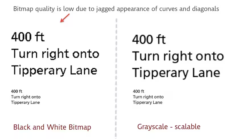 Figure 3: While the bitmap text has a jagged appearance around the curves and diagonals (left), the scalable technology enables the text to be resized without introducing distortion (right).
5. Current landscape
So how are designers tackling the “next generation of UI” today? Well, simply put, we’re not. At least not in the way we should.
With such extreme limitations in resources, we use simpler or preexisting fonts rather than the truly appropriate fonts for the job. We use fewer sizes and styles, sacrificing visual hierarchy and clarity. We truncate strings or abbreviate instead of designing for readability and quick comprehension.
We give up on brand integrity because we just can’t preserve it. In short, we’re designing compromises because we can’t realize design potential.
In fact, we don’t even know what the potential is with these new devices. Just as we have had to adapt our design thinking for responsive web design, until we can bring the full range of typographic options to bear in smaller screens and instrument displays, we just won’t know how far we can go.
Interlocking challenges
While each of the issues raised can be looked at independently, they’re so interrelated it’s almost impossible to consider them separate from one another. Typeface quality is a huge issue on lower-resolution displays — but that’s generally due to limitations in hardware capabilities and memory constraints preventing the use of a more capable font rendering engine.
If we solve for the lack of better font rendering within the hardware and memory constraints, then typeface quality is solved, as well. Scalable type is a more complete solution, with nearly infinite sizes and more characters available to crack the dilemma of dynamic and multi-lingual content.
Once we’ve overcome that barrier, not only can we design more usable interfaces, but we can also design more consistently-branded ones. That’s a considerable win both for users and brands.
Read next: The best typefaces of 2014
Get the TNW newsletter
Get the most important tech news in your inbox each week.

