Sean Mitchell is an interactive designer based in Vancouver, British Columbia, and the editor of TypeRelease.
We’ve counted down our favorite fonts every month this year, and now it’s time to look back at what 2014 brought us in beautiful typography… in no particular order, of course.
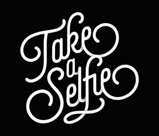
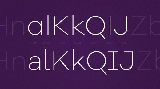
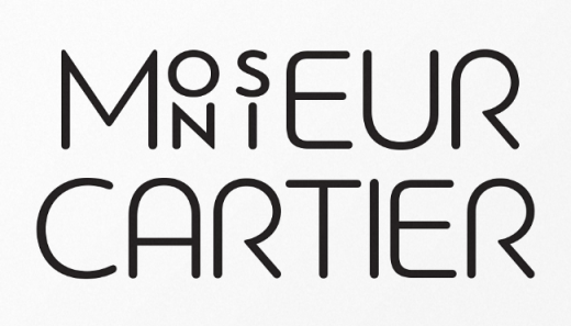
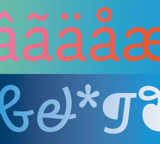
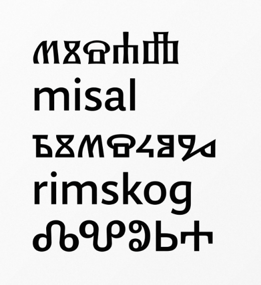
Lián Types: Selfie
Selfie is a connected sans based on vintage signage scripts.
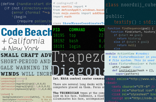
Font Bureau: Input
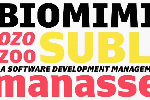
Input is a flexible system of fonts designed specifically for code.
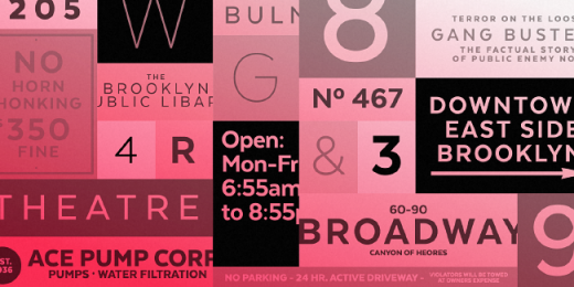
Latinotype: Texta
Texta is a contemporary, rational, transparent and useful sans to compose all kind of texts.
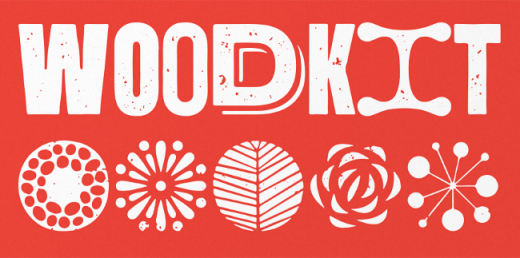
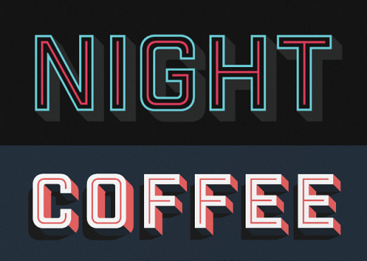
Typotheque: Woodkit
Woodkit is a playful fixed-width display series of typefaces inspired by wood type.
Rene Bieder: Galano Grotesque
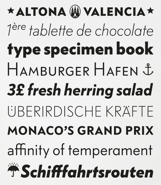
Galano Grotesque is a geometric sans in the tradition of Futura, Avant Garde, Avenir and the like.
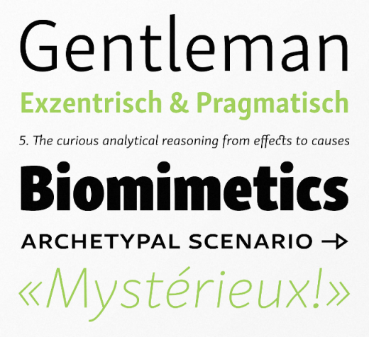
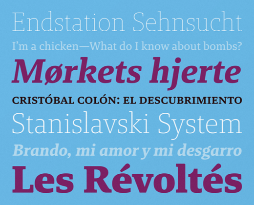
Rosetta Type: Skolar Sans
Skolar Sans is an extensive typeface family for the age of responsive design. From gently thin to extra bold, the four subtly graded width variants will fit all your content needs.
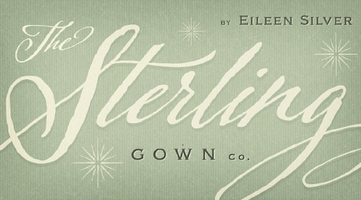
Laura Worthington: Adorn
Warm and welcoming, Adorn offers seven display fonts, four script designs, monograms, ornaments, illustrations, banners, frames, and catchwords.
Bold Monday: Nitti Grotesk
Nitti Grotesk is the proportional companion to Nitti and part of a larger collection of grotesque-inspired typefaces.
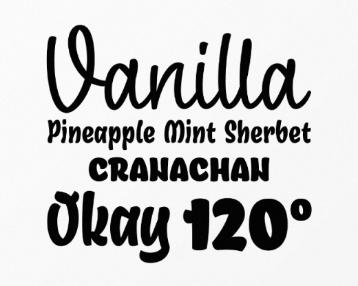
Mika Melvas: Ahkio
Ahkio’s roots are in 1930s sign painting and showcard lettering but with a modern and individual twist.
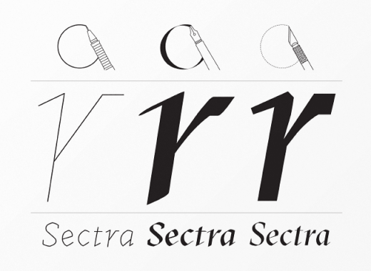
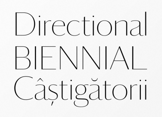
Grilli Type: GT Sectra
GT Sectra is a contemporary serif typeface combining the calligraphy of the broad nip pen with the sharpness of the scalpel.
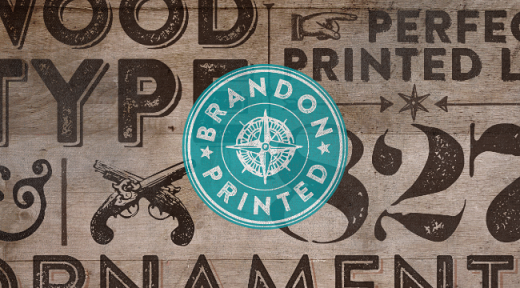
HVD Fonts: Brandon Printed
Brandon Printed has an eroded, printed look with four variations of every letter.
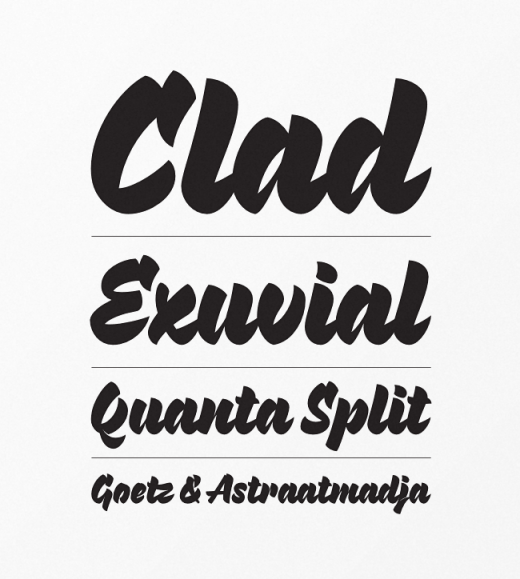
Process Type Foundry: Pique
A script with a crisp energy and buoyancy that only the collaboration of paper and screen can lay claim to.
Kyle Wayne Benson: Jeames
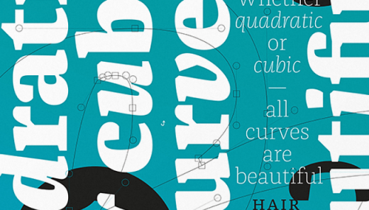
Jeames brings familiarity to the often detached feeling extended serif genre. The curved, heavy, joints let the letters bounce along while the proportions and contrast keep your eyes grounded.
Type Supply: Queue
Queue was drawn to reflect the contradictory and complex world of today.
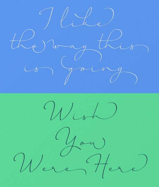
Petra Docekalova: Monolina
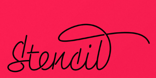
Monolina is a contemporary monolinear script that is based on the contrast between classical calligraphy and quickly jotted manuscript.
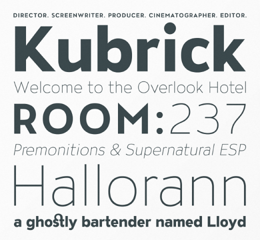
Production Type: Panorama
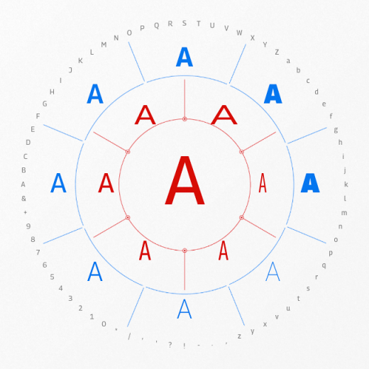
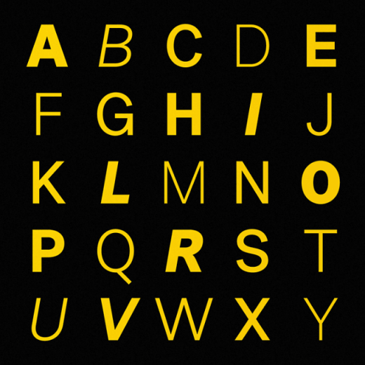
An arsenal of nearly boundless possibilities, from ethereal thin to blinding black, with an uncommonly handy series of steps in between.
TipoType: Libertad
Libertad is a sans serif that mixes humanist and grotesk models.
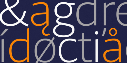
Klim: Domaine Sans
Domaine Sans follows the similar structural logic as Domaine. Both the Domaine Sans Display and Fine have exuberant detail and high contrast; whereas Domaine Sans Text is more robust and pragmatic for extended text-setting.
Calligrafiction: Peter
Peter is a neo-grotesque sans with rational and clear basic letterforms.
Milieu Grotesque: Patron
Generous x-height, distinctive stroke endings and an unconventional shift in balance.
Parachute: Bague Sans Pro
A versatile monoline typeface with a distinct and eye-catching personality.
Bold Monday: Brando
Brando is a contemporary serif with humanist proportions.
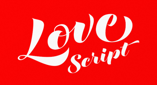
Positype: Love Script
Love Script is a font with a big heart.
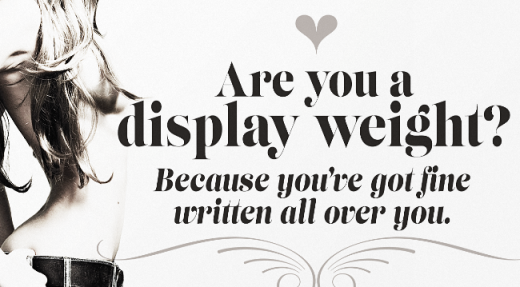
Positype: Lust Slim
Lust Slim is packed with alternates to play with – enough to turn you on and satisfy.
Hoefler & Co: Surveyor
A monumental family of typefaces designed for print and screen.
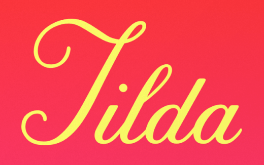
Font Bureau: Tilda
Tilda is a script typeface with size-specific styles by Jessica Hische.
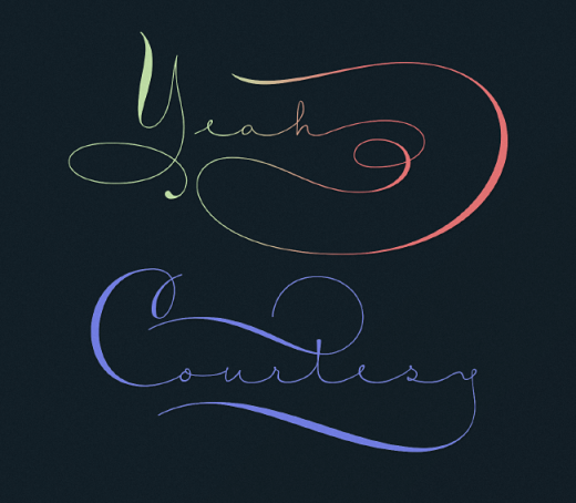
Sudtipos: Courtesy Script Pro
Courtesy Script Pro captures the elegance and propriety of finely practiced Spencerian penmanship.
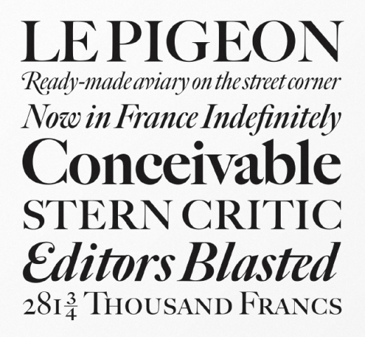
Font Bureau: Big Caslon FB
An expansion of Matthew Carter’s classic display serif.
FontFont: FF Franziska
FF Franziska – discreet, functional and modern, but with real personality.
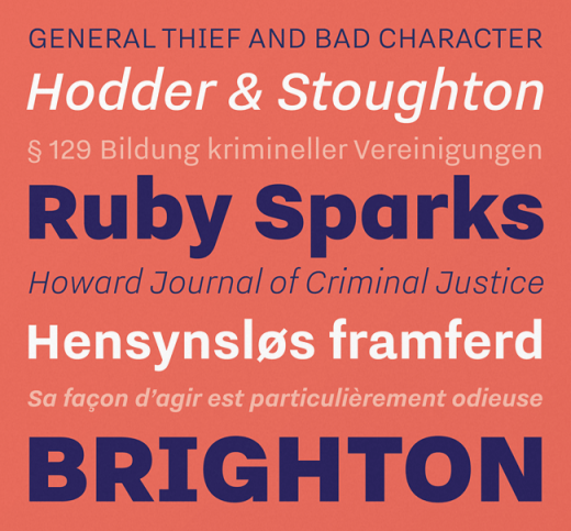
FontFont: FF Bauer Grotesk
FF Bauer Grotesk – revived and better than ever with six weights and italics, this is the must-have grotesk.
Suitcase Type Foundry: Urban Grotesk
Urban Grotesk attempts to follow the best of traditions of grotesk typefaces.
Typotheque: Parmigiano
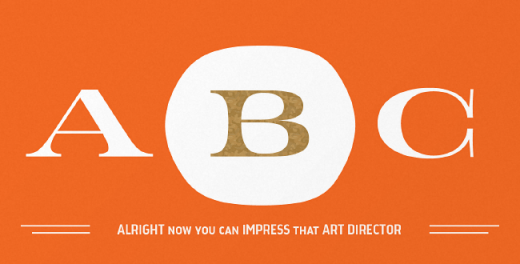
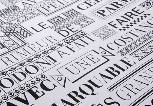
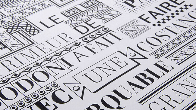
Parmigiano Typographic System (named after Parma, the city where Bodoni established his printing house) has the stated ambition to be the most extensive family of fonts ever to have been inspired by Giambattista Bodoni.
Monotype: Quire Sans
Quire Sans is highly functional and sexy at the same time.
Briefcase: BC Kakao
BC Kakao is a font family of stylistically similar fonts loosely based on calligraphy and handwriting.
Sudtipos: Horizontes Script
Horizontes Script – finding a balance between spontaneity, elegance and beauty.
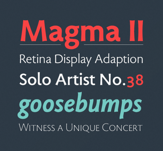
Stone Type Foundry: Magma
Magma is a rare sans serif typeface family designed explicitly for use in both text and display applications.
Typonine: Identitet
Identitet is a system designed to work together as a unified whole.
Hold Fast Foundry: Industry Inc
Industry Inc comprises numerous standalone styles along with a layered type system.
Avondale Type Co: ATC Overlook
A clean, versatile font with modern sensibilities and a dash of character.
Hoftype: Foro Sans
Foro Sans is well suited for ambitious typography.
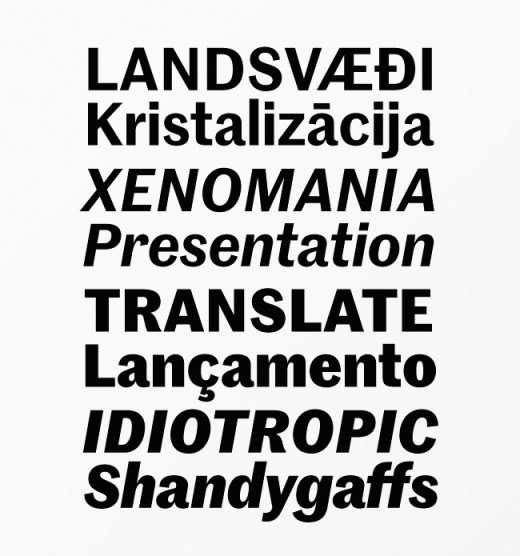
Commercial Type: Marr Sans
An eccentric British uncle to Morris Fuller Benton’s Franklin and News Gothics.
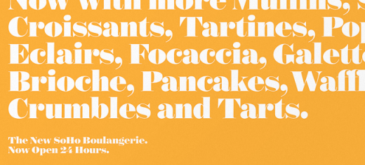
Commercial Type: Darby
A contemporary family of two related sans serifs: one is the functional Darby Sans; the other a refined display version for large sizes, where the contrast is dramatically higher.
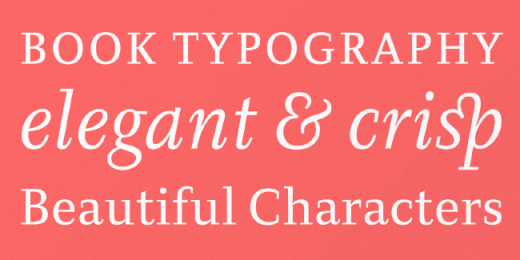
Ludwig Type: Diogenes
Diogenes is an elegant and crisp text typeface.
Want more? Here were our picks for the best typefaces of 2013.
Get the TNW newsletter
Get the most important tech news in your inbox each week.
