Reaching the attention and interest of visitors to your site, thanks to an attractive visual appearance and good ergonomics, is essential to make them want to stay on your site.
Capturing the interest of a new visitor and encouraging him/her to explore the site is particularly important for non-profit organizations because they often sell an idea, not a tangible product. Communicating your mission and nonprofit goals require careful consideration of the visual factors that will keep users on your site long enough to soak up your message.
This article focuses on the five basic tips to help website builders of associations and foundations create visually appealing websites. These tips are not new shattering revelations and could apply to almost every site. However, successfully implementing these tips could improve your website, increase its traffic and therefore increase the visibility of your associative activities.

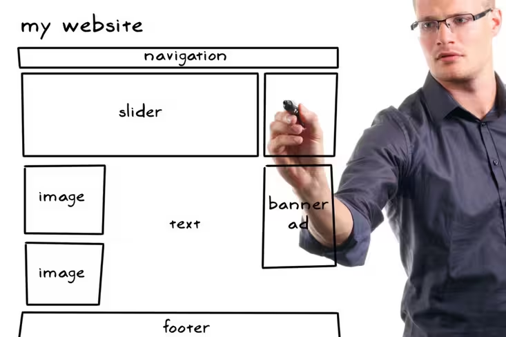
1. Create an overload-free home page that encourages exploration.
A cluttered home page that is overwhelmed with too much text or too many graphics can chase away potential donors. The homepage is often the first impression the user will have to your structure. It should never be designed at random just to have a presence on the web. Network for Good, a not-for-profit organization that provides fundraising ideas for other non-profit organizations, recommends “… for simplicity and clarity in design. Must be attractive, captivating, but uncluttered. ”
2. Create recognition of your structure with a logo.
Having a logo that strengthens the spirit of your structure or serves as a reminder for the cause helps make a site memorable. Visual identification through a logo is part of the emotional experience that users experience when they come into contact with your organization. The creation of a logo is an investment and must be a budget item with high priority. Ideally, the logo referring to a non-profit organization should be immediately recognizable, evoke and transmit your non-profit or your mission, and remain effective in a variety of colors or presentation modes.
3. Create a coherent graphic chart.
The maintenance of recurring visual elements on a website makes it possible to unify the site and make navigation easier. Help establish consistency by choosing colors and fonts that complement the identity of your association or foundation and ensure that they are maintained on all pages. Maintaining this visual coherence on the site and mirroring it in all your other information and communication media will strengthen the identity of your organization. The visual theme should reflect the culture of the organization and at the same time be targeted to attract donors, volunteers, and supporters that you want to reach.
4. Create an audiovisual presence.
A compelling video that tells a story helps to attract the attention of Internet users. Even if your site can exist without the video, this will bring him a definite asset. Creating such a video can be costly if performed professionally. But, it can also be done using a simple camera with a minimum of editing, certainly a look less polished but that will fulfill very well the function sought: tell your missions in pictures. The gain will not be measured solely by the number of visits to the website. A well-made video can extend its usefulness beyond the site itself as a centerpiece of the communication efforts of your nonprofit.
5. Create an emotional bond by using photographs to tell a story.
Using static or rotating photographs helps put faces on volunteers, recipients, and donors. Avoid photographs that could be used elsewhere because your photos need to reinforce your image and not just anyone. Unlike video, still, images allow the user to focus on a specific moment in time, allowing contemplation and creating a lasting link.
Word from web designers
Experienced Web designers might recommend not using templates because they can limit flexibility and appear too banal and personal. However, small organizations may consider this solution if their in-house design capability fails or if they cannot afford to outsource web design. Many models are available online in various content management systems (CMS), including the very popular WordPress.com. Although it’s not always ideal, starting with a template can provide a basic site that can often be adapted later to further integrate your organization’s signature.
The final word
Creating a visually attractive non-profit site does not necessarily require a significant budget. However, improving your site, if your budget allows it, is a goal that may require expenses. Consider these few tips as a starting point to help you evaluate your existing website and ways that you can use to improve how you tell the story of your nonprofit with attractive visuals.
Get the TNW newsletter
Get the most important tech news in your inbox each week.


