Crafting user experience can be a challenge – you need to anticipate your users’ needs and make educated guesses and decisions on their behalf. Combining this with a plethora of other project requirements, such as content creation and coding, makes it easy to become overwhelmed.
While there is much to learn about user experience best practices, there are secrets that can guide you to quicker, better decisions. Outlined below are five secrets to creating user experiences focusing specifically on user end goals.
Design in whole, not in part
User experience encompasses everything about your website or application. While it’s easy to focus on making sure that the checkout process is seamless, or that the user onboarding process is flawless, the site or app should be considered and refined as a whole. Even a fantastic initial experience can quickly be overshadowed if later interactions are not well designed.
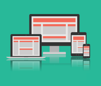
The emergence of responsive web development is a great example of experience and connectivity. We were used to designing great websites for desktop users, but when smartphones and tablets started to surge in usage, the experience was degraded for these users simply because of the device they were using. Designers realized that the design and experience should work no matter what device they were on, thus responsive website design was born out of the need and desire to keep the experience consistent throughout the whole site, not just a mobile version or desktop version.

Not only should every individual part be designed and perfected with the user in mind, the entire website or application should flow well together. It’s great to go into detail and perfect the small things, but make sure when you’re done you take a step back and see the entire site or app with the new changes you made to see if there are other areas that may now need to be improved or if your changes hurt other areas that were good.
When you design only parts of the site, your users feel this disconnect and it turns their pleasant experience into a disappointing one. In addition to a seamless connection from page to page, you should also take into consideration how you want your site to be perceived.
Spend time finding keywords to describe the overall experience you want to accomplish. Perhaps you want to visitors to think of you as credible or approachable. Whatever it is, figure out the general feeling and make sure each page and the site as a whole adhere to these throughout.
Secret: When you add new features or iterations to your site or app, ask a fellow designer (who isn’t involved with the project) to review. Listen to what they have to say to see if it accomplishes what you’ve aimed for, or if it made things worse.
Tell a story
Storytelling humanizes and makes difficult concepts easier to understand and remember. Use storytelling to not only describe who your users are, their needs and their scenarios, but also to connect with your users, bringing them further into your site or app.
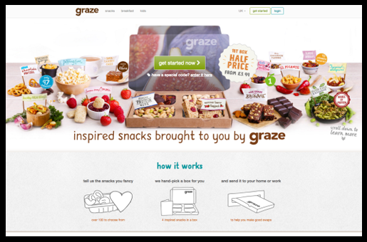
A great example of a brand telling a story is Graze. Graze’s website explains in clear detail exactly what they offer and how their site works in a very humanistic and story telling.

When you create a narrative about your users and their needs, the storytelling allows you and your team to understand your users more intimately. Think of this in similar terms to getting to know one of your customers well, so that you can better serve them. The more information that your customer gives you and the more stories they tell you about themselves, the more you learn and the better you can adapt what you are selling to help them.
Storytelling can also be used during your testing phase. Asking users to tell you about their experience, listening to what they’ve learned, and understanding who they are can only make your decisions much better for your users and in turn improve the user experience as a whole.
Secret: Welcome user feedback and behavior (consider tools like Intercom and Mixpanel) and let the outcome determine future iterations and needs.
Solve problems, don’t create new ones
User experience is about solving problems and helping the user meet their goal. If you have a feeling something could cause an issue, stop and take the time to address it before it becomes a problem for your users. This can be as simple as fixing a contact form to make sure it works and can be as complicated as not having enough resources to adequately power your site or app.
An example of this can be seen on Apple’s website. When you’re shopping for items online, most of the time you see photos of the product taken at different angles. This helps address the problem of not being able to hold and touch a physical product like you would in the store, but it creates a new one: wanting to see every inch of the product.
Apple solved this problem by giving their customers a complete 3D view of their products in a simple to use interface. No more clicking through images and possibly guessing at what something looks like that isn’t shown in the pictures.

Nothing frustrates a user more than not being able to find something or do something because they’ve encountered an issue. Things break all the time, stuff goes missing, sites go down, etc. Part of crafting a great user experience is to anticipate these needs and solve them before they ever happen. If they do happen, don’t wait around to fix it. Be proactive and fix these problems immediately.
Once you’ve gotten everything down, sit back and make sure things are happening and being understood the way you intended. Could something be perceived in a way is unintentional or even negative? Is it adding any value? If it isn’t then continue to work on it or try something new.
Secret: Every page has a purpose. Prioritize the purposes and needs for each individual page and ask yourself if you did everything you could to meet them.
Track everything and do your research
In order to know you are doing something right, you have to track everything. Every click should be monitored, every page load needs to be tracked, every page layout must tested to see which version converts better.
The use of tools such as Google Analytics, Chartbeat, Statcounter and others allows you to track and collect information about your users, such as time they spent on your site, where they went, where they are from, the type of device they used, how fast their internet is and even demographics.
Twitter recently experimented with several different UI changes (Moments, Heart for Likes). They did this with A/B testing, presenting some users with one thing while others got another. With this testing they were able to see if the UI changes were worth it. As we know by the recent launches of these experiments, the tests appeared to have gone well.
what will graduate next? pic.twitter.com/qUNcmCNPqL
— Luke Wroblewski (@lukew) November 3, 2015
Tracking everything allows you to gain a wealth of information to draw conclusions, which is very critical in helping you to determine your users needs and wants. If you’re not reaching the right users, there is something not working as efficiently or effectively as it should, or other there might be other user experience issue. Testing and tracking allows you to iterate and make the necessary changes in order to improve. Designers and developers working on a site or app are too involved in their product or service to see and understand every possible user experience issue. As they become so entrenched in the design, they have an in-depth knowledge of the design which prevents them from seeing things in the point of view of a new user. Tracking everything allows you to gain a wealth of information to draw conclusions, which is very critical in helping you to determine your users needs and wants. If you’re not reaching the right users, there is something not working as efficiently or effectively as it should, or other there might be other user experience issue. Testing and tracking allows you to iterate and make the necessary changes in order to improve. Don’t be afraid to evolve beyond the research and let go of aesthetics. It’s okay to go against rules if you need to.
Secret: Schedule an hour or two every week to dig into the data and let it inform design changes and decisions.
Seek outside opinions and feedback
Sometimes designers become hyper-focused on improving the design and accidentally trick themselves into thinking things have improved. In all actuality, this tunnel vision aspect can hinder the ultimate goal. Having someone check your work can be invaluable.
You don’t see your product’s usability issues because you created them. — Luke Wroblewski (@lukew) October 10, 2015
Stepping away and allowing someone who hasn’t seen it before gives a fresh take on your website or application and allows for feedback that you may not have otherwise gotten. Advice can come from different people, such as employees, stakeholders, or other designers who aren’t working on the project.
However, the user coming to your site for the first time or that has only visited a few pages in the past doesn’t know your site that well at all. They also may not be as savvy as you are about navigating sites in general.
While seeking advice is always well-received, you may find you need to test that advice to discover what will truly work. No better way to test your UX than doing so through user testing. There are a variety of ways to user test, such as A/B testing with analytics software (such as Google Analytics), or actually watching your users use your website or application.
Remember: don’t have to take everything they say to heart. Take it into account, but that doesn’t mean you have to apply everything. If the same thing is being said by different users, then there’s a possibility there is an issue. Ultimately you know what makes sense for your site.
Secret: Open up a Slack channel or use a service like Invision to collect and provide feedback with fellow designers.
Conclusion
It is a UX designer’s job to carefully define the requirements, flesh out the details and challenge every element of the client’s concept. While this may feel overwhelming, creating a great user experience is actually quite satisfying and easily achievable. The secrets outlined above will help you create an iterative process to produce a valuable product the user finds intuitive and easy to use – which is the ultimate motivator as a UX designer.
Read next: 5 UX mistakes that make users feel stupid
Image credit: Shutterstock
Get the TNW newsletter
Get the most important tech news in your inbox each week.
