
How much more memorable are visuals compared to text?
One oft-referenced answer is that people remember visuals 6 times better than text—an answer referenced in Buffer’s article on the anatomy of a perfect blog post and an answer that led to a lot of great discussion. After reviewing the original research, it’s clear that pictures are more memorable than words. So the next question became:
People remember visuals better than text. But which visuals exactly?
I’ve spent some time collecting the best research and science on pictures, images, infographics, and more, and I’m excited to share with you what I’ve found—along with some specific ways to use these insights in your marketing!

Quick stats on the power of visuals
While attempting to verify the “6x more memorable” stat (it seems quite validated that images trump text, though it could be anywhere from 6x more memorable to 2x), I found all sorts of additional interesting information on visuals. Here are some numbers I can verify:
- Research determined as early as 1894 that pictures are more memorable than text. This eventually became known as the Picture Superiority Effect.
- Sixty-five percent of us are visual learners. This means imagery helps 65 percent of us understand and remember information.
- A picture is worth approximately 84.1 words, according to cognition scientist Alan F. Blackwell. In his research, subjects created visuals to convey information and then described those images in words. The average number of words it took them to describe their images was 84.1. So a picture may not equal 1,000 words, but using an image in place of 84.1 words is still an impressive shortcut. This means less information for your brain to process and remember.
While it may be hard to pinpoint exactly how much more memorable visuals are than text, it’s safe to say visuals definitely aid memory. So let’s look at what makes an image memorable and how you can use that to your advantage.
Why visuals are more memorable than words
While President Abraham Lincoln may be remembered in part for his eloquent words, he was known to be fixated on one particular image.
The image was an 1861 map of the South depicting counties’ slave-owning populations in shades of black, gray and white.
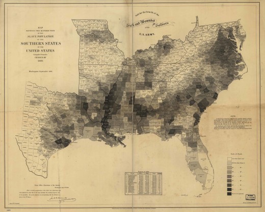
In fact, the image was so important to him, it was included in Francis Bicknell Carpenter’s portrait of Lincoln and his Cabinet members (seen below on the bottom righthand side).
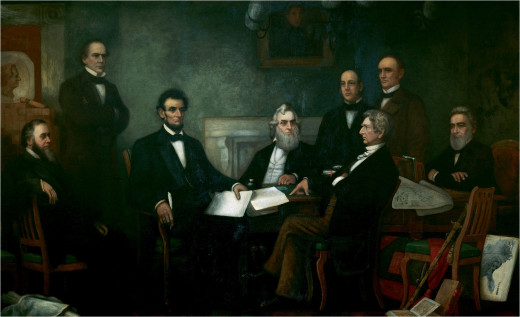
It literally gave Lincoln a picture of which states he could expect to secede and which might be persuaded to stay with the Union. It’s also an early example of an infographic.
Visuals do the same for us today as they did for Lincoln back then: Help us process complex information quickly.
In fact, roughly half of our brain is devoted to processing visual information, according to The Oxford Handbook of Cognitive Psychology, which explains why we’re able to decode visuals so quickly.
In fact, we retain 80 percent of what we see or do but only 30 percent of what we read and 10 percent of what we hear.
All of this is to say, images are easier than text for us to process and remember, but not all images are created equal. So below I break down what makes a visualization memorable to help you optimize your image selection.
1. Choose harmonious colors
Colors help us process and quickly identity what we see, according to one study. In discussing choosing colors for your brand, Leslie Harrington, executive director of The Color Association, notes:
“Color is the most memorable sense. Before anything else, [we] see color.”
In fact, color increases brand recognition by 80 percent.
Consider Tiffany & Co.’s robin’s-egg blue color. It is so synonymous with their brand, they’ve trademarked the color, and it’s now known as Tiffany blue. Or, for you sports fans, there’s the University of Tennessee’s vibrant orange, which Pantone calls UT Orange. In both of these cases, color is an intrinsic part of the brand.
Not only does color aid brand recognition, it trumps black-and-white images when it comes to memory. But that doesn’t mean you should go color-crazy. Images are more likely to stick if they resemble what we see in nature (so easy does it on the neon).
Something else to keep in mind: 8 percent of men and o.5 percent of women are colorblind, according to the National Eye Institute, and have difficulty discerning between reds and greens. On the other hand, nearly everyone can see blue, which works out really well for hyperlinks.
If you’re opting for a multicolor image, professors at the University of South Florida determined that harmonious colors are more memorable than non-harmonious colors. Think different shades of green instead of an array of pink, yellow and blue. Harmonious colors are easier to process, making the image more likely to be remembered.
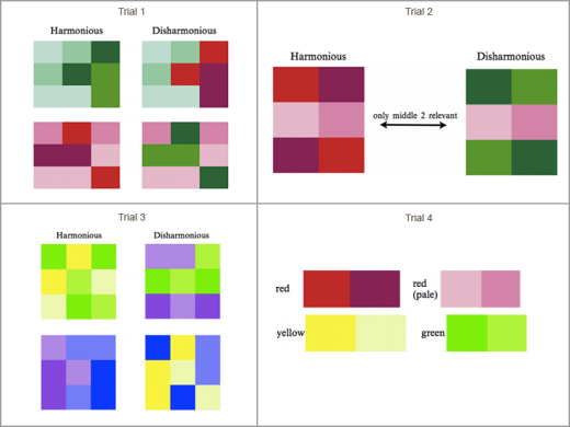
On top of that, an image with seven or more colors is more likely to be remembered than one with fewer colors. A different study pegged the uptick in memorability occurred at more than six colors. Either way, file that under “more colors than I thought.”
2. Include people in your pictures (the more emotion, the better)

You see that stunning pink sunset above? You’ll likely forget it.
That’s right, according to a study on image memorability, a lovely photo of a landscape will probably fall out of your brain with impressive speed. We’re far more likely to remember an image centered on a person, even something as banal as a man on the subway. Even more likely to be remembered are photos of people interacting. Images that focus on a single object also fare well.
However, there are different levels of memorability for images of people. Essentially, the more intense the emotion of the person photographed, the more likely we are to remember it. Partly because it triggers a response in us.

So aim for relatable over stunning when choosing between images. And select emotional expressions over easily forgotten neutral expressions. Take these kids winning a video game in the photo above. Who can’t relate to that feeling of crazy excitement when you win something important to you?
3. No need to find a beautiful image
Is beauty memorable?
The short answer: No. Not in images anyway.
Aesthetically pleasing images, like the picturesque landscape above, aren’t memorable, while this photo of a decrepit bathroom with graffiti on the toilet is.

As MIT neuroscientist Phillip Isola, one of the authors of “What Makes an Image Memorable?,” puts it:
“Pleasantness and memorability are not the same.”
That said, in one instance, at least, beauty might appear to assist memory. You’re more likely to remember a photo of supermodel Gisele Bundchen than you are Ms. No-Name iStock Model. But in fact, that has less to do with beauty and more to do with prior knowledge. We are more likely to remember something or someone we have prior knowledge of.
This means a visual is far more likely to be stored in our long-term memory if it already has meaning to us.
So in image selection and in design, considering using the familiar to your advantage.
4. Create creative infographics and charts
Infographics are beloved for a reason. These pictorials, along with grids and diagrams, are far easier to remember than graphs. This may be because illustrations in infographics mimic what we see in our world to some extent — for example, the cheeses in the infographic below.
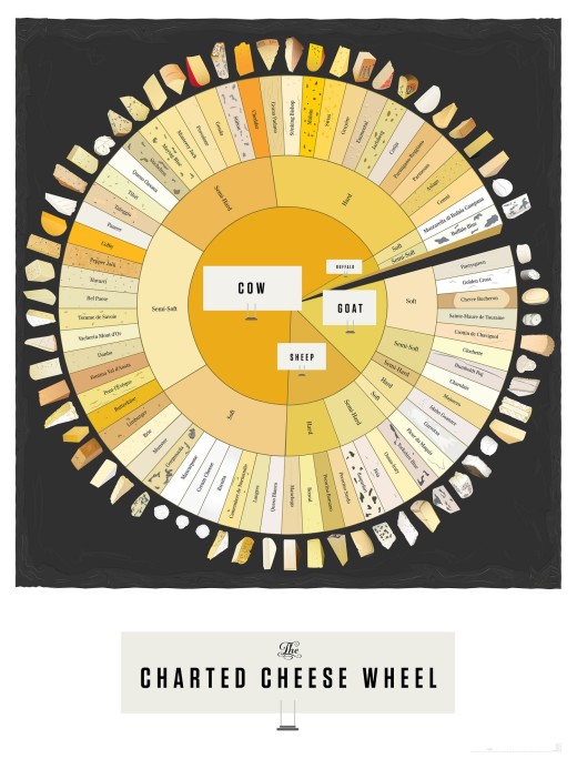
On the other hand, the lines of graphs don’t look “natural” — a graph looks like a graph, not like something we find in our day-to-day life. In addition, at their core, all graphs look more or less the same, and that certainly doesn’t up their memorability factor.
The question of chart junk
Yet “memorable” doesn’t always equate to “comprehensible,” according to a study on memorable visualizations. An infographic can be memorable because you spend some time deciphering it. (That said, it’s still recommended to strive for clarity.)
In fact, in that same study, visuals with “chart junk,” meaning visual additions that aren’t necessary to understand the information, were deemed more memorable than minimalist visuals. But it’s worth noting, that there are varying opinions on whether chart junk helps memory or hurts it.

Above we have a very basic example of chart junk with unnecessary lines both on the bars and on the numbers lining the chart, making them hard to see, plus a brick background. It adds up to more visual information than we need, which may increase its memorability but not our understanding.
Instead, a happy medium would be to strive for “functional art,” meaning designers can get creative to pique interest (and memorability) but should avoid any elaborations that impede understanding. Avoid art for art’s sake.
In short, aim for interesting imagery, not a visual obstacle course.
5. Use multiple images to reinforce your point
According to Janet Brain, a learning disabilities specialist, varied visuals are especially helpful in learning — she cites technology, such as interactive computer graphics and videos as helpful, but you can apply the same philosophy on a smaller scale to your projects. A variety of images aid memory because you’re receiving different visual cues that reinforce one main point. This is what infographics do.
You can also apply this to blog posts. For example, don’t stick solely with stock imagery, instead include a combination of grids, pull-quotes, infographics, vintage photos, artwork and video for optimum recall. You’ll notice that in this post I included President Lincoln’s infographic map plus the portrait the infographic appears in. So you’ve been exposed to this map in two different ways in one post, increasing the chances you’ll remember it — and hopefully, this article.
Also worth noting: While images are more memorable than text, images and text together are most memorable of all. No surprise there considering the popularity of infographics and overlaying titles on images. Just like multiple visuals can work together, visuals and text reinforce each other and aid memorability.
Review: How to make your images memorable
So does this mean the only way to stick in someone’s memory is to build an elaborate infographic of toilets of the world in seven harmonious colors?
No. (But that infographic would probably be really, really memorable.)
Instead, determine which memory triggers aid you the most.
Here are some takeaways to consider for your next visual:
- Numerous colors that are natural and harmonious are most memorable.
- People expressing emotion and/or interacting are the most memorable subjects, followed by objects. Landscape imagery is forgettable.
- Beauty doesn’t matter, but prior knowledge does.
- Infographics are memorable. Graphs aren’t.
- Functional art can assist memory.
- A variety of image types reinforce memory.
Personally, I plan to rely less on landscape imagery and look more toward relatable imagery in the future. I’ll also continue to use a variety of images, like I did in this post, where I included artwork, photos, scientific visuals, images with text on them, a vintage infographic and a modern infographic.
But memorability isn’t everything
Remember that your imagery still needs to work with your brand. Don’t scrap your branding guidelines for an array of memorable imagery that doesn’t aid your branding strategy. While reinforcing imagery helps memory, irrelevant imagery is extremely forgettable. It simply distracts.
Aim for memorable, impactful imagery that assists your brand.
And yet, the list above isn’t the only way to memorability. There will always be outliers — a strangely eerie black-and-white landscape that sticks in your mind or a graph of non-harmonious colors on a crazy topic. What I’ve outlined here is not the only way to get a visual to stick. The hope is that following these guidelines will increase your visuals’ chances of being remembered.
Marketing takeaways for memorable images
It’s worth noting that a memorable image doesn’t necessarily equate to an engaging or effective or clickable image. But that’s the natural next step.
So here are a few stats that provide some ideas on how to effectively use memorable images:
- Tweets with attached imagery are nearly twice as likely to get retweeted than those without.
- Presentations that include visuals are 43% more persuasive, according to one study.
- Forty-six percent of subjects in a Stanford University study used website design, of which visuals are an important part, to determine if a business is credible.
- Sixty percent of consumers are more likely to consider a local result with an image.
Can you imagine the benefits if a memorable image were used in all those instances?
Let’s mine our memories!
Think back to images that have elicited a response from others in your work. Why did they work well? What sort of images have you found most memorable in others’ work? Which images from this article stick out in your mind?
Include links in the comments. I’d love to see the visuals you mention — and see if they stick in my memory too!
Read Next: The psychology of selfies
Image credit: Shutterstock
Image sources: PicJumbo, Piktochart, Visually, UnSplash
This post first appeared on Buffer.
Get the TNW newsletter
Get the most important tech news in your inbox each week.


