Android can be beautiful. Naysayers might tell you otherwise, but it’s absolutely true. Admittedly, it’s far easier to find visually stunning apps for the iPhone and iPad; truth be told, there are just more of them in the App Store. But if you value incredible style and aesthetics, don’t dismiss Google’s mobile operating system. Look deep enough and there’s a wealth of apps that’ll make your jaw hit the floor. Artistic, creative and imaginative designs that would cause any app designer or developer to turn green with envy.
Here, we present 30 of what we consider to be some of the most beautiful and well-designed apps available on the Android platform.
Update: This article is paginated to make reading easier, but you can click here to read all of them on a single page.
Image Credit: Justin Sullivan/Getty Images
#nwplyng (Site | Play Store | Free)
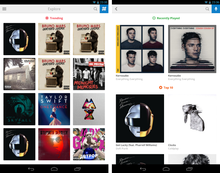
#nwplyng is a novel Android app that promotes sharing and discovering new music with a badge-collecting gamification system similar to Foursquare.
Whenever you’re playing music through your smartphone or tablet, the app will pick up the track and give you the option to share it via Facebook, Twitter and Foursquare. Heck, it can even pick up the music around you by listening and analyzing the track just like Shazam.
The app’s design is clear and consistent, with a super smooth side menu that you can slide in from the left-hand side of the screen. Sharing tracks is effortless and there’s even shortcuts for listening to the track on Spotify’s music platform.
Circa News (Site | Play Store | Free)
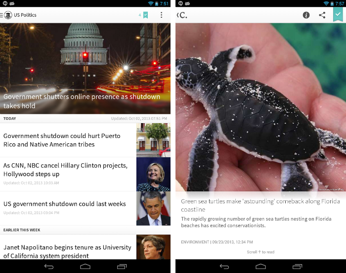
Circa is one of the first apps to address and challenge how the news should be written and distributed for mobile consumption. By structuring the news as small, bite-sized segments, it’s far easier for readers to quickly absorb the latest headlines.
From a design standpoint, Circa is wonderful. It incorporates a mostly monochrome color scheme, increasing the impact of the photographs layered into each story. It’s polished and professional like a broadsheet newspaper, with clean, legible typefaces and small, discernible buttons.
Feedly (Site | Play Store | Free)
With Google Reader out of the picture, third-party apps such as Feedly and Digg have arrived to scoop up the huge number of RSS enthusiasts desperate for an equally impressive news reader service.
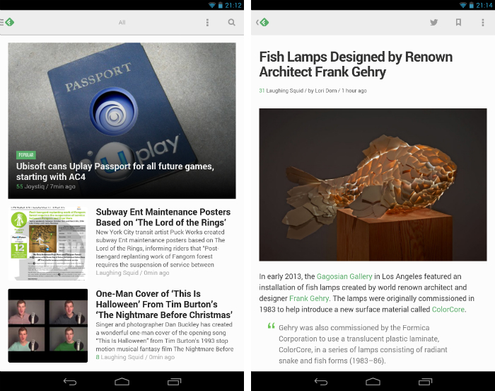
Feedly is stunning. With quick access to all of your favorite blogs, news sites and podcasts, it offers a very regimented, functional design. Headlines stand out with a bold, punchy sans-serif font, while the articles themselves have a refined layout with plenty of breathing space for the copy and imagery.
Digg (Site | Play Store | Free)
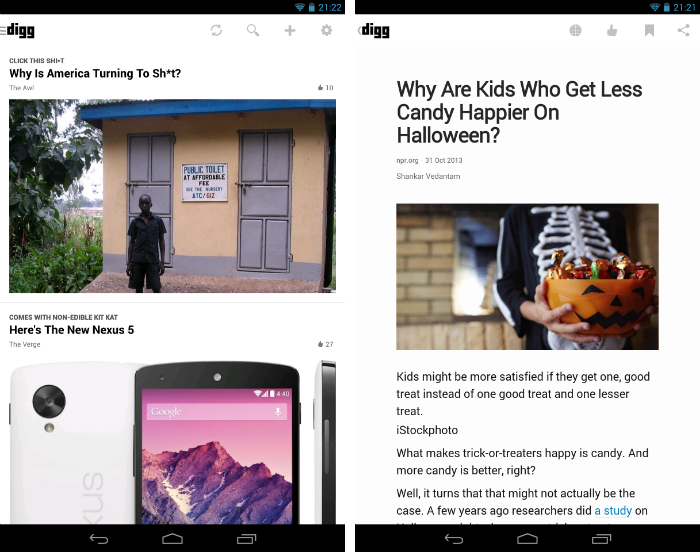
If Feedly just isn’t to your tastes, fear not. Digg is an equally impressive offering. In addition to acting as an RSS reader, you also get access to all of the popular and featured articles picked out by Digg’s in-house team.
The home feed prioritizes large, full-width photographs with smaller headlines and publication titles overhead. It’s a more visual take on Feedly, but again retains the professional design cues that have evolved over decades in the newspaper business. If you want to just kick back and read some premium, hand-picked content from across the web, this is a great option.
Flipboard (Site | Play Store | Free)
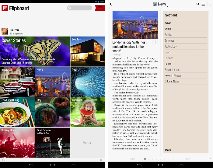
Flipboard wants to recreate luxury magazines for the Web. Unlike many other newsstand apps though, which simply regurgitate print publications as a digital PDF, Flipboard takes that content and repurposes it for your smartphone or tablet.
There’s nothing quite like it. Swiping vertically or horizontally to flip to the next page feels charming and intuitive; here it’s part of the core user experience, instead of a throwaway gimmick designed to replicate a physical book or magazine. The layouts are considered and the way it tinkers with screen real estate and text column widths is totally unique.
Vine (Site | Play Store | Free)
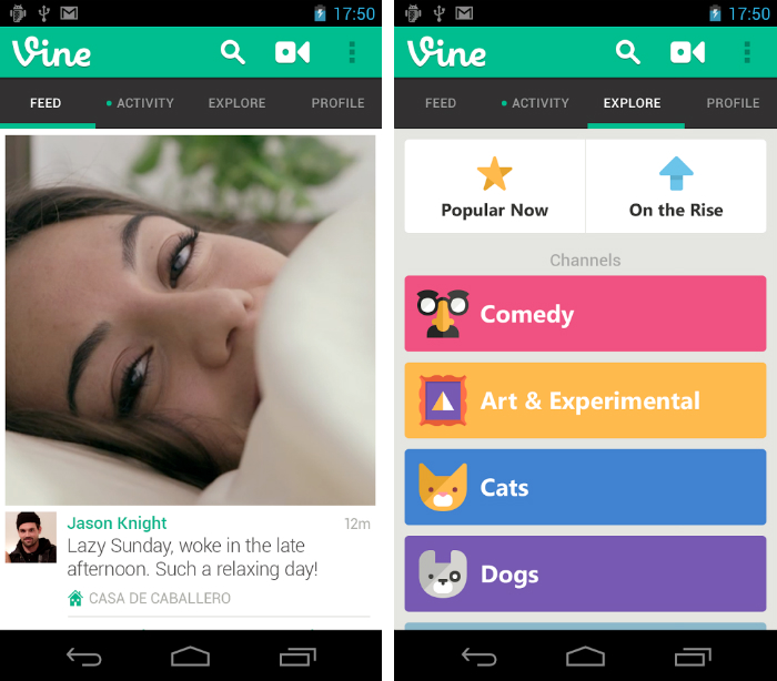
Vine was built on the simplest idea: to help people record and share creative, memorable or humorous moments with six-second videos. That alone would make it stand out from the crowd, but the design of the app itself has propelled Vine to become one of the most fascinating apps on the market.
On Android, videos stretch the entire width of the screen with small, functional icons for commenting, revining and liking individual posts. Content is front and center here, but Vine builds on that foundation with lovingly designed illustrations. Just head to the ‘Explore’ tab and you’ll see what we mean.
Hue – Beautiful Weather (Play Store | £0.99/$0.99)
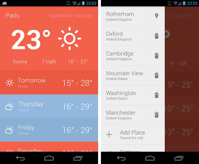
Hue isn’t afraid to splash some color around. The grey, drab menu settings listed in the side menu are contrasted with bright shades of either red or blue in the primary screen. They have a huge impact on the app’s design and makes monitoring the weather a beautiful, memorable experience.
Hue doesn’t skimp on information either. The current temperature is the app’s focal point, but look underneath and you’ll find the minimum and maximum temperature for that day, as well as the current wind speed and weather conditions.
Expedia Hotels & Flights (Site | Play Store | Free)
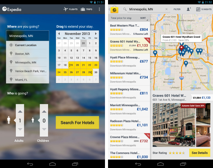
Travel apps are usually pretty dull, which is a shame given that you’re supposed to feel excited when you take time off, pack your bags and explore somewhere new. Expedia’s Android app breaks this trend.
Right from the home screen, all of your trip parameters are laid out in slightly different, but equally engaging ways. Maps are quick and responsive, with clear information about the price and quality of nearby hotels. As you ask for more details about a specific place, the app hides different parts of the map to allocate more space for reviews and photos.
Evernote (Site | Play Store | Free)
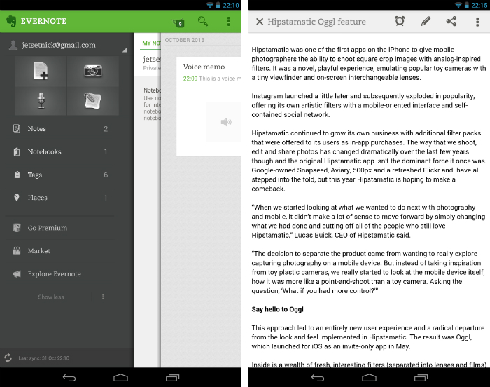
Evernote is one of the best note-taking apps of all time. The service needs little introduction, but if you’ve managed to miss out on this cross-platform sensation, take my word for it. Evernote is astounding.
It’s feature-rich and supports text, audio, photographs and webpages, or a combination of all four if you’re that way inclined. The typeface resembles that of a beautiful hardback novel or notebook, with layered pages sliding in to show specific notebooks, tags or notes. If you want to spend hours curating the perfect scrapbook for your home renovation project, this is it.
Grand St. (Site | Play Store | Free)
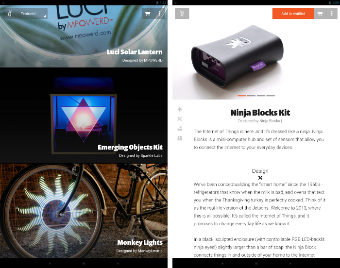
Grand St. is a curated marketplace for technology and gadget enthusiasts like you and me. It’s a simple idea at its core: highlight creative, innovative hardware that users can then buy with just a couple of taps. It’s part magazine, part catalog, wrapped in a beautiful design that will suit any device.
Right from the outset, you’ll notice that all of the photography is fantastic, truly high-level stuff. Products look gorgeous and they’re backed up by articles that feel like they’ve been written by true fans, rather than a marketing expert. Top to bottom, this app is almost flawless.
Google Search/Now (Play Store | Free)
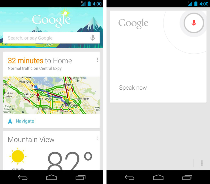
I’m convinced that Google Now is the future of search. By providing contextual information based on when and where we are, there will be fewer and fewer scenarios where we need to type or enunciate a search query into Google.com.
For Google Now to succeed though, it needs a welcoming design and rock solid user experience. Thankfully, it succeeds on both counts. The Android app is slick and unassuming, with charming cards that fall away with an effortless swipe. The artwork placed at the top of the feed and even the small icons given to different forms of weather are subtle and refined.
Umano (Site | Play Store (Free)
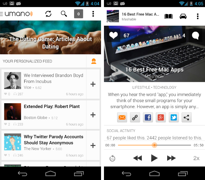
Umano solves an interesting problem for commuters and travellers. If you’re stuck on a crowded tube or bus on the way to work, how do you keep up with the news? Podcasts and radio stations are one option, but what if you want to catch up with a specific story or headline?
That’s where Umano steps in. You just pick your categories, create a personalized feed and start listening. The app doesn’t feature the most imaginative design, but it’s polished and highly accessible. Skimming through stories is quick and relatively painless, and you can always jump back to the audio player by swiping up from the bottom of the screen.
Nice Weather (Play Store | Free)
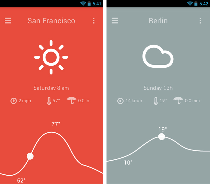
Nice Weather, created by Aurélien Hubert, is my personal go-to weather app for checking the temperature, wind speed and rainfall.
The app excels in its ability to maintain the utmost restraint. There are only a few visual cues on-screen, constructed by simple, white lines on a block color background. As a result, the information is communicated with incredible precision – with a momentary glance you’ll have everything you need to plan for the day ahead.
Swipe horizontally to view the forecast for the coming days. Alternatively, grab the circle on the line chart and slide it forward or backwards for a granular look.
Pinterest (Site | Play Store | Free)
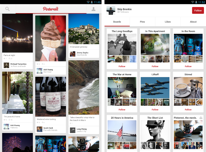
Pinterest should come as no surprise. The entire premise of the app is to show you beautiful goods and creations from around the web. To succeed, it needs an equally beautiful set of mobile apps to facilitate all of that drool-worthy content.
It’s been over three years since Pinterest launched, buts its pinboard interface is still a joy to interact with. For Android tablet owners in particular, it’s all too easy to just coast through a Sunday afternoon looking at sublime furniture, clothing, photography and artwork.
Origami: Your Family’s Home (Site | Android | Free, with in-app subscription)
Before we begin: Origami is free to install, but following a 30-day free trial you’ll be asked to sign up to a $5 per month subscription. Why the cost? Origami offers a 100 percent secure, private website for your family. It doesn’t matter if you’re sharing stories, photos or videos – if you’re on Origami, you can be sure that only your relatives will see it.
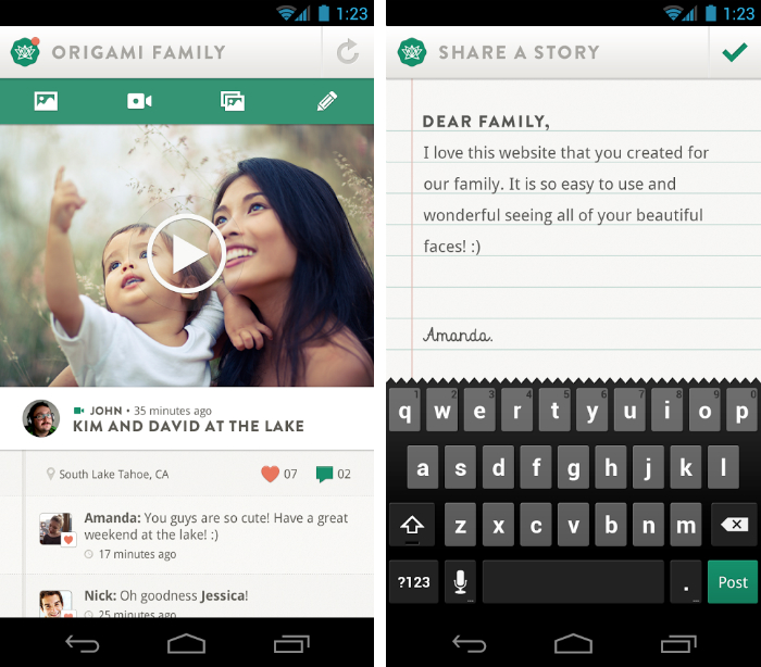
The Android app oozes quality. Text files are shown as realistic pages torn from a lined notebook, with beautiful type and unassuming icons for adding comments and likes. The tabs make it easy to quickly record and upload a new photo or video – almost everything is visible and easy to access. This is an app absolutely anyone can appreciate.
Google Keep (Site | Play Store | Free)
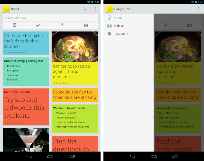
Take your refrigerator, slap some colorful post-it notes on top and then vizualize it as an Android app with a minimalistic, flat design. That’s Google Keep in a nutshell.
While Evernote targets power users with its dizzying number of features and sharing options, Google Keep strives for simplicity. Just add a quick note from the top of the app – either as a text file, checklist, photo or audio-based memo – and it’ll drop in at the top of the feed. Aside from reminders, there’s little else to get your head around really. Just a simple, elegant solution for taking notes.
Nike+ Running (Site | Play Store | Free)
Nike+ Running is my favorite fitness app. For many health junkies, the design of an app is a secondary concern while training in the gym, across the city, or out in the countryside. But at a subconscious level, it’s incredibly important.
If it’s difficult to pause your current run, skip ahead to the next song or track your progress while you’re pounding the pavement, many will delete the app almost immediately. With Nike+ Running, you’ll never encounter these problems. Everything is laid out beautifully and it’s easy to access all of the most frequently used controls.
Runtastic Heart Rate PRO (Site | Play Store ($1.99/£1.59)
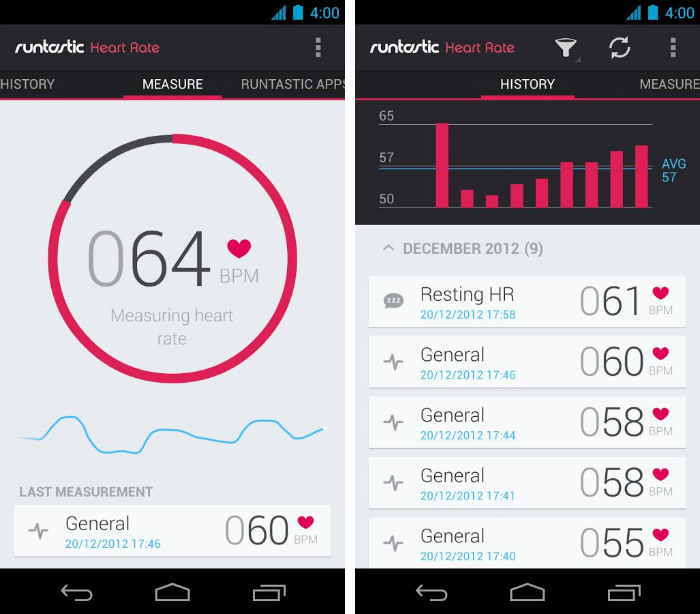
The name of this app doesn’t exactly roll off the tongue, but don’t let that put you off. Runtastic Heart Rate PRO is a sublime app to use, even if you have little interest in the speed of your pulse or the state of your health.
A thin, circular icon in the center of the screen will tell you when to place your index finger over the camera lens on the back of your device, before turning a delicious pink as it takes your reading. A waveform underneath fluctuates in line with your current heart rate, and there’s also the option to review your most recent readings as stylized bar chart.
Visual, accurate and informative.
SolMail ( Site | Google Play | Free)
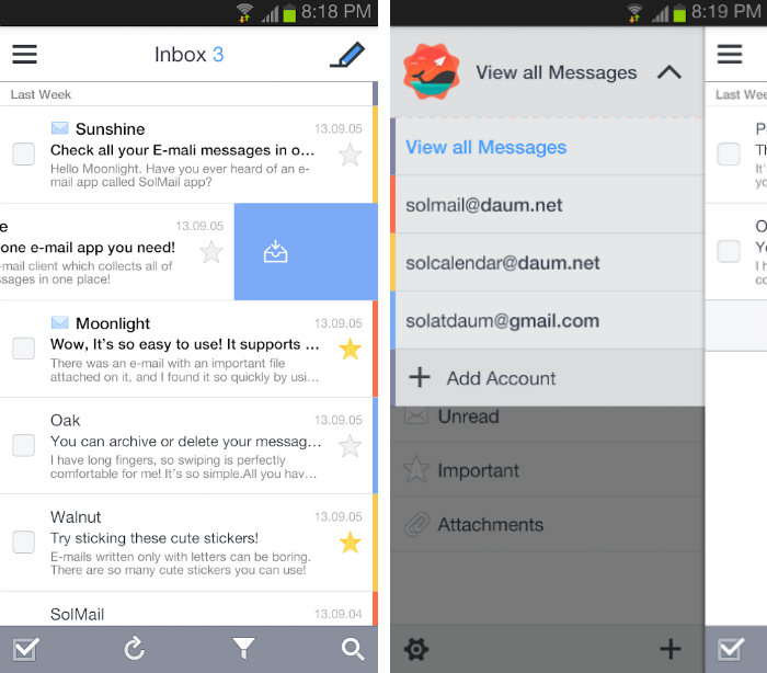
SolMail is another slick-looking third-party email app that you shouldn’t ignore. Similar to Evomail, you can add multiple email accounts from Gmail, Yahoo, Outlook, AOL, among others and manage them using a single, unified inbox.
Each account is color-coded and you can swipe messages to archive or delete them, similar to the much-loved Mailbox app on iOS. The interface is sparse but also clean in its design, leaning on a predominantly white color scheme to ensure a stress-free reading experience.
SolCalendar ( Site | Google Play | Free)
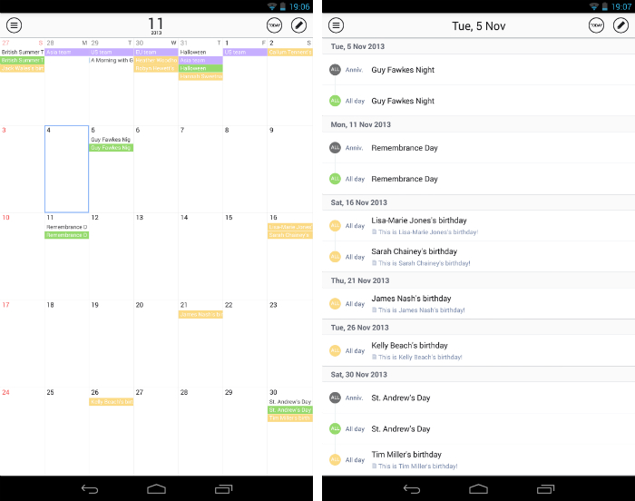
If we’re going to highlight SolMail, there’s no way we can ignore its companion productivity app SolCalendar. Again, this lovely piece of Android software combines a simple, white color scheme with splashes of soft, muted colors. It’s a joy to look at and dissolves any confusion you may have had about your upcoming schedule.
It’s the small touches that count too. Tap lightly on the menu icon in the top left-hand corner of the screen and the top section of the app will effortlessly tip over to help filter what’s shown on clear. Fast and responsive, there’s even some playful theme and stickers to use if you’re after a more light-hearted feel.
Expense Manager (Play Store | Free)
Keeping tabs on your expenses each week can be laborious and time-consuming. If you use a beautiful Android app to get the job done though, there’s a chance it’ll feel slightly less tedious (read: mind-numbingly boring.)
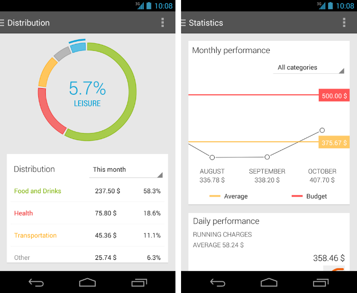
Expense Manager divides expenses into bright, clearly defined colors (health is red, food is green, leisure is yellow, and so forth) to give you an overview of where your hard-earned cash is going each week.
You can set a regular budget and then feed all of this information into a pie chart which shows the distribution of your daily expenditure. It won’t complete your expenses for you, but hopefully Expense Manager will put a smile on your face.
Tumblr (Site | Android | Free)
Tumblr is a hugely successful blogging platform in part because all of its default themes are exquisite. Unlike WordPress, anyone can quickly set up a blog that looks like it’s been created by a professional web designer. It’s unbelievable.
At the core of Tumblr though is its dashboard. It doubles up as a news feed similar to Facebook or Twitter, complete with a steady stream of posts from the people you follow. Somehow, the Android app for Tumblr manages to make what is usually a boring back-end dashboard incredibly enticing.
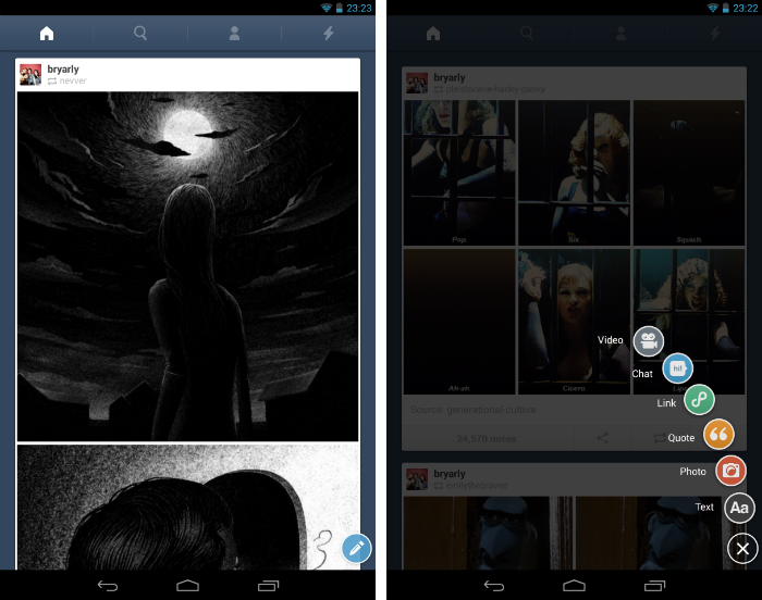
Content is displayed with minimal interference from the rest of the UI, and there’s a delightful set of composition icons that fan out when you tap the blue circle (illustrated with a pen) in the bottom right-hand corner of the screen.
Cleartrip (Site | Play Store | Free)
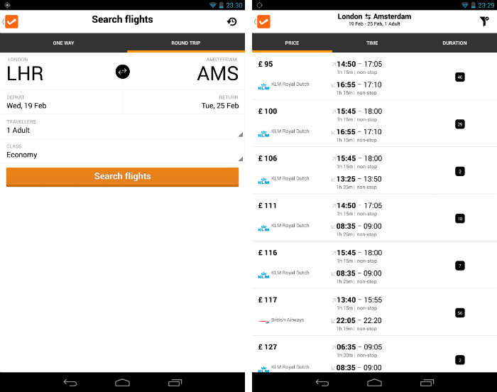
Cleartrip’s app for Android devices condenses your perfect flight into four simple criteria. The departure and arrival destinations, the date of departure, the travel class and the number of travellers. That’s all there is to it.
A separate tab lets you select a return date for round trips and once you’ve submitted your query, you’ll get a bare bones, yet informative set of search results. The true achievement of this Android app is in its ability to convey such a breadth of information through such a tiny number of pixels. It’s extraordinary and perfect for infrequent flyers who are usually overwhelmed by piles of superfluous information.
Press (Site | Play Store | $3)
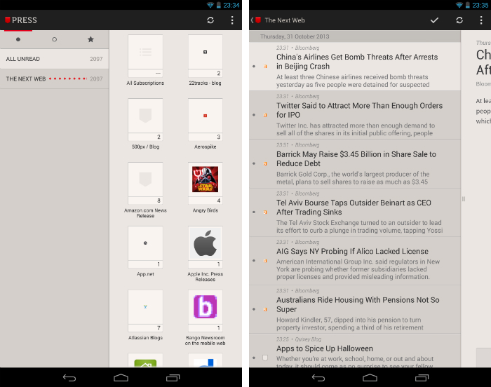
If you’re a Feedly, Feedbin, Fever or Feed Wrangler user and want a premium, hand-crafted reading experience for your Android device, listen up. You need to download Press. Just sign-in with your existing account credentials and the app will take care of the rest. It has a refined color scheme of only red, black, grey and white, which allows the content of each page to shine through unimpeded.
Lists are featured in a sidebar on the left-hand side of the app, with small thumbnail icons to represent each source. Tap once to view a specific blog or news site; individual posts will then slide in from the right and you have the option of either jumping back to the list to select a new article, or bouncing to the next available post using the horizontal arrows at the bottom of each piece.
Aviate (Site | Play Store | Free)
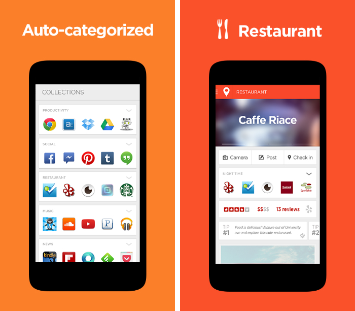
Aviate is an Android app that redesigns your home screen from the ground up. This isn’t about subtle widgets, icons or wallpapers; Aviate gives your device a full-blown visual overhaul, intelligently rearranging your display to prioritize the apps you need throughout the day.
So at the gym, you’ll get a list of all your favorite fitness apps. Heading into town for a spot of Lunch? Aviate will bring up Zagat, Foursquare and other location-based recommendation apps. The design is understated, but different enough to make Android feel fresh and new again. Dynamic and intelligent – that’s a pretty potent combination.
Spotify (Site | Play Store | Free, with in-app subscription)
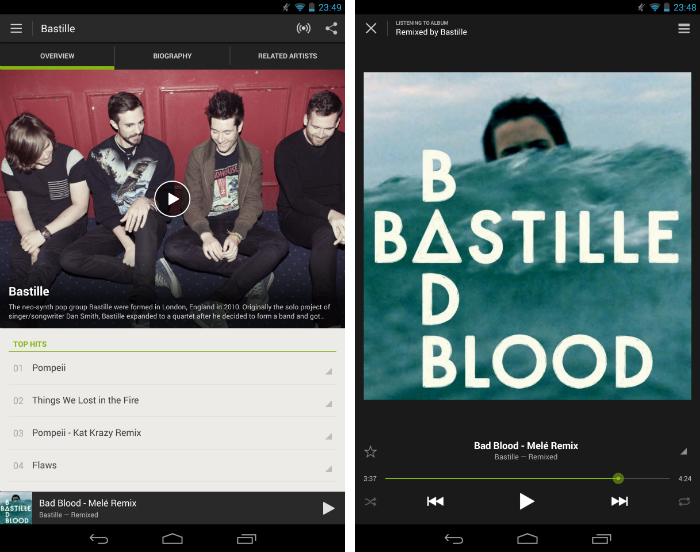
Spotify and Rdio both have their fans, but in our humble opinion Spotify takes the crown in the design department. The company’s mobile apps are phenomenal, combining a fast, responsive UI with beautiful artwork and artist/musician/band photographs.
The visual identity of Spotify – that iconic green and black color scheme – is embraced and developed throughout every fibre of the design. Even the audio player is good-looking, with high contrast controls and a subtle overlay for upcoming tracks in the play queue.
Whether you’re escaping the morning commute with some of your favorite tunes on the train, or pumping out the latest hits at a house party, Spotify is the app you’ll want to show off to your friends.
Evomail (Site | Play Store | Free)
Evomail isn’t a particularly memorable name, but if you spend more than five minutes with the app I can guarantee you’ll never forget it.
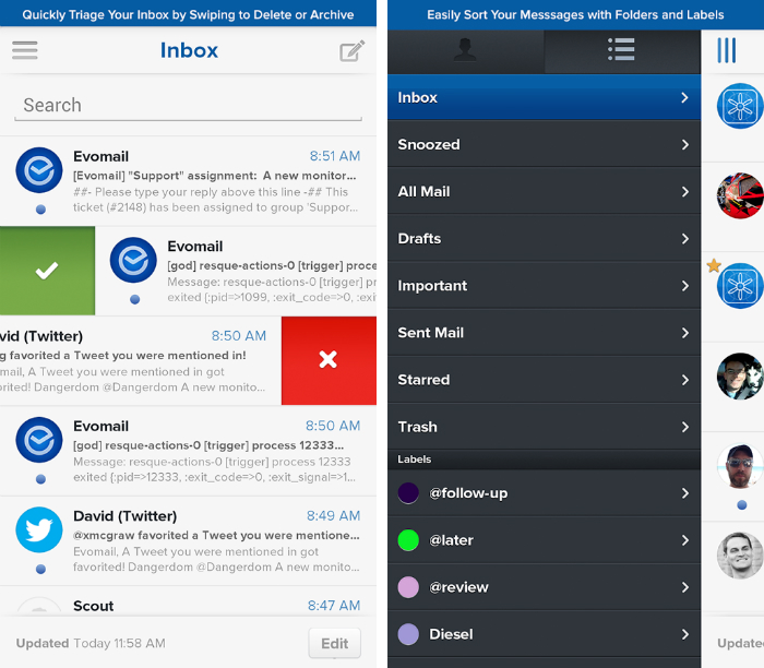
Tap the drawer icon to reveal your folders and labels, or long-press on the compose icon to bring up recent drafts. Taking a leaf out of Mailbox’s playbook, you can also swipe messages to the left to automatically delete them, or right to move them to your archive. Shaking your device undoes the previous action.
Email is rarely beautiful, but the functionality and ease-of-use that Evomail offers makes it dead gorgeous in a different way.
Bloom.fm (Site| Play Store | Free, with in-app subscription)
A word of warning: Bloom.fm is only available in the UK. Now, if you haven’t already scarpered to the next app on our list, you’ll be pleased to hear that this is one of best designed apps not only in the music industry, but in the entire Google Play store.
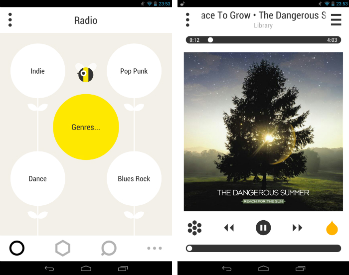
Bloom.fm rocks a polarizing yellow, black and white color scheme alongside a beautifully realized bumblebee aesthetic. UI elements are represented by flat, 2D flower heads, petals and pieces of honeycomb, while cutesy bees float harmlessly in the foreground. Behind all of this is a fantastic music app with multiple subscription options starting at £1 per month. Spotify, Rdio, Xbox Music and others take note; this is how you design an Android app.
Robin for App.net (Site | Play Store | $3.99/£2.49)
If you’ve joined the small, but growing App.net army – it passed 100,000 registered users in May 2013 – you’ll want a robust Android client to check your timeline, mentions and private messages.
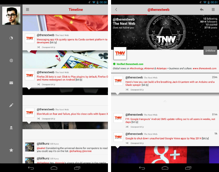
The timeline uses an unconventional design, with layered tabs hiding larger photos sourced from the linked article or uploaded file referenced in the post. As you scroll up and down, this letterbox view shows different parts of the image, before finally disappearing as another post takes its place. It’s a difficult effect to describe, but it’s utterly mesmerizing and unlike any other Android app.
Tunable: Tuner, Metronome, Rec (Site | Play Store | $1.95/£1.28)
Musicians usually need two tools to practise, aside from the instrument itself and the piece of sheet music or tabs they want to play from. A tuner, and a metronome to help them keep in time.
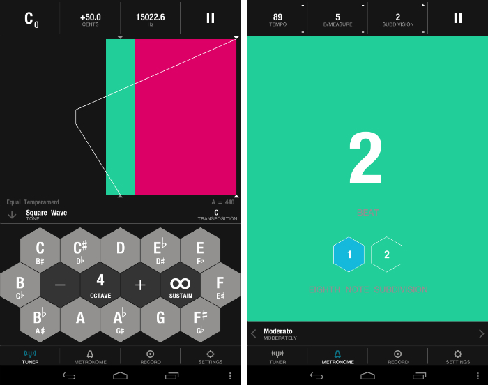
Tunable is by far the most beautiful app for solving these two problems while on the move. Just play a note and you’ll see the pitch measured out with a white vertical line and some funky pink and teal blocks. Stay within the green and you’re playing pitch perfect, but veer to the side and you risk falling out of tune. The app has a simple set of hexagonal keys for playing example notes in each key, while a separate tab uses similar interface for keeping time at different tempos and note divisions.
Notable additions
We can’t cover them all, so here’s a ‘best of the rest’ that we think deserve an honorary mention:
- Yahoo Weather | Android
- 500px | Android
- Flickr | Android
- Google+ | Android
- Google+ Hangouts | Android
- Google Play Music | Android
- Foursquare | Android
- Instagram | Android
- Onavo Extend | Android
- Flib | Android
- Pattrn | Android
- Pocket | Android
- Path | Android
- SoundCloud | Android
- TED | Android
- Timely Alarm Clock | Android
- Timer | Android
- Zite | Android
- Zappos | Android
Note: Did we miss any of your favorite apps? Be sure to let us know in the comments section – there are plenty of hidden gems just waiting to be unearthed in the Google Play store!
Don’t miss: 10 must-have Android apps for keeping on top of the news
Get the TNW newsletter
Get the most important tech news in your inbox each week.
