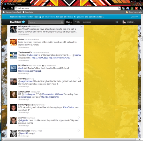
So we’ve been playing around with the new Twitter.com redesign for the last half an hour or so since we got access, and overall, we’re very pleased with the much needed update, as we’re sure most users that use the service’s website will be too (CEO Evan Williams was keen to point out that use of Twitter.com outstrips all third-party clients combined).
To learn about all of the goodness about the new design, check out our extensive live coverage of the event, the official video and our test drive video then come on back.
Welcome back. So the new site is a substantial upgrade right? As we said, we certainly think so, however, there are a few things that we’re surprised were not included in the redesign (at least so far). Here they are:
No User Streams
As Williams pointed out, the site was completely redesigned from the bottom up using Twitter’s APIs – which leads us wonder why Twitter didn’t include its river of tweets API (the Streaming API) right into the new design. There certainly was never a better time to do it, that’s for sure. Is the Twitter team worried that most of their users will be a bit overwhelmed by User Streams?
This could be the case, but as we imagine only a fraction of Twitter users actually follow more than 100 to 200 people, their streams shouldn’t come at them that fast and furious, right? Or was it an architecture concern? Certainly, if you’ve used the latest Tweetdeck User Stream beta, you know how great the Streaming API is, so we’re really wondering what gives here.
Right column isn’t locked
Use the new Twitter.com for a few minutes and this is one of the first things you’ll notice, especially now that there is endless scrolling: the right hand column doesn’t stick in place. While the expanded conversations and other pop out panes can come wherever you are in you stream, losing the newly organized top right pane (note there is now 4 “Who to Follow” recommendations instead of 2 for instance), is well, a pain to lose as you scroll down. Thankfully, this should be a relatively easy fix for the Twitter crew.

No multiple accounts
CEO Evan Williams was asked about this in the press conference and said, “not in this release” or something to that effect. Well, why not? Again, while we understand that probably the vast majority of Twitter users only have one account, why not add the functionality into the new design to further attract “power” users? Again, we’re hoping this is only a first iteration and that “not in this release” means that Twitter has plans for this in the near future. Still, it would have been great to just get – and our other two points – right from the start.
Overall, a really strong effort by the Twitter team that we hope may also mean the foreseeable end to the Fail Whale (we can hope can’t we?) and we hope that Twitter will integrate a lot of its users’ feedback on the new design sooner rather than later.
Get the TNW newsletter
Get the most important tech news in your inbox each week.


