Odes Roberts is an in-house designer for Shutterstock. This post was originally published on the Shutterstock blog and has been reprinted with permission.
With the start of every holiday season, we see the arrival of traditional color combinations that have become so familiar they can border on boring. After all, there’s only so much red, white and green a designer can deal with before feeling the urge to turn to other options. Like, what about tie-dye?
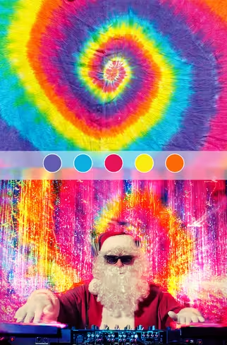
There’s nothing quite like bright, saturated primary colors for your holiday hangover. This array of colors takes you to that exact moment where all your friends and family get together in one place, the Grateful Dead or the Flaming Lips take over the speakers and there’s plenty of egg nog to be had. Sounds awesome to me.
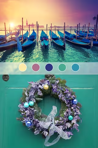
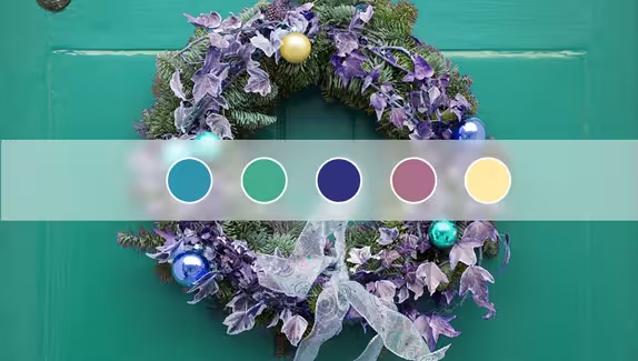
For a more subdued new spin on classic holiday colors, you can also go with warm, soft, light yellows and mild greens, with a bit of lavender. It’s not as much of a visual shock as the tie-dye, but it’s still enough to be considered daring.
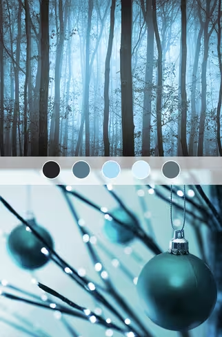
Or how about a little Tim Burton inspiration for the holidays? After watching A Nightmare Before Christmas a million times, I can confidently say that it has a crazy science of color and depth that you won’t find in many other films. If you’re looking for something a bit dark and brooding, use flat, black shades and dull, pale blues to bring out your inner Burton and terrify your friends.
What do you think? Does red and green still win out, or are you ready to start experimenting with your holiday palette? Tell us in the comments!
Get the TNW newsletter
Get the most important tech news in your inbox each week.
