
As a digital designer, it’s not always possible to be everything to everyone and wear all of the hats at the same time. Clients and stakeholders sometimes misunderstand the design process. They perhaps don’t always know that backend development and UX design are different disciplines to web design itself and so expect you, the designer, to be the all-knowing, all-fixing genius.

Photo credit: “brain picture”. Allan Ajifo. Creative Commons.
With this in mind and when you’re relatively new to UX design, you’ll certainly make some mistakes – nobody is infallible and some projects are just incredibly complex. To help reaffirm some good fundamentals, we’ve compiled some of the most common mistakes that we see in UX and some tips to help you to avoid them.
#1: Designing for yourself

The 💜 of EU tech
The latest rumblings from the EU tech scene, a story from our wise ol' founder Boris, and some questionable AI art. It's free, every week, in your inbox. Sign up now!
We’ve all been guilty of the “genius mentality” at some point. When you work in a creative field, you form strong opinions and always try to filter facts through your own experience.
But to be a successful designer, you must isolate passion from ego. You’re not out to prove anything with your design, your only goal is to help the user while creating a memorable experience in the process.
Of course, it’s not always easy to distance your wants from the needs of the user. Designers feel an almost parental sense of responsibility over their creations, but you must make sure the responsibility is to users and not your ego.
The best way to learn how to balance restraint with passion is deconstructing the work of others.
Let’s take a look at the BBQ Cultures site by Weber Grills as an example of confident design that embraces its no-BS audience.
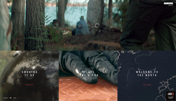
Photo credits: BBQ Cultures

Photo credits: BBQ Cultures
The bold rich colors, high definition images, and crisp intro video paired with masculine voiceover all appeal to the outdoorsman (or weekend warrior, for that matter). The site even uses a slider to reproduce some of the excitement of snapping open a grill to reveal the smoky meat – as you drag the hand icon from left to right, the grill lid opens. The mad-libs style form is also a perfect choice for the site since it creates self-confidence (no doubt appealing to the male audience).
The site understands the power of narrative, presenting the product in the context of a camping trip between a group of friends. But it doesn’t go overboard with design tricks: the animations and video last just long enough to capture your interest, then the site lets illustrations explain how to actually use the grill.
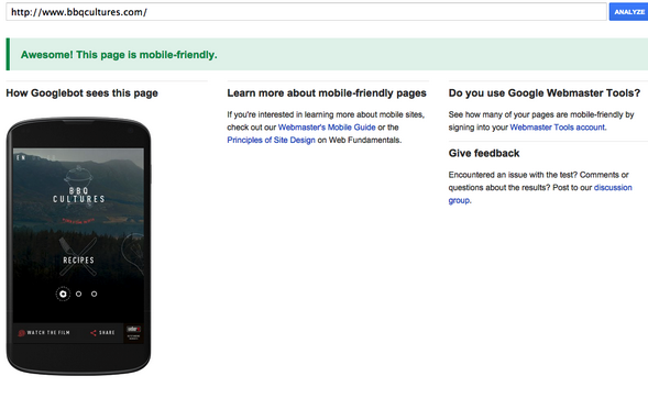
Photo: Google Mobile Friendly Test Tool
Richly animated yet content-focused, BBQ Cultures further delivers a consistent experience across all devices. When run through the Google Mobile Friendly Test Tool, the site even earns an excellent score for mobile optimization.
Now that we’ve explored a visual case study, let’s examine a few more tips on staying grounded in the design process (from our free e-book Web UI Best Practices):
- Always put yourself in the user’s shoes at every stage of the design process.
- Create user journeys to map out how the site will be used by different user groups.
- Work on buyer personas to further understand how different users groups navigate websites and what they want from the site and the company.
- Identify difficult aspects of the UI in order to create initial wireframes for those parts so that it fits in with UX practices such as user mapping and journeys.
- Test on as many real-world devices as possible. If the project is big enough, conduct some field research with users (at the minimum, you should always run moderated or unmoderated usability tests).
- Carry out A/B testing to test various design elements such as colors, buttons, text, images, etc.
#2: Mistaking UX for UI
Like we described in Chapter 1 of Web UI Best Practices, UX does not equal UI.
Mixing up UI with UX is a common mistake, probably due to the renewed interest that we’ve seen in both disciplines. It’s not surprising, as the abbreviations are similar and this is enough to confuse some people who aren’t familiar with the disciplines in the first instance.
The other reason is that the two are of course related. UI is concerned with how the user interacts with the interface of the site, which is naturally a part of the overall user experience.
But while UI is all about which buttons to press and where to go next (e.g. the clarity of the interface with regards to user goals), UX is concerned with how the overall design makes the user feel.
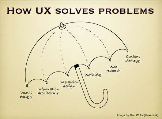
Image source: Hello Erik
In a nutshell, the goal of UI design is to create efficient yet captivating interfaces that help create a good overall user experience.
Referring back to our previous point, usability testing ensures that you remain focused on the overall experience when designing the interface. Don’t be guilty of the Dribbblisation of Design. Before you even touch Photoshop or Sketch, know your users – their fears, their goals, their desires, behaviors, and ambitions.
Understand that like the graphic above shows, UX requires mastery of many different disciplines. Just because you have a beautiful interface doesn’t mean it will work well, and just because you have a functional interface doesn’t mean people will love it.
When it comes to UX or UI design, start with the content first. After some initial user research, create an interactive site map that actually clicks through to your pages. Whether you’re using Keynote or a digital prototyping tool, always start with a site map so you can gauge the overall flow of the experience.
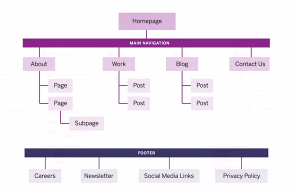
Photo credit: UXPin via Barrel NY
As you can see above from design agency Barrel NY, this site map documents the information architecture for your site. Once you’ve created this page, make sure you allow each “branch” to then click through to the wireframe or prototype of the page itself. We’ve tried this ourselves and it works in just about any tool from specialized prototyping apps to presentation software.
By working through the content first before wireframing, you prioritize your design accordingly:
- Content structure
- Interaction design
- Visual design
This process makes sense because content forms the foundation of all design, and it’s what users actually care about. Secondly, iterating on the interactions through low or mid-fidelity prototyping helps you better control the flow through that content. Thirdly, or usually simultaneously, you then polish the visual design so the experience feels as inviting as possible (considering that vision is our strongest sense).
#3: Asking users for too much information
Users are lazy. The more forms you add, the less motivated users feel.
Like we described in Interaction Design Best Practices, you generally want to create as frictionless an experience as possible. Duolingo, for example, only asks for the language you want to learn and enough contact information to set up an account.
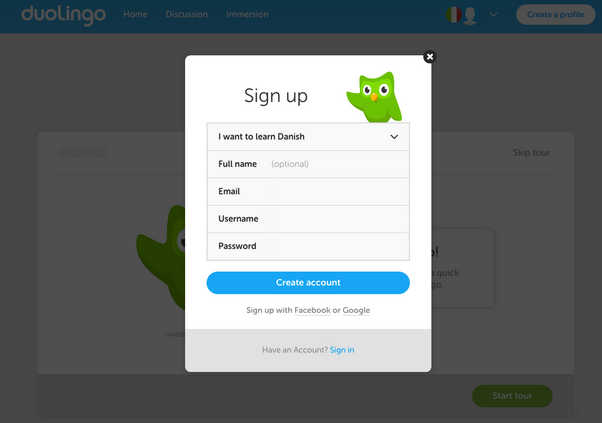
Photo credit: Duolingo Signup form
A study carried out on Imaginary Landscapes some years ago actually tested the theory that too many fields discourage user signups. The test compared an 11 field form with one with only 4 form fields.
The form with 11 fields required the following information:
- Name
- Company
- Address
- City
- State
- Zip
- Phone
- Fax
- Preferred contact method
- Comments
It also included checkboxes at the end asking how the visitor heard about the site.
The shorter, 4-field form cut down the information required:
- Name
- Phone
- Comments
Of course, you could shorten the form further by removing the phone number and comments (which generally aren’t that helpful). Depending on your industry, a phone number might be critical for lead generation, but you’ll find people are far more hesitant to risk unsolicited calls.
So what was the bottom line of the study? They found that the shorter form’s signups exceeded that of the longer form by 140 percent. Additionally, the number of conversions “increased sharply with the use of the more abbreviated form” by nearly 120 percent. The study also found that the removed fields had “no impact on the quality of conversions.”
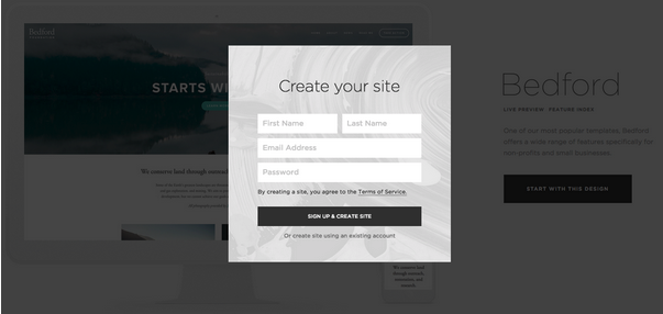
Photo credit: Squarespace
In order to arrive at the correct number of fields required, you should study your users and first define exactly all of the necessary data that you need to collect from them. While we can’t emphasize enough that you shouldn’t list a DMV-like form, we also understand that there’s no magic number.
The reality is that it’s a tradeoff. You’re dealing with competing priorities: sales teams usually want more lead information, while designers fight for the best user experience (which indirectly meets business needs). The only way to strike a balance is to test.
For example, Expedia found that removing one field from their form (for Company Name – it confused users as to what they were supposed to enter) caused an upsurge in sales to the tune of $12m.
Those types of results are reason enough to justify A/B testing on form elements.
Further Tips and Advice
You probably know this, but we’ve only skimmed the surface.
Nonetheless, there are some simple rules to bear in mind, although you should always approach each design project individually.
- Keep it simple, stupid– Minimalism and flat design are so popular because they strip away everything that doesn’t directly help users engage with content. Like we recommended in Web Design for the Human Eye, adopt a content-first design philosophy and practice sculpture through subtraction.
- Navigation – Build your navigation with a mobile-first philosophy. Ensure that enough padding exists around clickable areas so that they don’t encroach on surrounding fields. More importantly, design each page as if it will be the user’s first experience with your site. A “lost traveler” design mentality ensures that your site always provides clear orientation (the user’s current location) as well as simple navigation (the next step in the journey).
- Psychological tricks – All design is based in psychology. Your design must foster trust, inspire emotions and more, so read up on topics such as color psychology, personality in design, and the seductive art of interaction design.
We understand that it’s a lot to wrap your head around, so it’s normal to make errors while you’re still learning the discipline (which is equal parts art form). When in doubt, ask yourself what the user would do, then slowly work your way back to the business goals.
Business goals might decide the destination, but user requirements must always steer the ship.
For additional tips on designing smooth experiences, download the free e-book Interaction Design Best Practices: Time & Behavior. Case studies are featured from 30+ companies including Google, AirBnB, Facebook, Yahoo.
Read Next: Embracing emptiness in Web design
Image credit: Shutterstock
Get the TNW newsletter
Get the most important tech news in your inbox each week.