Sean Mitchell is an interactive designer based in Vancouver, British Columbia, and the editor of TypeRelease.
2015 started off with yet another set of gorgeous typefaces for all your design needs. Let’s check them out below.
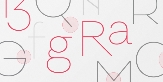
Fontfabric: Panton
Panton is inspired by the classic grotesque typefaces.
Lettermin: Ingra
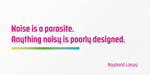
Ingra is a large family for big tasks.
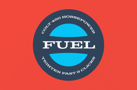
Fort Foundry: Colt
Colt aims to balance unbridled power and finesse.
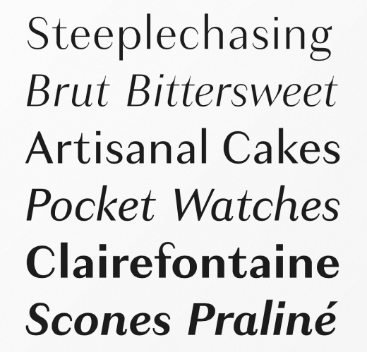
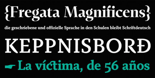
Typotheque: Echo
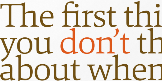
Clear and direct, with subtle influences from the broad nib pen.
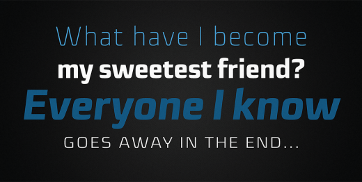
Rene Bieder: Galano Classic
Galano Classic – the display companion of the Galano Grotesque family.
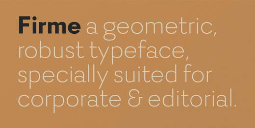
DSType: Firme
Firme is a geometric, robust typeface.
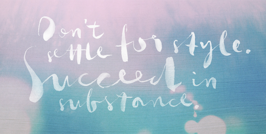
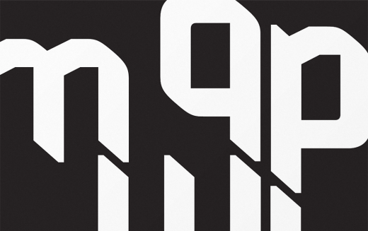
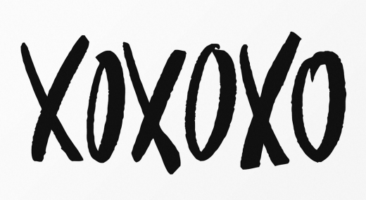
Phospho: Gloss Drop
Gloss Drop is a wild hand lettered typeface.
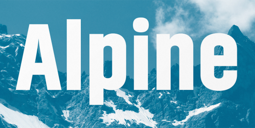
Indian Type Foundry: Akhand
Akhand is a virtually mono-linear sans serif.
Letters From Sweden: Brace
Brace lays slabs serifs onto the popular typeface Trim.
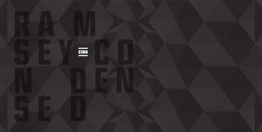
Associated Typographics: Ramsey Condensed
Ramsey Condensed is fun and easy to use.
Indian Type Foundry: Brahmos
Brahmos is a display typeface family in 5 upright styles.
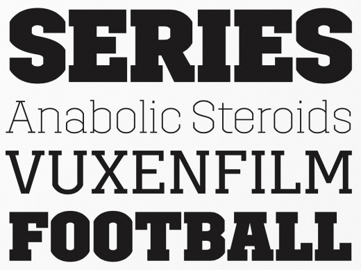
Production Type: Granville
A reinterpretation of the thick-thin style.
Fenotype: Frost
Frost is a smooth and lively connected script family.
Adtypo: Fazeta
Fazeta is a text face without sentiment.
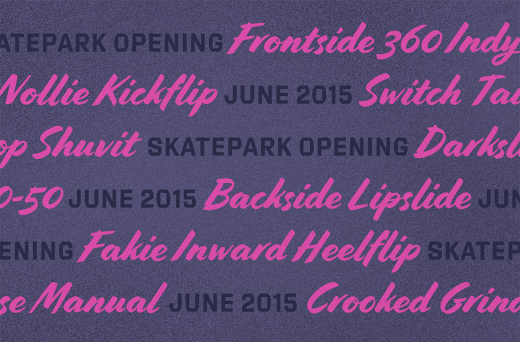
Jesse Ragan & Ben Kiel: Cortado Script
A fresh take on mid-century pointed brush lettering.
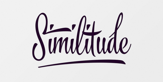
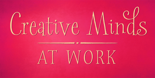
Laura Worthington: Spumante
Spumante is a slim, semi-connected script with lithely upright curves.
dooType: Sica
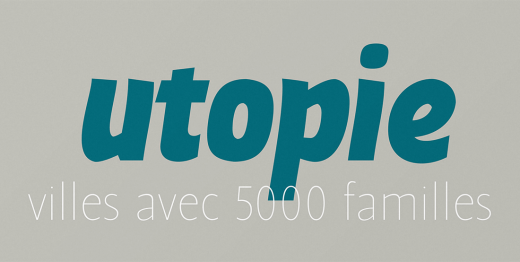
Sica was designed to address issues related to technology, while maintaining humanistic forms.
Tyler Finck: Pretty Many
A handmade typeface that gives a random, natural feel to any design.
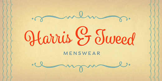
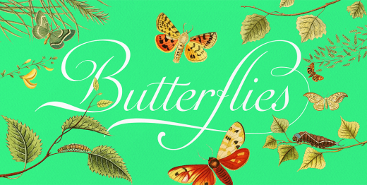
Sudtipos: Auberge Script
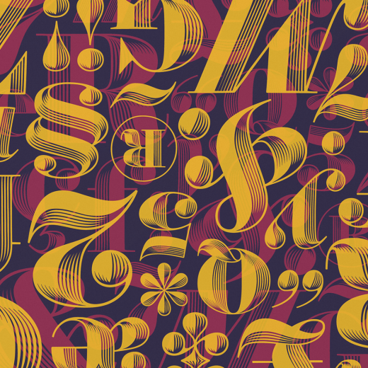
Auberge Script is an exercise in going overboard with alternates, swashes, and ornamental devices.
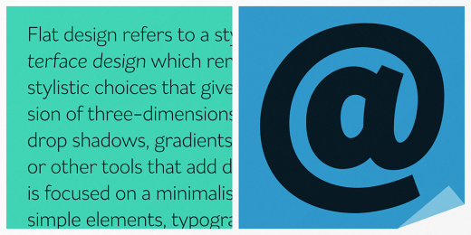
Schizotype: Flat Sans
Flat Sans is a grotesque with humanist leanings
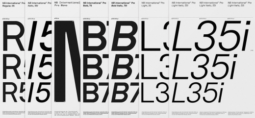
Neubau: NB International
NB International pays tribute to grotesk typefaces of the ‘international style’ era.
Stephen Rapp: Spry Roman
Spry Roman was designed to break out of the mold and dance along the baseline.
S-Core: Core Sans E
Core Sans E is a modernized grotesque font family.
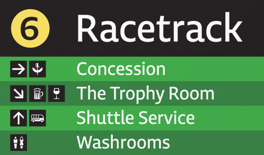
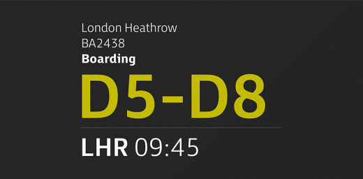
Fontsmith: FS Millbank
FS Millbank – a wayfinding typeface.
Hoftype: Mangan
Mangan combines classical rationality with contemporary design.
TipoType: Cavita
Cavita is a mix between both grotesque and calligraphic models.
Hoefler & Co: Obsidian
Obsidian is a majestic typeface that uses digital means to achieve traditional ends.
Los Andes: Styling
Styling is a simple, light, sans serif typeface.
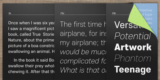
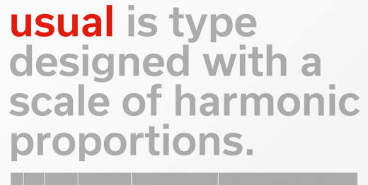
Rui Abreu: Usual
Usual is suitable whenever typographic sobriety and neutrality is needed.
In case you missed it: The best typefaces of 2014
Image credit: Shutterstock
Get the TNW newsletter
Get the most important tech news in your inbox each week.
