I’ve been writing about Ubuntu smartphones and tablets on and off for the last few years. I’ve had the opportunity to pick Canonical’s founder Mark Shuttleworth’s brain on a few occasions too.
One thing that’s always struck me is how long it’s taken to get Ubuntu mobile hardware onto retailers’ shelves. Canonical was talking about ‘Ubuntu for Android’ in 2012, and it’s only really just now that a device with hardware worth having has gone on sale running the Ubuntu OS.
Even then, it’s not big name manufacturers making and selling the devices – BQ and Meizu; neither of which I’d heard of before Canonical got involved with them.
With the Meizu MX4 Ubuntu Edition now on sale for €299, I’ve spent 24-hours playing around with it to see if it offers a viable alternative for users to iOS and Android.
Hardware and design
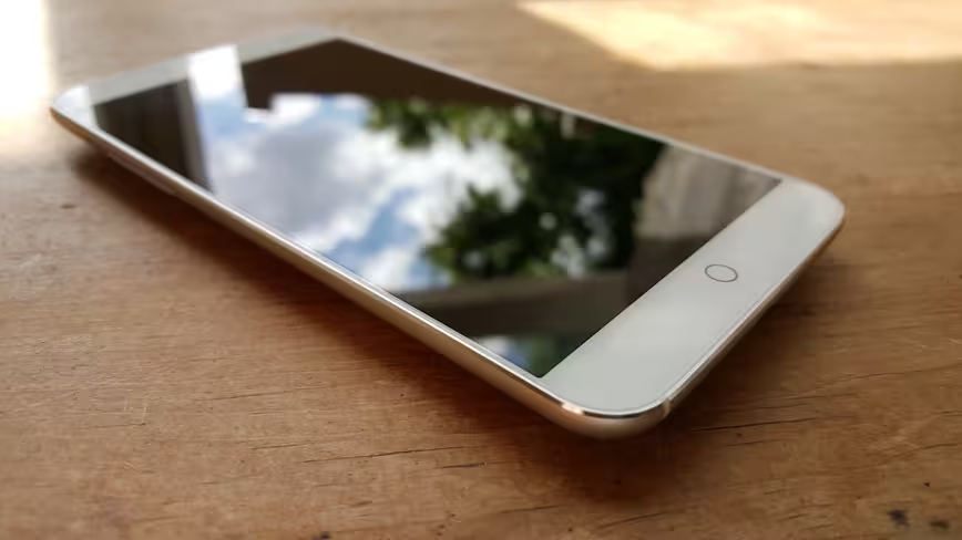
The Meizu MX4’s display is a Gorilla Glass 3-equipped 5.36-inch panel (1,152 x 1,920 pixels), which just about remains visible on full brightness in direct sunlight.
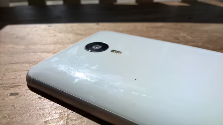
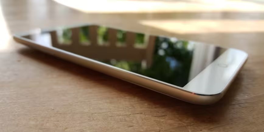
Despite the fact that it has a very plasticky white (or black) rear panel, the front of the MX4 and the overall profile belies its mid-range price tag. There’s probably a reason for that though: it’s hard not to think about ‘inspiration’ that might have come from previous generation iPhones. Does that ‘home’ button and bezel look familiar to you too?
Nonetheless, the result is that it’s light, slim and easy to use one-handed.
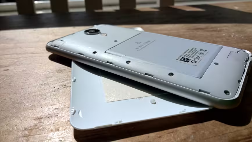
While the back of the device is removable, the battery is not. There’s no microSD expansion port hidden away either, which is a bit of a shame as the internal storage maxes out at 16GB.
Unfortunately, the white plastic panel is a bit of a fingerprint magnet too.
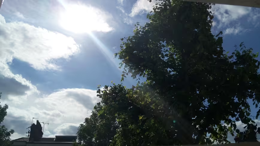
On the rear is a 20.7-megapixel sensor, which after a few quick test snaps offer encouraging, though not perfect, results (below). Obviously, this will be getting a more thorough test in a full review.
On the front, there’s a 2-megapixel sensor for video calling and selfies. Neither of which I engage in too frequently, so that’s fine by me. If you do love selfies, you might find the MX4 a bit lacking in that department.
The real difference
Hardware isn’t really where the Ubuntu MX4 sets itself apart from the rest of the smartphone crowd, though.
As an Android user (primarily), it was clear after just a few minutes that it will take a little time to get used to the MX4 Ubuntu Edition.
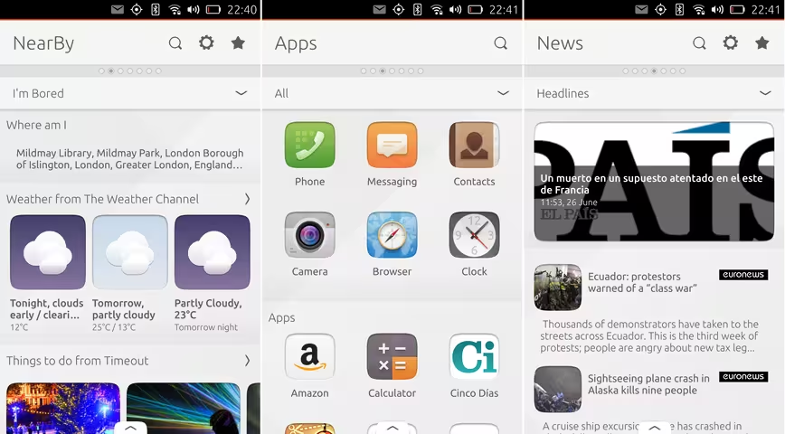
The main navigation is split into panels (Canonical calls them ‘Scopes’). The first presents information relevant to where you are, so it’ll show you local restaurants or bars or other information, depending on your needs. Scrolling down on this panel shows you trending Twitter topics. Clearly, this panel is all about information you might want ‘now’.
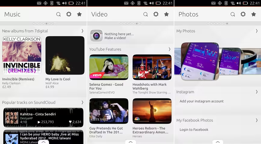
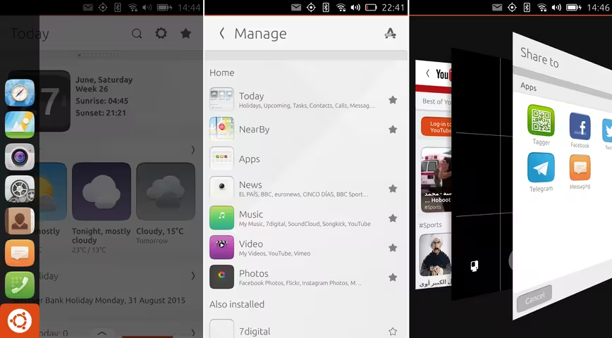
Scrolling across through the next few panels reveals news, apps, music, video and photo panels. There’s also a device management panel.
What’s key about the scopes is that on-device information is presented alongside content that hasn’t already been downloaded, such as with Videos, for example.
The Photos scope shows your cloud-stored images alongside local ones, if you connect your accounts.
To access core apps like the dialer or messaging, you swipe in the from the left-side. Swiping in on the bottom-right side opens up a list of running apps, swiping up on any of them individually closes them – just as it does on other OSes.
One thing that was immediately noticeable was the lack of features many people would consider ‘essential’ nowadays. Once you’ve taken a photo, for example, the only edit you can make to it without downloading a third-party app is to crop it or rotate it – no filters, no effects, nothing.
That’s not a huge surprise to me, and fits with the company’s explanation of wanting to target keen early-adopters first rather than make a mainstream push, but it’s something to keep in mind if you’re considering making the switch to an Ubuntu phone. It’s an ecosystem in early development, and you can feel that in the app store and overall polish.
First impressions?
I love the idea behind Canonical’s ‘one code base fits all devices’ approach to different form factors, so I want to love Ubuntu on a smartphone. However, it’s going to take some time – and I suspect a fair amount of patience – to really get to grips with what it can and can’t do.
The browser felt a little on the slow side the first time I used it, and there hasn’t been the chance to assess battery life or how it handles particularly demanding apps
On first impressions, it feels more similar to Amazon’s Fire Phone than a straightforward Android phone in the way it presents information. I’m interested to see how the scopes work out over time though, so check back for a full review in the coming weeks.
Read next: Shuttleworth says Ubuntu’s future is more exciting than space travel
Get the TNW newsletter
Get the most important tech news in your inbox each week.

