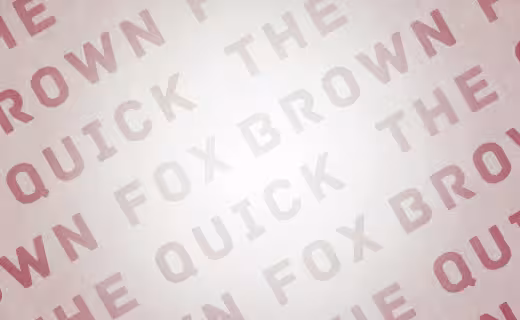
Sometimes no matter how beautiful a typeface is, it can still be quite difficult to imagine just how you’d end up using it on actual projects. Especially for the less typographically-inclined, even distinct faces can hide their true personalities if only seen in a simple “the quick brown fox” sample.
This is why we love Fonts In Use, an effort by Sam Berlow, Stephen Coles and Nick Sherman to catalog and examine real-world typography. Check out this list of 11 beautiful examples of typography in the real-world, discovered and picked apart by Fonts In Use:

If you were to design a traditional mom-and-pop butcher shop, Brothers is a natural place to start. The typeface, by legendary American sign painter John Downer, is endowed with his old-school craftsman values. Austin-based Ptarmak built the Chop Shop branding around Brothers, including its turn-of-the-century graphical elements, arrows, and panels.
.

The 💜 of EU tech
The latest rumblings from the EU tech scene, a story from our wise ol' founder Boris, and some questionable AI art. It's free, every week, in your inbox. Sign up now!
NBA Promos for the 2012 Season:
After a lockout delayed the start of this year’s NBA season, the league heralded professional basketball’s return with a series of 30-second TV spots. Cinematic slow-motion footage is overlaid with bursts of clever copy, single words and short phrases set in Trade Gothic Bold Condensed No. 20. The typeface is just right for the job. Its dimensions fit the frame well — bold without obscuring too much of the action. The letters are tough and upright, built like the players they celebrate.
.

While the content is on the lighter side, the design isn’t frivolous or cute. It’s not Gray Lady formal, but it does have the look of a fairly serious weekly news magazine. Much of this posture comes from steering clear of ultra-modern or casual typefaces and choosing the more conservative Founders Grotesk, Kris Sowersby’s ode to English Grots of the early 1900s. Sowersby toned down the idiosyncrasies of the old types, but not their heft and directness.
.

My favorite of the posters features Britannic, a Stephenson Blake design from 1901. This kind of high contrast, closed aperture, turn-of-the-century sans serif (like Radiant and Globe Gothic) is rarely used these days, especially in movie advertising. Even without the illustration, it takes the viewer to another place. Acier BAT, a Cassandre revival (see also Bifur), is similarly striking.
.
Fortune Magazine, “500” Issue:

Fortune’s current art director, Michael Myers, played a major role in the design of this issue. He also created the interior illustrations for the “500” feature. These follow a host of similarly styled typographic pieces he’s contributed to the magazine over the year.
.
As an educational corporation willing to invest in beautiful things to promote their language courses around the world, EF (Education First) is a typographer’s dream client. Albin Holmqvist was the lucky designer to take on their latest campaign, letting type do the talking in four short films produced by Swedish firm Camp David.
.
The Typographic Monotony of American Retail:

In an age when thoughtful design is more accepted and understood than ever, I think American shoppers could handle a little bit more — dare I say — sophisticated typeface selections. Here’s the painful proof: 15 of the top 20 retailers on the Fortune 500 use Helvetica in their main identity or current advertising campaigns.
.

It might be disappointing to some, but most of what the Bauhaus printed in their early years was set not in geometric sans serifs but in art nouveau flavoured text faces. The initial Bauhaus manifest from 1919 (below), for example, used Ohio by Schriftguss AG (LTC Pabst Oldstyle is the most similar digital font available). Back then, one had to content oneself with the fonts a printer had in stock.
.

For the upcoming Schocken/Pantheon Kafka library, cover designer Peter Mendelsund turned to a typeface derived from the handwriting of Franz Kafka himself. FF Mister K is not a facsimile of Kafka’s pen, but Julia Sysmäläinen studied the writer’s manuscripts closely to develop a font family that could be readable and useful in modern design. The result is a script with a sense of timelessness, a rare trait among handwriting faces — most are either antique or contemporary.
.

One of the first major newspapers to use webfonts in its digital edition, the Globe always feels like the Globe, on paper or screen.
At the heart of the Globe’s typographic personality is Miller Headline. The typeface is a slightly condensed addition to the popular Miller family by (Boston area resident) Matthew Carter. It was created specifically for newspapers like the Globe and served as the main headline face for the paper since 2001. BostonGlobe.com uses screen versions of the fonts via Webtype.
.

Before seeing Camera+, the playful and pretty Bree wouldn’t have been on my list of options for a software interface. It’s an unusual choice, especially for an app with so many buttons and options. Yet the type performs beautifully on the forgiving surface of the iPhone 4’s bright, ultra high resolution display.
For more typographic goodness, take a good look around Fonts In Use — believe me when I say we’ve only just skimmed the surface with the above. You might also want to check out the latest typefaces from the Lost Type Co-op: A “pay what you wish” foundry.
Get the TNW newsletter
Get the most important tech news in your inbox each week.