Every designer knows that typography is one of the most important tools in his or her arsenal, but quality type can be horribly pricy. Don’t believe me? Check out Hoefler & Frere-Jones‘ set of fonts, which commonly start at $200+ per font family.
Now, don’t get me wrong. Type designers most definitely should be paid for their work. And the pricing at foundries like Hoefler & Frere-Jones is reasonable, but that doesn’t mean it isn’t also completely inaccessible for many new and underpaid designers. For anyone tight on money, there are solutions out there and Lost Type may be your best bet for free and inexpensive display fonts.
We’ve covered this issue & Lost Type’s solution in the past, but now there are plenty of new typefaces to check out. Here’s a handful of our favorites:

Edmondsans is hard-working display face in three weights, featuring some useful niceties like small caps, non-lining figures, and a few alternates.
.

Geared is an industrial inspired Condensed Slab Serif in 4 weights (Thin, Regular, Bold, Extrabold). With an extensive character set, Geared could be a versatile addition to your next project.
.

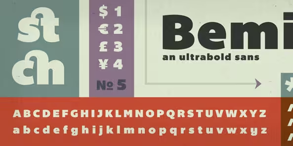
A Bold, Geomteric Sans Serif in two styles (Regular and Cut). 122 Glyphs per Style. Includes a Sweet Lightning Bolt character.
.

Created from original proofs of a 19th Century American Wood Type alphabet, Aldine Expanded was created and embellished by Javier Viramontes at the University of Texas, Austin.
.

A condensed uppercase typeface with regular, thin, inline, and bold weights.
.

Beautiful line width variation in this condensed sans-serif. Perfect for an elegant modernist headline.
.

A heavy-duty, lowercase slab-serif inspired by the monumental Saturn V rocket that carried men from the earth to the moon.
.
Onramp and Canaveral also appear to be new, and we’ve heard word that more faces will be premiering during this week, so keep your eyes on the link below for more.
For more inspiration, check out TNW’s Design & Dev channel!
Get the TNW newsletter
Get the most important tech news in your inbox each week.