Larger images, longer scrolling, and a new kind of flat design.
The forefront of web design is also expanding, but with 2015 winding down, we now have a clear idea of the year’s most influential trends. Here are the top ten trends — and their best practices — that defined web design in 2015, and are worth remembering as we head into 2016.
Deeper interactivity
Source: Beatbox Academy
As we move forward, the very idea of websites changes as quickly as their capabilities. The advancements of HTML5, CSS, Javascript, and jQuery now allow deeper interactions, a powerful tool for all businesses.
In 2015, we saw an increase in:
- Swiping and clicking
- Control over seen/unseen content
- Personalization (e.g., location tools)
- Microinteractions
- Scroll-based navigation
- Video and animation
- Push notifications
- Transitions and loop functions
This shift places more emphasis on microinteractions, the minutiae of interactivity: a ding sound when you send an email, or an animation to draw attention to a new notification. Interaction design with only get more intricate as technology allows, making this a trend that’s sure to stick around for a while.
Tips
- Design with the user’s goal in mind to discern which interactions are most significant or where to add them. Every step of the design process should be tweaked to help the user accomplish their goals faster. Personas, user scenarios, and experience maps mentioned work best for understanding your users and their goals.
- User interaction should be a conversation, with the site speaking on your behalf. Try role-playing between user and interface, where one person actually speaks for the future site, to anticipate user flows.
- Increase interaction with clear signifiers, such as a hamburger icon labeled “MENU” to communicate a pullout menu or a play button representing a clickable video.
- For web or mobile app animations, make sure you follow Disney’s 12 rules of animation.
Free resources
- 2016 IxD Awards – Interaction Design Awards’s best picks for IxD, a good resource for inspiration and new ideas.
- “Making and Breaking UX Best Practices” – UX Booth’s guidelines on the roots of UX design and the ideas behind the practices.
- Interaction Design Best Practices Volume 1 — Free 109-page guide teaching timeless IxD techniques based on 33 case studies.
Flat design 2.0
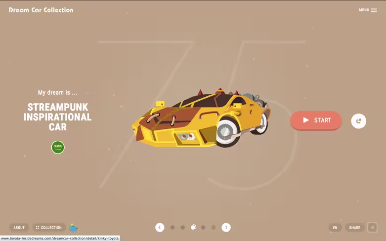
Source: Toyota: Dream Car Collection
Flat design may have started years ago as a reaction against skeuomorphism, but it’s certainly evolved beyond its strict origins. While before flat design was excessively flat, it has since become a more nuanced version of its simplistic roots. Ryan Allen calls it “Flat Design 2.0,” and it allows for more details and flourishes, including:
- Lighting highlights
- Gradient shadows
- Drop shadows
- Elements with greater values
However, the general simplicity and minimum embellishments still characterize flat design. Its almost-cartoonish graphics, legibility-first typography, and playful colors remain unchanged, and keep the style as one geared for easy comprehension.
Tips
- The simple graphics of flat design decrease loading times, making them attuned for responsive design.
- Flat design pairs well with minimalism, another trend. Both share the same goals of increased comprehension through simplicity, and both adhere to “less is more.”
- Ghost buttons — with a transparent background framed only by an outline — emerged as a trend without a trend, but can be useful outside of flat design. They functional as an interactive control without detracting from a prominent background image, making them a popular addition to hero images.
Free resources
- 25 Flat Device Mockups: Templates for creating flat design mockups on a variety of devices.
- 50 Flat Icon Sets: Digital Synopsis’s roundup of 50 flat icon sets that are free to use or peruse.
- Design Trends: Evolution of Flat Design — A free guide teaching flat techniques based on 18 examples of the year’s best designs.
Long scrolling
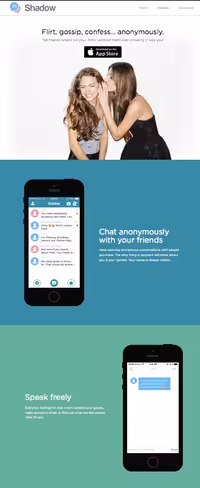
Source: Shadow
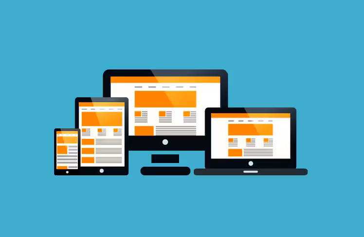
With mobile browsing now exceeding desktop, 2015 saw web design catering more to smaller screens. Like many of the trends on this list, long scrolling became popular for its usefulness in responsive design: smaller screens means longer scrolls.
Research has proven wrong the myth that users don’t scroll, and this revelation opened a new level to web design. Long scrolling offers more creative freedom, especially in areas of storytelling, creativity, and even navigation if the site is small enough. It also adds a natural narrative that encourages interaction.
This format does have its drawbacks, though, such as SEO effects and longer loading times. Long scrolling works better for some sites than others, particularly those with heavy mobile traffic or frequently updating content, and without too much heavy media like videos.
Tips
- Long-scrolling sites can confuse or disorient the user, especially if they want to return to a previous section. Including a sticky navigation menu or a jump-to-section option gives users confidence to explore.
- To circumvent the negative effects on SEO, follow the advice in this Moz article and this Quicksprout article.
- Effects such as parallax and scrolling-triggered animations draw out the playful aspects of the scrolling format.
Free resources
- One Page Love — A gallery of the best single-page websites, updated regularly.
- “Apple Resurrects the Scroll Wheel” — A TechCrunch article analyzing how the Apple Watch will breath new life into scrolling websites.
- How to Create a Parallax Website — A two-part tutorial that teaches the fundamentals, including coding, for parallax design.
Card layouts
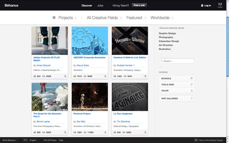
Source: Behance
Another practical trend popularized by the mobile movement, card layouts display a wealth of content in a clean, organized manner attuned to browsing. Each individual card contains all the relevant information a user needs to know, usually:
- Enticing image
- Title
- Description (or relevant tags)
- Control panel with options like favoriting, commenting, etc.
With their flexible layout, cards work exceptionally well with responsive design. Rows and columns can be effortlessly reorganized to fit different screen sizes.
Users intuitively know clicking on the card brings them to the related post. For this, cards are perfect for browsing through diverse and dissimilar content, especially linking to external sites.
Tips
- Pay attention to the gutters (negative space between cards) or the borders used to separate them. Users should never have to guess where one card ends and another begins.
- The entire card should be clickable, as opposed to only the image or textual links. Maximizing the clickable area makes interacting with the card easier, adhering to Fitts’s law.
- Cards can make great use of animation, especially hover-triggered effects. Common animations are changes in color or the entire face of the card, or even spinning or twirling effects — but since the card layout is common, you’ll benefit most thinking of a creative new animation to set your site apart.
Free resources
- “How to Build a Card Interface with Sketch App 3” — A tutorial on how to make simple cards using Sketch (an up-and-coming design app).
- 10 Material Design Cards for Web in CSS and HTML — A resource for designing cards for Google’s Material Design.
- Design Techniques: Cards & Minimalism — Free guide teaching card UI & minimalist techniques based on 43 case studies.
Advanced animations
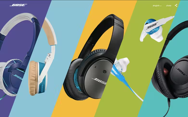
Source: Bose
Like interactivity, animation in web design constantly redefines its role as new options present themselves. This last year saw animations fulfilling a greater role in UI and UX design, becoming an expectation for usability rather than a visual flourish.
Because motion attracts attention, animation can influence the visual hierarchy of what gets seen first. It can also be used to show a relation, such as a window shrinking and flying to the place where it can be viewed again. At the very least, it highlights otherwise dull actions: a animation on hover shows a link is clickable more than a simple color change.
Tips
- Animation has long been used for loading screens to placate the user while they wait, and to give them realistic expectations for how long it will take.
- Long scrolling formats rely heavily on animation to create the appearance of smooth scrolling. When done well, combining animations and scrolling can create a more immersive and entertaining site.
- Adding slight animations to a background image add a vitality and energy to the page, and keep it from being dull. However, these animations should be minimal: too many will distract the user from the main content, and drag on loading times.
Free resources
- CSS3 Animation Cheat Sheet — This useful collection of ready-made, plug-and-play animations lets you apply premade CSS classes to any element you wish.
- Web Animation — A frequently updated guide to synchronization and timing for animation in web pages and APIs.
- Interaction Design & Animations — Free 80-page guide teaching interaction design techniques based on 47 examples of the year’s best designs.
Dramatic typography
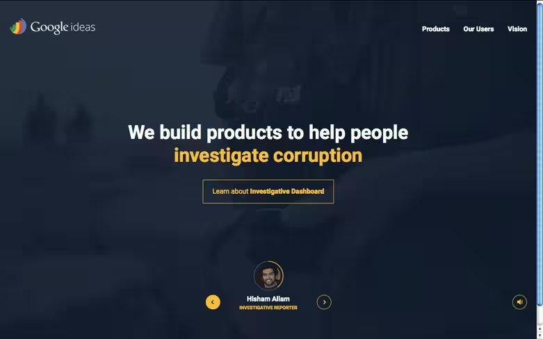
Source: Google Ideas
This last year, typography has stepped out from the background, perhaps because of increased availability of new fonts and font rendering no longer holding sites back. Dramatic typography refers to text that draws attention to itself — it does not always mean wild or elaborate typography. In fact, simple typography is sometimes the most dramatic.
Modern typography trends tend to fall into the following categories:
- Extreme size (big or small)
- Working in conjunction with images
- Customized or artistic typeface
Along with flat and minimalist designs, the current trend favors simplicity. A sans serif typeface set in bold styling makes a visual statement while improving readability.
Tips
- Remember the primary goal of typography is legibility and readability. It doesn’t matter how impressive your typeface is if users can’t understand the content.
- As a starting point, try not to use more than two fonts per site. While you can use more typefaces, you generally want to stick with the same typeface family.
- If your typography is effective enough visually, it can take over the role of an image on the page. Aesthetic typography can also be eye candy, and it’s common to see pages with beautiful text as the central focus.
Free resources
- Awwwards Typography in Web Design Gallery — Awwward-winning sites selected for their typography — updated regularly.
- “41 Best Free Web Fonts of 2015” — Instead of browsing through thousands of options, Elegant Theme’s list hand-picks the best from this year.
- Design Trends: Dramatic Typography — Free guide teaching typography techniques based on 21 examples of the year’s best designs.
Vibrant colors
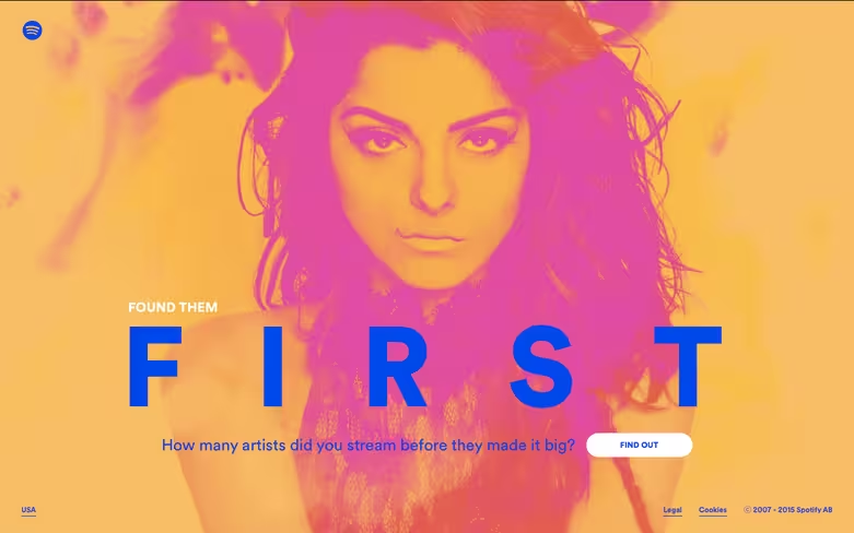
Source: Spotify: Found them First
In the past designers were limited to 216 web-safe colors, but today there are millions, an advancement timed nicely with the rise of HD screens.
Bright, “happy” colors coincide with the goals of other trends to shape the appearance of current web design. Vibrant colors match the tone of flat design, with a lighthearted, friendly appeal.
These attention-grabbing colors also relieve some of the natural drawbacks of minimalism — with few elements to choose from, extra weight falls on colors to be a stimulating visual. With typography, colors can attract notice to specific words or phrases.
Moreover, colors serve a valuable function for suggesting usability. Think of cards that change color when hovered over — this is an obvious indicator of interactivity, as opposed to a static element.
Tips
- You don’t always need more colors to stand out. Monochromatic schemes (which emphasize one primary color) can make a strong visual statement when paired with bold typography.
- Know the emotions behind the color so you can choose them for the right context and culture.
- Understand how to use the 3 main color schemes for the appropriate contrast on your site.
Free resources
- ColourLovers — A global community showcasing their own clever palettes and discussing color theory across all mediums.
- Tint UI — A color picker for copying hexadecimal codes. Allows for browsing by platform (Material Design, iOS, etc.), brands (Twitter, Firefox, etc.), or current trends.
- Design Trends: Vibrancy of Color — Free guide teaching color techniques based on 22 examples of the year’s best designs.
Functional minimalism
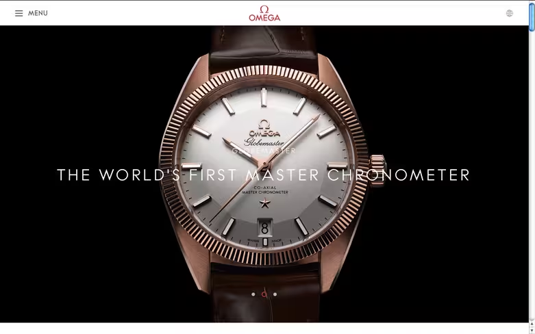
Source: OMEGA Watches
Another result of the rise of mobile browsing is the popularization of minimalism, a style defined by using only the bare essential, or minimum, elements.
On a practical level, minimalism cuts down loading times, enhances readability, and creates interfaces so simple they can be understood at a glance. Fewer elements makes responsive design is easier, as well. On an aesthetic level, minimalism adds an air of sophistication, no matter the type of site.
In terms of UI elements, OMEGA (above) includes only what’s necessary: language settings, expandable menu, and the logo for returning to the home page. This draws attention almost exclusively to the product hero image.
Tips
- Given the emphasis on the content, minimalist sites work well with hero images and video backgrounds: there are simply less UI elements to compete with the graphics.
- Hiding navigation menus in slideouts or pulldown menus is a great way to conserve space, and allows a fuller, more immersive screen for a first impression, before the user worries about where to go next. If you use a hamburger menu, try adding a “MENU” label so less tech-savvy users don’t get confused.
- Applying different degrees of symmetry makes the sparse elements speak even louder. Most websites are approximately symmetrical, but consider applying asymmetry if you want a single element to stand out the most (e.g. a large product image offset by a small block of text).
Free resources
- Gallery of Minimal One-Page Websites — A site dedicated to featuring the best one-page websites.
- Best Minimalist WordPress Themes — A nice launchpad for minimalist templates, though not all are free.
- Design Trends: Elegance of Minimalism — A free guide teaching useful web minimalism techniques based on 28 examples of the year’s best designs.
Captivating photography
Source: Mario Frigerio: Wedding Photographer
HD screens paved the way for better image quality, both technical and artistic aspects. More sites are relying on breathtaking photography for their visual presentation instead of digital graphics.
The most noticeable trend in photography is the hero image, the single photo that spans the entire background. Hero images create immersive experiences by focusing the entire page around a single image — which is why they’re often used as landing and login pages. There is a lot of flexibility in utilizing hero images. The tone and message can be changed for any site, as long as the photograph matches the goals.
Tips
- While custom photography is often more personal, stock photography is a viable option for designers trying to save time or money. When done skillfully, stock and custom photography can even be combined; the custom photos make the stock photos also seem custom, so you have the benefits of personalization with less cost. For free stock photos, try Unsplash, Pixabay, and Pexels.
- Color overlays allow designers to manipulate how an image is perceived based on the color’s attributes. Giving an otherwise dismal photo a yellow or orange overlay will make it appear more upbeat and friendly.
- Another photography trend is to replace traditional product images with photographs of the product in their natural environment. This provides customers with context about how it feels to own the product, which can increase sales.
Free resources
- “10 Pitfalls to Avoid When Using Stock Photography” — An article from Design Shack warning against ten common mistakes with stock photography.
- TinEye Reverse Image Search — A great tool for stock photography that reveals all of a photo’s locations on the Internet.
- “The Ultimate Guide to Beautiful DIY Photography — A beginner’s guide to taking your own web photography.
HD backgrounds
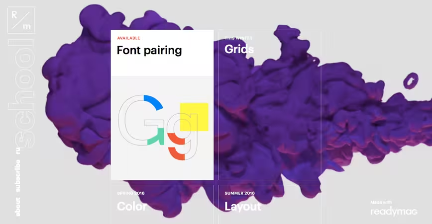
Source: R/m Design School
The hero images described above aren’t the only trend concerning background visuals. People with high definition devices — which is quickly becoming most people — want the make the most out of their potential, and so HD backgrounds became popular this year.
This encompasses both hero images and also video. Browsers and internet speeds can now handle more video (within reason), and cinematic backgrounds give more immersive effects than a stagnant photograph.
HD is another resolution greater than 200 ppi (dpi), while standard definition is 72 ppi. This makes images designed with SD in mind appear blocky or blurry on HD devices, but HD images appear fine on SD.
Tips
- Use scalar vector graphics when you can. SVGs translate images using lines and points, whereas raster formats (.jpg, .png, .gif) work pixel-for-pixel. Raster formats are okay for real-life images and video because they have a fixed number of pixels from the start — that’s why it’s important to capture the media in HD from the beginning.
- HD media can steal attention away from other elements on the screen, so design a layout where important features won’t be overshadowed.
- Take an active role in cropping backgrounds for different devices. Most will not conform to the usual 1:1.5 aspect ratio of cameras, so cropping is needed regardless.
Free resources
- Improving Image Quality on the Retina Display — Tuts+’s tips on tackling HD displays, including the usage of CSS media queries.
- Browser Shots — An online tool for testing your site’s screen resolutions and browser capabilities.
- 20 HD Blurred Background Sets — A collection of free blurry HD backgrounds.
Read next: Why every member of your team should be a UX expert
Image credit: Shutterstock
Get the TNW newsletter
Get the most important tech news in your inbox each week.