Alexander Huls is a freelance writer whose work has appeared in The New York Times, The Atlantic, Esquire and other publications. This post was originally published on the Shutterstock blog and has been reprinted with permission.
Moleskine notebooks are the lifeblood of many a creative person — from advertising executives to writers and designers. Those who discover (and inevitably fall in love with) the beloved notebooks become loyal customers for life. We’re no different.
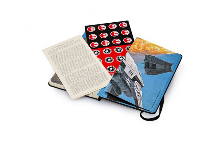
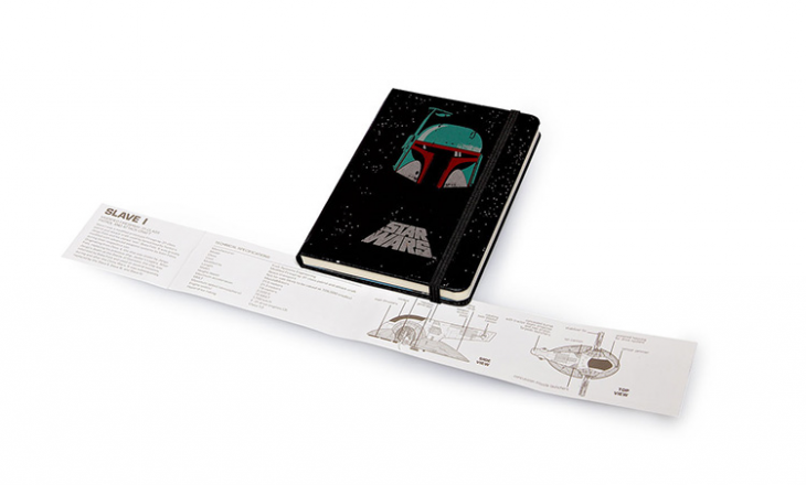
These days, Moleskine notebooks come in a lot of shapes and sizes. And while we love the famous black notebooks, we’re also huge fans of how the company finds ways to continually reinvigorate its brand — whether it’s introducing a new color, going digital with Evernote, or creating special collections anchored to famous brands like Star Wars.
We sat down with Fabio Di Liberto, Brand Manager for Moleskine, to talk about what goes into designing notebooks beyond the company’s classic black original. What emerged was a variety of valuable design tips for all creative folks — whether you’re making a notebook or not.
1. Design for the user
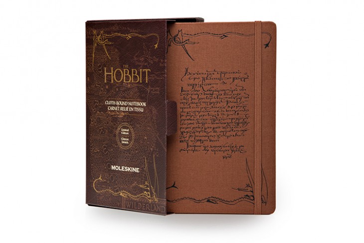
Moleskine has excelled in recent years at producing wonderful special collections, often tied to popular brands like Disney, LEGO, Star Wars, The Hobbit, The Simpsons, and Evernote. When it comes to designing those special notebooks (or any notebooks, really) they’re always thinking of one thing: customers. “We always have our public in mind when we think about the characters and the story that that particular notebook will carry with it,” says Di Liberto. “Whether it’s color palettes or more breakthrough innovations, we look at what the final result will mean to the public and market.”
2. Do your customer research
Because Moleskine cares so much about making its users happy, much of the design work is motivated by research that helps to anticipate what people will probably like. “There is an entire team dedicated to experimenting with the colors and different materials, based on their internal and external research,” says Di Liberto. It’s a good reminder that the best way to ensure someone will like a design is to actually know (as much as possible) that they will in advance.
3. Treat that research as a guide, not a guarantee
As much as Moleskine finds it useful to identify, for example, color palettes that will potentially appeal to customers, “potentially” is the key word. The truth is, some designs may not succeed as expected. That’s okay, says Di Liberto. “Some of the colors might not work over time, and they are part of our exploration, too. Sometimes it’s just about exploring new avenues.”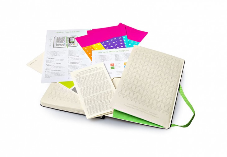
4. Design with strong values
The Moleskine notebook is iconic. It’s instantly recognizable. Something so familiar can be hard to merge with something that’s equally — if not more — recognizable (like Darth Vader or Mickey Mouse). That’s the challenge Moleskine faces with its special collections. So how do you best integrate the two? Find compatible values. “When we proactively look for partnerships, we look for other brands that we share values with,” says Di Liberto. That’s what makes it easier to integrate two brands into one product. “It’s taking the best from one another to create something that’s superior to the simple sum of the two.”
5. Find a unifying idea, then apply it
“We’re always interested in our own twist, our own interpretation,” says Di Liberto. Moleskine’s particular twist? “We’re fascinated by the ‘making of.’ The hand-sketched. The story behind the characters, behind the movies, behind the brand. That’s usually our way and our interpretation.” The result is an effective visual consistency across a variety of products that creates a unified design. It’s a great tool to make something recognizably yours, even if you’re using someone else’s imagery.
6. Consider using metaphors
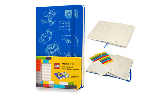
Moleskine’s behind-the-scenes twist is especially evident with its LEGO collection of notebooks, which renders the famous building blocks (and characters) as sketches. Moleskine chose that approach because it felt a special kinship with LEGO. “The building block is a good metaphor for the notebook itself. In LEGO, it’s a true specific piece or a platform you can build on, just like people use the pages or entire notebook to transform it into something different.”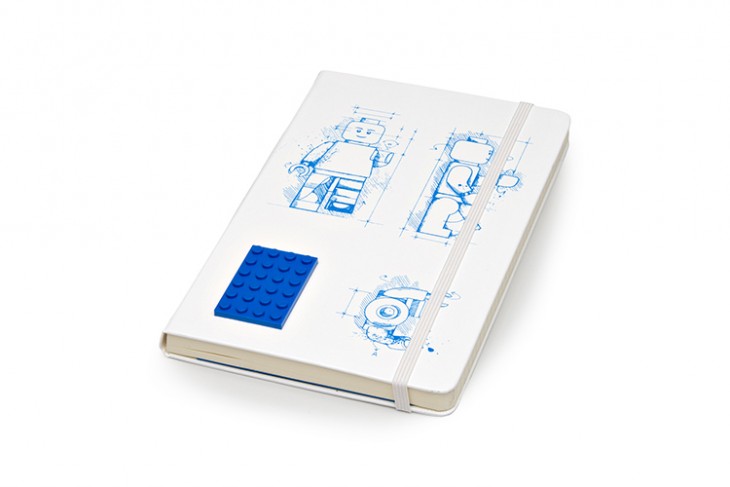
7. Keep experimenting
Even when Moleskine finds the perfect design approach — like it did with LEGO — the designers still explore variations. Though their core concept may not change, it doesn’t mean it keeps repeating itself. “We try and change it year after year by adding color to the covers, and new twists to the same story to make it appealing.” In other words, a great design concept isn’t the end of the road, but another step in the journey.
8. Use every possible space to tell your story
A while ago, Moleskine realized it was missing a design opportunity: the paper bands around the notebooks. It was decided that the bands could be used to keep telling a notebook’s conceptual story, especially for the special collections. “That’s something we internally call the B-Side Project,” says Di Liberto. “All of our objects have a little bit of a B-Side story that continues on the paper band.” In design, the more you can tell your story, the better.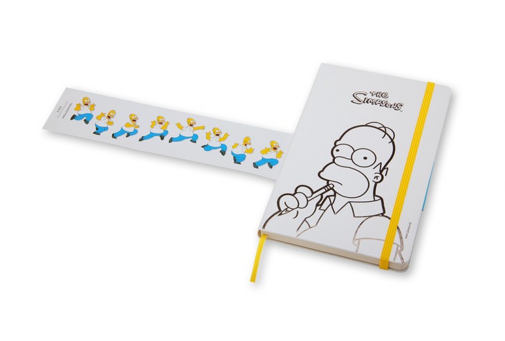
9. With iconic imagery, sometimes less is more
A literal approach — like the direct use of imagery of Darth Vader and Homer Simpson in their respective collections — isn’t the only approach. Take the Minnie Mouse notebook, which doesn’t use an actual image of Minnie. Moleskine used her iconic polka dots instead, effectively evoking without actually showing. “We deliberately stayed away from Minnie as a character,” says Di Liberto. “We felt that the polka dots were very recognizable. A Minnie face would have made the notebooks look like a traditional Disney product. We wanted to get to something that would suggest, more than explicitly show, in order to celebrate the character.”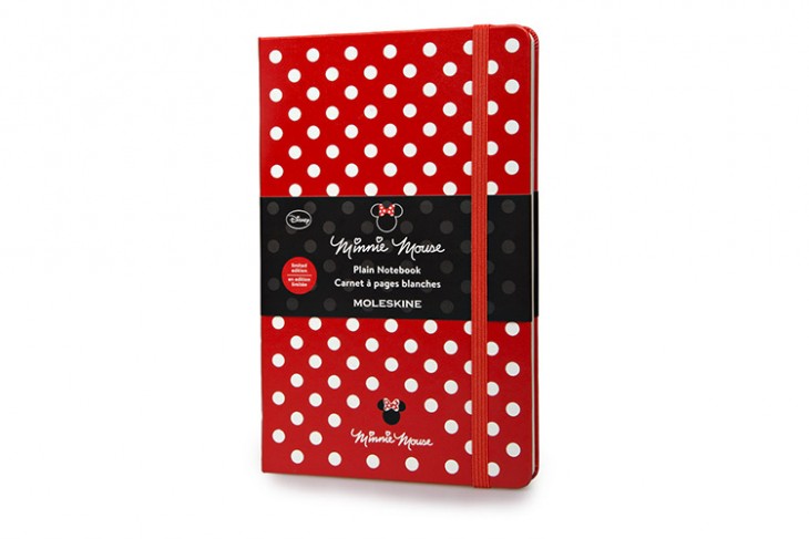
10. Create products to help change the world
At the end of the day, every notebook Moleskine makes is motivated by one mission. “The notebook is a starting point. It’s a blank canvas. It’s supposed to be filled with the content of the user,” says Di Liberto. “We really are about providing contemporary talent with the tools that allow them to express themselves, do their jobs, produce, dream, and imagine a better world. It’s about bringing good things to the world that are good for the people.”
Get the TNW newsletter
Get the most important tech news in your inbox each week.
