Well, it is that time of year where we start to reflect on the past year and look forward to the new year. In 2012 we have seen several new trends appear in web design, one of the most notable being the rise of responsive design.
With just days until we ring in the new year, let’s go out on a limb and make some predictions for 2013, shall we? In this article, I’m going to share with you ten predictions I have about web design trends that could make their way into 2013.
1. More responsive design, please.
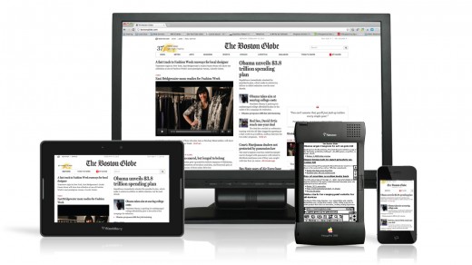
Duh. It should be no surprise that responsive web design is here to stay, so why do I predict it as a trend in 2013? Simple: the methodology behind responsive design is still changing and being established. For instance, the start of 2012 brought the idea of responsive design catering to breakpoints per device. When new devices hit the market such as the iPad mini, this idea was challenged, leaving us with the idea that the breakpoints should be made when the design falls apart instead.
My prediction is more attention will be made earlier in a website design project to ensure that the responsiveness of the site is based on the design and not the vast variety of devices out there. The idea of forgetting about the size of devices will help drive better responsive design, so we will start seeing websites designed with breakpoints of all types.
2. Typography will take center stage.
Web designers and developers are always focusing on the weight of things such as images and Javascript when they start building their websites. As the last couple of years have seen the first breakthroughs in web type in a very long time, this combination will inevitably drive the increased usage of typography as the central element in website design. While there are things such as @font-face to serve fonts from the server, some of which are heavily weighted — the weight of fonts used for website design are often lighter than their image and script counterparts.
Also, typography and layouts that are based on content are inherently easier to make responsive than really complicated layouts with different types of images and JavaScripts. As an added bonus, don’t be surprised to see more inventive ways of typography being displayed on websites either.
3. Buh-bye Flash. Hello just about anything else.
No surprise here as far as a trend that will carry over from 2012. It’s highly evident that Flash is on its last leg. It’s bad for the SEO of a site, many mobile devices don’t support it (I’m looking at you, Apple), and it is a pain to update (it crashes my browser all the time, what about you?). Plus, there are so many other technologies out there that can do what Flash does now (i.e. HTML5/CSS3, JavaScript, etc.).
I predict that we could see the end of Flash in 2013. It’s already on life-support as companies who did support Flash before start to dump it. With so much negative attention surrounding Flash, fewer designers and developers are going to use it which will make those who want the technology less and less able to hire someone to do it.
4. Skeuomorphism will show its age.
There has been some recent discussion about how Apple’s skeuomorphism is out the door, even as much as Apple questioning its own design decisions. Bringing in items from the past to provide cues in new technologies doesn’t help us advance in the way we think. For instance, we don’t need a visual of a bookshelf with books on it to know that we are about to read an ebook. We know they are ebooks, we put them on our devices. We are okay with looking at the cover and knowing what it is.
Since Apple is looking toward other design aesthetics, wait for others to follow suit as well. We already see major companies creating their own design methodologies, such as Microsoft’s Metro, so I predict that companies will look toward the way they think for design inspiration and less toward what the big dogs are doing (i.e. Apple and skeuomorphism).
5. Large images used for large impact visuals.
This goes against my prediction above about typography being used more than images due to the site weight. However, more websites are using large images on their home page to make an impact. These same websites are also keeping bandwidth and data usage in mind by only serving large images to those with large screens.
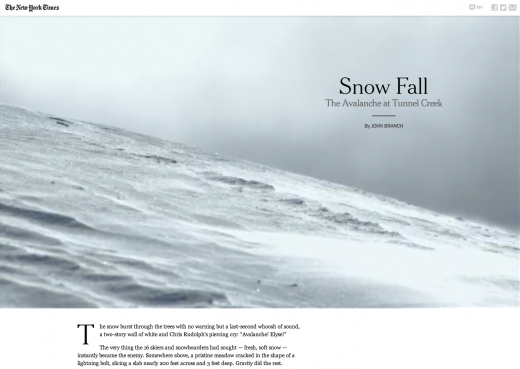
We are seeing more and more websites using large images as visuals on their home pages, and I don’t see this slowing down any time soon. It’s true that these large images make an impact, and companies know this. So, I predict this trend will continue through at least the first half of 2013.
6. Give me (more) white space!
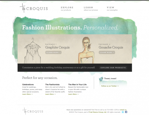
Toward the end of 2012 websites were being designed with more white space. I predict this will continue as we move into 2013. Responsive web design and a clean design aesthetic (with the new Myspace leading the way) are both factors. These white space heavy designs lend an air of gravitas, and who doesn’t want their website to make them seem professional and knowledgeable?
7. More sharing on social networks.
Look for more social media integration into your favorite websites and even new websites. While sharing buttons at the end of articles is very old news, I predict the use of deeper integration with social media networks on websites to explode in 2013.
This includes further expansion of social single sign-on, “pay by tweet” or “pay by status” sharing, exploring other types of social media based on website content (such as Instagram for news sites or Pinterest for artists and designers), and even more advertising on social networks.
8. Calmer color schemes to reappear.
Color trends come and go faster than anything, but look for the use of more subdued or calmer color schemes as new websites make their way to the Web. This is already evident in some websites launched in the last few months, such as PayPal’s home page redesign. You can also see this in Pantone’s color choice for 2013.
It’s really hard to predict what colors are going to be the most common at any given time. However, desaturated and light colors will more than likely dominate the color palettes of new websites and mobile apps. Also, it is safe to add that the use of whites, grays, and blacks will be used more as the primary colors in a design than actual hues.
9. Mobile apps will start to replace mobile browsing.
Even though there is a push to make websites work on all devices, including mobile ones, certain websites seem to work better when they are used through their own app. Twitter, Facebook, Pinterest, etc are all examples of such websites where their apps are much better than their mobile browsing experience.
The movement from mobile browsing on certain sites to apps that will serve the same content will become accelerated in 2013 as more and more people are using their phone for everything. Give Facebook’s mobile site a run and then compare it to the native iOS app — there’s just no comparison.
10. King content will keep its crown.
Content will keep its rightful throne as we move into designing for the web in 2013. Without content, there is no website. What will keep content on top is the increasing need to be able to access any content anywhere you are. We can give responsive web design a big pat on the back for keeping content where it belongs: priority #1.
Along with content staying on top, more focus will be made on creating high-quality content. Writing, designing, publishing and sharing will help content keep its crown, while responsive design will be responsible for the delivery. It’s all in the family when you think about responsive web design, content, and social media, a family which will dominate in 2013.
Image Credits: Dan Kitwood/Getty Images, Antoine Lefeuvre/Flickr, Justin Sullivan/Getty Images, AFP/Getty Images
Get the TNW newsletter
Get the most important tech news in your inbox each week.


