Even in our Web 2.0 world a good, solid resume is still very important. While the “your resume must be one page” days are thankfully behind us, there are still some best practices that can help your resume stand out for the right reasons. Let’s start with the simplest thing: font choice.
The best advice is to stick with the basics, nothing ornate or decorative, and for all that is good and webby, don’t ever use Comic Sans in your resume. Today a lot of resumes are scanned into OCR systems (even if you send it electronically) and while Times New Roman is a stellar font, it actually doesn’t scan well. Better choice: Arial, Verdana or Helvetica. These sans-serif fonts don’t just scan well, but they are also very easy to read on screen. Since there is a better chance that your resume will be emailed around and might not be printed out, you need to make sure that your resume reads as well on screen as it does on paper.
Reading leads straight to the next topic: design and layout.
Again (and this will become a mantra here): simplicity is key. Colors, patterns, unique layouts? Those look great if you can pull them off, the problem is that most of us don’t have the design skills to pull off something other than a basic resume layout. I know, Word and Pages and everyone else have resume templates, but often I think those templates are designed to show off what the app can do, not help you show off what you can do (which is the point). If you have some HTML skills, you might like the Sample Resume Template as pretty stylish option. My advice? Ask a few friends (the employed ones) if you can look at their resumes. What do they layouts look like? What information is included?
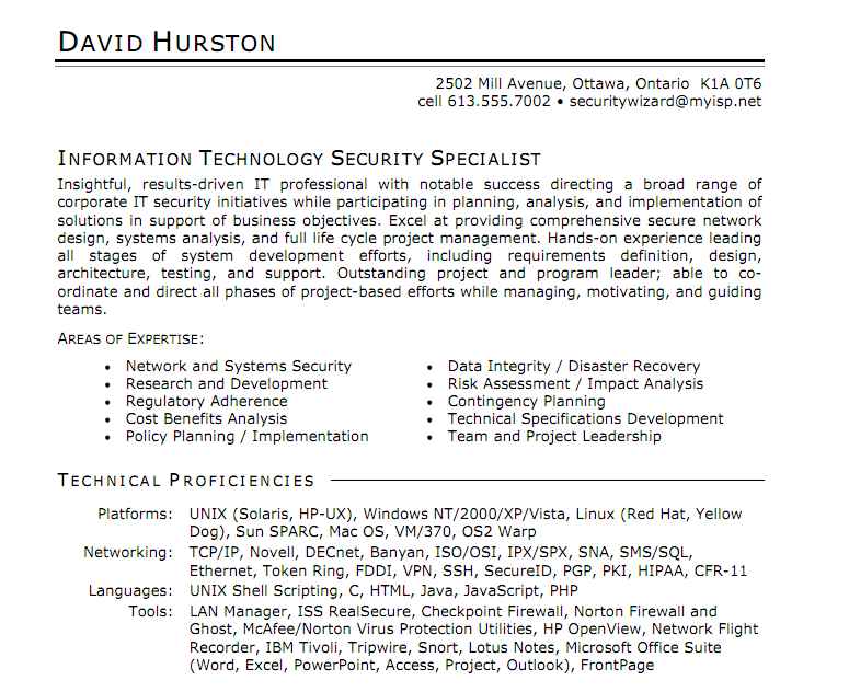
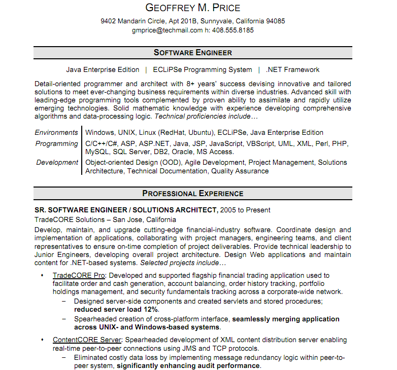
Here are two examples from Monster.com’s sample resume set (Monster has localized versions for each country):
You can download these samples as PDF files from Monster. Which isn’t the most helpful thing in the world, since you can’t easily pull those into Word (or Pages or whatever you’re writing your resume in). However, you can get a good feeling for what are the “accepted” or “popular” resume formats in your industry (at the moment). The good thing is that once you get your resume layout done—it’s done.
Tip: Get your content in first then worry about the design and layout. It’s a lot easier to work with a whole document than to realize that you got your latest position perfect only to have the next one not fit the mold you set.
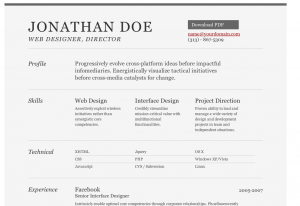 When you’re thinking about how to layout your resume, also think about who will be reading it. If you’re applying for a technical job, the hiring manager (or the HR person vetting the resumes) will want to see what your tech skills are right up front. Don’t bury those important parts of your qualifications in bullet points. Which brings me to another point: Have resumes tuned towards different audiences.
I have a master resume and then ones that specifically tailored to the job I am applying for. Is it a teaching job? Then I highlight the courses I’ve taught and lectures I’ve given. Writing? Clearly all my web-focused writing as well as books I’ve written. If I were going for a programming job…well that would be silly because I can’t write PHP code to get out of a paper bag. You get the point though. The Simple Resume Template is a good example of a tech-focused resume. Fill that out according to the template and I’ll know what chops you have (or say you have).
Now let’s talk length.
If I go back to my first tech job in the mid ’90s, my resume is about six pages. Yeah, a little long. So I have two versions of my resume a short and a long version. I don’t take out my academic information, but I trim down my positions to the last five or so years and reduce the number of points below each position to a select few. The goal is a 2-3 page resume that is easily read and referred to by anyone reviewing your application.
Speaking of reading, let’s talk file format.
As much as many of us loathe MS Word, it’s still the common denominator file format for resumes. There is a catch, though, MS Word on the Mac and MS Word on the PC might render your resume differently. Remember that fonts discussion? Yeah, as much as Arial isn’t be best font typographically, it is pretty universal. So step one, make sure your resume looks good on Macs and PCs. What about other formats? Always. I have a PDF, RTF, TXT, and even HTML version of my resume available (or at least close at hand) so I can send them off when asked. Again, double checking your PDF and RTF versions on other machines and OSes is a very good idea. Remember this is your resume we’re talking about here.
Now that you have the perfect resume and are ready to start your plans for world domination, one last thing—don’t forget about your resume! Really, don’t let it sit as it is now, look at it again in another month and see if it needs updating. Maybe you find that you have a better way to say something now than you did before. Maybe you signed that book deal. Set a calendar reminder to check your resume and make sure it’s up to date and professional.
Summary:
- Use simple, common fonts: Arial, Verdana, Times. Arial and Verdana will scan better
- Don’t go formatting crazy: bold, italics, underline
- Simple, to the point. Use bullet points to focus attention on important information
- Make sure your alignments are the same throughout the document
- Have a Word, PDF, RTF, and text version. Check them on Macs, PCs, and other computers
- Check. Your. Spelling.
- Check. Your. Contact. Info.
- Check the two above again
- Ask friends, colleagues, even HR professionals for resume examples for styles
- Have a concise version and long version
- Have “tuned” resumes for different types of jobs you might apply for
- Keep it updated. Check once a month to make sure everything is still correct. Set a reminder in your calendar! This is what we have computers for!
- One last spelling and information check
Follow these tips and that should help put your resume in the best light possible.
Okay, that and what you’ve done, but I can’t help you with that.
Final tip, when you go for your interview have several copies of your resume printed and with you. It couldn’t hurt to have it on a flash drive too, but that might be over kill.
Get the TNW newsletter
Get the most important tech news in your inbox each week.
