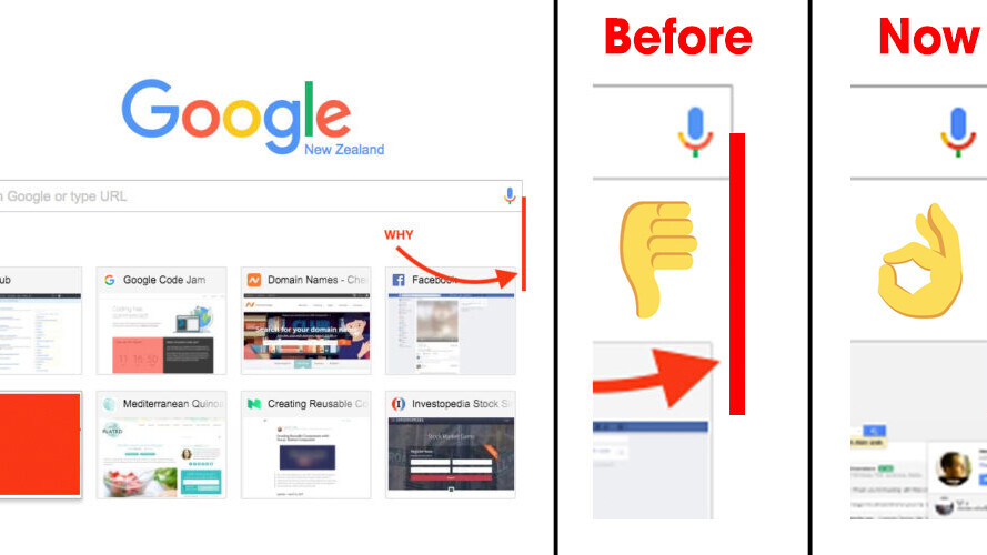
Google has rolled out an update for Chrome that corrects the annoying asymmetry in the browser’s ‘new page’ tab – so you no longer have to flinch in agony every time you lay your eyeballs on it.
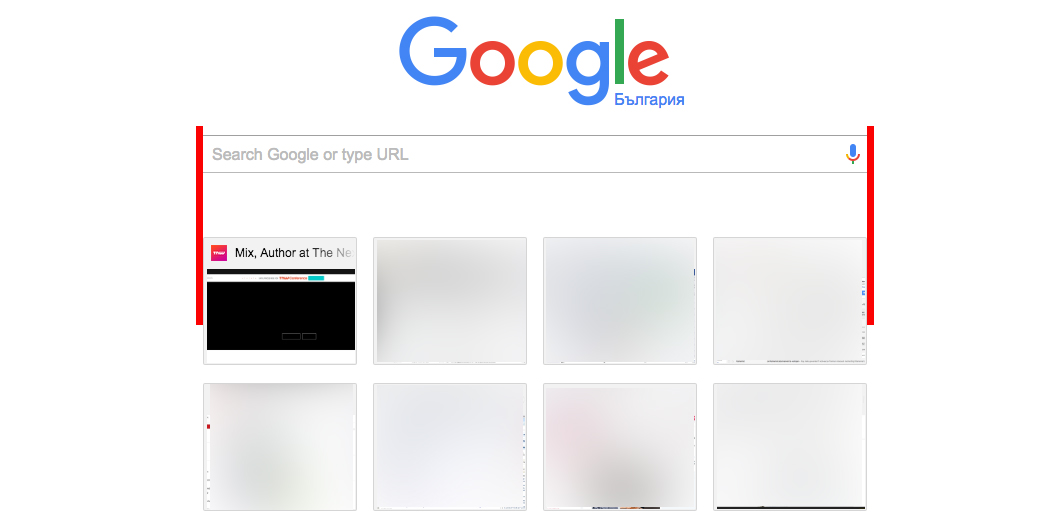
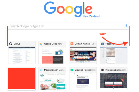
Last week, we wrote about an inconsistency in Chrome after attentive users took to Reddit to point out that the search box in the ‘new page’ tab was not properly aligned with the thumbnails for your most visited websites.
Fortunately, the Big G was quick to sort out the flaw.
Here’s how the ‘new page’ tab looks now:
As we explained in our previous post, the misalignment had to do with improper use of CSS and the box-sizing property, to be exact.
We then demonstrated that the asymmetry can be easily corrected by simply disabling the ‘box-sizing: border-box’ property – and it seems the Chrome team has followed our lead.
Google product manager Patrick Nepper contacted TNW to inform us that the fix is already live, but you might have to clean your cache to see the change.
“Since it may take some time for the change to be picked up automatically, users can clear their cache and restart Chrome to get this out of sight immediately,” Nepper explained.
You can find instructions on how to do this on the Chrome support page here.
Get the TNW newsletter
Get the most important tech news in your inbox each week.


