Witti Design’s line of smart home accessories contains several products which can only be described as delightfully odd. As a big fan of interesting design decisions in technology products, I simply had to review a couple of the company’s strangest offerings: the Notti and Dotti.
First, the Notti
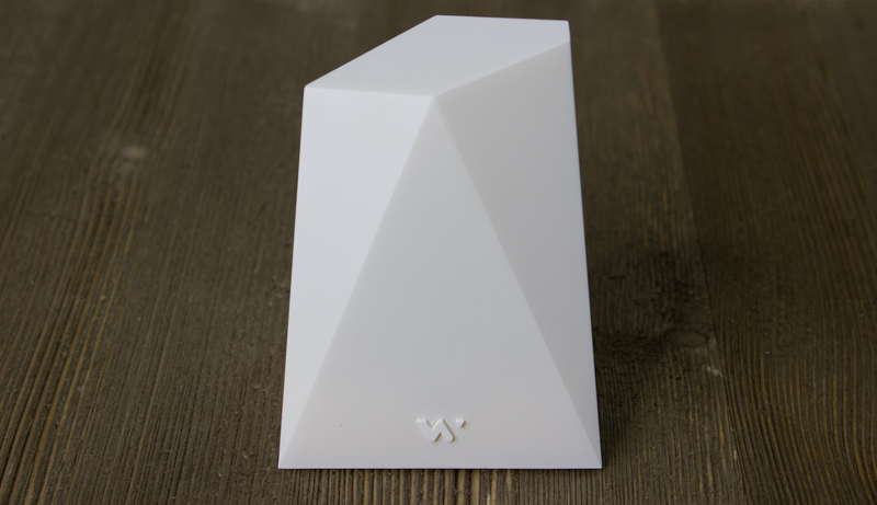
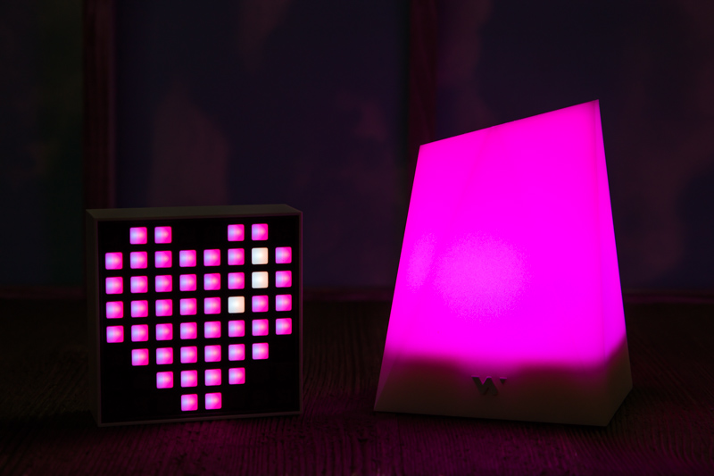
Pictured in the above image is the Notti, a smart light with a unique aesthetic that you can take from me when you pry it from my cold dead hands. Despite the fact that it doesn’t connect to Alexa or Google Assistant, can’t be voice-controlled, and still manages to have the audacity to call itself smart, I still fell in love with my Notti review unit.
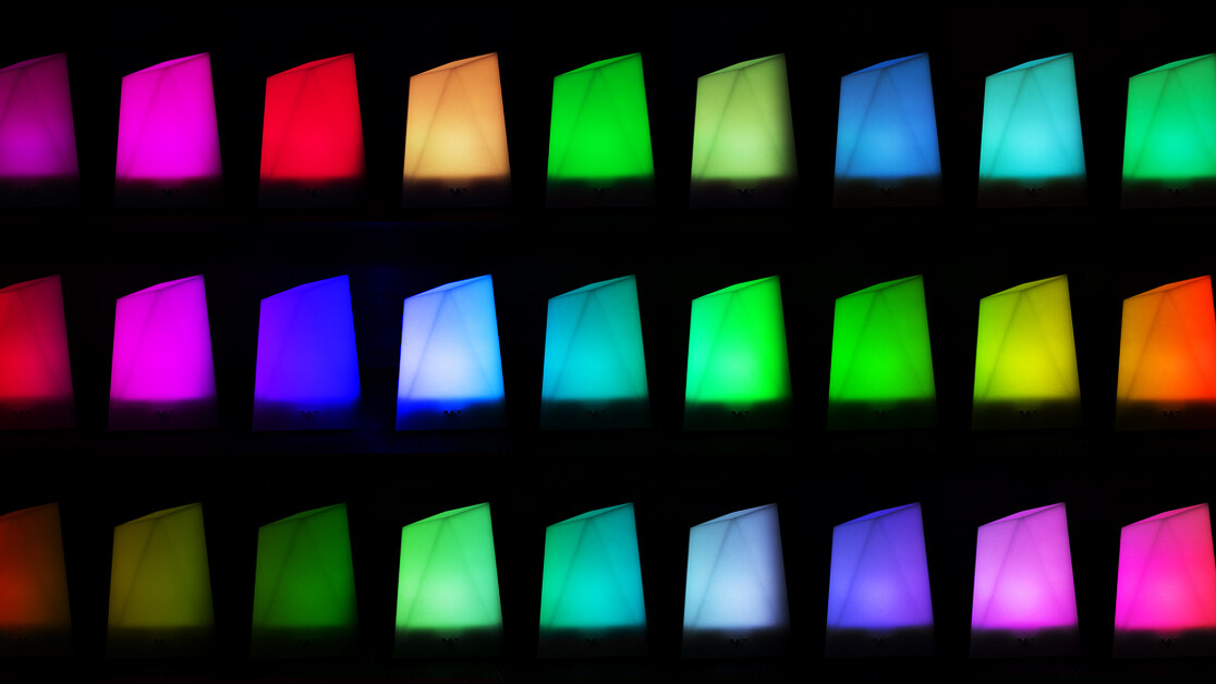
Let me explain why: It’s ridiculously easy to change colors with or without the app, the colors are beautiful and the design is mesmerizing. The Notti looks like someone went to Superman’s Fortress of Solitude and used some sort of kryptonite axe to knock a chunk loose. And it’s perfect for date night.
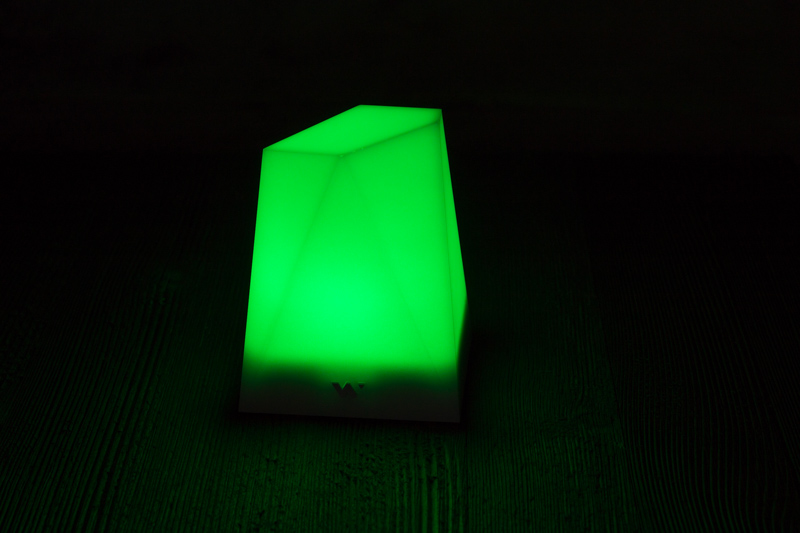
It has one button, just one! You long-press it and the light turns on. Double-press it and it begins cycling through colors, once it lands on the one you want, you press the button. And that’s it. The app’s even easier to use, and adds further functionality like dimming, patterns, and the “smart” features.
What’s so smart about it?
You can connect the Notti via Bluetooth to your phone and then set it to react to your notifications, music, and alarms. This sounds like a big selling point, and I’m sure a bunch of people will use and enjoy it, but to me it was a conflation of two things that didn’t need to go together.
Notti looks really good and, as a mood light, it’s absolutely excellent. I didn’t need it flashing my notifications at me – mostly because I never stop getting notifications – so I quickly stopped using that feature after confirming it works as advertised.
The only problem I had with the Notti was its lack of voice control. But, for the price, if you don’t need to shout at your smart light, it’s a lot cheaper than a Hue (and doesn’t require a hub). Plus it’s got a battery life of about six to eight hours at max brightness, which is really good.
Now, the Dotti
The Dotti, on the other hand, is excellent as a notification light, but not so great at ambience. Where the Notti works best for date night (get it? Notti is naughty) the Dotti is more of an artsy piece of tech that looks awesome on your desk.
It’s smaller than I thought it would be, at 6.6 cm by 6.6 cm it’s almost small enough to fit in your mouth. But that actually makes it pretty useful as a notification indicator. Like the Notti, it has an excellent battery-life – we got about 4 hours out of it.
I didn’t enjoy the Dotti quite as much as the Notti, but that’s because it’s a “smart” light (in the exact same way as the above Notti) for people who like to create pixel art, and I don’t.
Don’t let my lack of creativity put you off of it though, it’s got some nifty features. You can link up to four Dottis together and create custom animations across each one. There’s a lot to like about the Dotti, but I mostly enjoyed having its pleasant Twitter and Slack notifications in lieu of my phone’s.
I recommend both products, but only with the caveat that these are slightly more appealing as decorative products than necessary gadgets.
The Dotti can be had for $39.99 here on Amazon, and the Notti is only $34.99 here, also on Amazon.
Sometimes we publish paid reviews: we always say so when we do. This isn’t one of them.
Get the TNW newsletter
Get the most important tech news in your inbox each week.


