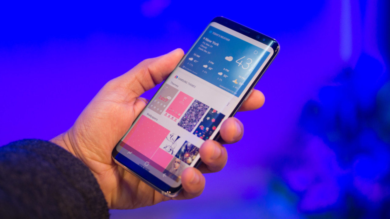
You can stop reading rumors now: the Samsung Galaxy S8 and S8+ are finally official, and will go on sale on April 21.
They make a stunning first impression, but not because they’re in any way surprising. Samsung is terrible at keeping secrets, and nearly all the major rumors ended up being true. Just look at the specs and features:
- 5.8/6.2-inch curved Super AMOLED screens (if you ignore the rounded corners)
- 18.5:9 aspect ratio (2960×1440)
- HDR support
- Bixby voice assistant
- Snapdragon 835 (or equivalent Exynos)
- 4 GB RAM, 64 GB Storage
- 12 MP F1.7 OIS Rear Camera
- 8 MP F1.7 AF Front facing camera
- Iris scanner
- Android 7.0
- Dual Bluetooth audio
- USB-C port with fast charging
- 3,000/3,500 mAh battery
- IP68 weather resistance
- ‘DeX’ desktop dock
- Headphone jack
So yeah, just about the biggest ‘reveal’ is the fact that the front-facing camera now comes with autofocus, which is actually pretty rare.
Yay?
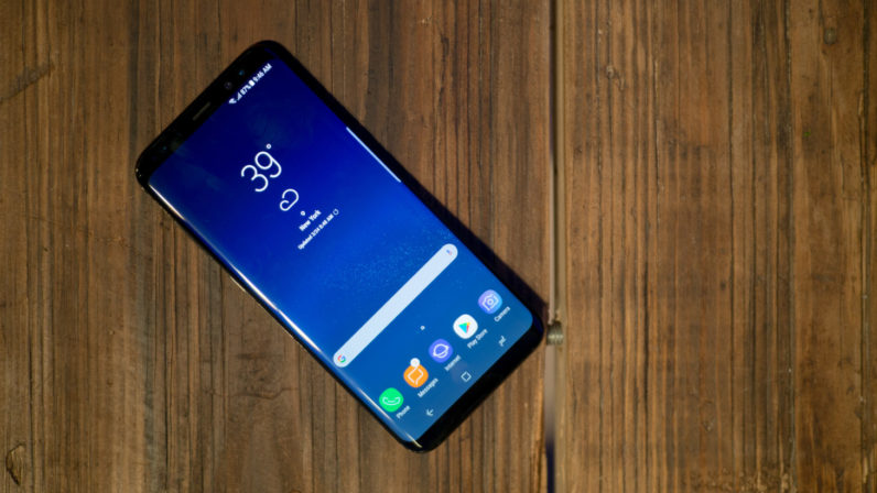
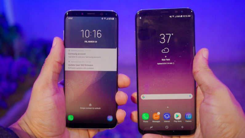
But whatever Samsung lacks in the element of surprise, it makes up with sheer style. The Galaxy S8 is gorgeous (bear in mind Samsung’s early press event had pretty much the worst lighting ever).
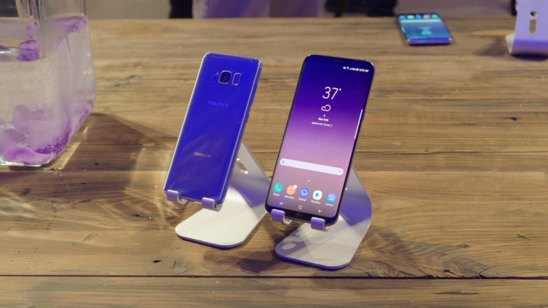
I can’t help but feel a bit bad for LG. The new G6 is its best-designed phone yet – beating the Samsung to the punch on the whole tiny extra-tiny bezels thing – but the S8 is on another level.
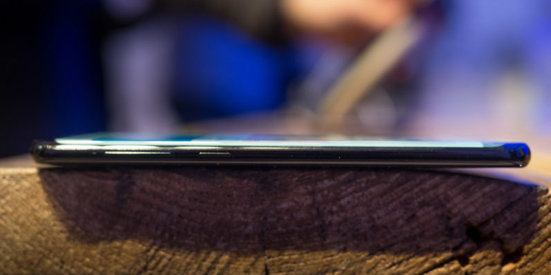
The bezels are even smaller. The phone is slightly slimmer and thinner. The curved edges make it more comfortable to hold. And speaking of curves, the screen corners are perfectly smooth, unlike the slightly jagged edges on the G6.
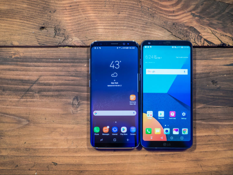
It’s just a more refined device, though it’s worth noting LG touted the G6 as being built to survive multiple drops. Samsung makes no such promises. I also wish Samsung had done more with the backside, which has hardly changed since the S6 (though there’s a slight texture under the glass this time around).
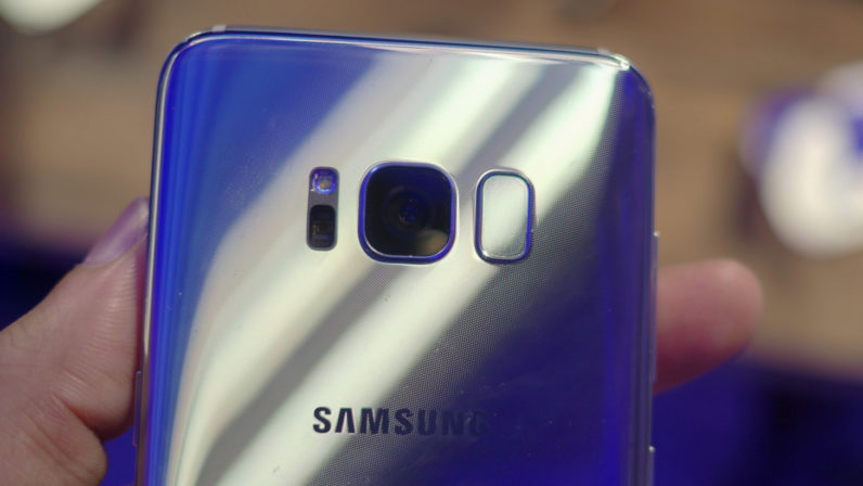
Even so, Galaxy S8 is the best-looking phone I’ve ever held, with the possible exception of the Xiaomi Mi Mix.
After using the G6 and now the S8, I don’t know how I could ever go back to a device with ‘normal’ bezels. Some other reporter’s iPhone 7 at the event looked laughably outdated next to the S8.
The longer aspect ratio means you’re getting more real estate for reading text or using apps side-by-side, while keeping the phone slim enough for a comfortable grip. In width and thickness, the S8 is pretty much identical to the S7, which only had a 5.1-inch screen. In fact, the S8 actually feels a little bit smaller thanks to the curved sides.
But it’s also 6.5 mm taller, making upper UI elements harder to reach with one hand. I actually wish Samsung had made the S8 even smaller than the S7 – somewhere around the size of an iPhone 7 – and still packed in something like a 5.4-inch screen. There are people who actually like small phones, you know?
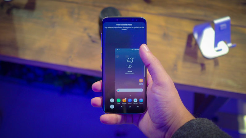
As for the S8+, I preferred the smaller model for one-handed usability, but I suspect many might choose the raw size of the S8+’s display. Whichever device you pick, Samsung thankfully has an optional one-handed UI mode which shrinks the screen to a more comfortable size – a feature I was sad to see omitted on the G6.
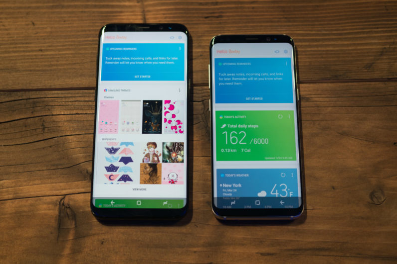
I should also mention the display tech has improved too. Aside from being brighter for better HDR support, I also noticed less of the off-angle color shifting OLED screens are generally prone to.
Once you pry your eyes away from the display, you’ll find a new button dedicated to Samsung’s new voice assistant Bixby.
I didn’t get to play around much with it, but Samsung says it’s ultimately wants Bixby to perform tasks you could normally only do with touch, not just set alarms and reminders. Right now, it mostly seems useful for setting alarms and reminders, thought it does have some tricks up its sleeve.
For example, it understands context well enough so that you could ask it to “send the last photo I took to my girlfriend.” If Bixby doesn’t yet know who your girlfriend is, it will ask you to confirm. It also extends beyond voice with a visual search element; Samsung demoed finding pricing for a wine bottle by simply pointing the phone’s camera at it.
But Bixby’s main advantage is really that dedicated button. The delay cause by waiting for a wake word to be recognized or long pressing the home button are small but significant deterrents. Bixby’s physical button works instantly, and, crucially, will be a physical reminder the assistant is there to help.
That said, Samsung hasn’t removed the Google Assistant, so you you can still just long-press the virtual home button if you’d prefer the efforts from Mountain View.
The last headline feature is ‘DeX,’ a desktop dock and interface similar in concept to Microsoft’s Continuum for Windows 10 phones. The dock has USB and HDMI ports for connecting peripherals and a display; simply drop in your S8, and a desktop version of Android will take over your monitor.
The overall experience is actually highly reminiscent of Android apps on Chrome OS, which unfortunately includes issues like not being able to resize certain apps that haven’t been optimized for the OS. Nonetheless, Samsung says it’s partnering with big names like Microsoft and Adobe to ensure a smooth desktop experience, and this should be less of an issue as more apps implement Android Nougat’s free-form window features.
I’m curious to see where Samsung goes with DeX, but it’s yet to convince me it’ll be all that useful. Right now, the dock requires you to connect a monitor, keyboard and mouse; if you’re going to be using all three of those things, chances are you already have a desktop nearby. I’m pretty sure a laptop dock would’ve been a more practical solution.
That sort of cautious excitement represents my general take on the S8 so far. It’s a device that makes lofty promises, but I’m not sure how well it can keep them. To list some of my reservations:
- The big screens are wonderful, but 3,000 mAh sounds positively measly for a 5.8 inch screen.
- The design is gorgeous, but the G6’s military-standard testing gives me a lot more confidence it’ll survive a couple of drops. Durability is important.
- Samsung makes great cameras, but a dual-camera setup provides more creative opportunities, whether for depth of field, higher quality zoom, or different focal lengths. Single cameras are starting to feel stale.
- The edge-to edge screen could lead to accidental button presses.
- Bixby’s got some clever applications, but I don’t like the idea of juggling two separate voice assistants.
What I can be sure of – barring any fiasco on the scale of the Note 7 – is that the Galaxy S8 will sell like hotcakes. It pushes the envelope for Android hardware, looks better than almost anything out there, and makes an excellent first impression. You can bet that now that Samsung’s killing the bezel, all sorts of phones will follow within the next year – even Apple’s probably doing it.
Let’s just hope all the moving parts come together once the device actually hits stores come April. Stay tuned for our full review when we have a final unit in our hands. In the meanwhile, preorders start tomorrow March 30 at 12:01 AM EDT.
Get the TNW newsletter
Get the most important tech news in your inbox each week.


