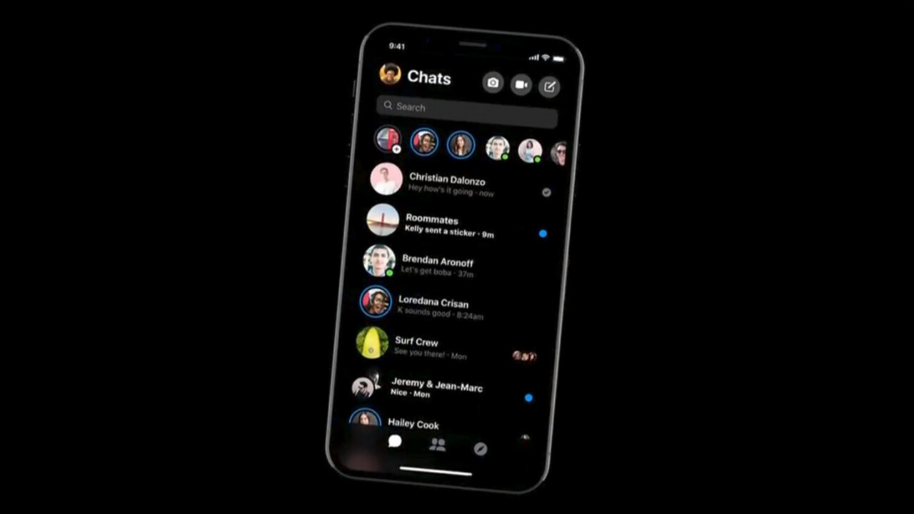
Facebook Messenger is the second most popular messaging app in the world , behind another Facebook property, WhatsApp. But while WhatsApp has remained relatively clean and minimal, Messenger’s features can make the app overwhelming. So much so, that some people have turned to the pared-down Messenger Lite instead.
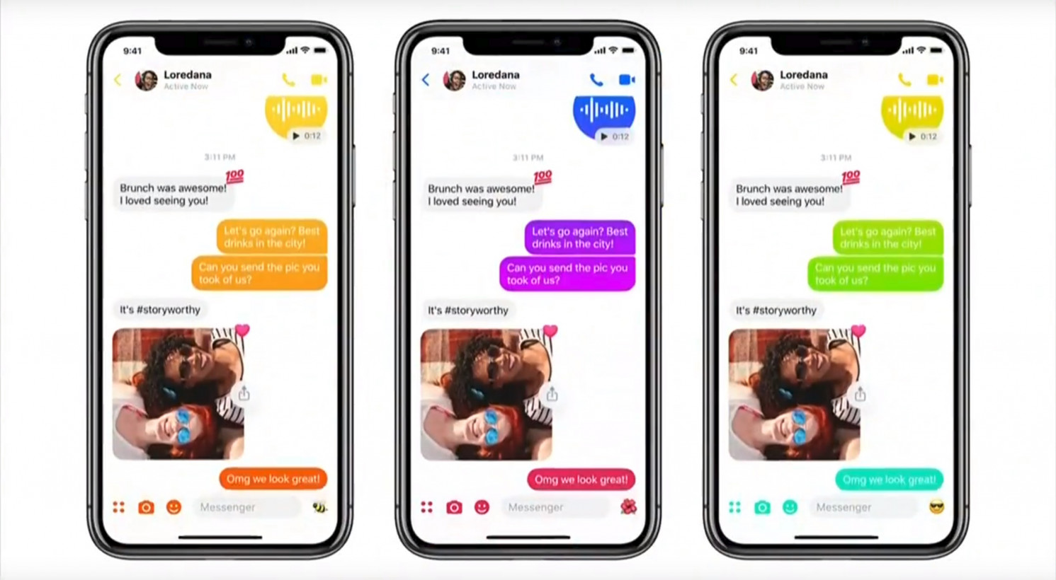
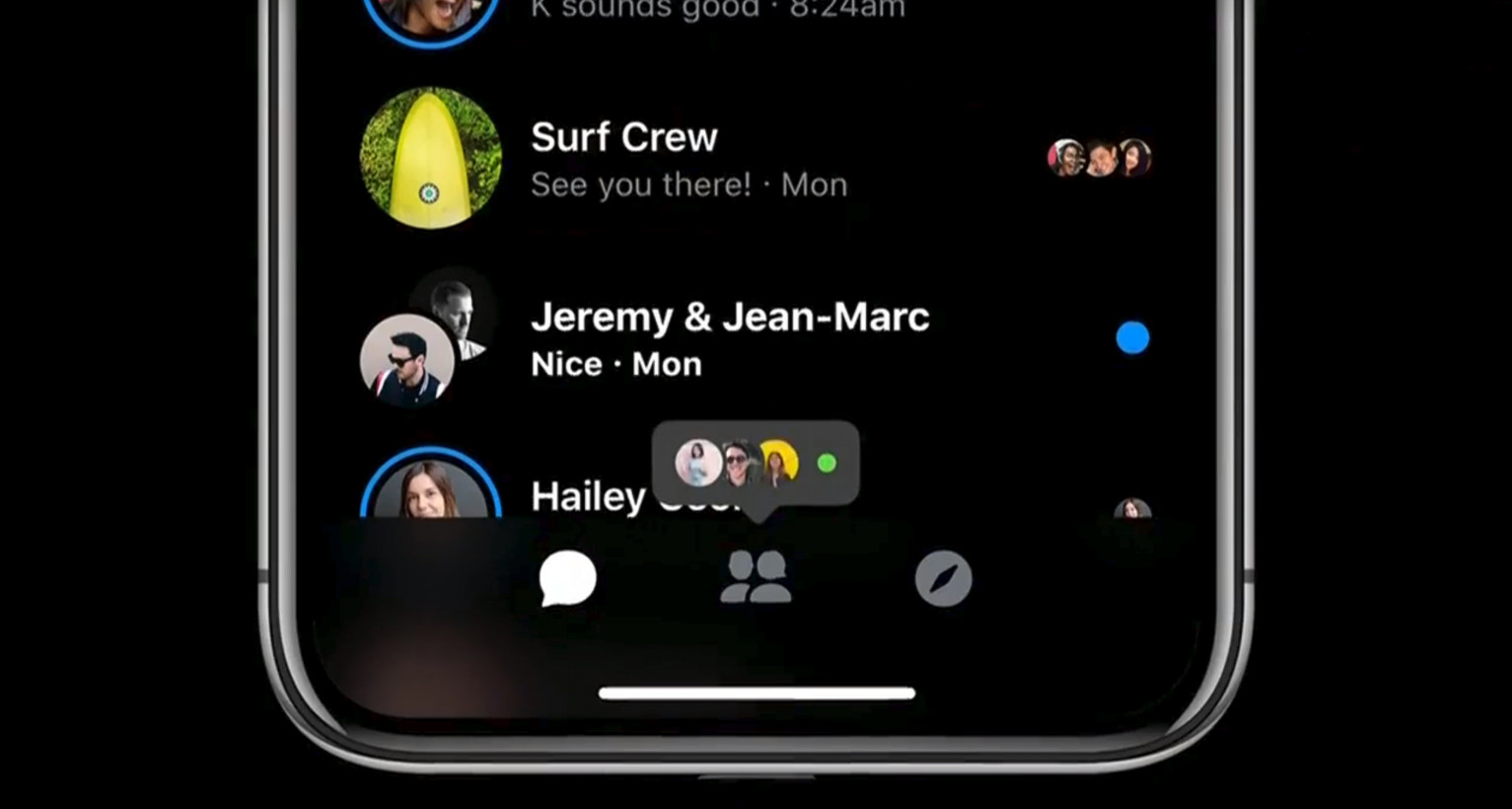
Now Facebook is trying to remedy Messenger’s bloat with a new design, which it teased today at its F8 conference in California. Based on the teaser trailer, the new app reduces the plethora of buttons and tabs to just three sections, while there are now camera and call buttons at the top of your chat list. Pardon the low quality images – Facebook’s video feed wasn’t exactly 4K.
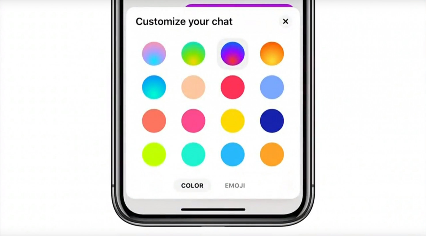
Within conversation, Facebook cut down the number of buttons from six to four. As far as we can know Facebook isn’t actually removing any features, so any omissions were likely combined with other buttons. Also note the new gradient chat bubbles, which makes Messenger a bit more like Skype. The company said the new app would be faster too.
Oh yeah, it’s also getting a dark mode, in case you didn’t notice in the header image. Hoorah!
Facebook didn’t specify exactly when it would arrive, but it did say “very, very soon.” As someone who uses Messenger everyday but hates the bloat, that can’t come soon enough. If you want to see the presentation yourself, you can watch Facebook’s F8 keynote and skip to about 1 hour and 31 minutes in.
Get the TNW newsletter
Get the most important tech news in your inbox each week.


