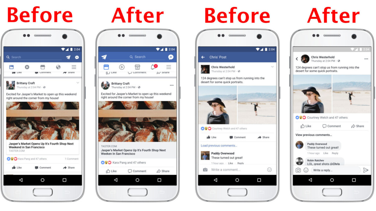
Facebook’s mobile apps are getting a new look, though blink and you might miss some of the changes.
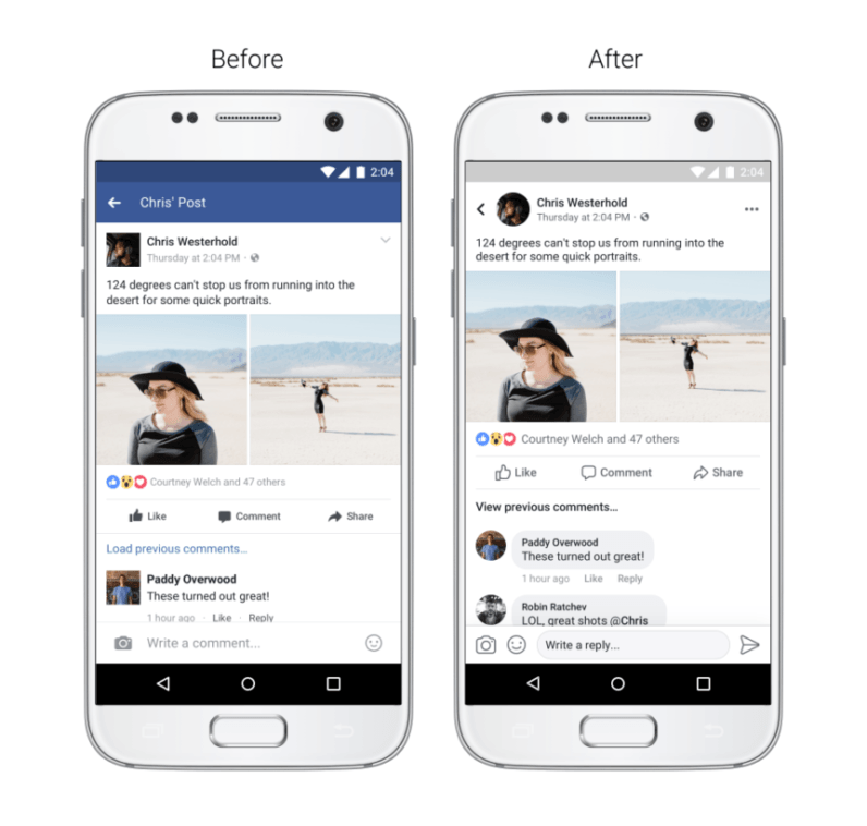
The most obvious update is coming to comments, which now look a lot more like a conversation in your average messaging app rather than than a series of posts. This falls in line with Facebook’s recent desktop tests, which display comment threads a bit more like group chats.
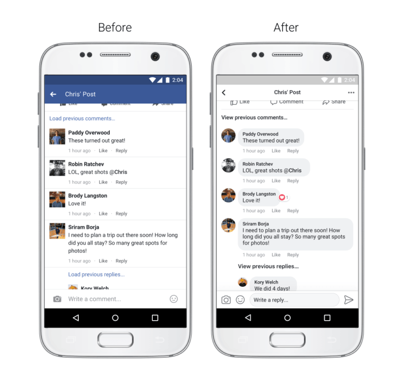
Facebook might also be trying to subtly make conversations with strangers a bit more friendly. The text bubble’s resemblance to a messaging app could make it feel more like you’re actually having a personal conversation with participants, rather than replying to a random internet thread.
Less obvious are the changes to the News Feed. Facebook is using a brighter shade of blue and has increased color contrast overall to make text more readable. The link previews are slightly larger – they now take up the entire width of your screen – and the Like, Comment, and Share buttons are now larger.
There are also other small tweaks like a more prominent back button and the ability to see where a link will take you before clicking on it. The whole shebang looks a fair bit more like Instagram now.
Facebook will be rolling out the new design “over the coming weeks,” so you may not see it just yet. The new look certainly isn’t the most dramatic overhaul Facebook’s ever seen, but seems to mostly be for the better.
That said, if there’s one thing we know about Facebook, it’s that people like to rant about design changes – especially if some of these changes ever come to the desktop. What do you think about the new look?
Get the TNW newsletter
Get the most important tech news in your inbox each week.

