Samuel Hulick is a long time UX consultant with an intense focus on user onboarding. This post originally appeared on the Help Scout blog.
Unless your product is eyebrow-raisingly basic, there’s a very, very good chance that a new user won’t get to experience all the value you have to offer in their very first sitting.
And since user onboarding isn’t merely the process of introducing your new signups to your product’s features, but instead the process of driving people to success, getting there will take many follow-up trips.
For that, you need to think of ways to get people logging back in—something your interface can’t do on its own because, well . . . the user would already be there!
Instead, you need a system for continually going out to where your users are and luring them back to the good stuff. And for that, there’s no place better to find them than their inbox.
Enter: lifecycle emails.
Lifecycle emails 101
Not sure what the term “lifecycle email” means? Don’t worry, I’ve got your back.
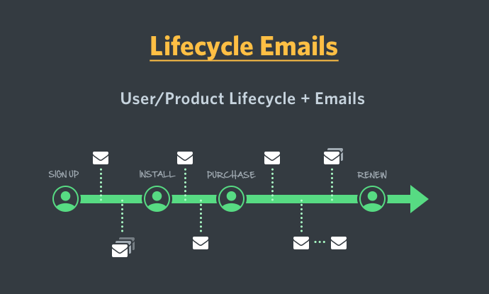
Just like a frog starts out as one of those weird gelatinous eggs and slowly grows to a tadpole, then a froglet, then a full-on adult frog, the relationships people have with your company also develop over time.
When you first pop up on their radar, people may be unsure if they even need what you provide. Over time, though, that relationship can be cultivated and trust can be built. As alluded to above, emails are the best way to keep in touch across multiple points in time.
A word of warning
That said, many companies make the mistake of defining their lifecycle email efforts in terms of the emails themselves, rather than the relationship those emails exist to develop.
While lifecycle campaigns exist in part to keep your product in people’s thoughts, you would be doing your users and yourself a big disservice if you approached it as an opportunity to repeatedly blast your brand name at them.
You want to craft your strategy around key moments in the lifecycle and approach each email from a perspective of being as helpful as possible within that moment, not as a mosquito in their ear.
On the highway to user/product love, lifecycle emails are road signs providing timely guidance, not annoying billboards.
Matching emails to activities
Since the purpose is to bring people back into your product to continue their march toward victory, I’m a huge proponent of identifying what your onboarding flow’s most crucial steps are and then creating a series of emails that speak directly to those activities (as opposed to first trying to think up interesting emails and then sprinkling links inside them afterward).
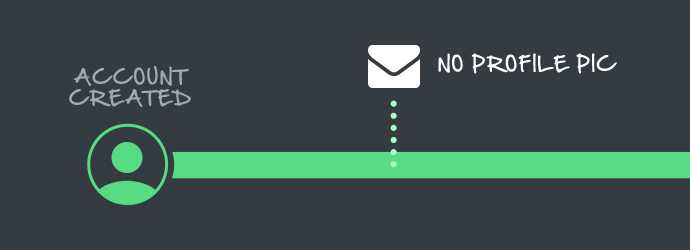
For example, if your product is a dating website and you know that if someone doesn’t upload their photo they stand a very poor chance of generating any romantic inquiries, then crafting an email (or, even better, a series of emails—more on that later!) around getting people to do that one particular step is a very, very good idea.
Of course, aligning emails with actions is only good if the recipients actually take those actions, so let’s make sure these emails truly motivate.
What goes unopened goes unread
Startups tend to criminally underestimate the power of a compelling subject line. Just like many of the best marketers spend half their time on a blog post just writing its headline, a significant amount of time should go into a subject line that drives clicks. If your subject line isn’t piquing your users’ curiosity, it doesn’t really matter what’s inside the email—the recipient will never get that far.
Writing compelling subject lines is an art unto itself, but the best cheat code I’ve found for ones that lead to high open rates is to keep things as close as possible to the kind of subject line you’d send a friend.
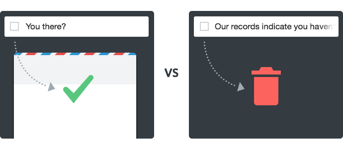
This typically means keeping them brief, personable, and almost unprofessionally informal. For example, a subject line like “You there?” will almost always beat out “Our records indicate you haven’t logged in for 20 days.”
That said, getting email opens isn’t very valuable on its own if the content awaiting them doesn’t seal the deal in getting users back to your site.
Catching more flies with honey
Getting people to do things on the internet is hard enough, but getting them to do things that they don’t actually want to do is nearly impossible.
Before writing the email, make sure you’re not only clear on the action it will be triggering, but the benefit the user will get by taking that action. Too often, startups write from a self-centered perspective that commands the user, rather than entices them. Since you have absolutely zero leverage for negotiation inside a person’s inbox, it makes a lot more sense to seduce than it does to instruct.
Let’s return to the dating website example above, where you want your users to upload a photo. Rather than sending an email with a flimsy command like, “You haven’t uploaded a photo yet—log back in and add one!”, appeal to the value someone would receive out of doing so.
“Did you know that profiles with photos get 6 times as many date requests? It’s true! Upload yours now!” would likely convert much, much better.
Don’t get in your own way
Another very common mistake is to crowd the body of the email with a bunch of nonessential chatter or extraneous links.
Emails designed to trigger a specific action should have sniper levels of
focus and nothing else.
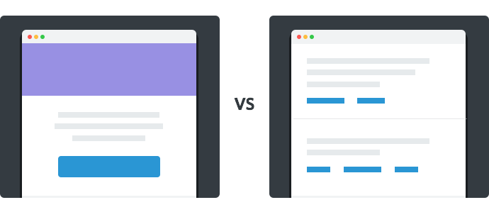
In fact, it’s very, very common to see action-oriented emails without a very clear purpose at all, often having four or more links, each kicking off a different activity. These come across as cluttered and distracted, and giving each of them equal prominence reduces the likelihood that any of them actually gets clicked.
Go with one rationale and one call to action—preferably as a huge, super-clickable button. Once your appeal has been made, it should be completely obvious where to click to take that action, and surrounding distractions should be left on the cutting room floor.
Oh, and while you’re teeing up your users with a big, fat button, make sure the words on it are pulling their weight, as well! Bland, directionless copy like “Sign In” or “Get Started” provide no information about what’s to follow or motivation around why they should click it to begin with.
In the dating website example above, “Start Getting More Date Requests” or “Complete Your Profile Now!” would both be much stronger options.
Don’t be a stranger, either!
Don’t forget that any given action can (and probably should!) have more than one lifecycle email associated with it. If your software helps people manage projects and they haven’t created their first project even after an email went out reminding them to do so, there is VERY little harm in sending them another one. Even if they were turned off by it (unlikely), it’s not like they were getting much value out of the product with zero projects, anyway.
Often, it’s simply a question of timing in your user’s life—everyone gets busy, and completing the setup of a product they signed up for a few days ago isn’t always a priority. As long as you’re sending friendly, considerate emails that speak to their interests, there’s a vanishingly small chance that you will be resented for being helpfully persistent.
Onboarding is no time to be shy. Keep things moving forward—it’s vastly preferable to radio silence followed by a “your trial’s about to expire!” email the night before they need to make the decision to pay or go.
Stack the deck in favor of a happy onboarding outcome for both parties by helpfully driving them to take care of their side of things!
Read next: Are you making these 5 common user onboarding mistakes?
Get the TNW newsletter
Get the most important tech news in your inbox each week.
