Samuel Hulick is a long time UX consultant with an intense focus on user onboarding. This article originally appeared on the Help Scout blog.
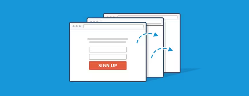
Getting people to sign up for your software is tough. It requires a lot of time, energy, and money, yet many companies are losing most of those hard-won users immediately after their first-run experience. Don’t let your company be one of them!
Let’s take a look at some all-too-common user onboarding mistakes that may be damaging your business.
1. Counting on the interface to explain the value of your product
There’s a phenomenon in the software business called the “aha moment.” It’s the moment when the value of your product becomes clear crystal to the user. They say, “Oh, okay, I get it now!”
Unfortunately, this “aha moment” comes too late for many products as the users are required to fiddle around in the interface in order to understand the value of the product as a whole.
Getting users to figure out your product’s value by learning its interface is like getting people to follow a recipe when they don’t have the slightest idea what they’re cooking.
You don’t start with instructions to knead dough and simmer sauce and hope it turns into a pizza—accomplishing anything of significance requires setting the proper context beforehand. In this case, that context is how much their lives will be improved with your product in it.
Getting users to “aha!” before signing up stacks the deck in your favor twice over. First, it orients all their following actions in a meaningful, informed direction, and second, it adds a tremendous amount of motivation to getting there—much more than relying on curiosity alone.
Getting the light bulbs to go off before signup not only results in many more people understanding your product, it results in more substantial first experiences, as well.
Bonus tip: Not sure how to unlock the “aha moment” ahead of time? Contact a potential customer and try to convince him or her to start using your product using only the material on your marketing site.
If that alone isn’t enough to convince them, remember what else you had to say to seal the deal, and add it to your copy accordingly.
2. Not knowing which actions lead to conversion
Of course, inspiring an “aha” doesn’t do you much good unless users actually get to experience that amazingness first-hand. While an “aha” might indicate that people understand the improvement you provide, getting them to a “wow moment” means that they’ve actually experienced the improvement themselves.
In order to confirm people are really receiving the improvement your marketing site promises, you need to track success rates.
When companies begin to measure activity, many find that around 50 percent of users who sign up for their product only log in once and then never come back. That’s a sobering realization—you invest so much in acquiring new users, only to lose half of them immediately after their very first visit. How can you slow down this hemorrhaging?
Josh Elman of Greylock Partners addresses it this way: he looks at the last 20 people who have successfully converted into customers and traces each of their actions, step by step, to see what brought them to the conversion point. By understanding which actions lead to conversions, you will better be able to nudge users toward that end goal.
The emphasis shouldn’t be on getting new users to click around and familiarize themselves with the interface, but on helping them complete meaningful tasks that lead to mutual success.
You know your user onboarding is really working not when it gets new users activated, but when it gets new users coming back.
Bonus tip: In addition to tracking how many users successfully complete each key step in the journey, also measure how long it takes them to get there. Time is precious and never more so than during a user’s first few minutes with your product!
3. Killing momentum within the “first sitting”
It’s best to think about the first-run experience in terms of helping users improve their lives (as opposed to just getting them to complete the tasks you laid out).
New users didn’t sign up for your product because they were super excited about learning what all those buttons in your interface mean; they signed up because they were interested in the value that you promised to deliver. Your aim with the first-run experience should be to give them a taste of that value by guiding them as seamlessly as possible towards their first small win.
That small win should be something related to the overall improvement your product provides. Giving new users a real taste of the sweet life you provide—even a small one—will make them much more likely to come back.
Once you know what you want to lead your users to during their first-run experience, it’s time to remove everything that hinders them from getting there. Note all the actions that the user must take to get to the small win, and trim down anything that can be done later.
Onboarding is not a time to throw a bunch of things at the wall and see what sticks. If you’re not very sure that the conversion tradeoff that comes from asking for accessory data like phone numbers or their business’s employee count is worth it, then adopting a “when in doubt, throw it out” mentality is highly recommended.
Prize their attention as the extremely scarce resource that it is.
For example, if you can possibly get along without confirming their email address, even briefly, then by all means avoid nose-diving all that precious momentum into the chaos of their inbox before they’ve even had a chance to do anything significant in your application.
Keep in mind that this is not the same as “make it short and unmemorable.” Lumosity recently shared a study where they found that slowing things down and asking users to reflect on the experience they were about to have made people more invested and thus more likely to stick around. Of course, they’d never have known that without tracking conversion rates—one more reason to do so!
Bonus tip: Another momentum-killer that often goes under the radar is poor site performance. Every time your pages take too long to load, it’s yet another opportunity for your new users to fire up Twitter or go brew that cup of coffee they’ve been craving.
Keep them locked in with zippy response times, or at the very least by communicating that your site is working away on their behalf!
4. Failing to celebrate success with the user
It feels great to cross out an item on a to-do list, doesn’t it? Now think of how satisfying it is to knock everything off the to-do list, crumple up the entire completed list, throw it in the trash can, and look up into the skies in a super hero pose! Why not let your users experience the same thing when they get to their first quick win?
I find it odd that in many cases, when a user defies the odds and makes it all the way to logging their first real victory in someone’s app, the company isn’t there to celebrate. The moment a user completes an important task is a great opportunity for you to forge a positive emotional connection between them and your company.
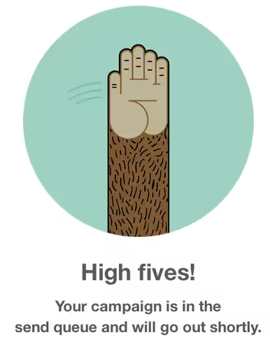
Let your users know that they are doing great by acknowledging their progress and giving them a figurative high-five!
I call these design opportunities “success states,” and I see opportunities for them all over. Get ahead of the curve by finding the “fist pump” moments in your own UX and crafting something that makes them concrete.
They don’t have to be grandiose gestures, either—even a well-timed “Nice job!” can do wonders.
Bonus tip: Use this moment as an opportunity to really let your personality shine, just like Mailchimp does by giving their users a literal high five!
5. Not following up with them once the first-run experience is over
Okay, so you’ve explained to your users how your product will improve their lives, figured out which steps they should take first, streamlined the path to completing those steps, and given them a high five when they got their first quick win. Great! What else is there to do?
The answer is simple: get them to come back and do more!
Of course, there’s not a lot you can do on your site to get people to return to it (because if they were there, they’d…already be there). Instead, you’re going to reach out and grab them by the collar the old-fashioned way: a well-timed, value-driven email in their inbox.
Lifecycle emails are CRIMINALLY underused in Web apps. If you’re running with a blah “welcome” e-mail and then hoping that a “your trial is running out” email two weeks later will be enough to get people to achieve all the value your product can deliver for them, your appetite for risk is far greater than mine.
Instead, I like to make a list of all the big things that people really need to accomplish to fully go from 0-60 and write up a series of emails that go out to anyone who hasn’t yet made a particular piece of progress.
Bonus tip: When you write them up, don’t command people to take actions; instead, sell the “better them” that’s only a click away.
For example, if you have a dating app, don’t tell your users, “Please upload more than one photo.” Ask them, “Did you know that people with more than one photo are 60 percent more likely to get a date request within a day?” Who doesn’t want more dates?
Your first-run experience can make or break your business
Running a software business is tough. People are getting busier and busier, attention spans are getting shorter and shorter, and competitors are popping up all over the place. Blown first impressions are not the stuff to build a customer acquisition strategy around.
You have invested a lot of time, energy, and money into building your business. You probably have a great product that you want to share with the world. Don’t let it all go to waste because of a sloppy first-run experience. Do everything in your power to perfect your onboarding process and get those users coming back!
Read next: Setting the stage: Killer user onboarding starts with a story
Get the TNW newsletter
Get the most important tech news in your inbox each week.


