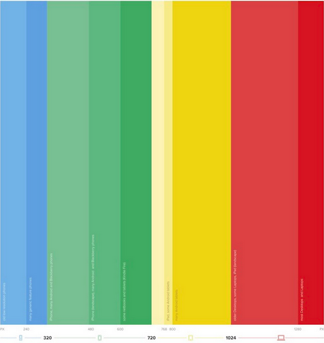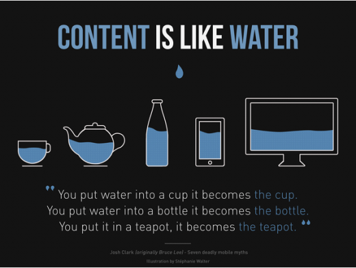
User experience is nothing new. We can attribute the recent resurgence most obviously to mobile and tablets (and even wearables), as these have forced us to reconsider design for different screens beyond desktop and laptop.
Photo credit: Responsive Design Cheatsheet
But like many design disciplines, UX is of course plagued by misconceptions and myth. For instance, many people commonly believe UI to be the same discipline as UX, an inaccuracy that’s further encouraged by all the jobs advertised as UX/UI designer. Add to this that usability is often also used interchangeably and it’s easy to see why the designer who’s just starting out, or the layperson, can become confused.
With that in mind, let’s take a look at some of the most common myths out there and examine why they are just not true.
1: Functional designs automatically create good experiences
As discussed, this is a very common misconception and one that is perhaps initially a little difficult to get your head around.
Simply put, usability is centered around the ability to use something such as a product or website. It’s about how easy the product is to use/find your way around without the need for any real mental effort.
A site or product with a good level of usability will:
- Not require you to think about what you need to do next
- Have a low level of end user mistakes occur during testing
- Allow a user to quickly and easily figure out what they need to do next
- Be simple to pick up and learn
In design, it’s all about leaving the correct signals and following certain conventions that people expect (also known as external consistency, as described in our e-book Consistency in UI Design).
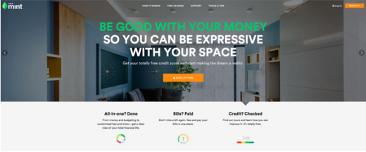
Photo credit: Mint
For example, generally a website will feature its logo at the top left of the web page (so that’s where the user expects to see it). Likewise, users are accustomed to seeing the navigation menu on a bar at the top of the page and if it’s not there, then they have to look for it (never a good thing).
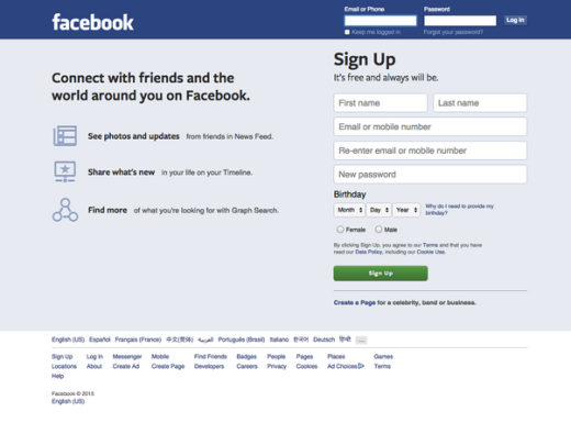
Photo credit: Facebook
Not all sites place the logo in the conventional place, but most do, including Facebook, Google and many more high profile sites. Following conventions can feel a little restrictive for the designer, but it creates a much more usable experience for users. Remember that consistency does not equate to uniformity, so feel free to mix in some elements of inconsistency to keep the design visually interesting.
User Experience on the other hand is concerned with how the site makes the visitor feel. It’s about ensuring that everything about a site, from the colors used, to its usefulness and the way it looks evokes a sense of emotion in the user. For example, many brands are currently concerned with designing an experience that creates trust with the user.
This can be done through customer testimonials, the provision of social proof, case studies and even the language and colors used on the site.
Photo credit: Webdam via Hubspot
According to the Stanford Web Credibility Project, “nearly half of all consumers (or 46.1 percent) in the study assessed the credibility of sites based in part on the appeal of the overall visual design of a site, including layout, typography, font size and color schemes.”
Since many retailers now exist only online, without a high street presence, trust is an important consideration and one that should always be worked into the UX. This is especially true when it comes to shopping carts and mobile, as discussed by Smashing Magazine.
So UX and usability are different in that one is concerned with how easy it is to use a site, while the other is all about the overall experience for users.
2: Primary content belongs above the fold
This may have been true once, but the different screen sizes and mobile devices means that we’ve long outgrown our fear of scrolling.
To begin with, how do you discern where the fold begins and ends when you’re designing for different devices? You don’t, it’s almost impossible unless you’re prepared to conduct some serious research.
Photo credit: Wikimedia. Creative Commons.
In the 90s, designers did have a habit of cramming everything into the above-the-fold area for desktop. In those days, we weren’t accustomed to scrolling and so didn’t like doing it – the mouse was often missing the scroll wheel, so that meant furiously clicking on the scroll bar, unless of course you used the keyboard arrows.
These days, cramming too much content in above the fold can seriously impact how the content displays across device. Studies show that actually, we don’t mind scrolling and are perfectly willing to do so in order to find the information that we want.
We see landing pages that concentrate their efforts on creating CTAs above the fold, but even these are pretty minimalistic these days.
Source: Sleeping Tapes
However, it’s still important to craft content above the fold so that it tells the user that there’s more to be found below. This is obvious due to the presence of the scroll bar, but you can leave further clues and it’s always better not to assume anything about your users.
With this in mind, you should avoid horizontal lines placed where they could act as a barrier (such as on the fold). It’s also wise to ensure that you make use of the browser scroll bar and don’t use iFrames or any other elements containing scroll bars (they may confuse the user).
So while above the fold content remains important, it’s not necessary and can be counterproductive to cram in too much content. Instead, content should be well spaced with signals to lead the user further along your narrative.
3: Users read the same on the web
It’s not necessarily true that people don’t read online, they just read differently.
Some skim, some cherish every single word. Some read quickly and can devour a whole site in an evening, while others will take weeks to finish the same content.
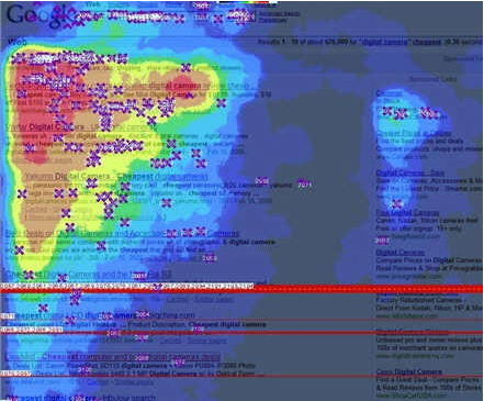
Photo credit: Amit Agarwal. Google Golden Triangle. Creative Commons 2.0.
There’s no set rule for everyone, no matter whether they’re reading in print or if they are reading online. It also depends largely on the medium – very few people read a newspaper (remember those?) from cover to cover for example. However, studies show that the majority of people read in a certain way online, with the most famous research having been carried out by Jakob Nielsen in his 2008 eye-tracking study.
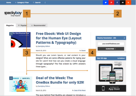
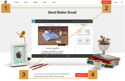
As we described in our e-book Web Design for the Human Eye, most people read in either an F or Z shape.
F-Pattern
Photo credit: Speckyboy
Z-Pattern
Photo credit: MailChimp
Make sure you design text for easy scanability, using techniques listed below:
- For product descriptions, include the most important information in the first two paragraphs.
- Use short snappy sentences and digestible paragraphs – the latter should be around 6-8 lines deep as a maximum.
- The use of subheaders (H2,H3) , images and bullet points to break up text.
- Keep H1 headers within 7 words to make strong first impressions
- Paying attention to readability scores and how they match up with your target audience.
- Clear white space must be visible in between paragraphs.
With regards to the latter, it’s important that you write for your audience and understand that people read differently online. If you’re skimming an article and you come across a complex word, you’ll often stop to make further sense of the word. This essentially means that the reader is lost (although perhaps not just for one word) as once they have had to stop, then they’re unlikely to continue.
Of course, different sites will use varying levels of jargon, but if you’re addressing the general public, be straightforward. Nobody likes to feel stupid because they don’t know some buzzwords.
You should also use bold text to highlight areas of importance or interest, as well as “pops of color” as discussed by Trap It.
A further study carried out by Jakob Nielsen found that by improving the writing style there was a 124 percent increase in usability. He suggested the same as the above and also recommended that designers and writers embed outgoing links to improve credibility and to only write one main idea per paragraph as well as use subheaders intelligently.
4: White space is an empty canvas
Imagine if you landed on a web page that had no white space.
What do you think it might look like? Cluttered? Illegible? All of this and more probably. White (or negative) space between elements creates subtle relationships and makes a web page easier to navigate.
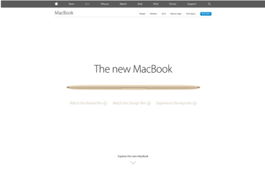
As described in The Zen of White Space in Web Design, white space improves readability and lends a feeling of sophistication and luxury. Cheaper brands want to cram more into the available space so that they can sell more. More confident brands – such as Apple – can afford more white space to better allow the product to speak for itself. The experience translates to the physical world as well, since Apple retail stores use the contrast of minimalism to help people focus on products.
Photo credits: Apple
White space isn’t just used in text though, it’s the padding around navigation buttons, the area between text and an image and the padding that helps to showcase certain, important content elements.
So white space is never wasted. Not only is it a functional part of design when it comes to padding out elements, it also creates an air of sophistication. Treat white space more as a sculpting tool rather than a void. To learn more about mastering white space, check out this thorough piece on awwwards.
5: Give users as many choices as possible
“You can’t have too much choice” is a phrase that all of us are familiar with, but in the context of design, is it true? Bluntly put, no it’s not. In fact, it couldn’t be further from the truth.
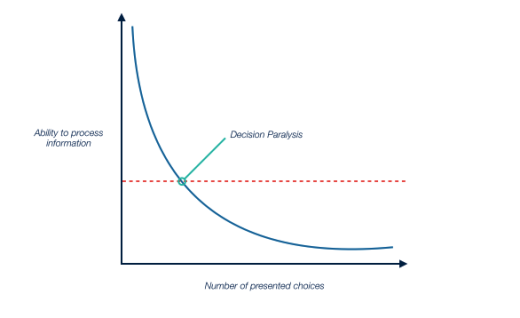
Hick’s Law, which we described in Interaction Design Best Practices, states that as the available options increase, so too does reaction time.
Photo credit: Marcin Treder, UXPin, based on: Shake, Rattle & Roll to my Magic Number: 7 +/-2 by Kate Simpson
One study supporting this finding is the now infamous Jam Test, which took two different jam displays and tested them in a busy supermarket. One of the displays showed 24 different flavors of jam on it, while the other only showed six. The test found that the 24-jam display lead to 60 percent of people trying the jam, but only 3 percent of them actually buying any.
Photo credits: “raspberry jam”. kim. . Creative Commons.
On the other hand, the 6-jam display resulted in less people stopping at the display (40 percent), but almost 30 percent went on to complete a purchase. Less choices, in this case, meant less “noise” and a higher conversion rate.
What’s the explanation for the phenomenon? When more options are presented, the user expects they can make the perfect choice (which heightens expectations). When fewer choices are offered, users don’t have any expectations and as a result, can’t be disappointed.
To overcome this, think about:
- Creating product comparison tables to provide a quick and easy overview of features.
- Use advanced search options that can be accessed by clicking on a hidden area.
- Place popular products in more prominent positions.
- Understand your audience and their buying habits by triangulating usability testing with customer interviews and site analytics.
- Don’t attempt to cram too much onto one page – section the site logically and keep product sets together.
- Front-load choice.
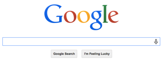
Less is often more. Just take a look at Google and you’ll see that the main focus on the search page is the search box. That’s what the company is most known for, so really, what more does it need?
Sure, it could highlight its online courses, or G+, but why fix something until it breaks?
Source: Google
Likewise, when creating promotional pages, feature only one offer per page and you’ll probably see much better results. The same thinking also applies to email designs.
User surveys might tell you that most people want a feature-packed site that contains lots of different and varying offers, but research tells us that in fact, people don’t really know what they want. Surveys are a good starting point, but make sure you run some real usability tests with at least five users to gauge behaviors (much more important than opinions).
Final Thoughts
Rules and conventions are helpful when it comes to certain elements of design, especially usability, but part of mastering design is knowing when to actually break the rules.
Design as a discipline is always subject to change depending on current philosophies such as flat design and minimalism, the emergence of new technologies, and the creativity and bravery of the designer.
Use conventions to inform your design (but know their limits), understand how users think and act, and create designs that they are not only highly useable, but create what we all strive for – a truly memorable experience.
For additional tips on designing smooth experiences, download the free e-book Interaction Design Best Practices: Time & Behavior. Case studies are featured from 30+ companies including Google, AirBnB, Facebook, Yahoo.
Read Next: 3 common UX mistakes killing good design
Image credit: Shutterstock
Get the TNW newsletter
Get the most important tech news in your inbox each week.
