Jerry Cao is a UX content strategist at UXPin — the wireframing and prototyping app. To learn more about how to create visually digestible interfaces, download the free e-book Web UI Design for the Human Eye: Colors, Space, Contrast.
Visual hierarchy is the difference between a site that strategically influences user flow and decisions, and a site that just “looks nice.”
An interface’s visual hierarchy relies on the same principles of aesthetics used by the Renaissance masters, but on top of that (or rather beneath it) there’s the subtext of secondary goals – promoting specific content, encouraging user signups and call-to-actions, and generally improving the overall experience so users enjoy their visit beyond just accomplishing their goals.


The 💜 of EU tech
The latest rumblings from the EU tech scene, a story from our wise ol' founder Boris, and some questionable AI art. It's free, every week, in your inbox. Sign up now!
Source: ShareFaith
Seems like the Renaissance masters got off easy.
In basic terms, visual hierarchy describes which elements dominate your user’s attention and draw their eyes most. But there’s no one right way to build a concrete hierarchy, and competitive designers must perfect different methods – or invent new ones – to stay on top of the game.
We’ll describe five of the most basic elements, the essential building blocks necessary to support simple or complex hierarchies.
1. Size
At the risk of sounding crass, it is the size of the boat that determines its motion in the ocean.
Bigger is more noticeable, but not always better. The simplest way to explain it is that your most important elements should be the biggest, but it’s when we get into the details that it becomes more complicated.
One of the principles of Fitts’s Law is that objects with a bigger size – specifically clickable range – are easier to engage with. In other words, the user exerts less effort to click bigger items. This holds especially true for calls-to-action, where you want to leave no question as to where the user should go.
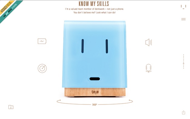
Source: Teye
Of course, that’s not to say that it’s as simple as making your “DOWNLOAD NOW” call-to-action 10x larger for more conversions. Subtlety and harmony between elements is the key.
For example, what do you think the designers of the Teye website want you to interact with most?
The large, clickable, interactive Teye product is obviously the main attraction – and it’s obvious because of its size. In fact, no copy is even required to tell users to engage with the product – the image functions as a subtle call-to-action because of its contrasting color and size. As a result, lesser attention is demanded by the four icons around it, which actually expand in size (when you click) to give product descriptions.
Clickability aside, size is still a vital component of the site’s overall visuals. Depending on the degree, larger elements can dominate even our hard-wired left-to-right, up-to-down site patterns. Furthermore, because it’s based on perspective, size can also be conditionalized with contrast. You can reach the same benefits by making other elements smaller instead of one element larger – keep that in mind as a useful way of saving screen real estate.
Size affects even text and typography, as you can see by this very article’s title, subheadings, and content text. As flexible guidelines, Smashing Magazine’s study of 50 popular websites calculated some average sizes:
- headings: 18-29 pixels
- body copy: 12-14 pixels

Source: Huge Inc.
All the principles of size are visible in this screenshot from Huge Inc. The first thing you notice is the biggest: the stylistic H that serves as their logo. Next is “Nike Making,” whose large typeface and bold style create immediate weight. Next is the line of text directly beneath it, written in a smaller font size so as not to steal attention from the key visuals. If your eyes are still interested enough to wander, they’ll eventually notice the tiny logo and hamburger menu in the corners, or the navigation bar to the right.
The hierarchy makes sense here. First, the large colorful H catches your eye. Soon afterwards, you’ll seek context for the unorthodox visual, which is immediately accessible with the hyperlinked “Nike Making” headline and secondary sentence. Visual hierarchy lays out the user path, while Fitts’ Law simplifies interaction by making the entire chunk of copy clickable and in close proximity to its related visual.
Without even thinking about it, you end up clicking exactly where the designer wants you to go.
2. Color
Your choice of color, even if it’s just blacks and whites, will have an enormous influence on how users perceive your site.
For starters, each color has its own psychological connections, which we explain in great detail in Web UI Design for the Human Eye. Barring that for a moment, colors themselves have their own hierarchy, where blacks and reds will more readily draw attention, while soft yellows and creams may take a backseat.
However, those effects can be enhanced – and even reversed – by the use of contrast. Contrasting colors against their natural opposite (known as complementary colors) draws greater attention to both. This has an enormous impact on visual hierarchy, as placing a yellow call-to-action against a blue background may produce better results than a red CTA.

Source: Vito Salvatore
Naturally, the website of digital designer and art director Vito Salvatore should include compelling visuals. And the photo he chose for his home page demonstrates his ability. In terms of color, the tan of the sand contrasts with the deep blue of the sky, making this a visually dynamic image. For functionality, the choice of white for the typography allows the links to stand out elegantly, despite the grandeur of the background photography.
On a subtler level, the tan color actually complements the blue sky, as you can see in this color wheel. While that might be pure coincidence in the photograph, it nonetheless creates a balanced feel in the aesthetic. Notice also how the tan dust trail creates a sense of action, leading your eyes towards the red car (which then points in the direction of the white text menu).
When we deconstruct the design, you can really start to see how the color, visuals, and typography lead your eye towards the most valuable part of the screen.
3. Layout
Your website interface’s layout is one of the most direct ways to control your visual hierarchy – you can literally place an element at the top of the visual hierarchy by placing it front-and-center. But there’s more at play than just height on the screen.
One of these factors are prime pixels. Another principle of Fitt’s Law, which we’ve briefly described, is to take advantage of the locations within easiest reach. In web design these are, amongst others, the corners and border of the screen, as “throwing” the cursor to sides requires less mouse control than a fixed point in the middle.
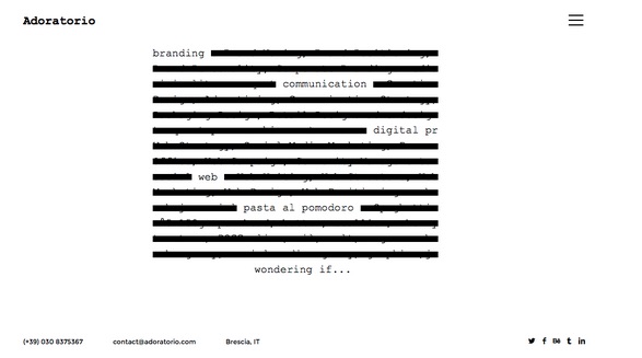
Source: Adoratorio
While you’ll probably focus primarily on the center of the screen (given its size and contrasting black lines), the stagnant clickable links remain easily accessible in the corner and at the bottom. Scrolling up and down changes what’s displayed in the middle, but the site logo, hamburger menu, contact information, and social media links stay firmly in their prime locations.
Of course, your layout certainly affects the visual hierarchy, not to mention usability. The Gestalt principles (described below) dictate that objects in a line create momentum to propel eyesight forward, even dominating the effects of color. Rows and columns, then, aside from supporting an organized structure to keep the chaos at bay, also create some prime real estate when they end – perfect for CTAs or other preferred content.
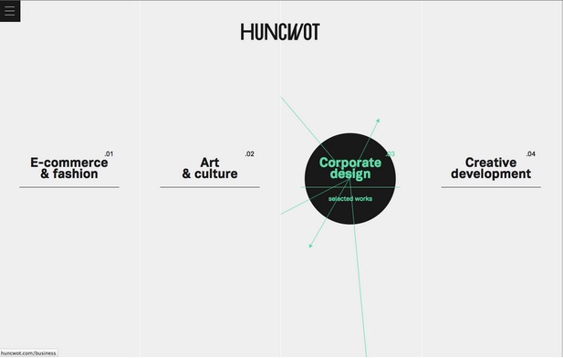
Source: Huncwot
As you can see, Huncwot keeps the options for its homepage organized in a straight horizontal line (with an animation behind whichever selection you’re hovering over).
When deciding the layout, remember what we said about Hick’s law in Interaction Design Best Practices. Hicks law, in a nutshell, cites that the more decisions a person has, the longer the decision-making process. Thus, you want to find a perfect balance between giving your users a lot of options and restricting their choices to only the essentials. This will affect which layout method you choose, as you don’t want to overburden your user with content, but you also want to provide enough to satisfy them.
It’s a tricky balance, but mandatory for every single website. Otherwise, if you crowd your website with too many interface elements, your visual hierarchy flattens and nothing stands out to the user.
4. Spacing
Related to layout, the spacing within your interface guides the eye and, under the right circumstances, explains or suggests function. Spacing impacts your visual hierarchy in two distinct ways: proximity and negative space.
Proximity is a powerful tool for a web designer as it can suggest an element’s meaning and functionality using only visuals. The Gestalt principles, from the visual-psychological school of thought from the early twentieth century, led to the discovery that users tends to perceive elements placed close together as having similar functions.
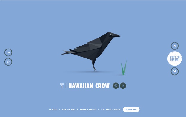
Source: In Pieces
The spacing for the In Pieces page demonstrates the Gestalt’s grouping principles.
Elements related to the central image are directly beneath it. The sites content, with related navigation options, are grouped together at the right. The navigation controls for the site as a whole are grouped together at the left, and non-navigational links for the entire site are grouped together at the bottom. On a related note, also notice how it takes advantage of prime pixels by placing important scrolling options on the horizontal borders.
Another aspect is negative space, commonly known as white space. It’s a rookie mistake in web design to treat white space as an empty canvas rather than as a design tool. Skilled designers know the less elements you have, the more potent the ones that remain. The right amount of empty space between your crucial elements will keep them the center of attention.
In fact, Dmitry Fadeyev cites a study that found white space between paragraphs and in margins improved comprehension by almost 20 percent.
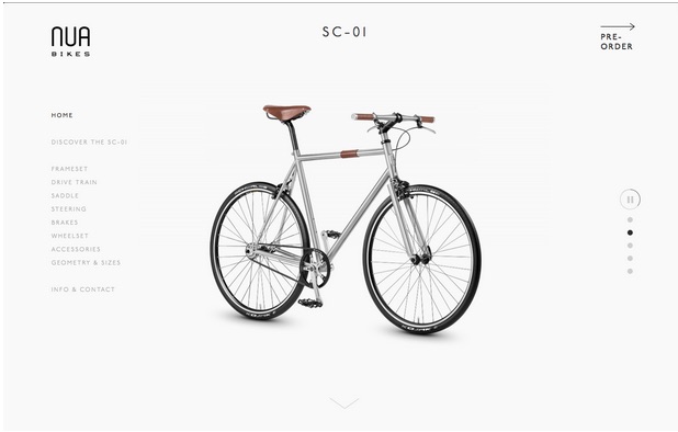
Source: Nua Bikes
Nua Bikes makes good use of negative space. With its minimalistic approach and lack of conflicting visuals, the site sets the users’ focus on only what’s important – the bike it’s selling.
To learn more about the power of negative space, we highly recommend this A List Apart article by designer Mark Boulton. He explores negative space in greater detail, deconstructing its active and passive elements, as well as categorizing negative space as micro or macro white space.
5. Style
We don’t mean to give the impression that web design is a quantifiable practice with only one way of doing things. Personal style, such as the use of textures, graphics, and the type of imagery (e.g. icon or photo-heavy), all affect the visual hierarchy and allow you to express an individual design persona.
One of the most powerful stylistic tools is texture. When used properly, texture enjoys the same advantages of size and color (in terms of aesthetic appeal) while adding depth and atmosphere . The clearest example of this is in displacement: giving just a single element texture will make it stand out, while having a textured background will make non-textured objects in the foreground stand out.

Source: Le Mystère de Grimouville
As you can see above on Le Mystère de Grimouville, the texture on the title not only draws attention to it, it also infuses a quaint atmosphere and style to the site. The texture, as well as the size and place, set the title apart from the less important body text.
The mysterious effect is perfect, considering that the site tells the story of a mystery that haunted the 140 residents of Normandy for over four years.
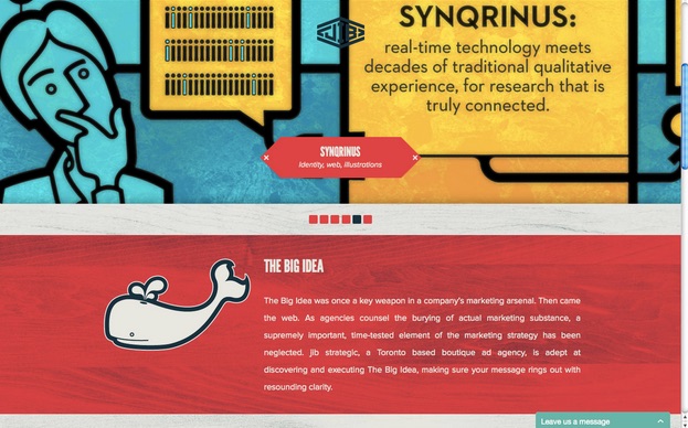
Source: Jib Strategic
Taking an opposite approach, Jib Strategic adds texture to the background to draw out the foreground. This not only influences the users’ focus, it creates an old-fashioned style with the grainy wood, but still appears modern with crisp typography and graphics.
In addition to texture, the types of graphics and imagery you use also affects your visual hierarchy. A swirling flourish around the logo draws attention and reflect the site’s personality. Likewise, rich photographs or clever icons will be sure to draw the eye, regardless of your site’s layout or color scheme.
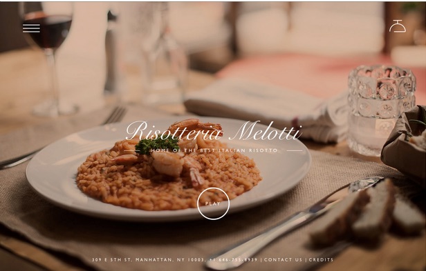
Source: Risotteria Melotti
Not to downplay the use of color in Risotteria Melotti’s site, but it’s the allure of the content – a delicious-looking meal – that makes it the most appetizing item on the screen. In fact, the texture in this site isn’t executed in the traditional format of gradients, shading, or somewhat photo-realistic effects. Just by using a rich photograph showing a rustic dinner table, we can still feel the texture of the environment permeating the screen.
Because the photograph sits in the background, the interface objects (mostly are still clear and we get the same feeling of atmosphere
Don’t underestimate the power of human interest when designing visuals, as they can sometimes trump rules thought to be set-in-stone. When it comes to texture, remember that moderation is the key – otherwise you’ll end up going full-skeuomorphic which just feels tacky.
Takeaway
Knowing how to use each of these building blocks is a standard requirement for a web designer, but know when to use which – and even better, how to use them together – is what creates a mastery of the skill. Every element in your interface will intermingle and vie for visual dominance. Even if your design is pixel-perfect, each user will bring with them an element of unpredictability (for example, User A might have a preference for the color green…).
Keep in mind that this is not only a science but an art – feel free to experiment and allow your own creativity shine.
To learn more about how to create visually digestible interfaces, download the free e-book Web UI Design for the Human Eye: Colors, Space, Contrast. Visual case studies are included from 33 companies including Tumblr, Etsy, Google, Facebook, Twitter, Medium, Intercom, and Bose.
Read Next: The art of copy – designing for words
Image credit: Shutterstock
Get the TNW newsletter
Get the most important tech news in your inbox each week.