Mikael Cho is the co-founder of Crew, a network that connects short-term software projects with handpicked developers and designers. This post originally appeared on the Crew blog.
You know it when you see it.
That’s usually the case when it comes to how we feel about design. Getting on the same page with someone about your design ideas can be difficult with words alone, which is why tools that help communicate what you see in your head can be useful.
If you’re working on a new idea for an app with a friend, your friend might say, they like the design style of Facebook. But what they’re really saying is they only like the style of Facebook’s buttons, nothing else.
To get a better understanding of someone’s preference for design, one of the most common places to start is by creating a collection of different images, graphics, or examples of styles you enjoy. This is often called a mood board.
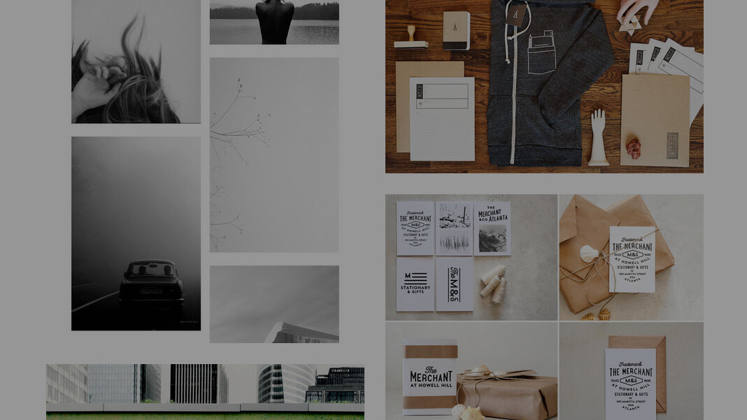
Here’s an example of a mood board for a logo design:
![]()
At our company Crew, we constantly have projects going on that involve some level of design, from creating our logo to designing our homepage. Making a mood board is usually a good place to start for most of these design projects however, mood boards aren’t always the best option in every situation.
There’s times when it makes sense to make a mood board and other times when it might hurt the design process.
When to use a mood board
The best time to make a mood board is in the early stages of the project, when a design style is undefined.
Most of us don’t think exclusively in words or text alone. Your mind is much more dynamic than that. When we create something, it’s more likely that a complex mix of different images, feelings, and colors swirl through your head. Your experiences and sensations inform your work and short of telepathy, it can be difficult to convey your design vision to others.
A mood board allows you to share that vision in a way that speaks much louder than words alone. It helps you communicate your thoughts and define the style of your project from the outset.
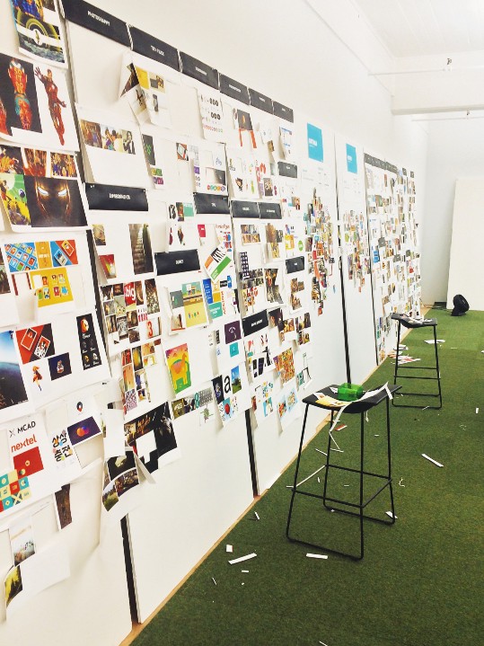
Here’s an example of a mood board we created during the early stage of our Crew logo redesign:
![]()
With this logo project, we wanted to communicate a clear style with the designer we partnered with by showing him how we imagined the logo looking in a real defined space.
When you are first trying to get a beat on a design style, it’s easy to go in a bunch of different directions.
Everything excites you.
When you create a mood board however, you start to look for consistency between elements. By laying everything together you can see what fits and what feels out of place.
Our ability to identify things that are out of place is based on The Gestalt Principles of visual perception. In the 1920s, German psychologists noted that people tend to organize items that have similar characteristics (shape, size, color, etc.) into groups. Items that don’t fit these characteristics, feel like they don’t belong.
You can probably spot the image that feels out of place in this mood board:

Seeing items within a mood board that fit or clash can help spark conversations early on before a design moves too far in the wrong direction. A good mood board helps prevent miscommunication.
When the team at Foursquare decided to do a major redesign of their app that reaches over 45 million people, the team knew their app’s success would largely be impacted by the design decisions they needed to make together.
Because multiple people were going to be part of the redesign process, the Foursquare design team started with a mood board to align everyone’s preferences for the look and feel of the app.
As Foursquare Designer Sam Brown wrote,
The initial version of our style guide was a lofty moodboard, it talked about how we wanted the app to feel: “intelligent, relevant and useful”, “magical and fun”, “trustworthy and highly-regarded.” It showed some fun directional color schemes as well as laid out much of the groundwork for our overall information architecture and navigation.
Talking over a mood board is a way to get a discussion going about what elements matter or what needs rethinking. It provides an entry point for conversations that may be difficult to have later on.
Creating a mood board helps resolve potential problems before they become bigger issues. It can save frustration, time, and money.
“The best process for experimenting with different visual design directions for us was to start as broad and wild as possible, narrowing down into something that was universally loved…We threw away 90% of the work we did. No idea stayed sacred for too long,” Sam noted.
This is why creating a mood board usually works best if it happens in the early part of the design process. Ideas can be thrown in and just as easily tossed out with no hard feelings. This type of environment is often more casual and less judgmental which helps everyone share their opinions more openly.
When to not use a mood board
A mood board isn’t always the perfect choice for every situation. Here’s a few scenarios when we’ve found that mood boards can hurt the design process.
A design direction has already been defined
Using a mood board while a different design direction is already being incorporated can throw everything off. This is how you end up with products that don’t quite feel right. This happens because every decision in one design element impacts how everything else feels.
For instance, Apple and Basecamp are two design-focused companies. However their styles are very different, especially when it comes to images.
Here’s a webpage on Apple’s site compared to Basecamp’s homepage:
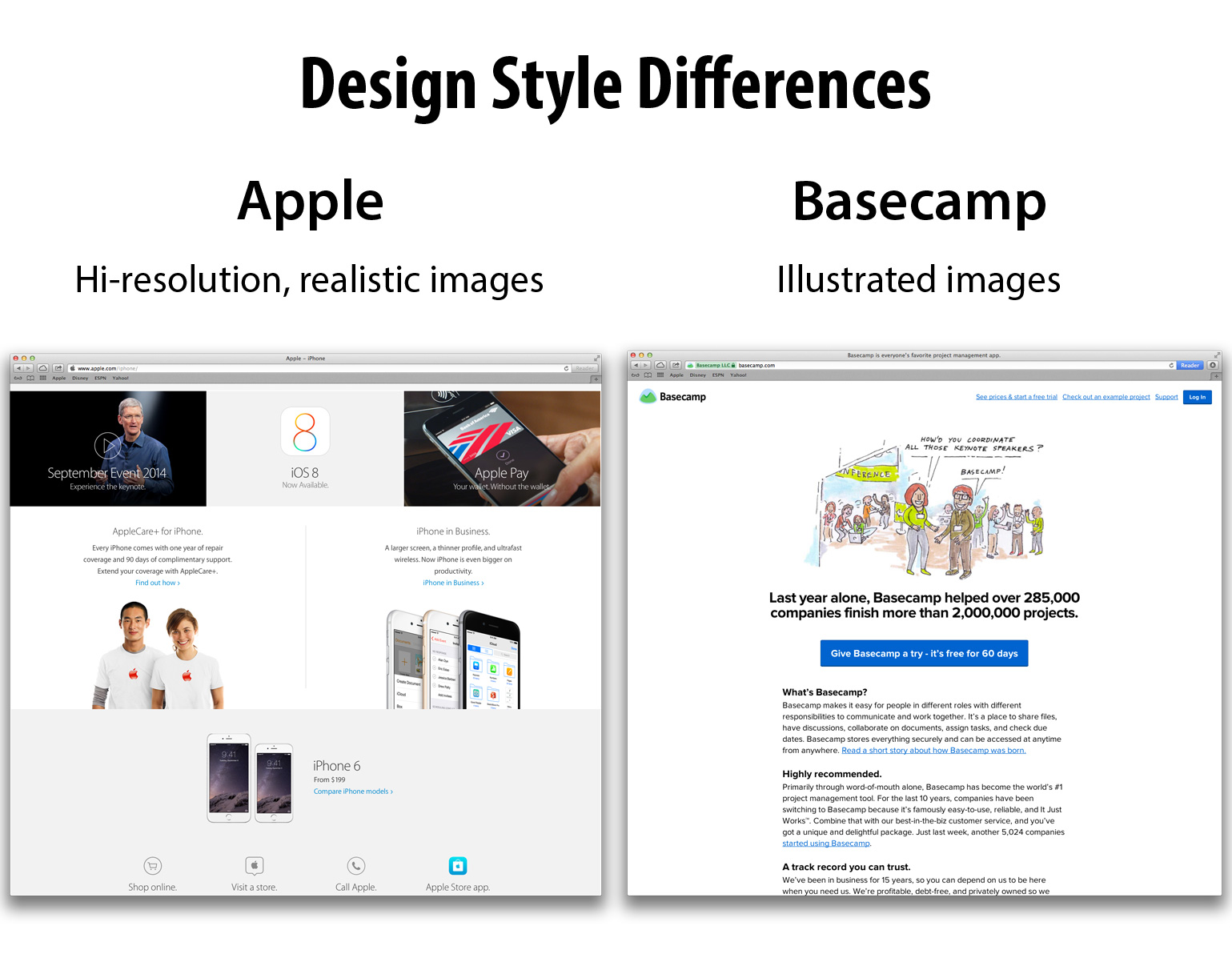
Let’s say your first mood board points a design in the direction of an Apple-esque design with realistic images. Then, later in the design process, someone comes in and says I like the illustrative feel of Basecamp’s images.
You might end up with an unclear direction, and get something like this:
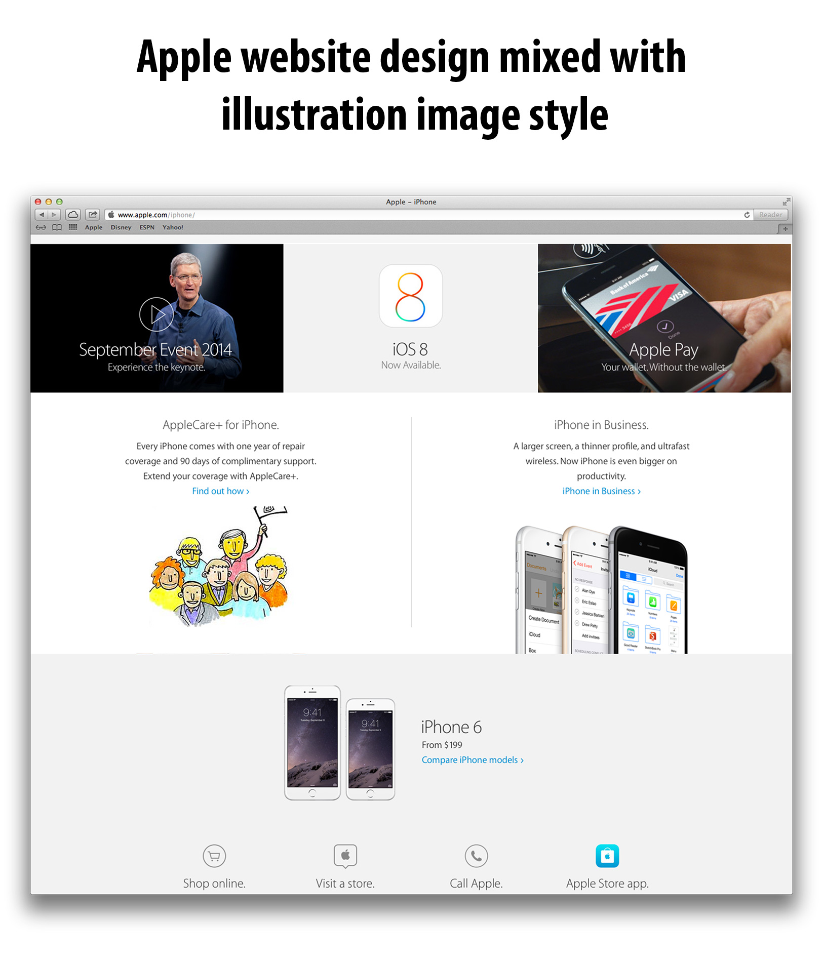
The mixing of the illustration style doesn’t quite feel right with the other elements of the Apple webpage.
A mood board is most effective if used at the beginning of a design process but using them beyond this stage can be detrimental, especially once you’ve chosen a path and you’re getting into the finer details of a design.
A mood board is your broad paint strokes, not the fine details.
If you don’t want to influence the design direction
Another case you may not want to use a mood board is if you’re looking for a unique perspective on design and you don’t want to influence the input of other people.
This was the case when we did our first redesign of our homepage at Crew. We weren’t sure which design direction we wanted to go in so we turned this design direction responsibility over to the designer we were working with. Since we had been staring at our homepage for many months, we wanted a fresh perspective on a new style.
We didn’t want to block possibilities we hadn’t thought of.
The designer we worked with ended up finding a concept that was different than anything we had in our heads, helping us eventually define a better overall direction for our site.
If you’re not sure on a creative direction you want to go, it can sometimes be helpful not to create a mood board. In this case, experimenting is encouraged rather than narrowing in too much on a specific direction.
Granted, you can also strike a balance by creating a mood board that loosely defines a direction without pushing for a specific style too heavily.
How to make a good mood board
There are many tools you can use to create a mood board. Sometimes printing out images and sticking them on a cork board works. If you prefer using an image editor like Photoshop then that will do the trick too. We made a no-frills mood board tool for ourselves to make it easier to quickly make and share a mood board.
Whichever tool you decide to use, here’s some things we’ve learned when making mood boards that might be helpful for your next design project:
Don’t hold back
When you’re making a mood board at the beginning, add in what you like, whatever it is. This is not the time to filter. You can refine your mood board and design direction as you go. A mood board is meant to be a space where you and whoever else has a stake in the project can get what’s in your heads out on paper, without judgment.
Specify what you enjoy
When you put something in a mood board it can be helpful to specify what it is you enjoyed about the item. For instance, if you throw in an image of a homepage design you like try to pinpoint what it is you like about it.
Did you enjoy the color scheme or the font style?
Here’s an example of a comment on a mood board from our mood board tool:
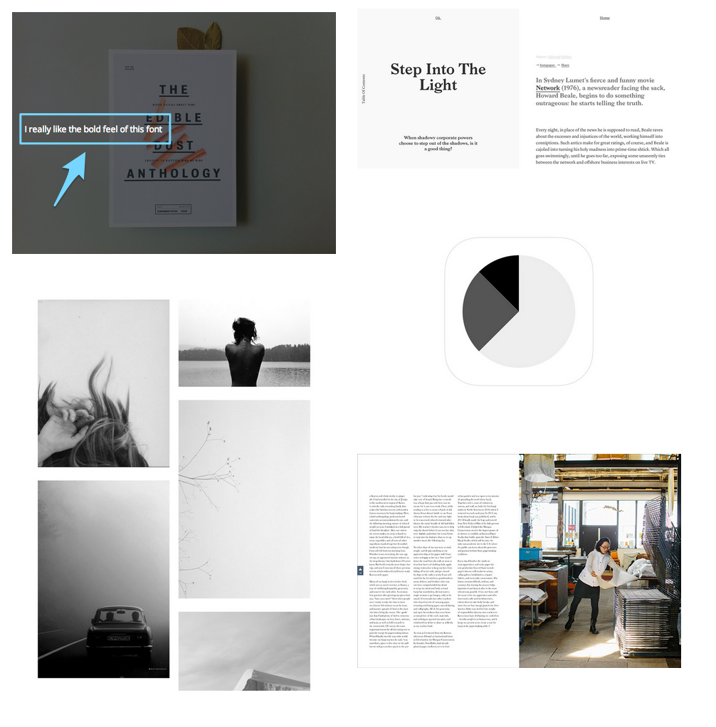
Adding a comment with an image on a mood board can be helpful to refer to if you only like part of the image. Granted, if you like the image but can’t quite put a finger on what it is specifically about it you like, say you chose it because you like the vibe. The other items you include in the mood board will likely help fill in the gaps about your design preference.
Inspiration doesn’t have to only be online
The online world is awesome for finding inspiration. However, sometimes the real world and tangible items provide another perspective on design possibilities.
Here’s an example of a few magazine we have in our office at Crew that we use for design inspiration. These were especially helpful when we were looking for inspiration for the design of our blog.

Our visual world is complex and creating a mood board is one way to access how we feel about design.
We want to be careful not to limit design possibilities with a mood board but it can help provide a general guide for direction especially early on in the process before too much is at stake.
Read next: Future-proof your brand with the right typography
Get the TNW newsletter
Get the most important tech news in your inbox each week.