With the recent release of Timeline, Facebook continues to sink its teeth into our personal lives. And while the redesign is a welcome change, there are some glaring issues that can’t be overlooked.
I don’t blame Facebook’s design team by any means. It’s the upper management that’s definitely falling behind on their aesthetic and user experience priorities. But what is Facebook doing wrong? Here’s why Facebook’s Timeline needs some serious work:
1. Monotony
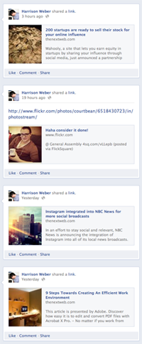
 I share a lot of links, and now that some time has passed, my Timeline is starting to look repetitive and spammy. Sharing great content is the responsibility of the user, but Facebook really needs to play a role in keeping your feed interesting — something it has never done.
Layout variety for posts, perhaps in a way similar to Flipboard or Jux (where I previously worked), could turn a repetitive list of links into a slightly more interesting list of links. Shaking things up by slightly altering elements (e.g.: background color) as you move backwards in time is another way to make Facebook less painful to use.
2. Hospital Color Scheme
It’s interesting to note that many of the most successful web companies emphasize blue, including Twitter, Tumblr, Myspace and Skype. But my profile makes me sad and sleepy, because Timeline reinforces Facebook’s palette in the same spirit of a hospital waiting room. I’d love to see a white background, higher contrasting colors and some grays to keep everything neutral.
Take a look at the Maps subpage, where my distaste for Bing Maps is now at an all time high. The places I’ve visited should be interesting for me, but Facebook’s presentation is full on dull; the opposite of what I’d expect from a company that could bank $1b in net income this year.
3. Ads Like Adwords
 Google’s most profitable product is also its ugliest. Adwords ads look like the kind you’d expect from the back of a tabloid, yet they’re littered all over the web. Facebook has taken note, and continues to bore its users to tears with archaic ads. Sure they’re predictable, non-intrusive and profitable, but there’s still plenty of room for improvement.
4. Overflow
There’s simply too much sharing on Facebook to make looking back in time worth while. Facebook needs to develop a method for detecting the importance of a post to keep the whole scrapbook notion from falling apart. For the ‘Likes’ subpage, there’s never going to be anything intimate about the ‘like’ verb, which means there’s no real benefit to browsing ‘Likes’ over time. Sharing ‘life events,’ on the other hand, keeps the entire Timeline concept afloat, and I believe Facebook already gives manually marked life events priority.
5. Static Subpages
It’s almost like Facebook designed its new Subpages pages to be ignored. The ‘About’ page, for instance, feels terribly static and disconnected from the main Timeline. The ‘Friends’ page replicates the features of the search bar, and the ‘Map’ page is a disappointment. The ‘Photos’ page has definitely been improved from the last design, but the navigation is still unintuitive, and causes hesitation while going back and fourth between albums.
6. High Expectations
 In order to take advantage of all Facebook’s new features, users have to change their behaviors. Facebook wants its users to share every possible detail, including everything from the songs they hear (though Spotify) to the news they read.
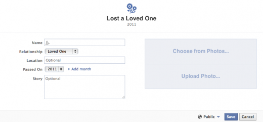
Intimate sharing, like births and deaths, are among the hyper-sensitive details that now seem to be expected, and for tons of people, this is just uncomfortable.
7. Asking for Protest
Facebook has a history of confusing its users with redesigns. In the end, there’s no need for a website that connects you with friends to have a learning curve. Twitter’s most recent redesign led to a ton of changes, but the new look is intuitive enough to prevent mass confusion.
I’ve had the Facebook Timeline for a few months now, and don’t get me wrong; it’s the right step towards a very profitable direction. The Timeline is built to engage users for longer than ever and pulls in more data than any public government census (think how happy advertisers are). Facebook just needs to keep an eye on quality before it bloats itself to death with too much content.
In case you’re not sure what’s changed with the Timeline, you should check out this complete guide.
What’s your critique on Facebook’s Timeline? Let us know below.
Get the TNW newsletter
Get the most important tech news in your inbox each week.


