A new month, a whole new bunch of typefaces to drool over. Scroll down to see which typefaces stood out the most in April. Keep going and you’ll find our March issue.
Linotype: Neue Haas Unica

Neue Haas Unica is an extended, reimagined version of the Haas Unica design, a Helvetica alternative that achieved near mythical status in the type community before it virtually disappeared.
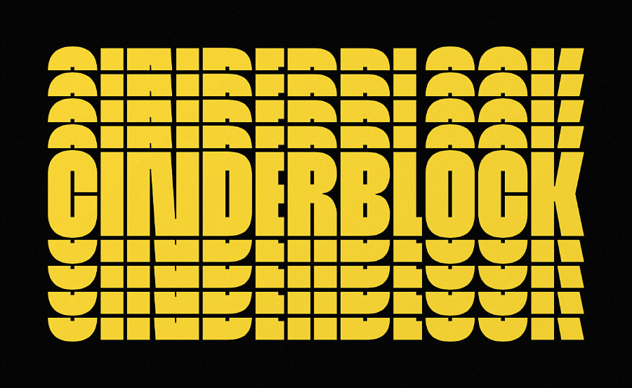
YouWorkForThem: Cinderblock

The <3 of EU tech
The latest rumblings from the EU tech scene, a story from our wise ol' founder Boris, and some questionable AI art. It's free, every week, in your inbox. Sign up now!
Cinderblock was designed to achieve maximum vertical coverage of any given surface.
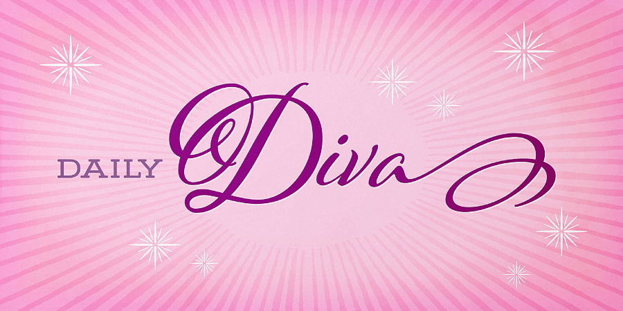
Lián Types: Indie
Indie is a smooth brush script containing five styles.
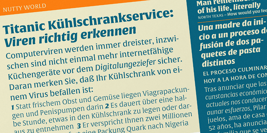
Mostardesign: Chronica Pro
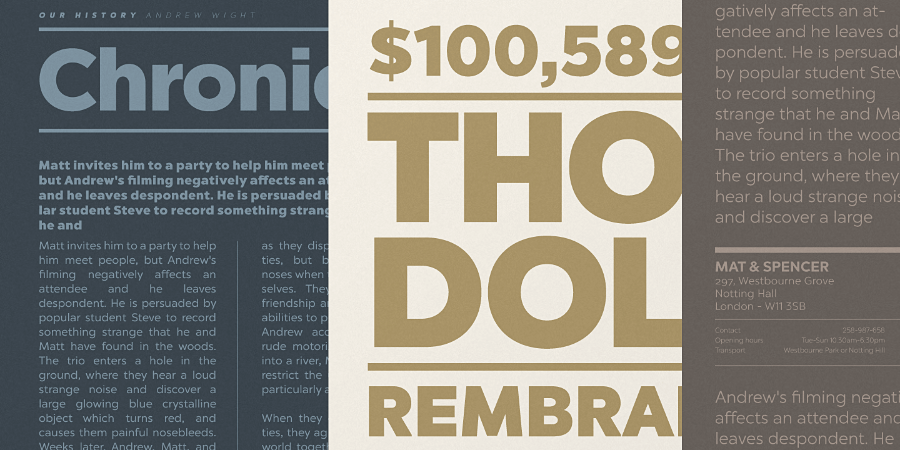
Chronica Pro is a contemporary font family focusing on balance and quality.
Laura Worthington: Adorn Smooth
Adorn Smooth provides a suite of distinctive typeface designs designed to complement each other rather than match exactly.
Jan Fromm: Komet Pro
Komet is a sturdy typeface with a calm and upright feel.
FontFont: FF Eggo
FF Eggo breaks the mould in terms of flexibility and italics.
Kimmy Design: Burford Rustic
Burford Rustic is the weathered and textured alternative to the Burford family.
Suitcase Type Foundry: Pacifista
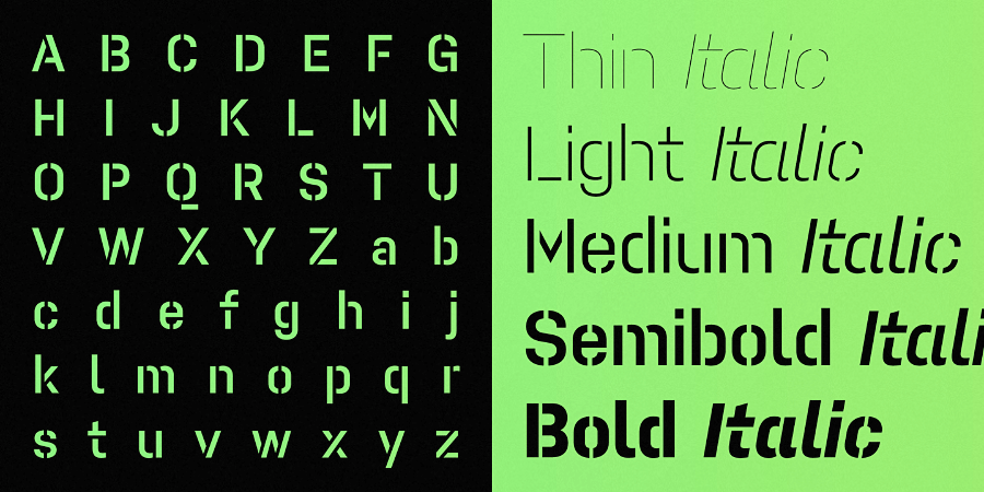
Pacifista — straight lines, regular arcs and purity of drawing facilitate maintaining the maximum possible legibility.
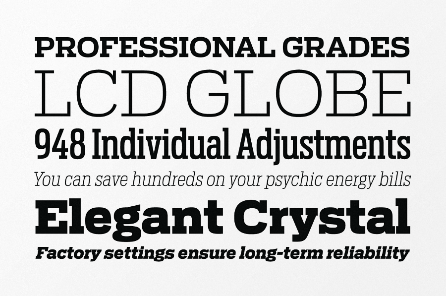
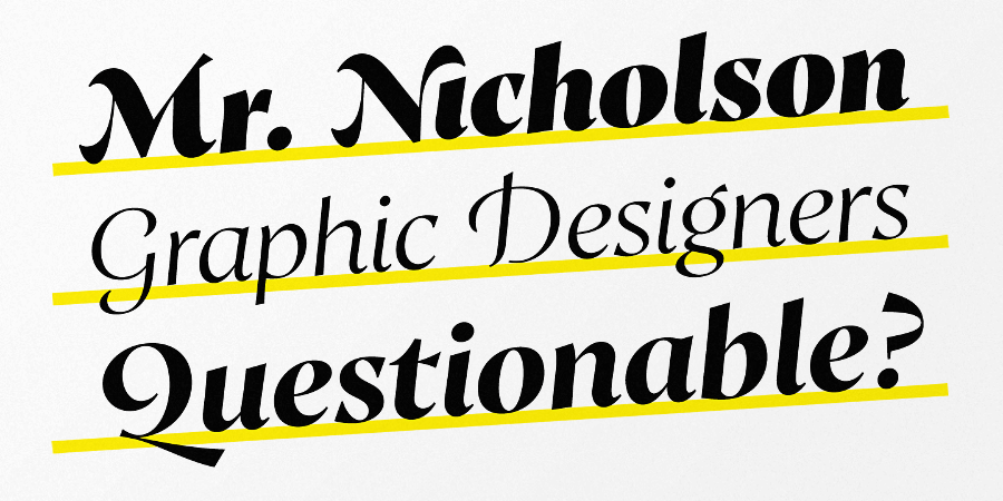
Production Type: Trianon

Replete with useful function for editorial design, including old style and lining figures, ornaments which fit each font’s contrast and weight, and a large range of weights.
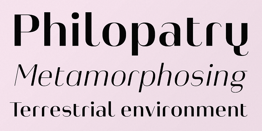
Insigne: Solitas
Solitas is an ideal equilibrium of compact dimensions and geometric underpinnings.
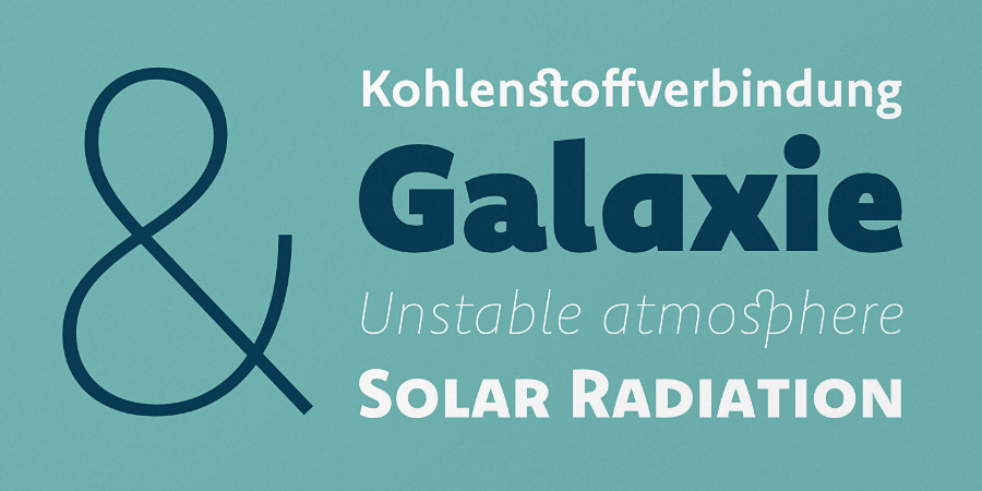
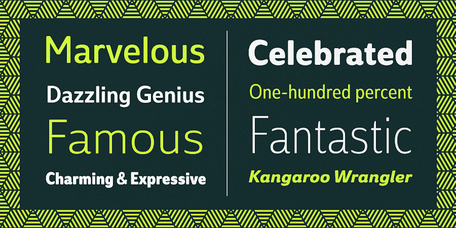
Jakob Runge: Cera Pro

Cera Pro is a good companion for setting clean text and headlines for print and screen.
DSType: Jules
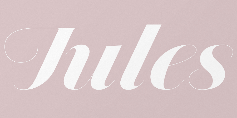
Jules is a type system for extremely big sizes.
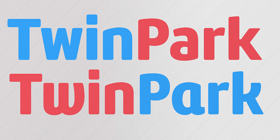
Thomas Jockin: Azote
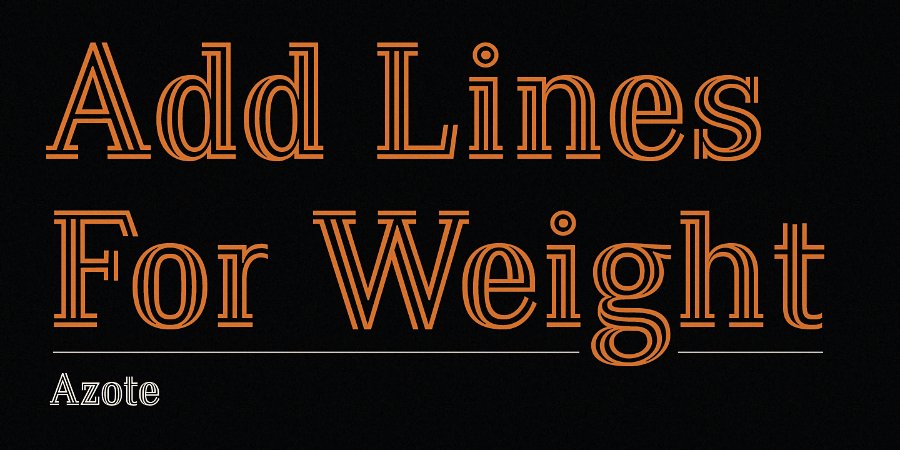
Azote is a multiline typeface family that adds lines for weight.
TipoType: Amelia Rounded
Amelia Rounded is a geometric sans with the softness of humanistic strokes.
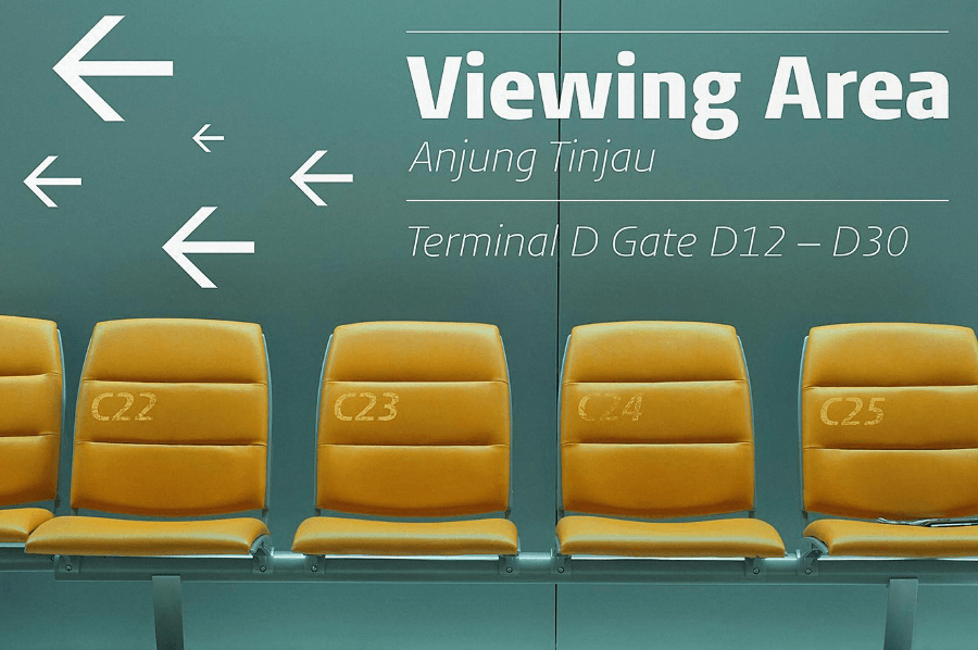
Font Bureau: Antenna Serif
Antenna Serif weighs in at 56 styles making it a versatile performer.
The Northern Block: Webnar
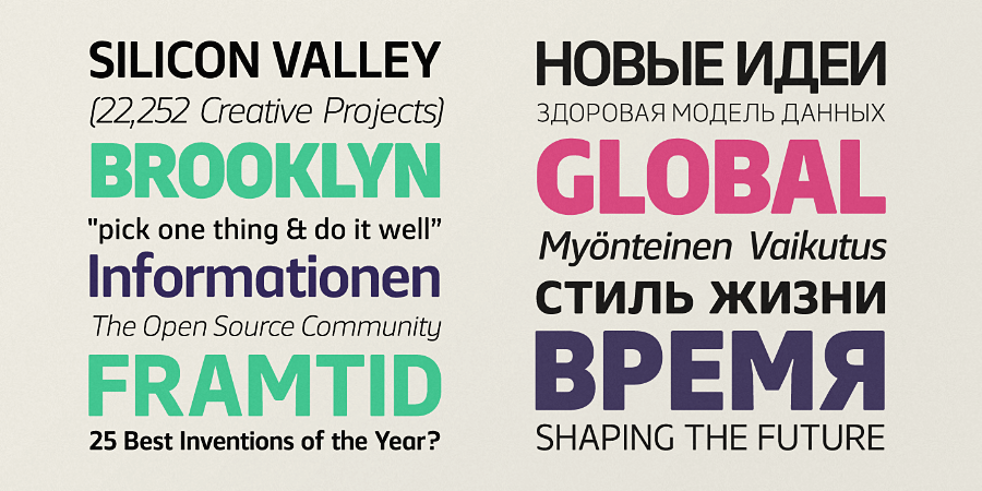
Webnar is a modern geometric sans serif created with information and technology in mind.
Atlas Font Foundry: Heimat Display
Heimat Display combines an idiosyncratic appearance with the feeling of a grid–based letter construction of the late 20s.
FontFont: FF Aad
FF Aad is a modern sans serif typeface with a humanist character.
Latinotype: Go Gipsy
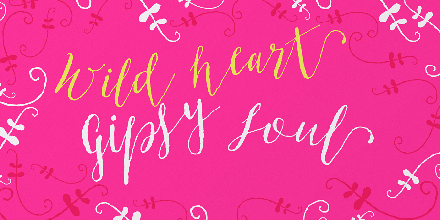
Go Gipsy is inspired by a magical journey – full of love, art and nature – through the Mexican Caribbean.
TypeTogether: Alverata
Alverata is inspired by the shapes of romanesque capitals and inscriptions of the 11th and 12th centuries, without being a close imitation of them.
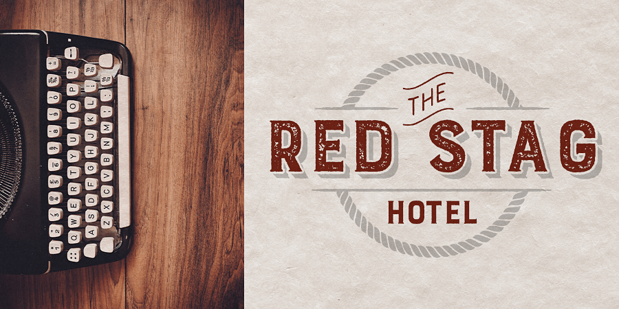
Coppers And Brasses: Canal
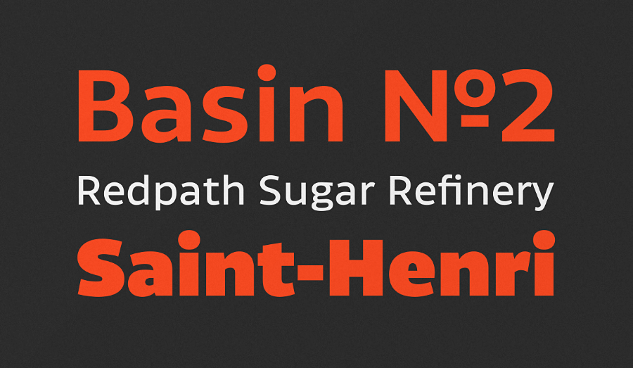
Canal is inspired by the blue collar, hard working people of the 19th and 20th centuries.
Bureau Roffa: Proza Display
Proza Display was made to function especially well at large sizes, drawing the reader’s attention with its beautiful and slightly eccentric shapes.
Manuel Viergutz: Hand Stamp Swiss Rough
Hand Stamp Swiss Rough is a rough and dirty sans with authentic stamp look.
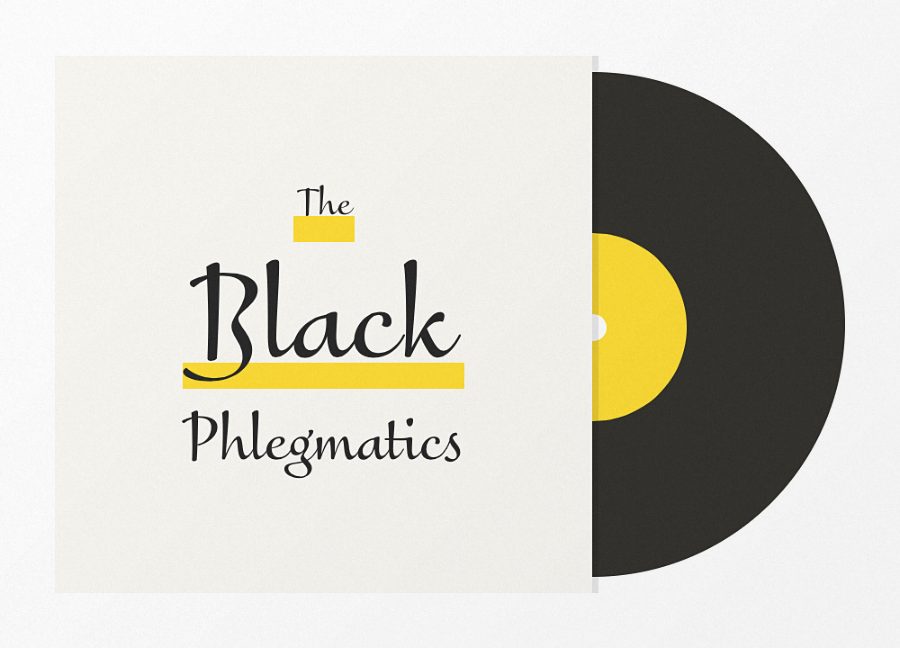
Coppers And Brasses: Double
Double is an exploration in extremes.
TypeType: Inters
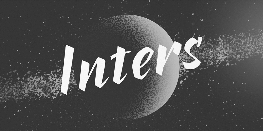
Inters is a very strict and rhythmic font, but at the same time very sensual and emotional.
Mika Melvas: Sivellin

Sivellin is an elegant brush script with a lots of alternates, swashes and small caps.
Read Next: 25 of our favorite typefaces released in March
Image credit: Shutterstock
Get the TNW newsletter
Get the most important tech news in your inbox each week.