The end of the year is near, and that could only mean one thing. It’s time to look ahead at what website design could look like in the year to come.
Like every year, I scoured and searched the internet far and wide looking for the new up-and-coming trends that we could start seeing more of on websites launched in 2019. Everything from layout to colors, typography to white space, and everything in between — no design element has been left out of the possible web design trends of 2019.
Below are the ten design trends you might just start seeing more of around the web when our digital calendars flip to 2019.
1. Broken grid and asymmetrical layouts
I added this trend to last year’s design predictions guide, but it seems to be sticking around in 2019, too.

The 💜 of EU tech
The latest rumblings from the EU tech scene, a story from our wise ol' founder Boris, and some questionable AI art. It's free, every week, in your inbox. Sign up now!
The concept of the grid in design terms is an imaginary plane with horizontal and vertical lines, used to help layout elements on the page or screen. With most websites, the grid is easy to point out — you can look down the left side of the website, for example, and see the logo, title, and content, line up together, for the most part. When you have a broken grid, you have items that are pushed around on this plane in a way that makes the grid feel less rigid, or broken.
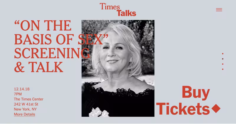
Times Talks‘ website showcases a broken grid layout throughout most of its website, especially in the hero area (shown above) and throughout different sections of its site.
This type of design — one that favors the unexpected, pushing boundaries, and experimenting with asymmetry — has been around for a while. It’s been used as a technique to help stand out from the crowd, to draw attention, or to otherwise experiment with design. However, in 2019, I see it making more of a statement and becoming more common on the web.
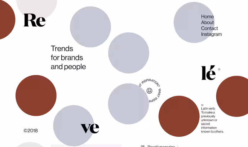
Studio Revele experiments with an asymmetric and broken grid website design aesthetic with its homepage design (the circles can be moved around the screen to help facilitate this broken grid concept more).
In 2019, I expect to see more use of broken grid and asymmetrical layouts as we start to pull away from the rigid grid form that we’ve come to embrace pretty heavily in recent years. With experimenting with the grid and being ok with asymmetry in web design, I anticipate this trend becoming more prevalent in the coming year.
2. Fluid/organic design and elements
Slowly more and more we are pulling away from the straight lines that came with flat design and starting to experiment with more fluid shapes and lines. These types of shapes, ones in which aren’t your typical circle, square, rectangle, or any straight-sided shape are often referred to as fluid or organic shapes. 
Small part of Wandering Aimfully’s homepage, featuring organic shapes and lines seen behind the circle images and as a subtle background behind the heading below them.
By shedding the very straight and near-clinical lines we’re accustomed to seeing online, and replacing them with elements drawn from nature and life (such as shapes of ponds and lakes, torn pieces of paper), these organic shapes and lines can make designs feel more approachable and in line with human nature.
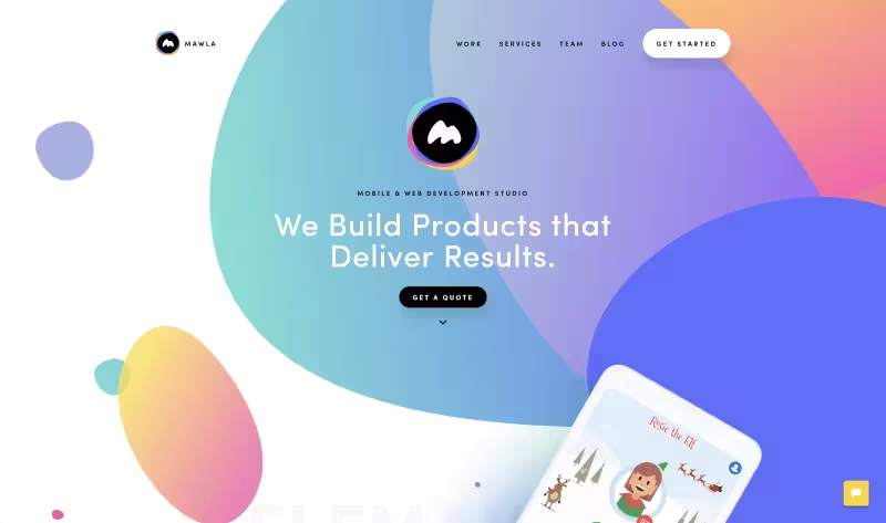
Mawla’s website uses organic shapes and lines on their homepage, specifically here in their hero area on their site.
Moving into 2019, the typical shapes that have been used in web design for so long (circles and squares, I’m looking at you) will start to be joined or replaced by more organic shapes and lines, bringing a whole new element of design and intrigue to websites design and launched in 2019.
3. Nostalgic / Throwback / Retro design aesthetic
What is old is new again. As we’re moving beyond flat design, where experimentation seems to have no limits, the time seems ripe to also bring back old design elements with a hint of nostalgia.
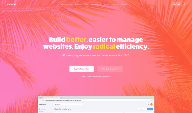
Statamic’s website design features a retro color scheme reminiscent of the bright colors and imagery of the 1980s.
Experimentation with nostalgia and retro design styles can create a nice juxtaposition between then and now design. What makes this even more interesting, is that we can expect seeing more retro design styles reflecting time periods before websites were easily accessible to the masses; making it feel “new” to many people.
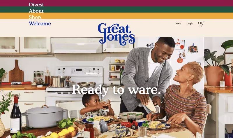
Great Jones’ website features characteristic 1970’s typography and color scheme, a design aesthetic that was common way before ARPANET in 1983.
I anticipate seeing more websites embrace different design styles that lend themselves to times past, both in the design of the websites themselves and in the content. Some of these throwback elements will likely include color schemes reminiscent of design trends of the past and typography that makes us think back to a different time.
4. More enhanced/elevated image treatments
Images have always presented unique design opportunities, especially on the web. Putting images in circles, making them black and white, adding a drop shadow behind them – all of these are techniques that designers have been using to enhance and/or draw attention to images on websites (and just about any other type of design).
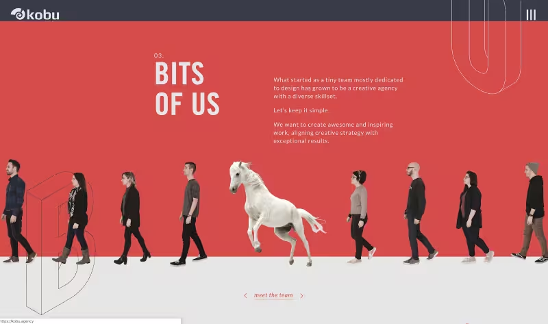
KOBU’s website features imagery that has the subjects cut out instead of a standard image, allowing the design to flow between the “cut-outs” of their team members.
Taking image treatment a step further can draw attention to an image, or even draw attention away from an image. Where most websites feature a very large hero-style image that spans the entire width of their website, taking up a great deal of height and not changing the image much at all, changing up the way images are presented is a design trend that I believe will start picking up more traction in 2019.
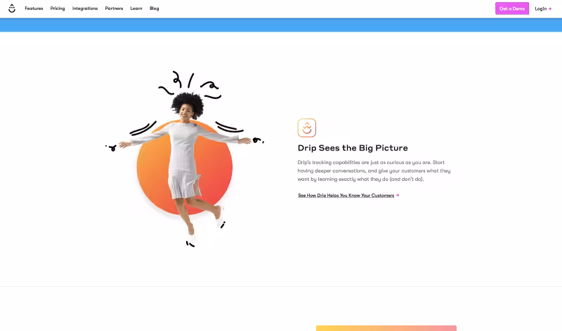
Drip’s website shows images that have been cut out and have added drawings and shapes to enhance the image even further, which also places more emphasis on the design of the site itself.
Instead of executing one type of image treatment, expect to see websites layer image treatments to push the image as far as it can go to either draw more attention to them or to pull attention away from them. Stacking design treatments like making an image monochromatic, cutting out the subject, or adding a pattern on top to make a brand new image, will likely be more prominent in web design in 2019.
5. Monochromatic and absence of color
Having millions of colors at your fingertips is cool and all, but what if you limited yourself to just one color, or no color at all? If done well, that type of design constraint can help enhance a design and make it more memorable.
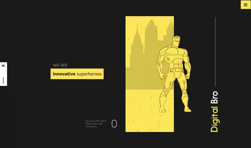
Digital Bro’s website sticks to a very monochromatic color scheme by using one hue of yellow and very rarely strays from that one variant of yellow (black and white are considered neutrals).
Limiting yourself to one color can help solidify your branding while adding constraints in terms of flexibility of design. With most websites having two-five colors that are used throughout, using just one color could make you stand out and be more memorable to a website viewer.
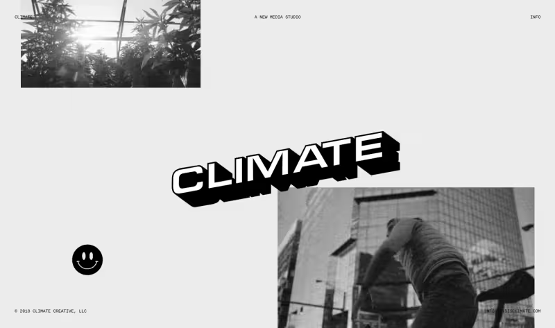
Climate’s website sticks to a grayscale color scheme, absent of any other color, even making their videos on the site all grayscale.
Pushing it one step further and eliminating color all together is definitely an option if you’re looking to simplify your color palette (in art and in design, black, white, and gray aren’t considered colors so much as they are referred to as neutrals). In 2019, I expect more websites to use less color or no color at all.
6. Overlapping design elements
Falling closely in line with broken grid layouts and asymmetry, having items overlap each other can bring visual interest to specific types of content on a page. This can bring an element of the unexpected as we’ve grown accustomed to elements on a web page having their own space and separate from the elements around them (generally not touching one another).
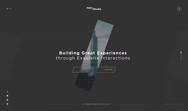
Mad Studio’s website features overlapping elements as the main design aesthetic throughout the site, enhanced by subtle animations that make the website feel three-dimensional.
When done with careful consideration, the trend of overlapping elements on a page can help enhance the overall aesthetic of the site. This can also be pretty difficult to execute giving the mobile-first world we live in, as overlapping elements if not done well can cause confusion and frustration of users when elements overlap in the wrong ways.
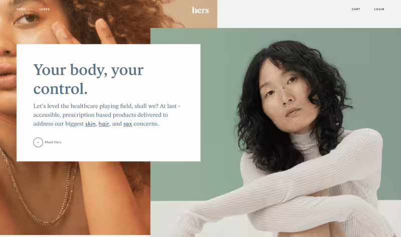
Hers’ website showcases overlapping elements in parts of their website, including their main hero area on the home page.
Using overlapping elements where they share similar space is a trend I see growing more common as we move into 2019 and start experimenting more with a website being three dimensional.
7. Reimagined hero/header areas
As hinted above, most hero areas (formally known as “above the fold”) feature a large image that spans most of the viewport, often with some text on top to focus the attention of the viewer. And over the last couple of years, there hasn’t been much in the way of experimentation with this area of a website (arguably, the most important area).
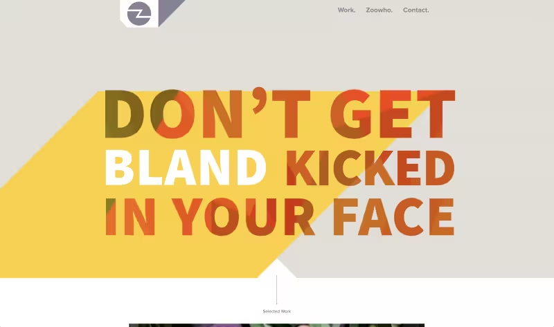
A unique approach to a hero area used by Zoo Creative (treating the hero area as a billboard, and clever use of animation).
While some websites have started to push the boundaries of what is possible with their hero/header areas on their websites, as we pull away from the typical full-width-image-with-text-overly type heros, I expect to start seeing more and more experimentation by web designers as to what is possible in this area.
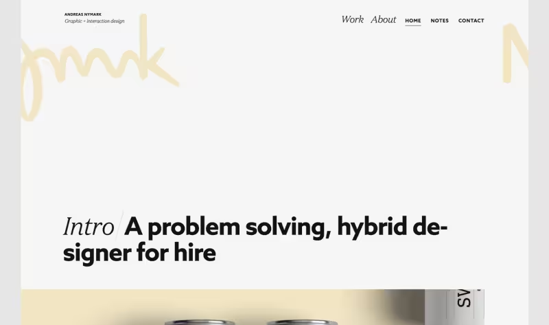
Andreas Nymark’s website features a white-space heavy hero area with a simple heading at the bottom of the hero area (notably also hitting on another trend to be mentioned later in this article).
In 2019, I expect various types of experimentation to this all-important area of a website, including minimizing the area, changing up the content present (and using something different than just a full-width image), and treating this area with more importance in grabbing viewer’s attention first hand.
8. Large and experimental navigations
It seems like every year there is a trend to do with navigation on a website. Likely because it’s one of the hardest elements of the page to design for. So essential to how we use the web, but a pain to keep it functional yet aesthetically appealing.
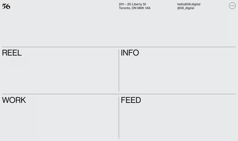
56 Digital’s website showcases a rather large navigation — making it the center of their website instead of a smaller part of their site.
With 2019, the trend is likely to continue to see more experimentation with navigations. But instead of just changing a few things such as placement on the page, font size, or even the layout itself, experimentation is likely to push the boundaries of what is possible in 2019, such as making the navigation the main part of the website or making it very large and a focal point.
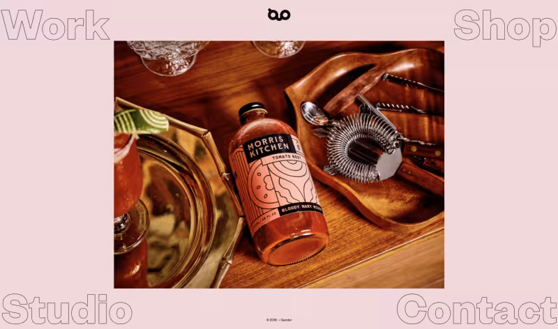
Gander’s website has rather large navigation in all four corners of its site instead of the typical navigation bar across the top or down the side.
With experimental navigations becoming more of a design trend in 2019, we can expect to see very large navigations, website homepages that is nothing but their navigation, and navigations with sophisticated animations.
9. More than enough white space
Using white space effectively is a design tool used by designers for decades. However, what may not be as common is the amount of white space used or even making the white space the focal point instead of the content itself.
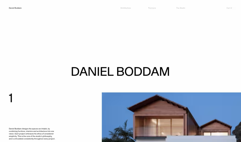
Daniel Boddam’s site uses extra white space in the heading of his site, which is bringing attention to space otherwise often filled with content.
The use of extra white space in this manner contrasts the reason why we typically use white space — add margins or spaces to give our eyes a rest. Adding extra white space now helps move it to be a focal point or a more noticeable part of the design aesthetic. By choosing to add extra white space in areas that don’t necessarily need it, it then becomes an important part of the design and more noticed by visitors.
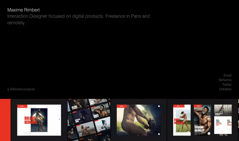
Maxime Rimbert’s website uses a large area of white space on their website, to help draw more attention to the works below and visually distance the works from the intro.
Moving into 2019, we may start to see websites use lots and lots of white space to make a statement or to make it the focal point of the website. While in the past we may have thought this extra white space was a waste of space, but the trend now may be that it gives the space a little something extra.
10. Pushing the boundaries of typography
While experimenting with typography is always something to be expected from designers, it’s a bit harder to push the boundaries of typography on the web than it is in print. As coding becomes more sophisticated, experimentation with typography on the web has become a bit easier over time.
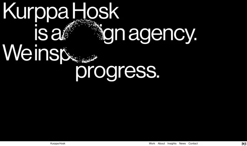
Kurppa Hosk’s website experiments with typography by adding animation and user interaction. The text explodes and forms a circle around the user’s cursor.
Experimenting and pushing the boundaries of typography could include cutting or purposely subtracting parts of letters and words (relying on negative space to fill in the rest of the letters), photography inside typography, type on a diagonal line or shape, animating typography, etc.
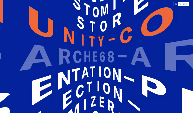
ARCHE68’s website features typography pushed to its two-dimensional limits to make it near three-dimensional. Not only does the typography have a bending effect, but it also auto-scrolls left and right and moves with user scroll up and down (you’re seeing their navigation, which hits on another design trend mentioned above).
For 2019, typography experimentation and pushing what is possible with type on the web will likely become a trend with new website designs in the coming year. Since experimenting with type is much easier in print, expect to see the same way type has been treated in print to move to the web as we learn new ways to code for typography.
Some final takeaways
We’re in a post flat design world, and it looks like web design takes a more experimental approach than we’ve seen in years past. Virtually no element on the web page is safe from experimentation as we move into 2019.
(Need more inspiration? Check our 2018 web design guide, 2017 web design guide, and 2016 web design guide, too).
With adding extra white space, making navigations the focal point of websites, and experimenting with typography to gaining inspiration from times past, 2019 looks to feature websites experimenting with their design aesthetics with nothing left untouched.
Get the TNW newsletter
Get the most important tech news in your inbox each week.