Slidebean‘s Web-based presentation app is now available to all, the company announced today. As its name suggests, its product is a slideshow creation tool, described by its founders as ‘Instagram for presentations.’
You may be tired of what has become a startup cliché but in this case, the X for Y description is quite meaningful. Just like Instagram’s filters make you pictures look neat in seconds, Slidebean offers design templates that help anyone create good-looking presentations.
According to the startup, its goal is to let users focus on content, and take care of the rest on their behalf, enabling them to create a presentation in a few minutes. Here’s a short video that summarizes Slidebean’s vision:
http://youtu.be/RVqhAvrkXU4
In practical terms, the first thing you get asked when launching Slidebean is to give a title to your presentation. Once you do, you will see a message that says: “All set – Focus on your content. Pick a design when you’re done.” The next step is to choose a format type for your first slide, among a short but fairly complete range of options such as text-only, bullet point lists, quotes, images and graphs. You then upload your text and optional media assets, and repeat the process until the next slide.
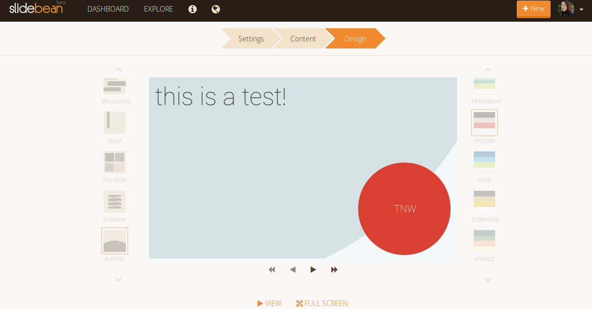
Only at this point do you get asked about design, and even then in a very simple way. In the left-hand column, you can choose between different layouts, each with its own typography and visuals. In the right-hand column, you can pick your favorite color scheme. Going back and forth between design options is only a matter of clicks – a long way from what it would take to do the same with PowerPoint and most other presentation tools.
Removing the design barrier
According to Slidebean’s CEO, José ‘Caya’ Cayasso, most of the startup’s competitors follow a misguided process: “Software out there, like Prezi and Haiku Deck, follows the same approach as PowerPoint: an empty canvas where the user creates the content while having to figure out the format: color, font, size and alignment,” he says. “There’s a UI learning curve and adjusting these options results in a lot of wasted time, or a bad look if the user has no design skills.”
Conversely, Slidebean’s team removed distractions by separating content from design. On a side note, this is also good for SEO. “[Slidebean’s slideshows] rank very well in Google because the presentations are uploaded as text and indexed [as such],”Caya told TNW.
Slidebean’s ease of use has proven to be its main selling point among its beta testers, even more so than its nice design templates. The beta version was released to 1,000 users last November, and reached the 5,000 user milestone last February, with a current average of over 1500 monthly active users.
The team noticed that two user segments were predominant: corporate types and the education sector (both teachers and students). In other words, Slidebean is reaching a non-technical audience that has to create presentations frequently and favors efficiency over full-fledged design tweaking.
From Pota-Toss to Slidebean
 You may know Caya from his TEDx talks or remember the pitch he delivered at TNW Conference Latin America in 2012. At the time, he was promoting mobile gaming app Pota-Toss, a Kickstarter-funded project developed by parent company Saborstudio and accelerated by DreamIt Ventures.
The game first went live in the App Store in 2012, followed by a sequel in 2013.
Pota-Toss can’t be deemed a failure; it had raving reviews, generated 300,000 downloads, managed to get some paid users, and is still available in the App Store. Yet, Saborstudio couldn’t secure a funding round on time, causing founders to move on to new endeavors – and in Caya’s case, to Slidebean.
While he’s building Slidebean with a new team, including co-founders José Enrique Bolaños (CTO) and Vinicio Chanto (CDO), he’s also drawing lessons from his previous venture and doing things at a different pace.
“Part of the problem with Pota-Toss was that we didn’t have our product while at DreamIt,” Caya explains. “Whereas with Slidebean, we had a product right from the beginning of Start-Up Chile’s program, even if it was just our beta MVP.”

A tale of three Americas
 Besides their sensibility to UX and design, Slidebean’s three co-founders have another interesting thing in common: they all are from Costa Rica. They worked together from there for six months, before moving to Santiago for Start-Up Chile last November. A recent graduate from the program’s eighth batch, the startup has now moved to New York City, completing its journey across Central, South and North Americas.
 On a related note, the company’s name and logo – a coffee bean – are a nod to the founders’ home country and to their shared fondness for the hot beverage. It even made its way into the app’s custom wait icon, a steaming cup of coffee.
The reason why the team moved from Chile to NYC last May was to join DreamIt Ventures – in Caya’s case, for the second time around. Back in 2012, Saborstudio was the first Costa Rican startup to be selected by a major US incubator. This resulted in mutual trust, with Caya deciding to apply again and DreamIt welcoming his new company.
Caya is also applying lessons learned with Pota-Toss: “[What we happened then] is why we are now launching so early in the program,” he said. Slidebean’s fundraising prospects already seem more encouraging, having attracted approximately $150,000 so far from private investors and various government funds.
 The team is convinced that being in NYC can add a lot of value to its work, as can DreamIt and its network. Slidebean’s staff is currently working from the incubator’s shared offices in Wall Street. It will stay there until Demo Day next August, and Caya is hoping to stay in the US even longer. “The best case scenario would be to have at least our growth team here, and our development in Costa Rica, with not such a high burn rate,” he asserted.
What’s on the product roadmap
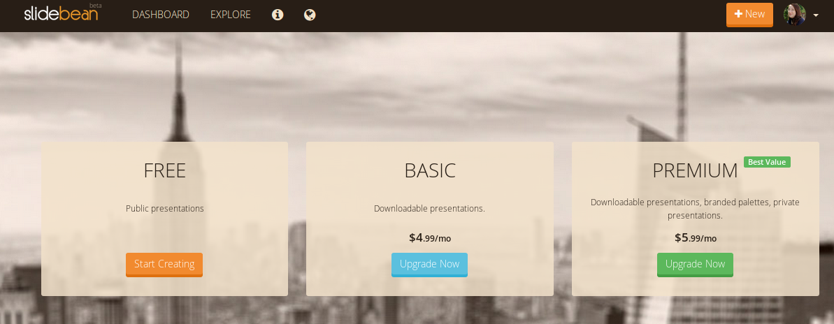
Slidebean recently became a freemium service with exclusive features for monthly subscribers. Paid accounts have access to options such as offline, downloadable and private presentations, as well as the possibility to use their own logo and custom colors. Here’s the startup’s pricing page:

It is worth mentioning that this list of options is set to grow, as Slidebean may implement new features and pricing options based on user feedback. For instance, it plans to offer special deals to universities due to its good results in the education vertical during beta testing.
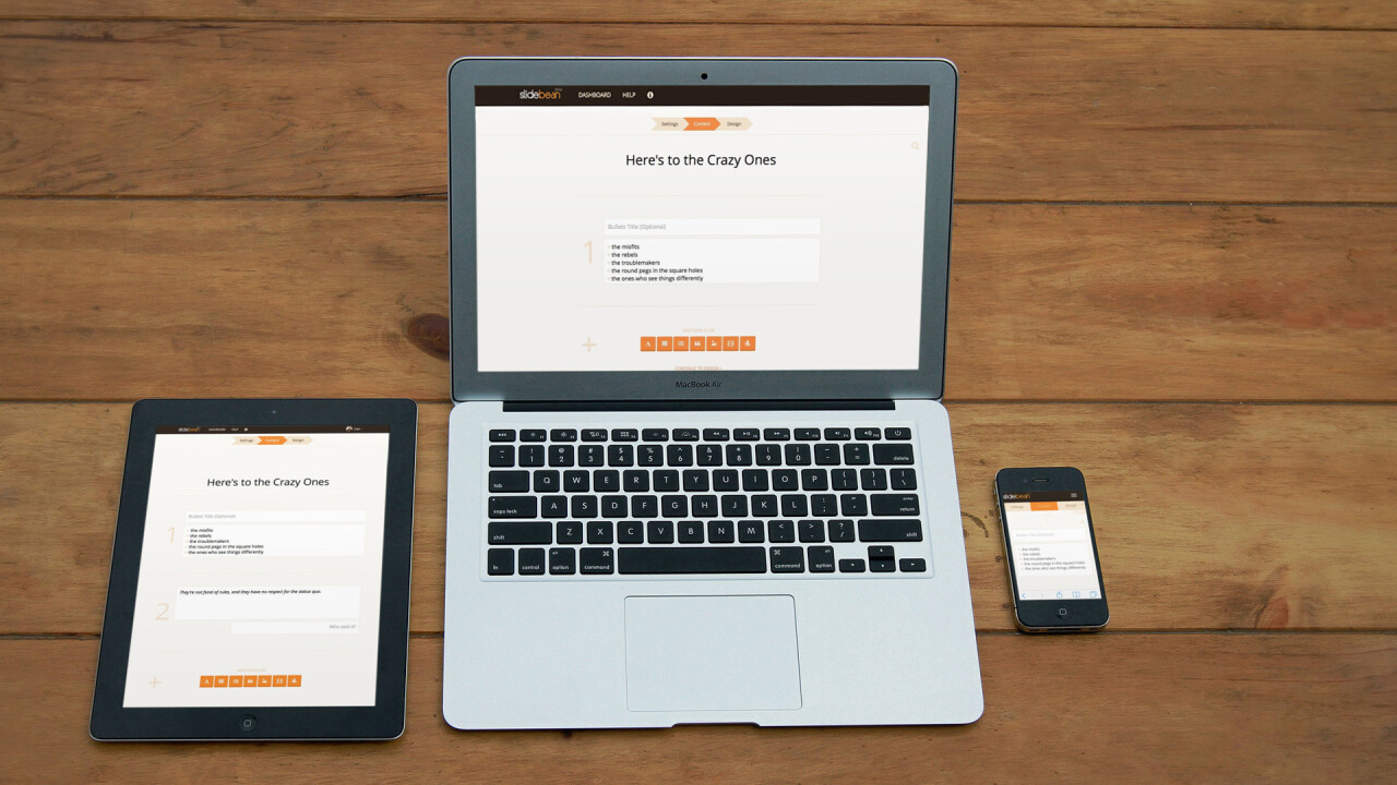
Slidebean’s team also made a point for the site to be fully responsive, a big difference compared to many competitors. “All the slide design is handled seamlessly by our website, which works in both desktop and mobile devices. A cloud-based app also lets users edit and present wherever they are, said Bolaños.
Still, the next big thing to come out of Slidebean’s brewer will likely be native apps – most likely iOS in September or October, followed by an Android version later on. In the meantime, it will be interesting to see if its Web-based version does indeed follow the same path as Instagram.
Get the TNW newsletter
Get the most important tech news in your inbox each week.


