I’m The Next Web’s resident productivity geek. I have a relentless obsession for finding the best tools to get things done; ironically, it’s quite often at the expense of actually getting things done.
In my hunt for the end of the ‘productivity rainbow’ however, one product has always been held in very high regard: Flow.
Flow is a task management solution that helps teams and individuals get things done; and today, the team behind the product, MetaLab, released an enormous overhaul of the product. Quite frankly, so much has changed it would be quicker to list what hasn’t changed than what has, but let’s crack on all the same.
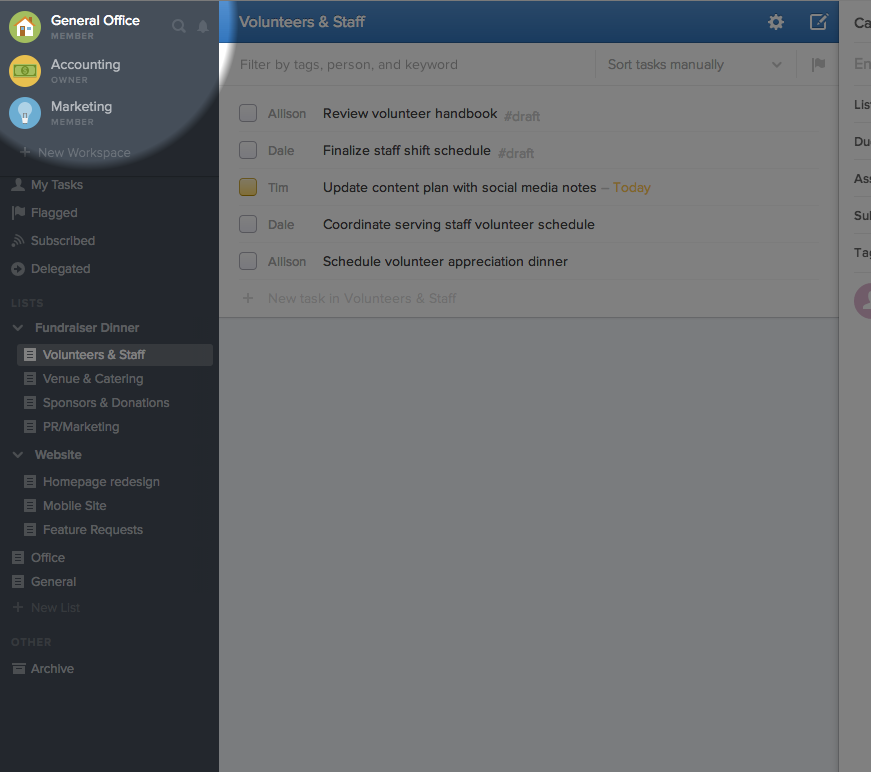
Workspaces
The most significant change in the new Flow is undoubtedly ‘Workspaces’.
The previous version of Flow felt geared more towards individuals that worked with various teams and companies. For many of you, that might have been why you used it, it provided a simple and effective way to work on multiple projects with different companies/clients in one view. You will have simply created lists of tasks and shared those lists with whomever you pleased.
With the new Flow however, everything revolves around ‘workspaces’ and a team of people within that workspace. You can share specific lists with specific people within that workspace, but the workspace as a whole is geared towards a specific group of people working together.
Neither is better than the other, but people and businesses will have their preference.
The new Flow is fantastic for companies and individuals who frequently work with the same team. It means it’s super easy to keep everyone on the same page and to on-board (and off-board) teammates. It’s not so awesome for freelancers as it means they’ll need to have a separate workspace for every company they’re working with. And much like competitor Asana, the major downside with this is that there’s no simple way of viewing all the tasks across all your workspaces in one place. The good news is that Flow says this feature is designed and virtually ready to go.
Flow does provide pretty decent control within a workspace however, letting you segment the workspace into groups by ‘team’, ‘product’ and ‘company’ – so one can easily share what they want with who you want.
What’s more, you can keep certain lists completely private, or can even invite certain team members or guest members into specific workspaces. Guests are only given access to the lists they’re invited to—perfect for temporary teammates.
So that’s the new Workspaces feature. If working in the confines of individual workspaces is a preference rather than an issue, you’re going to absolutely love the new Flow.
What else is new?
When you launch the new version you’ll be taken on a neat guided tour of the new Flow. Everyone that joins Flow for the first time sees this and it’s a useful feature to get to grips with the product fast.
If you’re moving over from the previous version of Flow, you’ll notice all your previous lists are included in one new workspace. All privacy settings match your previous settings but you will need to create new workspaces for lists and tasks that would be better suited elsewhere. You’ll then need to move your lists over into the new workspaces you’ve created. Thankfully, Flow not only makes it easy to create new workspaces but also to move lists between them.
Dashboard
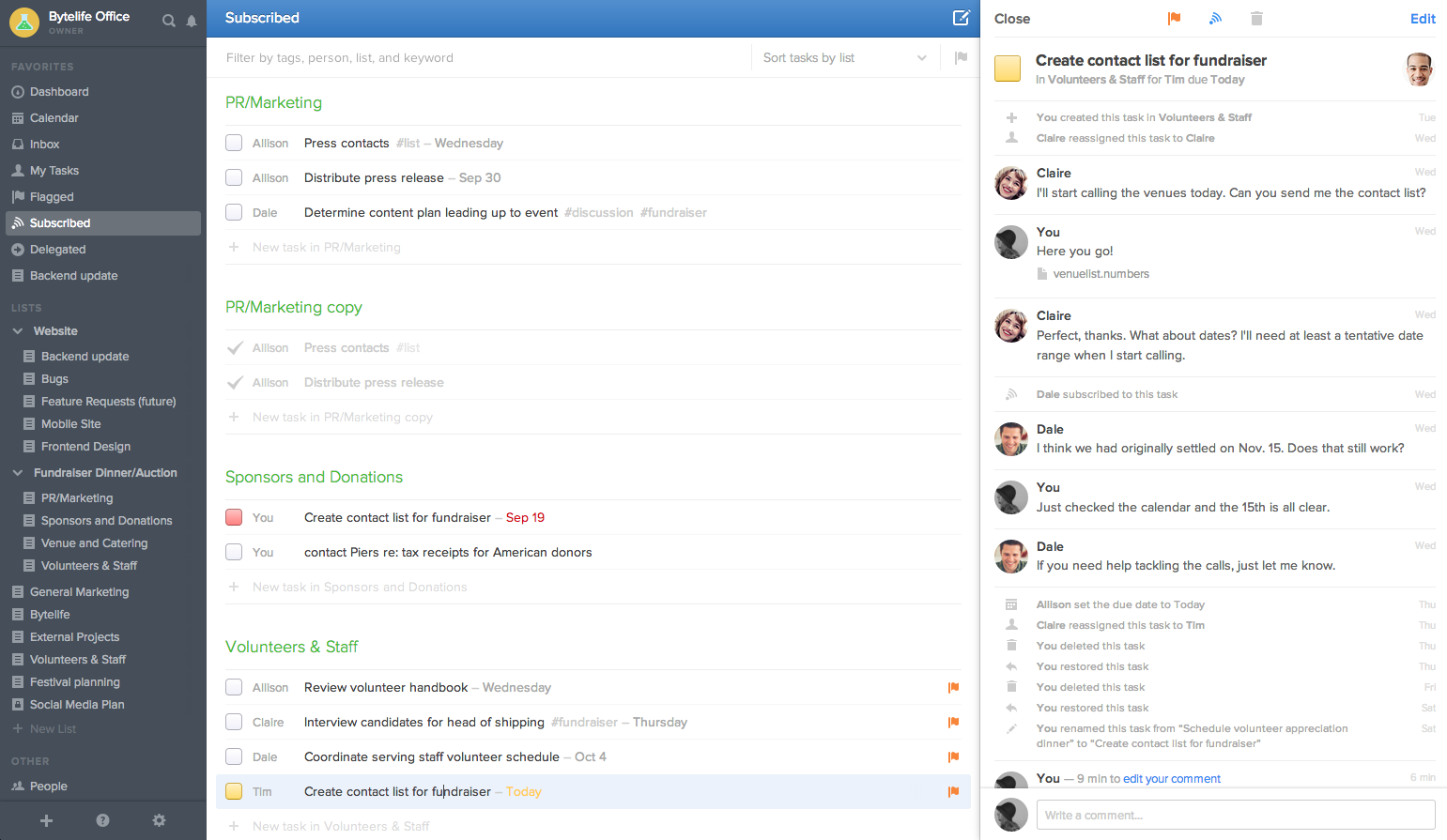
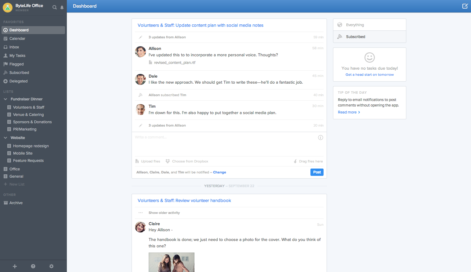
The first page you’ll nearly always see when you’ve logged into Flow is the workspace-focused Dashboard which gives you an overview of all relevant activity that’s taken place in the workspace. Akin to Facebook’s stream, this will feel familiar fast. Same-task activities are grouped together and you can respond with a comment inline.
Shared Upcoming:
View everyone’s due tasks in the new Upcoming calendar view.
Smart Quick Task
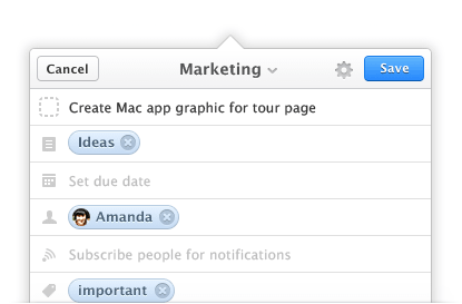
There are Quick Tasks for every list section so it’s nice and easy to add new tasks to particular lists and projects you’re working on. Keyboard shortcuts all work as normal too. Task descriptions have been removed in favor of using comments on a task page to describe details of a task.
Shared List Sidebar
The order and grouping (formerly “Folder”) are shared amongst everyone in the workspace.
App Pane
Tasks and day lists appear instantly in the app pane, allowing you to still view and manage task lists on the left.
New Mobile View
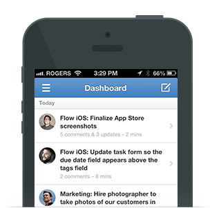 The iPhone app has been rewritten with performance in mind and includes a streamlined version of what you see on the desktop, with added views, including the mobile dashboard. There are also a number of neat little details to make adding and editing tasks and lists nice and easy.
There’s no manual reordering on mobile yet, however, which makes planning your day by drag and drop reordering of your tasks problematic. Android user? App is MIA for now but reportedly being built.
Unfortunately, the mobile web app leaves a lot to be desired with only options to view the dashboard.
Favorite Lists
You can add shortcuts to your most used lists by adding it to favorites.
Attachment Viewer: View all attachments in a task in a full-screen viewer. If your window is wide enough, the attachment view sits next to the task pane to let you read the feed and leave comments while viewing attachments.
Linked Repeating Tasks
Repeating tasks are now linked, letting you view all copies of a related task in a single list.
List Filter Bar
Quickly filter any task list by list, person, tag, or keyword.
Soft Deletion
No longer do you have to click past a confirmation dialog every time you delete a task. If you accidentally delete one (or many) you instantly recover it down the line from the Dashboard.
 Other small but significant new features and changes
- Internationalization Support: expect many new languages soon.
- Complete Retina Support: Flow now looks fantastic on Retina displays.
- Improved Responsiveness, Improved Drag and Drop: Using the latest HTML5 technologies, we’ve been able to greatly improve the performance and reliability of dragging and dropping. You can even drag and drop tasks between browser windows!
- Speed: Flow is faster than ever now with a speedier API, faster loading times, faster search.
- Its desktop Mac App has also been updated for the new Flow.
Pricing
Pricing is now far more favorable than in the past in my opinion, though the packages themselves feel somewhat odd to me. With the ability to segment a workspace into groups within a company, I’m not sure why a company would need multiple workspaces. I put the question to Flow who responded with :
“Our tiers are priced based on numerous different features, workspaces being one of them. Smaller companies will likely only need 1-2, but larger organizations will likely want to break up their teams/divisions/large projects into workspaces. For instance: We have separate workspaces for Flow, Ballpark, Pixel Union, our consulting team, etc.”
People numbers seem somewhat low for a corporate account but Flow assures me that Enterprise options for more than 50+ people are available, but just not self serve.
Conclusion
If you currently work with just one or two teams and the majority of your team is on iOS or OS X, Flow is going to be incredibly hard to resist.
It’s quite simple really: if Apple made a task management app for the web, this would be it. It’s slicker than anything else out there and now has the functionality to compete with any major team task management solution.
However; Windows and Android users will feel like they’re currently missing out on Flow’s’ full experience’ – no Android app, no browser extensions and no desktop app for Windows just yet. The good news, as I mentioned previously, is that an Android App is on the way.
Freelancers who work with a number of clients and projects might also find it difficult to manage their tasks with the plethora of Workspaces that may be needed – particularly with no overview of all tasks across all workspaces. But as I also mentioned previously, Flow has made clear this is a feature they’re building as you read this, so ensure you follow their blog or Twitter profile for future feature updates.
All in all though, Flow is a juggernaut of a task management solution and a pleasure to use. As long as it keeps its promises to solve its cross-workspace management frustrations and cater to Android (and potentially Windows Phone users too!), it has the potential to be the leading player in a very competitive space. It’s completely bootstrapped too.
➤ Flow
Get the TNW newsletter
Get the most important tech news in your inbox each week.

 Other small but significant new features and changes
