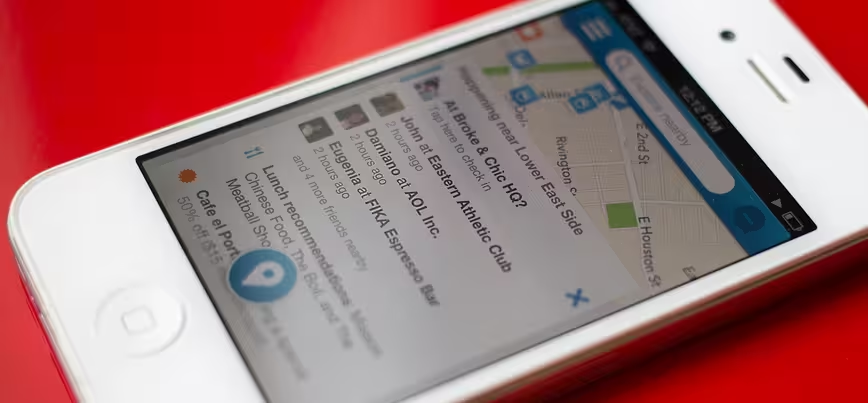
Foursquare today updated its iOS app to version 6.0, featuring improved search and recommendation features which mirror the company’s most recent Android app release.
This update comes with little surprise, as Foursquare has gradually shifted away from game mechanics over the past year, instead emphasizing discovery features which compete with services like Yelp.
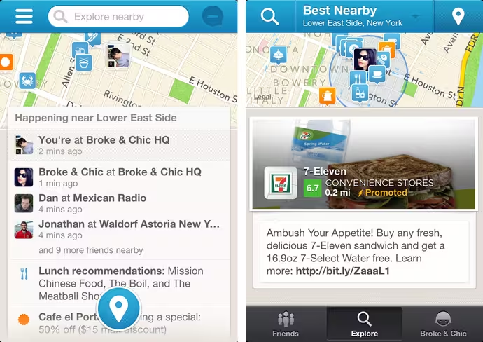
The latest iteration of Foursquare for iOS isn’t jarring, but the changes aren’t subtle either; the company has placed its explore section front and center, merging it together with the Friends tab. Here’s a look at the new Home section (left), compared to the old Explore section (right):

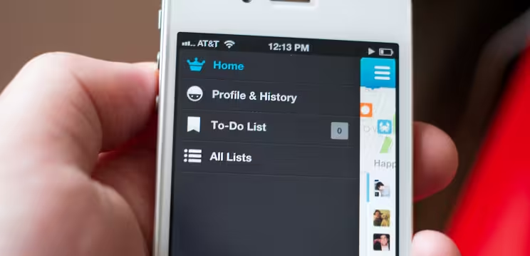
As a result, the profile tab has been placed on the back-burner; it’s now accessible in the app’s drawer-style navigation menu. To-do lists and settings have also made their way into this menu, giving both sections new prominence.

Beyond emphasizing discovery, removing the previously fixed bottom navigation buttons makes the app feel significantly more open — almost spacious.
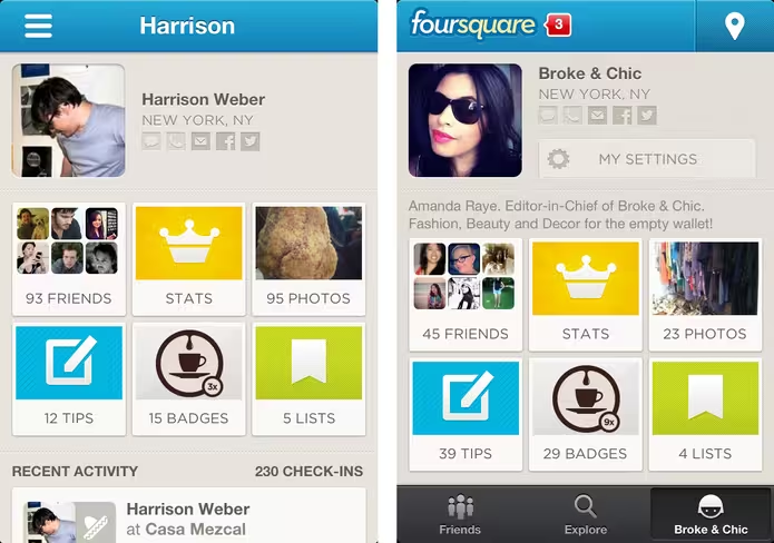
The profile page is one example of how the app now feels cleaner (shown below: left new, right old). It’s noteworthy, however, that checking-in and viewing notifications is now only available in the Home section of the app.

There’s an unexpected, almost quirky side effect to this update, too. Now that the check-in button is essentially floating at the bottom of the screen, it’s more difficult to ignore — it almost warrants a tap, just to see if it’ll go away.
The floating check-in icon takes some getting used to, but in terms of balancing discovery with speed, it’s a smart change. More subtle adjustments, like the absence of background textures and branding, leave the app looking slightly more refined.
It would be easy to complicate an app like Foursquare, but the company has moved elements around to push content first. Especially on a 3.5-inch screen, you’ll feel the difference immediately when you launch the app.
Did you notice the easter egg?
Disclosure: This article contains an affiliate link. While we only ever write about products we think deserve to be on the pages of our site, The Next Web may earn a small commission if you click through and buy the product in question. For more information, please see our Terms of Service.
Get the TNW newsletter
Get the most important tech news in your inbox each week.


