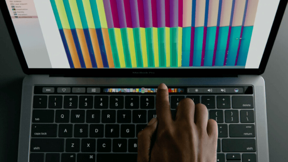
Some of us think the Touch Bar on the new MacBook Pro is a bit underwhelming, but at least there’s limitless potential to what developers can do with a mini touchscreen, right?
Apparently, not if Apple has its way.
See – as noted by TechCrunch – Apple wants you to take the Touch Bar really seriously, lest you be scolded by Jony Ive’s sultry voice. Here are some of the things Apple explicit tells developers to not do in its Touch Bar design guidelines:
- Don’t use the Touch Bar as a secondary display: “Although technically it’s a screen, the Touch Bar functions as an input device, not a secondary display.”
- Don’t use buttons wacky button designs: “…the Touch Bar should resemble the appearance of physical keyboard keys in terms of size and color.”
- Don’t you dare put keyboard shortcuts on there: “In general, the Touch Bar shouldn’t include controls for tasks such as find, select all, deselect, copy, cut, paste, undo, redo, new, save, close, print, and quit.”
- Don’t add animations: “The Touch Bar is considered an extension of the keyboard, and people don’t expect animation in their keyboard.”
Among many others.
Don’t get me wrong, I realize that Apple is just trying to keep things in check so that the Touch Bar doesn’t become a gaudy mess of glittery unicorns doodles hovering above your keyboard. Making it an extension of your keyboard, rather than your display, makes some productivity sense.
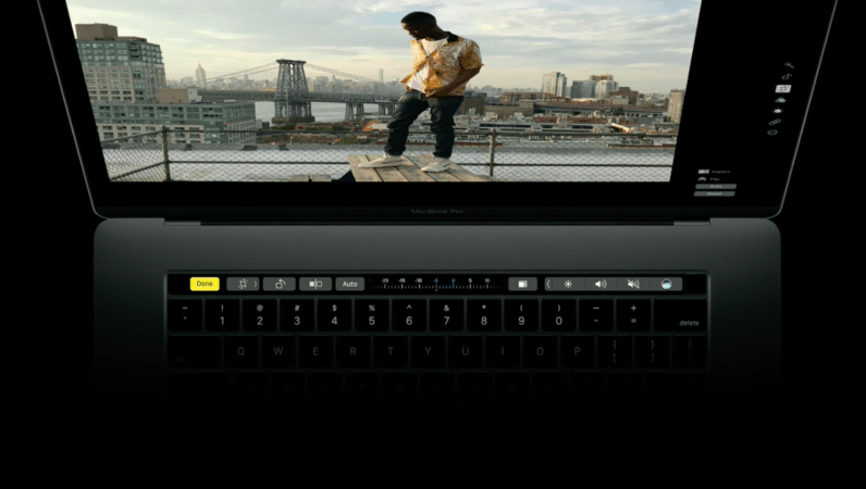
But there are also a myriad of obvious uses for a secondary touch display, and it’s a shame Apple is discouraging some of them. Some of these taboo things wouldn’t necessarily be better on the main screen, depending on how you use your computer. Some alternate uses for the Touch Bar off the top of my head
- An RSS feed, so I can follow news without wasting screen real estate while doing other things
- A Twitter feed
- Really, a feed of any kind
- Music visualizations when minimized
- In-game stats (to disappear the HUD)
- Quick app shortcuts
- Weather updates
- Copy and paste shortcuts, with clipboard access (because I do this all the time)
- A “where is my pizza” delivery tracker
- Zoomed in view in Photoshop for fine pixel adjustments
- Touch Bar mini-games (okay, this one is distracting, but wouldn’t it be fun?)
Besides, I have to call foul on the fun police attitude, Apple. The first look you gave us involved heavy use of emoji.
Let’s just hope Apple doesn’t put the kibosh on the developers out there with more eccentric ideas. If I want a never-ending feed of tiny hedgehog GIFs on the Touch Bar, gosh darn it, then let me have it.
Follow all our coverage of Apple’s MacBook Pro event here.
Get the TNW newsletter
Get the most important tech news in your inbox each week.
