Working off of feedback from users for a year, Twitter has made some welcome design updates to its web and mobile apps, as well as to TweetDeck and Twitter Lite.
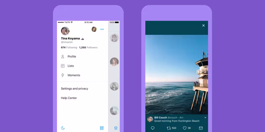
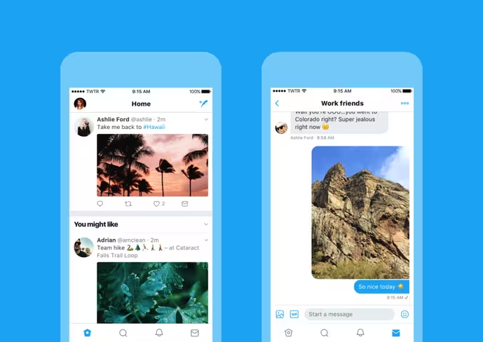
First off, there are simpler icons for things like replying to tweets (it’s now a chat bubble instead of a backward-facing arrow), and cleaner typography. Twitter has also jumped on the rounded profile picture bandwagon, which I’m on board with. Of course, if you’re using a logo for your brand’s account, you might want to adapt it to suit the new shape.
Next, the iOS app is catching up to its Android counterpart with a navigation menu that’s hidden away in a side panel on the left. That puts your Profile, additional accounts and settings in one place, and cuts down on the clutter in the tab bar at the bottom of the screen.
Plus, it’ll use Safari’s viewer to open links so you don’t have to log into sites you’re already signed into on that browser. If you prefer using the Reader view, you can set the app to default to that for all your links.
In addition, both mobile apps will get an accessibility option to boost color contrast across the interface so it’s easier to read.
Overall, Twitter looks a fair bit cleaner with this update. The changes will roll out over the next few days, so you should be able to see them on a screen near you soon.
Get the TNW newsletter
Get the most important tech news in your inbox each week.