There’s a lot of hooplah on Twitter today about… well, Twitter.
The company has just started a series of tests that tweak major changes to its design on iOS, including the replacement of the ‘fav’ button with a heart which we saw on Android last month.
It appears that Twitter is performing a series of A/B tests which revolve around the design of the reply, retweet and favorite buttons found directly below tweets in the timeline.
The first test makes the buttons significantly more prominent than their faded counterparts in the current design (pictured lower left), adding a circle to draw attention.
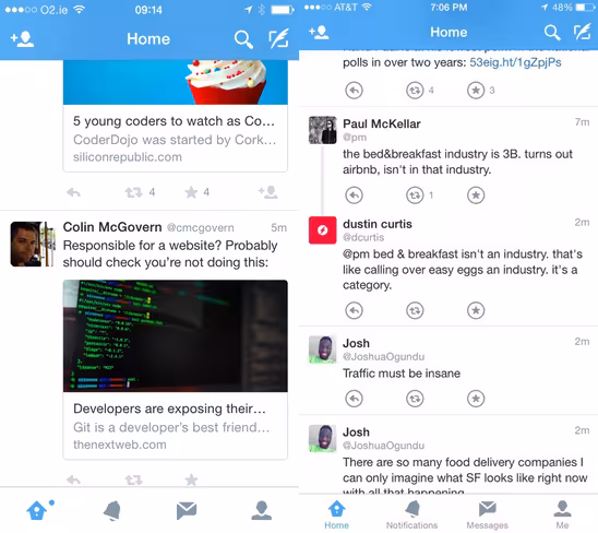
Another test fills in those buttons with a dark color to provide contrast, which looks awful.
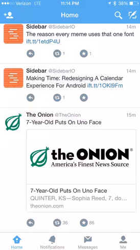
A third test adds the circular border and replaces the favorite button with a heart.

As you may have noticed in the final screenshot, Twitter has also been testing a white variation of its design for the last few weeks.
These button tests are obviously for a single purpose: pumping up engagement on the service. The company has very publicly said it wants to increase engagement across its social network and this is latest way to boost that.
Twitter pushing the new ‘like’ button test to iOS users as well as Android testers indicates that the company is seriously mulling killing the current favorite button.
I actually dig the new buttons — it makes them more obvious and encourages the user to stab them. I suspect the test will be very successful.
What I am worried about, however, is the death of the favorite button. The test expansion to iOS shows the company is seriously considering killing off the star in favor of the ‘like’ heart and I think it’s a bad idea.
Favorites mean hundreds of different emotions and responses — I’m done talking to you, I saw your message, I hate your message, etc — so simplifying it to a ‘like’ action dumbs it down to Facebook-level reactions. That may simply be because more people understand what the button actually means.
The change seems small enough that it won’t matter, but I think it’ll fundamentally alter the way people use the button. I’d be more interested in seeing the company extending the favorite in new ways, like Slack recently did with ’emoji favorites.’
Twitter, you can change anything you like, but please leave our favorite buttons alone.
Read Next: Twitter should copy Slack’s emoji favorites right now
Get the TNW newsletter
Get the most important tech news in your inbox each week.