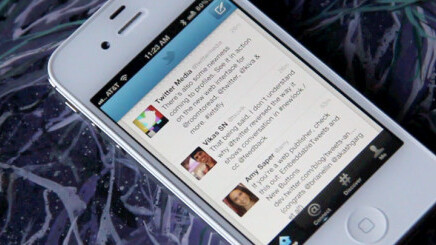
If you took a peek-a-leek at the ratings of Twitter’s iOS app this morning, you might have been a bit taken aback. The app’s current version clocks in at a healthy 4.5 stars, a near-perfect rating when you consider that there are over 6,700 entries.
But that rating was not so great in December. The app was averaging two and a half stars and had been for some time. In fact, the ratings had taken a serious hit since the redesign of the app to bring it more in line with the web version and away from the look of the app Tweetie from which it was derived.
So how did Twitter get a jump of 2 stars in under a month?
Since that initial version, the app has been tweaked and massaged in ways big and small. Most recently, background profile images and photo filters were added. There have been speed improvements and usability tweaks as well. It’s generally a much better app now than it was on first launch.
However, there are an enormous amount of people that think of Twitter not in terms of this client or that, but as a homogenous service. The Twitter app for iOS isn’t one client among many, it is the Twitter client. Period.
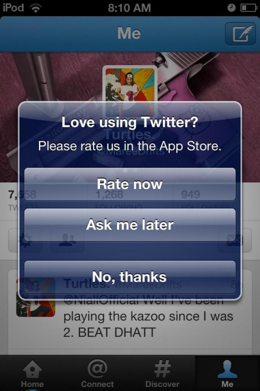
And that’s exactly who Twitter turned to when it needed to boost the ratings of its app. Over the holiday, Twitter began pushing a standard iOS ‘Rate This App’ notification to users of the app.
The notification reads ‘Love using Twitter? Please rate us in the App Store. Tapping on the rate button brings a user to the store so that they can plug in a rating.
These notifications are nothing new. A depressingly large number of apps in the store use a similar mechanic to hound their users into leaving a rating on the store. Some do it once, some do it multiple times. It’s almost always unwelcome…to some of us anyway.
Apparently, it wasn’t so unwelcome to all of those millions of Twitter users that have been using the app but not rating it. They seem to really like the Twitter app as it is, enough to send its ratings skyrocketing.
What does this tell us about Twitter and the App Store?
First, it tells us that no matter how annoying these ratings popups are to some of us, they do work, especially when you have an enormous userbase. The larger the base, the less likely they are to be picky about popups like this. So, yeah, don’t expect these to go away any time soon if a company can get a bump like this out of them.
Second, it tells us that most people are pretty stinking happy with the way that the app is now. Twitter has been in the process of building a completely different media product on the framework of the original message exchange system.
These new bits of muscle and sinew may feel foreign to some of us, but to new users (and those who have joined over the past couple of years), they are Twitter. And the app, which works on both iPad and iPhone, seems to serve these users well enough. And the addition of crowd-pleasing features like more photo-rich profiles and image filters likely didn’t hurt.
And there’s also the way that the notification was worded. A couple of very smart folks have pointed out to me that it’s language could suggest people to rate how they feel about ‘Twitter’ the service, rather than just Twitter the app. This could have skewed results to the positive, whether it was intentional or not.
Not that there aren’t complaints, and legitimate ones. Speed issues remain, there are glitches present in many simple interactions including several during the signup process. It still doesn’t feel like a completely ‘native’ app.
But, it seems, those issues don’t matter so much to most Twitter users. To the tune of 4.5 stars.
Get the TNW newsletter
Get the most important tech news in your inbox each week.


