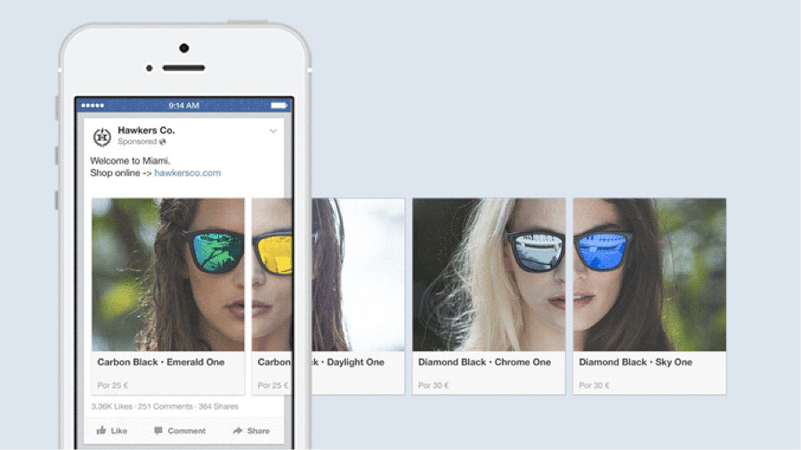
Facebook carousel ads are extremely engaging and fun way to promote your business.
According to data collected by Kinetic Social, these ads can also drive up to 10 times more traffic to advertisers’ websites than static sponsored posts on Facebook. And LOVOO found that they got a 72 percent higher click-through rate versus single image mobile app ads.
It feels clear these ads can be extremely effective, but how can you maximize their potential? In this post, we’ll walk through not just how to create a carousel ad but also how you can get the most out of your ads.
Let’s get started.
What are Facebook Carousel Ads?
The Facebook carousel format enables advertisers, across both Facebook and Instagram, to show 3-5 images, headlines, and links or calls to action in a single ad unit.
You may have spotted them in your newsfeed. Here’s how they look on desktop:
And on mobile:
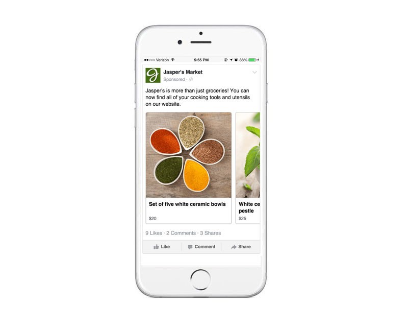
On mobile, users can swipe through the cards while desktop users can maneuver between images by clicking on the left or right arrows.
5 ways you could use Facebook Carousel Ads
Carousel ads are extremely versatile and can be used in a number of ways. While many businesses use this type of ad as a way to promote products, the ads also provide an excellent opportunity to showcase your brand’s uniqueness and tell a story.
In this section, I’d love to highlight 5 unique ways you can utilize Facebook Carousel Ads.
1. Highlight a product
Tieks are a specialist ballet shoe maker and used carousel ads to highlight one of the products. Each card of the ad focuses in on one aspect of their shoe, and they used the headline copy to provide more context to each image.
2. Illustrate how to use a product
Tyme Hair used carousel ads to showcase how you can use one of their products. To show how their curling irons worked, they used each card of the ad to share a step with a corresponding image.
3. Tell a story
Stories are an incredibly effective way of sharing your brands message and engaging with your customers. Project Repat, a company who make quilts out of old t-shirts, have used carousel ads to tell the story of how your memories can transform into a quilt.
4. Product tour
In the below example, Music app, Deezer have used carousel cards to give people a taste of the in-app experience before they even download it. Each card of the ad summarized a feature of the app, offering people a good idea of what to expect from the app.
5. Share an article
Carousel ads are an amazing way to share and promote articles. In the below example, Precision Nutrition shared articles from their website on healthy eating for athletes – this ad led to 6,000 new newsletter signups.
A quick experiment
We quickly tested Carousel Ads as a way to drive clicks to our content, and it’d be a pleasure to share our results here. Alongside the Carousel Ad, we also tested a Post Engagement Ad to give some context to our results. Here’s what we found:
- The Page Post Engagement Ad had a CTR of 1.05 percent versus 0.20 percent from the Carousel Ad.
- The CPC for the Post Engagement Ad was $0.57 versus $0.87 from the Carousel Ad.
- The Post Engagement Ad also generated 79 post likes, two comments, three shares and 38 page likes on top of the 188 link clicks at 80 percent of the cost of the Carousel Ad that generated two post likes, zero comments, zero shares, 155 link clicks and only one page like.
Our hunch is that, though it underperformed in this test versus a Post Engagement Ad, with a little bit of testing and optimization we could improve the effectiveness of the Carousel Ads as a way to drive clicks to content.
An initial thought is that maybe if the first card in the carousel ad didn’t quite do it, perhaps another one of the four would. Here’s what the first card looked like:

Have you experimented with Carousel Ads as a way to drive clicks to your content? If so, I’d love to hear your thoughts and experiences in the comments below this post.
How to create a carousel ad
It only takes a few simple steps to create a carousel ad, and I’d love to share how you can create these ads from your Facebook Page and also from Adverts Manager.
Let’s go!
From your Page
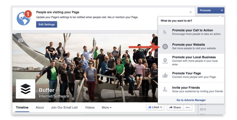
To create a carousel ad from your Page click the ‘Promote’ button on the top right corner of the page, and then select ‘Promote your website’:
Next, you’ll see an Ads window open up, under the ‘Images’ section of this window click the ‘+’ button to add multiple cards to your carousel:
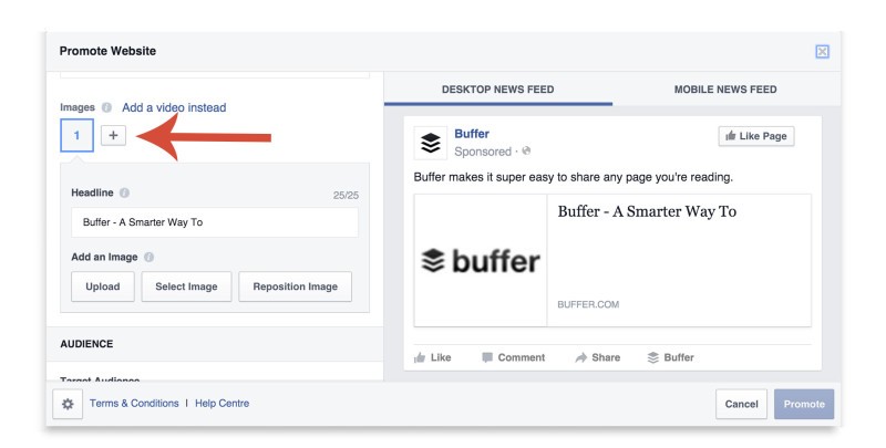
Once you’ve added the number of cards you’d like (anywhere from 3-5), you can add an image and headline to each card, and when your ad is looking great and ready to go, fill out the Audience, Budget and Duration fields then hit ‘Promote’ to put it live.
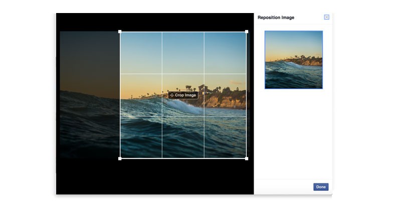
Pro tip: If you need to crop an image, click Reposition Image to drag and drop the Crop Image tool onto the part of the image you want to show.
From Adverts Manager
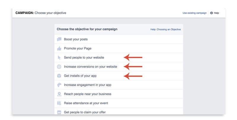
To kick off a carousel ad campaign from Facebook Adverts Manager, first click ‘Create advert’ and then choose either ‘Send people to your website’, ‘Increase conversions on your website’ or ‘Get installs of your app’ from the campaign objective page.
Step 1: Create Advert
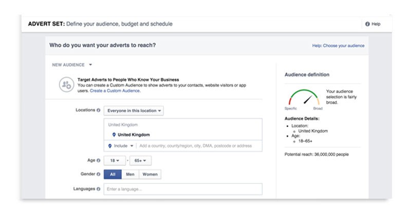
This is where you can create your carousel. When you reach the advert creative screen, choose ‘Multiple images in one advert’ to build a carousel ad.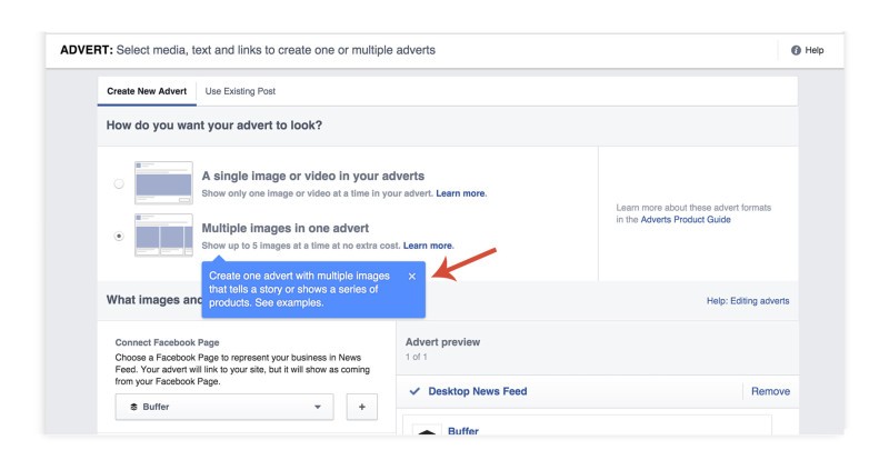
Once you’ve uploaded your creative, you’re good to go and put the ad live.
How to create the perfect carousel ad
Grab attention with the first image
Facebook’s Newsfeed is a very busy place, and users are often overloaded with content. To help your ad succeed, pay close attention to the first image and be sure it makes sense on its own and also grabs attention.
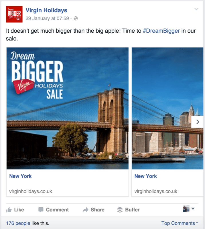
A great example of this is Virgin Holidays post about their #DreamBigger sale. The first card on the carousel shows you exactly what they’re offering and grabs attention with a powerful image of New York City:
Adhere to Facebook’s recommendations
Facebook have shared some design recommendations for Carousel Ads. If you’re looking to maximize your performance, it could be best to try and stick to these where possible.
Here’s a snapshot of their recommendations:
-
Recommended image size: 600 x 600 pixels
-
Image ratio: 1:1
-
Text: 90 characters
-
Headline: 40 characters
-
Link description: 20 characters
-
Your image may not include more than 20 percent text
Pro tip: Use the Headline space under each image for product names or benefits, price or percentage off, or a call to action
How to create one long image
Some advertisers choose to break up one big image into cards, to tell a great visual story as the user swipes (or clicks) through them.
Here’s an example:

If you’d like to create an ad in the carousel format that showcases one long image, here’s how to do it:
- Decide how many carousel cards the image is going to cross (this should be anywhere from 3-5 cards).
- Create an image with the correct dimensions. Its height should be 600 pixels, and its width should be 600 pixels multiplied by the number of carousel cards used (ex: a four-card image should be 2400×600 pixels).
- Upload this same image for each carousel card, but crop it at equal intervals to divide it up across the cards. Alternatively, you could crop each 600×600 card using image editing software like Sketch or Photoshop before you upload.
Pro tip: Facebook has an option to automatically show the best-performing images first your carousel. If you’re creating a long image across multiple cards, it’s best to leave this box un-ticked.

6 creative examples of carousel ads
1. Straight Outta Compton
Straight Outta Compton used carousel ads to showcase sections on the film and announce its release on VUDU.

2. Deezer
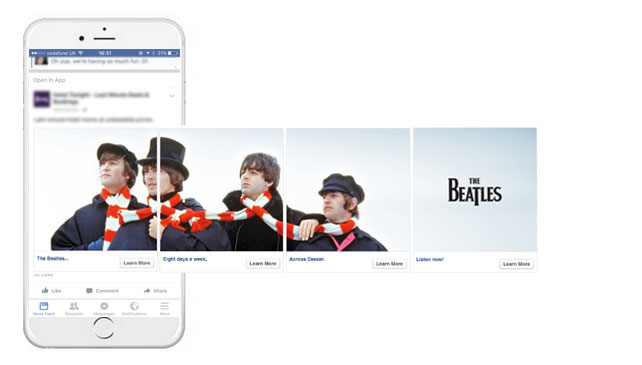
Deezer turned to carousel ads to announce that The Beatles music is available in their app. The ad features an image of the group spread across three cards and utilized the headline space on each cards to break the news about The Beatles being on Deezer.
3. Xbox
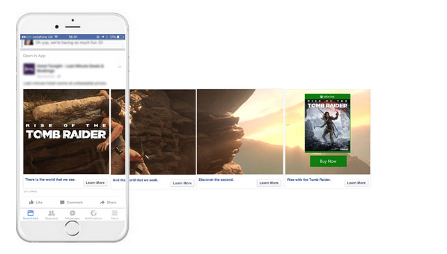
To promote the latest Tomb Raider game, Xbox used a panoramic shot of character, Lara Croft, hanging on a cliff face.
Alongside the images, Xbox used the cards headlines to tell trail the story of the game. The last cards on the carousel was a link to purchase the game.
4. Fallout
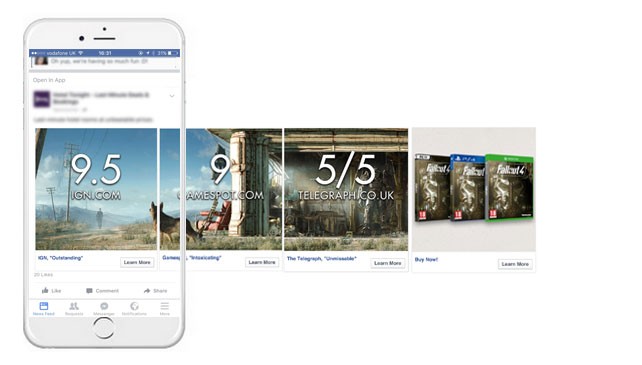
To promote Fallout 4, Bethesda Game Studios used carousel ads to share ratings and reviews from well-known and trusted games industry websites and magazines.
5. Tesco
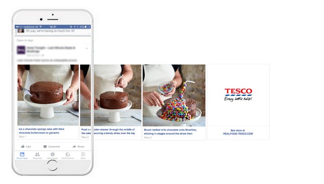
Tesco used carousel ads to showcase a step by step recipe and link back to Real Food blog.
6. Chipotle
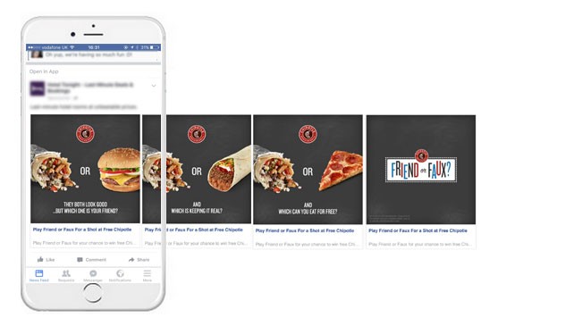
Chipotle used carousel ads as a to drive attention to their ‘Friend or Faux’ campaign; the cards compared Chipotle meals with other varieties of fast food to ask which is your friend and which is your faux.
➤ This post originally appeared on Buffer
Read next: Facebook’s new slideshow ads are better than video for slow data connections
Get the TNW newsletter
Get the most important tech news in your inbox each week.


