
I try to read as much as I can, and every morning I put aside 30 minutes to check out the latest posts from my favorite blogs and writers.
In 30 minutes, you can only take in so much. Some posts I read thoroughly, others I open and close again within a matter of seconds. My favorite ones, I load into Buffer and share.
Often, my decision to read a post and then subsequently share it relies a lot on the formatting: Is it easy to read? Can I scan through?
In this post, I’m excited to share with you why formatting is so important and discuss some tips and tricks you can implement into your own content to increase its potential for sharing.
Why formatting is as important as the content itself
When it comes to creating highly shareable content online, there are few aspects more important than formatting.
Attention is a scarce resource — especially online. This is illustrated by a Microsoft study that found the average attention span of an internet user has dropped substantially from 12 seconds in 2000, to just eight seconds in 2015.
If your post doesn’t look instantly appealing, your readers will click away before ever seeing how great your content is.
To showcase the importance of formatting, let’s use one of the Buffer blog posts as an example. On the left below is a formatted version of the post (the one you see on the blog), compared to an unformatted version of the same post on the right.
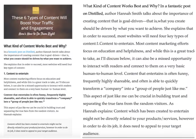
Both of these images contain exactly the same content. And it seems the formatted version is far easier to read and instantly much more appealing to to the eye.
Thankfully, there are some formatting techniques, tips and tricks that we’ll cover today to make your content super-easy to read and highly shareable.
Let’s dig into it, starting with some quick wins you can implement in minutes.
Formatting Your Content: 3 Quick Wins
1. Use eye-catching subheadings
Subheadings are used to divide content into scannable blocks that both Google and your reader will find easy to digest.
When adding a blog post to your CMS (content management system, like WordPress) you’ve maybe come across tags like <H1> or <H2> before. These Heading Tags are the way to format headings and subheadings in online content.
Heading Tags range from H1 down to H6 (though H5 and H6 are largely unused online today).
The H1 tag is typically used for your blog title, it’s best practice to only everhave one H1 tag on a page.
Google uses H1 tags to categorize the content of a page — if you have multiple H1 tags then it’s difficult for Google to figure out which keywords to associate with your content.
The H2 tag is often used for subheadings of an H1 and then H3 is for subheadings of an H2.
It’s best practice to keep the use of each tag consistent across your site to increase readability. For example, this is how we use tags to structure posts at Buffer:
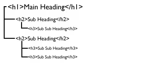
At Buffer we also like to use a technique we’ve called the Heading Stack where we use an H2 followed directly below by an H3. You can see this technique being used on many posts.
2. Make it scannable
Most online readers scan through content. In fact, even if someone enjoys your work, they’re only going to read 20–28 percent of a post on average.
Your formatting ensures that the reader can get all of the important information out of your content without reading it word for word.
To make a post scannable, before publishing I read it through and highlight any important sections that I feel the reader needs to take in to get the most value from the post.
Then to bring these highlights to life I use bold, italics and bullet point lists in this way:
- Bold is used to highlight important sentences and capture the readers’ attention.
- Italics are mainly used to bring out conversational sentences.
- Lists (like this one) help us process information more easily than when it’s clustered in paragraphs.
3. Short paragraphs
Progress makes us feel good. No one likes to put effort into a task and feel like they’re going nowhere.
The same applies to reading. Short paragraphs make you feel like you’re progressing through content quicker and gives you a sense of advancement.
One way to do this is to structure your paragraphs using the inverted pyramid style. This means you start each paragraph with your conclusion first, then use the sentences that follow to support it.
This graphic from CoSchedule describes it well:
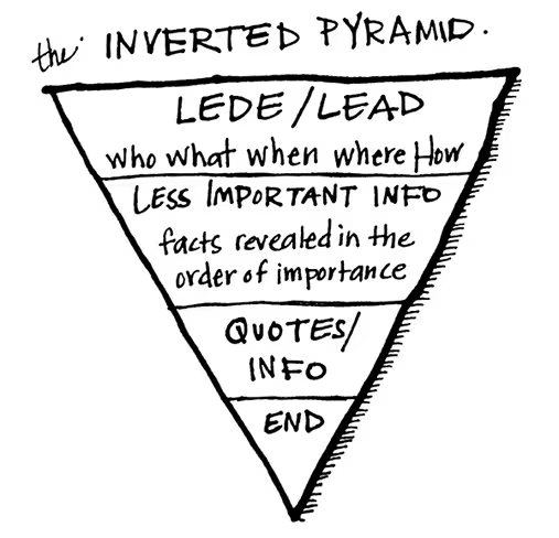
The inverted pyramid approach is so useful as it means readers can scan from point to point and if something grabs their attention then they can carry on reading to dig deeper.
Make your content easy to share
If you want people to share your content, you’ll want to make it as easy for them as possible.
During a recent experiment, Crew started testing share buttons at the top and bottom of each article on their blog and Jory MacKay, Crew’s editor, opened up about their findings in one of his writing dispatches.
One finding Crew picked up on early in their experiment is that readers are more likely to share using the buttons at the bottom of a post, compared to the ones at the top. MacKay believes there are a couple of reasons for this trend:
- The share buttons are more obvious and recognizable at the bottom.
- People are more likely to share a post that they’ve read through.
In his post, MacKay also refers to the importance of prototypical elements:
In the most basic terms, this just means we like what we know. When we expect to see something on a website in a specific place with a specific style (like sharing buttons at the top or down the lefthand side of a post) we feel good when they’re there and disconnected and unsure when they aren’t.
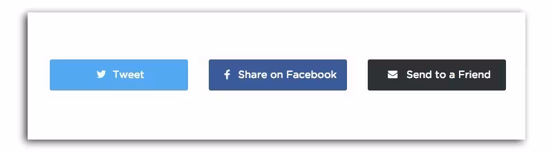
When it comes to share buttons there are four key aspects to keep in mind:
- Position: whenever you visit a blog, you expect to see share buttons in certain positions (left hand side, top or bottom of the post), by keeping to these expected standards, readers won’t have to go looking for ways to share your content.
- Color: color is hugely important in marketing. If you use the correct brand colors on share buttons readers will instantly associate each button with its respective platform (e.g. a Twitter blue button will mean share this post on Twitter.)
- Branding: logos are prototypical elements. When we see a little bird icon chirping at the bottom of a post, we know we can share to Twitter without needing to think about it. You don’t need to use both the logo and brand color, but should always have one or the other.
- Social validation: if we’re unsure about something, we unconsciously look to others to guide us. When we can see a post has been shared hundreds or thousands of times before, this social validation makes us more likely to share.
Tip: Don’t overlook mobile
Here at Buffer large chunks of our Social blog traffic come from iOS and Android devices.
When we discovered that share buttons weren’t appearing on mobile we added the SumoMe plugin and almost instantly saw an uplift in shares, as Kevan explained in a recent post:
Now we get 500 social shares per week and nearly 7,000 total since the change — all of which we would have never had were it not for the consideration of responsive design and mobile visitors.
Best share plugins for WordPress
Get the images right
Our brains retain much more information when it’s delivered visually, in factone study found that people retained only 10–20 percent of written or spoken information but almost 65 percent of visual information.
We also process visual information more efficiently than text. Just see it yourself with this great example from Uberflip:
Supporting text with visuals means that readers can can scan through and still pick out the most important and relevant takeaways.
Images are also highly shareable and posts with images on Twitter on average receive a 35 percent boost in Retweets.
What kind of images work best?
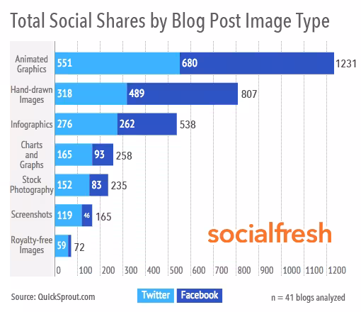
QuickSprout did some research into what types of images generate the most social shares for a blog post.
The data found that animated graphics were the best type of images to use in you blog posts if you want to generate more shares, as you can see in the below graphic from Socialfresh (created using data from Quicksprout’s study).
For a great example of how animated graphics can enhance your content, check out how product studio ustwo use them on their blog:
Second, just behind animated images, Quicksprout’s study found that hand-drawn images (like those on The Oatmeal) increase social shares.
Infographics came in third place. With graphs and charts in fourth. Furthermore, posts that included graphs and charts received 258 percent more trackbacks than blog posts with other types of images.
(P.S. If you’re looking for a GIF to include in your next social update or blog post check out our handy GIF moodboard.)
Use quotes
Quoting experts and thought leaders is a great way to give your content some added credibility and build trust amongst your audience.
One much-overlooked benefit of using quotes, however, is that they can increase the amount of shares your content receives.
A study by Twitter found that quotes get a 19 percent boost in Retweets. This study was also backed up by Dan Zarella who found that Tweets including quotation marks were 30 percent percent more likely to be Retweeted than those that did not.
How to use quotes in your content
There are various ways to include quotes in your content and you don’t have to use the same method in every post you write:
- At the start of the post: many books open each chapter with a quote, you can take the same approach by including an appropriate quote to kick-start your post.
- To support a point you’re making: quotes are a great way to support a point you’re making. Where possible I try to quote a well-known or experienced source to back up my points.
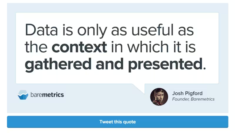
- To make a point standout: this is something Baremetrics do very well, they pick out a key point from the post include an easy-to-share graphic.
Formatting quotes correctly
If you’re using quotes in your post it’s a good idea to distinguish them from the rest of the content.
If you’re just quoting a couple of words, then it can be best to use quotation marks and italics. For example, “this is a short quote.”
If you’re using longer quotes, then you can format them using the <blockquote> HTML tag. Remember it will format everything the same afterwards so you need to close the formatting buy putting </blockquote>
Here’s how a blockquote looks on the Buffer Social blog:
The secret of leadership is simple: Do what you believe in. Paint a picture of the future. Go there. People will follow.
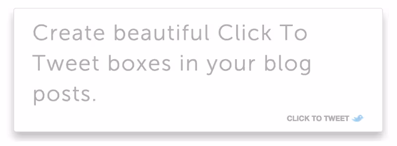
CoSchedule also have a brilliant WordPress plugin to make quotes easy-to-Tweet.
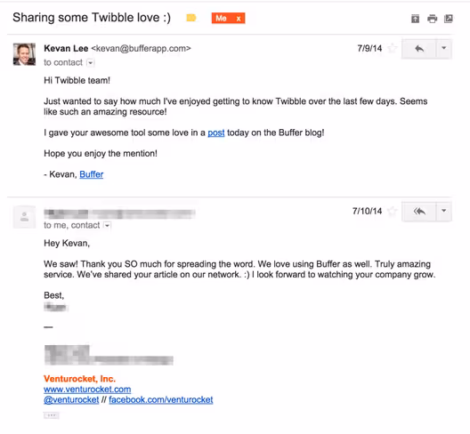
Reach out to everyone you quote
Getting in touch with the people you quote in your post is a great way to increase the amount of shares your content gets and help you to connect with new audiences.
A few top tips for emailing people you’ve quoted:
- Keep it short: their inboxes are probably very busy, keep you message concise and to the point.
- Don’t ask them to share: you shouldn’t explicitly ask them to share your post, this message is simply to let them know you mentioned them.
- Include a link: you don’t want person you quote to have to go off in search of your post, include a link to it’s east for them to check out the post.
Here’s an example email Kevan sent after mentioning Twibble on the Buffer Social blog:
Quick fire: How to format your social shares
The way you format your posts on various social channels can give you a competitive advantage and help increase your shares.
Here are some quick fire tips to make your Twitter, Facebook, Linkedin, and Google+ posts more shareable.
Here we go!
Formatting a Tweet for maximum Retweets
Tweets, by their very nature, have a short life-span (research suggests around 18 minutes), that leaves you a very short window to grab the attention of your followers and gain some Retweets.
If you’re looking for Retweets the optimal length for a tweet is between 100 -115 characters.
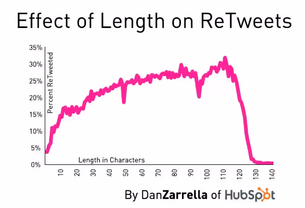
Twitter shared some insight into what fuels a tweet’s engagement. Here are some highlights from their findings:
- Photos average a 35 percent boost in Retweets
- Videos get a 28 percent boost
- Quotes get a 19 percent boost in Retweets
- Including a number receives a 17 percent bump in Retweets
- Hashtags receive a 16 percent boost
It’s important to note that these results may vary by industry. If you want to increase your Retweets, you might want to test different types of tweets (some with images, some using hashtags, etc) to see what works best for you. You can use a tool like Buffer analytics to test and measure your results.
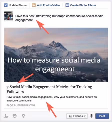
Standing out on Facebook
According to certain sources (Facebook itself even), the perfect Facebook post is a link post. The information shared by Facebook itself on this subject is pretty fascinating:
We’ve found that people often prefer to click on links that are displayed in the link format (which appears when you paste a link while drafting a post), rather than links that are buried in photo captions. The link format shows some additional information associated with the link, such as the beginning of the article, which makes it easier for someone to decide if they want to click through. This format also makes it easier for someone to click through on mobile devices, which have a smaller screen.
One of the brilliant things about links is that most fields are customizable, too. You can add your own status to accompany the link (you can also do this using Buffer), change the heading copy and summary text as well using Open Graph tags.
When you come around to adding the status, research shows it’s best to keep it short. BizLocal found that longer posts tend to perform poorly and the ideal length is between 100 to 119 characters. With questions tending to drive interaction up by 10 to 20 percent.
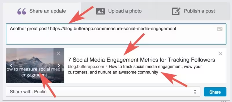
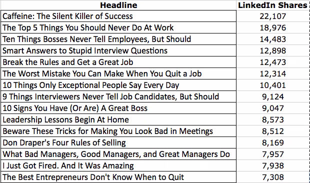
Breaking through on Linkedin
Like Facebook, Linkedin has posts are highly customizable. You can edit the link headline, description, thumbnail image (using Open Graph) and add your own status (using Buffer) to sit nicely alongside the link.
If you take a look at the most shared content on Linkedin in September 2014, you can see they have short, snappy titles — generally under 10 words.
If the headline of the post you’re sharing is longer than 10 words, shorten it up a little to increase your sharing potential.
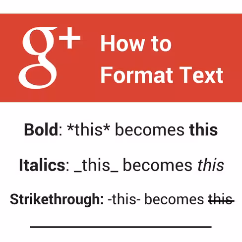
Google+
Unlike other platforms, longer text is encouraged on Google+. Research by Quintly shows that the average Google+ post peaks at 156 characters, or 2–3 sentences.
With these longer posts in mind, Google+ allows you to format the text in your update using use bold, italics and strikethrough text, so that you can make it easier for readers to scan.
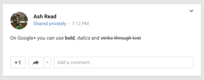
You can format text on Google+ using this guide from Social Media Examiner:
Over to you
I’d love to hear your thoughts on formatting content that gets shared.
Is there anything new you picked up in this post you’re going to try?
What’s worked for you in the past? Any formatting tips you’d like to share?
This post first appeared on Buffer.
Get the TNW newsletter
Get the most important tech news in your inbox each week.