
Vivek Sharma is the co-founder and CEO of Movable Ink. Vivek is leading the charge to make email a more dynamic and relevant communication channel for marketers and consumers. With a background in both sales and product development, Vivek brings a potent combination of engineering talent and business savvy to his role as Movable Ink’s CEO.
Creating responsive emails that look great on mobile devices isn’t a nice-to-have anymore – it’s a necessity. According to our Q4 2014 Consumer Device Report, nearly 67 percent of emails were opened on a mobile device.
But according to Salesforce’s 2015 State of Marketing report, nearly half (42 percent) of marketers say that they rarely or never create responsive emails.
The thing is, it’s not that hard to create responsive emails. With the right design hacks, email marketers – whether they’re a team of one or a team of twenty – can start creating more effective emails that look great on mobile and engage consumers who are on-the-go.
Here are 10 quick design hacks that brands can use when they’re designing responsive emails:
1. Ditch the Multi-Column Approach
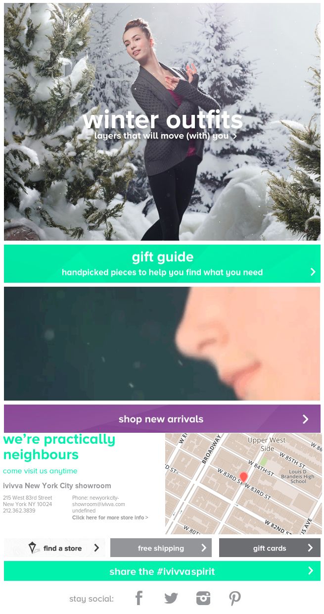
Image credit: ivivva
A lot of brands create regular email newsletters with multiple columns to split up content. That might mean that you have new announcements and upcoming events in a side column and major content or deals in the main column.
On mobile, columns can be tricky to navigate. Many brands have opted for infinite scroll websites and emails need to follow this “scroll-down” philosophy.
Single-column emails should position the most important content on top, with buttons and prominent links showing customers the next steps.
2. Watch the Font and Subject Line

Image credit: Carnival
The smaller the font, the harder it is to read on mobile devices. In general, it’s better to make the font too big than too small. A size of 16px is great, although you might want to experiment with sizes all the way up to 20px or more.
The font style should be considered as well. Send a variety of emails with different fonts to see which looks best in your emails.
Ensure that the subject line and pre-header text are working to support each other and keep the subject line somewhere between 30 and 45 characters for mobile devices.
3. Create a True Hero Image
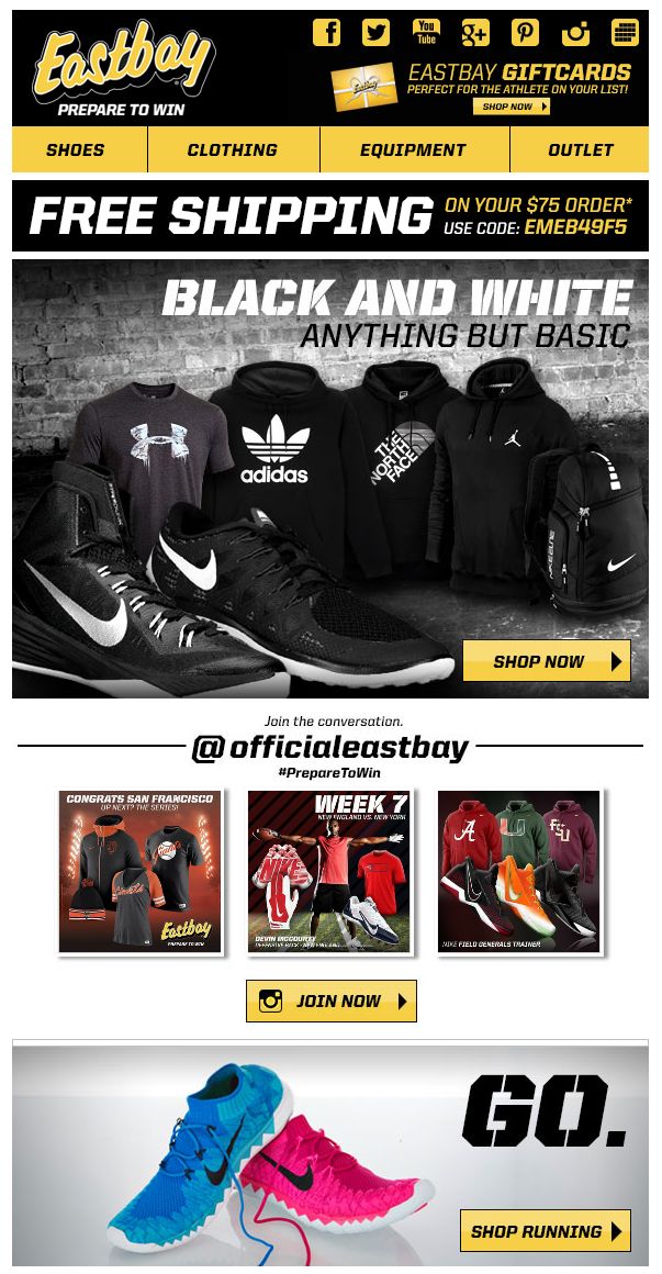
Image credit: Eastbay
The hero image can really become a superhero image in a mobile screen. Most customers aren’t likely to explore your email much further if it requires scrolling, so this is your big chance to drive action.
That said, it’s important to make sure that your hero image can render properly. Sometimes, hero graphics will appear to be smaller than the text, especially any header text that you include.
4. “Thumbify” Your Links
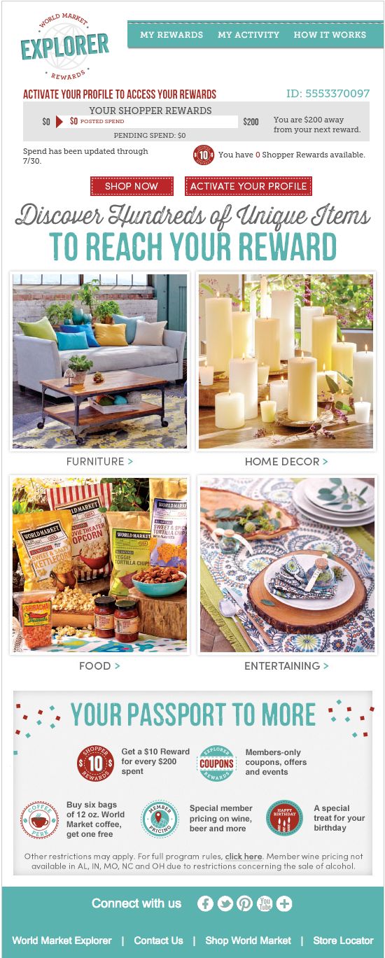
Image credit: World Market Explorer
Every time you include a link in your text, remember that users will have to access it with their thumbs. That means getting landing pages and websites ready for mobile devices, but also making sure that the link itself is possible to “thumb.”
Bigger font sizes can help, but more importantly make sure links aren’t packed together. Too many links in a single paragraph can lead to users pressing the wrong link and getting frustrated.
One tactic to avoid crowding URL links too closely together is to use pixel padding to allow for area around or between clickable areas.
5. Keep the Best Stuff Above the Fold

Image credit: Virgin
In responsive design, the “fold” is the point of an email where users have to start scrolling to look at more content. That means emails need to show the most important content above the fold.
Think carefully about what graphics and copy go into the top section of the email. That’s the first thing your subscribers will see when opening your email and, if they don’t scroll, it’s the only thing they’re going to see.
If you want mobile users to convert, the best strategy would be to make your calls to action easily accessible. These can take the form of large, square-shaped buttons that take users to your product.
6. Offer Different Content for Many Devices
The hardest part of responsive design is creating content for different devices. Many brands have to create separate graphics and layouts for mobile and desktop emails. They don’t think about how to build separate graphics or calls-to-action for iPhone users versus Android users. A lot of the time, they don’t have the technology to do it.

But there are contextual marketing platforms that allow companies to create email content that changes depending on the device on which it’s opened. That means that a hero image to download an app could be placed at the top of an email when it’s accessed on a mobile device or an email could offer exclusive iPhone downloads to iPhone users but show something else on a desktop or Android device.
7. Build a Content Strategy
If a customer opens an email, what are they going to see? What’s going to make them convert and what might make them hesitate?
This is what brands need to consider when they’re developing a content strategy for mobile. Customers likely aren’t spending a lot of time checking their email; they’re just flipping through their inboxes looking for anything interesting or anything that could be deleted. Your content needs to drive action immediately or it’s likely that the email will be forgotten or deleted after the initial open.
With the smaller mobile screen devices you have less real estate and the primary screen space should be dedicated to the most important message or feature that you want to deliver. You’ll need to understand your content strategy to know what this primary message or feature will be.
8. Make Your Emails Local
One of the most important data points in mobile emails is location. This can make all the difference in the world: if your customers get an offer and there’s a map showing that the closest store is only a few blocks away, they’re far more likely to walk over and redeem that offer.
Geo-targeted emails can create this kind of seamless, personalized experience and see huge results. AIMIA, for example, saw a click- through rate increase of 66.67 percent when including a map of locations where customers could redeem rewards points.
9. Create Big Beautiful Buttons
In the quest to “thumbify” every email, marketers should create buttons that can be pressed from the confines of a smartphone screen. Buttons should be sized for optimal mobile rendering, which means resizing them to about 48px.
Social media buttons often get left behind in the shuffle when brands are creating responsively designed emails. If you’re trying to encourage social sharing, make sure that Twitter, Facebook, and LinkedIn icons are comfortably clickable, too.
With the right technology, you can even integrate live social media content from Instagram or Twitter right in the email.
10. Test, Test, and Test Some More

Most email marketers are pretty familiar with the fundamentals of A/B testing. Splitting your audience and sending out two different emails is crucial to finding out what kinds of subject lines, content, and creative converts the best.
With responsive emails, you also want to see how each email renders on every device. This can be a tricky process to test out. Often, email marketers can test responsive emails on their own devices but there’s no assurance that the email will look as good on an Android if all you’ve done is looked at it on an iPhone.
Then, there’s the fact that A/B testing essentially gives half of your audience the losing creative that doesn’t perform as well. However, with real-time A/B testing and creative optimization, you can actually test different variations on creative and copy and, when one proves to be more effective than another, you can switch the losing creative with the winning creative, the majority of your entire subscriber base sees the best-optimized email.
The Next Generation of Responsive
While many marketers are still hesitant to commit the time and resources to making sure every email is responsive, others are striking ahead and offering real-time experiences with dynamic content.
Local maps, weather-targeted sales offers, and more have become common practices for email marketers that have already perfected the art and workflow of designing responsive emails.
Brands that are still only creating piecemeal responsive email strategies should start small by streamlining the design process. From there, it’s possible to start taking responsive to the next level.
Read Next: The email hot or not list
Image credits: Shutterstock
Get the TNW newsletter
Get the most important tech news in your inbox each week.