This post originally appeared on Buffer’s blog.
You’ve got all the great tools to create engaging images for social media. You know what the brain loves about visuals and how to build something beautiful to drive engagement. You’re all set to make something great!
One last thing: How exactly should your image look so it fits in the News Feed, timeline, or stream?
There’s so much to consider in creating great images for social media—for me, the size and shape tend to get locked in before I even realize what’s happened. Yet the size and shape—the height, width, and orientation—are the elements that most influence how an image will appear in a social media stream.
Fortunately, there’re some answers out there on how to create ideal images that show up consistently great in your audience’s timelines. We’ve collected all the answers here, along with our favorite two templates to fit any network.
Ideal image sizes for social media
Image sizes are a huge topic to cover.
There’re ideal image sizes for cover photos and profile pictures, Facebook ads and Twitter cards. Several in-depth blog posts have tackled an overview for what’s best in all these many different spots. Here are two of my favorites:
Most of the major social media channels like Facebook and Twitter now give you added control over how your profile picture and cover photo look. You get some really neat tools to resize and scale these pictures until they’re pixel perfect.
Here’s the process for a Facebook cover photo, for example.

For ideal sizes on cover photos and profile pictures, I’d highly recommend the sites mentioned above. They’ve got it all covered.
I’d love for this post to focus specifically on the social media images you share with your updates, either as image attachments or as links.
The best sizes for sharing images on social media
We’ve long been interested in the impact of social media images for engagement, retweets, clicks, and more. We found that tweets with images receive 150 percent more retweets than those without.
One of the big questions for me is how you get an engaging image to look its best when it’s in a stream, timeline, or News Feed?
What’s the best—and maybe even the easiest—way to go about it?
In general, here are the best sizes for sharing images on social media. (Click on any link here to jump to the details for a specific network.)
Facebook – 1,200 x 628
Twitter – 1,024 x 512
LinkedIn – 800 x 800
Google+ – 800 x 1,200
Pinterest – 735 x 1,102
Instagram – 1,200 x 1,200
Our two favorite image size templates that cover most networks
In experimenting with the fastest, easiest way to create images we know will work well in social media feeds, we came across a couple of image sizes that became our go-tos: one size for horizontal (landscape) images and one for vertical (portrait) images.
- Horizontal (landscape) – 1,024 x 512
- Vertical (portrait) – 800 x 1,200
Note: If you’d like to grab either of these as a Canva template, we’d love to make this easy for you. Click here for the horizontal template; click here for the vertical template.
One of the simplest ways we’ve found for creating the 1,024 x 512 pixel images is to use Pablo. You can create an image in under 30 seconds and share directly to Twitter, Facebook, and Buffer.
We use the horizontal size for sharing to Facebook and Twitter.
We use the vertical size for sharing to Google+ and Pinterest.
The horizontal size, as you’ll read below, fits perfect for Twitter’s 2:1 aspect ratio. The fit isn’t quite spot on for Facebook, yet we’ve found that it’s close enough where no important bits get cropped when Facebook resizes things.
If you prefer to have a square image size to go along with the portrait and landscape orientations, Constant Contact has some good recommendations for what they’ve used successfully.
- Square – 1200 x 1200 (share to Facebook and LinkedIn)
- Landscape – 1200 x 627 (share to Facebook and Twitter)
- Portrait – 736 x 1128 (share to Pinterest and Google+)
Ideal Facebook post image size
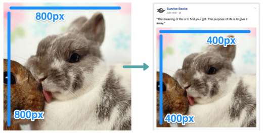
The orientation of your image—whether it’s horizontal (landscape), vertical (portrait), or square—will determine which dimensions Facebook uses to show your image.
If you upload a square image to share, it will be 470 pixels square, the maximum allowable size in a Facebook feed. This’ll be the case no matter what size square you upload, be it an 800 x 800 image or a 400 x 400 image (the smaller images might appear a bit blurry when they are sized up to 470 pixels square).
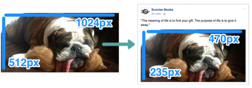
If you upload a horizontal (landscape) image, it will be scaled to 470 pixels wide and the height will be adjusted accordingly.
Landscape images smaller than 470 pixels wide could appear at less than the 470-pixel width, aligned left with whitespace to the right of the image.
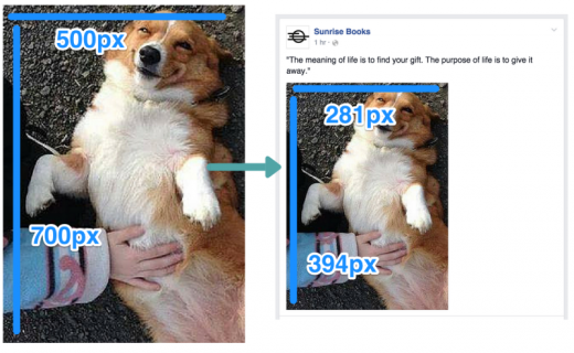
If you upload a vertical (portrait) image, it will be scaled to a height of 394 pixels, aligned to the left, with white space to the side. The adjusted width will be relative to the 394 pixels. For instance, if you upload a 500 x 700 image, Facebook will resize it to 281 x 394 pixels.
If you plan on sharing multiple images in the same Facebook post, there’re some great insights at Have Camera Will Travel that cover all the various options that ensue here.
Sharing links to Facebook (and the images that come with them)
If you share a link to Facebook, the image associated with the link can be displayed in a number of ways. Again, all depends on the image size (pixel width and height) and shape (orientation).
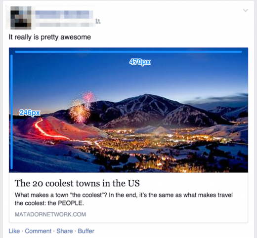
Images previews for shared links are scaled to fill a box of 470 pixels wide by 246 pixels tall.
When choosing an image to go along with a link, Facebook looks at the Open Graph tags for a page, specifically the og:image tag, which specifies the image that Facebook should use when sharing in the News Feed.
You can add the og:image tag manually into the <head> section on every page of your website, or you can try out a plugin like Yoast SEO for WordPress, which handles the code and implementation for you. (We’re big fans of the Yoast plugin for the Buffer blog.)
If you are creating an image to be used in the og:image tag for your link, keep in mind that anything outside of 470 x 246 pixels will be cropped from the top and bottom in order to fit.
Additionally, if the link you share does not have the proper og:image tags installed or the image in the tag is not large enough, Facebook will not display it full-width. A thumbnail image will be placed in a small box to the left of the link text.
For most all image orientations—square, horizontal (landscape), and vertical (portrait)— the thumbnail will be scaled and cropped to fit a 158 x 158-pixel square.
In certain cases, very tall images (like infographics, for instance) will have 158-pixel width and 237-pixel height.
What we’ve found to be the best solution for creating and sharing images to Facebook is to build an image that is 1024 x 512. While this doesn’t quite fit the dimensions above perfectly, it is large enough to look great on retina displays (where the pixel density is greater) and large enough so as to fit with the full-width areas in the News Feed.
(And as you’ll see below, this image size is ideal for Twitter as well.)
Ideal image sizes for Twitter posts
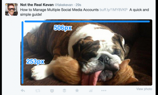
On desktops, Twitter images appear in the timeline at 506 pixels wide by 253 pixels tall.
This size works out to an aspect ratio of 2:1, meaning that for every two pixels wide, your image is one pixel as tall. If you create images at 800 x 400 or 1,000 x 500—any size within the 2:1 ratio—the image will appear fully in tact in the Twitter stream.
Here’s an example of an image that is 1,024 pixels wide by 512 pixels tall (a 2:1 ratio), scaled to fit the 506 x 253 frame.
(Note: Uploading an image that is smaller than 506 pixels x 253 pixels will result in whitespace to the right of the image.)
If the dimensions fall outside the 2:1 aspect ratio, Twitter crops the image to fit, and the full size can be viewed only by clicking the image.
Twitter crops these images from the top and bottom, leaving the middle of the image as-is.
Image sizes for Twitter cards
Images are also present in each of the nine different Twitter Cards. If you’re interested in trying out something like a lead generation card or a product card,AgoraPulse does a great job of breaking down the images sizes for each type of card. I’d like to get a bit deeper into a couple of specific ones that seem key for content sharing.
- Summary card
- Summary card with large image
Summary cards show a headline, description, link, and photo when you share a url from a site that contains the appropriate Twitter Cards code. All this information is pulled via HTML tags, often the same ones that are being used by Facebook to display links.
(The Yoast SEO WordPress plugin mentioned above also includes support for Twitter Cards.)
Each type of summary card contains a thumbnail or featured image.
The image must be a minimum size of 120px by 120px and must be less than 1MB in file size.
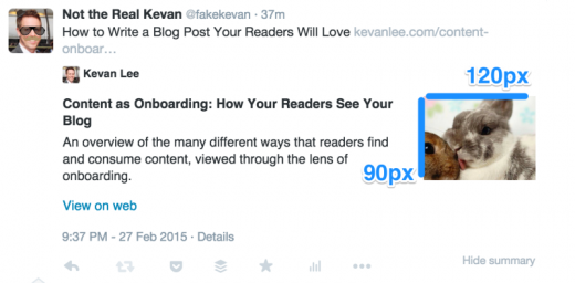
For an expanded tweet and its detail page, the image will be cropped to a 4:3 aspect ratio and resized to be displayed at 120px by 90px.
The image will also be cropped and resized to 120px by 120px for use in embedded tweets.
For summary cards with large images:
Images for this Card should be at least 280px in width, and at least 150px in height. Image must be less than 1MB in size.
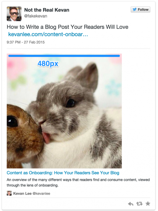
All images for the large-image cards will be scaled to fit a width of 480 pixels. So landscape and portrait images will be resized to 480 wide and however many pixels tall (there doesn’t seem to be a maximum or a minimum here). Square images will be resized to 480 x 480 square.
Any image smaller than 480 pixels will appear aligned to the left with whitespace filling the empty space to the right.
One thing that’s interesting to note here is where the images get cropped. For the basic summary cards, photos will be cropped in the following ways:
- Square and portrait images will be cropped from the bottom up and not from the sides.
- Landscape images will be cropped from the outside in, and not from the top or bottom.
For the summary cards with large images, there don’t appear to be any noticeable crops.
If you’re curious how your images might look with Twitter Cards, you can enter your link into Twitter’s free card validator to get a quick preview.
Ideal LinkedIn post image size
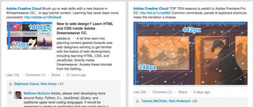
When you share links and articles to LinkedIn, the thumbnail photos appear at a maximum of 180 pixels wide by 110 pixels tall.
If you upload an image directly, the image will appear at a maximum width of 350 pixels. The height of the image—whether square, landscape, or portrait—will be scaled to fit the new width. For example, a 700 x 500 image will be scaled to 350 x 250.
One outlier among these standard sizes is for LinkedIn’s Showcase Pages, a feature that allows companies to create pages based on offshoots of their brand (for instance, Adobe created pages for Adobe Creative Cloud, Adobe Marketing Cloud, etc.)
On these pages, thumbnail and featured images for links appear either at the standard size of 180 x 110 or at a larger size of 442 x 248.
LinkedIn uses the same Open Graph tags as Facebook and other social networks. If you’ve got your site well-optimized for Facebook links, then you should be good to go for LinkedIn as well.
(There’re a few neat ideas from SmashingBoxes as far as LinkedIn thumbnail workarounds if Open Graph tags don’t seem to be a possibility for you.)
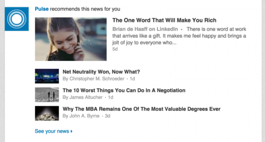
One additional way to share content on LinkedIn is by publishing articles that appear on people’s home pages via LinkedIn Pulse. LinkedIn built a substantial publishing platform for this content, which includes the ability to add featured images to the articles.
In the home page feed, the featured image on a Pulse update is 180 pixels wide by 110 pixels tall—same as it is for all link thumbnails. If the story is placed in the recommended reading list below a featured Pulse story, the thumbnail will be 70 x 37.
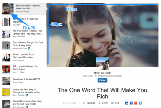
Inside the Pulse page, a list of articles runs along the left-hand column. The image thumbnails here are 70 x 70 square images.
The featured image at the top of the article is 698 pixels wide by 400 pixels tall.
(Cropping for these images occurs from the outside in, so the very middle of the picture will be what’s displayed in the smaller thumbnails.)
Ideal image sizes for Google+ posts
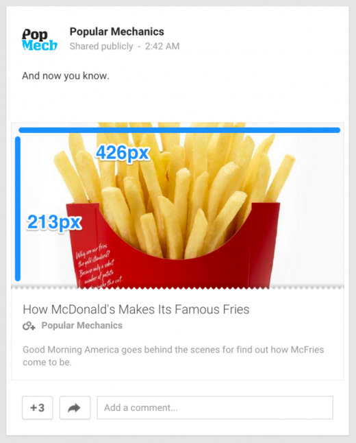
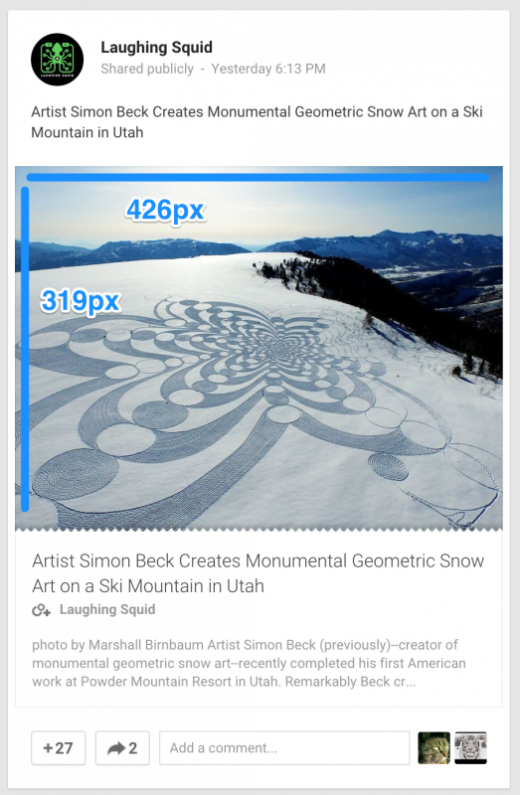
When you share links and articles to Google+, the featured photos appear at a maximum width of 426 pixels. The height scales accordingly.
Similarly to the other social channels mentioned here, Google+ pulls in images from URLs using Open Graph tags. If the image used in the Open Graph is not at least 426 pixels wide or if Open Graph tags do not exist for a url, Google+ may instead place a thumbnail image to the left of the update. This thumbnail is 150 x 150 square.
If you upload an image directly to Google+, the image will appear at a maximum width of 426 pixels also (same as above). The height of the image will scale to fit according to the new width.
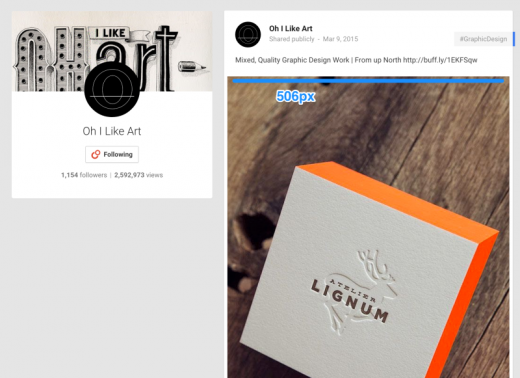
Clicking through to the update URL, the image will be 506 pixels wide, maximum, with a height that scales accordingly.
If the image is smaller than the 346-pixel width, Google+ places the image centered on the update with white space to each side.
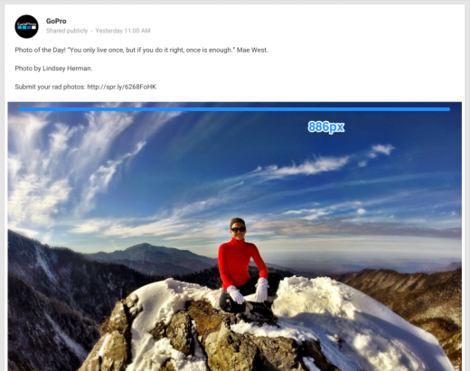
One other way that Google+ may display photos is as a full-width image that spans across both columns of the Google+ stream. These images are 886 pixels wide. The height scales accordingly.
Ideal image sizes for Pinterest Pins
There are a couple of different places where a Pinned image can appear on Pinterest.
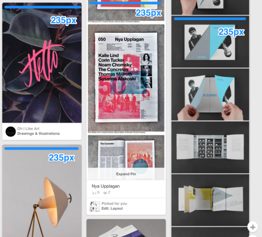
In the feed, Pinterest images have a width of 235 pixels. The height scales accordingly.
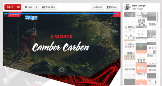
If you click to expand a Pinned image, the image will have a width of 736 pixels. The height, again, scales accordingly.
Beyond these two places, the other spots that you might find a pin include the cover for Pinterest boards and in side ads for recommended and related Pins.
According to Pinterest, the best aspect ratio for Pinterest images is between 2:3 and 1:3.5, with a minimum width of 600 pixels.
So this might raise the question (one that I’ve asked a lot before): What isaspect ratio?
It’s how the width and the height of an image relate to one another.
For instance:
A 2:3 aspect ratio could be
- 600 pixels wide by 900 pixels tall
- 800 pixels wide by 1,200 pixels tall
A 1:3.5 aspect ratio could be
- 600 pixels wide by 2,100 pixels tall
- 400 pixels wide by 2,800 pixels tall
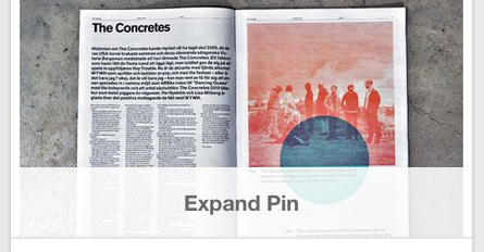
Pins with an aspect ratio greater than 1:3.5 will be truncated in the feed, cropped from the bottom up with a small “Expand Pin” link covering the bottom. If a user clicks to expand, the cropped portion of the image appears.
Ideal image sizes for Instagram photos
Instagram makes things pretty easy. Every image on Instagram is a square.
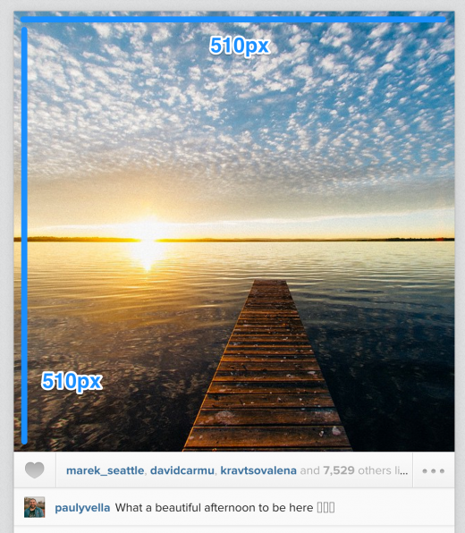
The Instagram photos in a feed appear 510 pixels wide by 510 pixels tall.
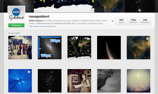
The thumbnail photos that appear on one’s profile page are 161 x 161.
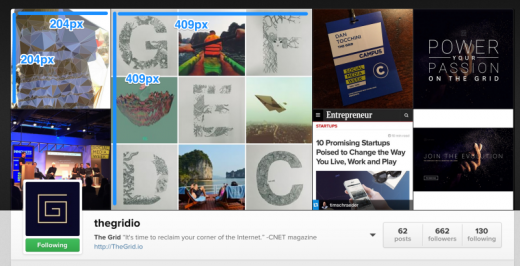
The images in the header are either 204 x 204 (for the smaller featured images) or 409 x 409 (for the larger featured image).
I hope these image size overviews might be useful for you. We continue to learn lots about what’s best for all the different social networks, and I’ll be happy to continue updating this post with all our latest findings.
(I’m also eager to experiment with mobile sizes as well!)
Is there anything we can add to this resource to make it more useful for you? What has your experience been with sharing different image sizes to social media?
I’d love to hear from you in the comments!
Read Next: 61 social media metrics, defined
Get the TNW newsletter
Get the most important tech news in your inbox each week.
