This post originally appeared on the Mention blog.
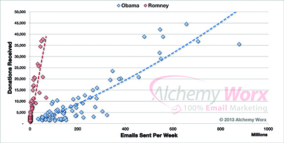
In both his election campaigns, President Obama’s team relied heavily on email marketing to raise funds. In 2012 for instance, email fundraising was responsible for nearly $690 million in donations.
To raise this kind of money through email marketing, Obama’s team had to accomplish two goals. First, they had to build an email list with millions of people. Second, they had to motivate those people to donate.
If emails can become the largest digital fundraising source for a future President, only imagine what an active email community can do for your business!
Today we will explore some of the secrets to building and activating an email list of your own.
1. Driving traffic
Before you can start converting email subscribers, you need to get your subscribe form in front of eyeballs. At least initially, this top-of-funnel step will probably be your bottleneck, so you’ll want to focus on building your traffic quickly.
Run a giveaway
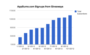
Noah Kagan grew AppSumo’s email list by 147,000 subscribers in just 10 months by leveraging the power of giveaways. It gets even better when you consider that each new subscriber generates $0.83 of gross profit, so those new subscribers translate into over $100,000 in profit.
So how did the team use giveaways to drive this many new subscribers?
Choosing an AppSumo product its target audience would like, the company let people enter to win it by taking specific actions such as subscribing via email and sharing on Twitter. Because of the viral nature of social sharing, these giveaways amplify the initial promotion to quickly reach a larger audience, all while increasing the visibility of specific AppSumo products.
But all giveaways are not created equal. Across 25 different giveaways, Noah saw significant difference between the most successful giveaway ($6.90 profit per new subscriber) and the least successful ($0.24 profit per new subscriber).

The difference? The most successful giveaway offered free attendance to an entrepreneur getaway, and the least successful offered a free Macbook Air. Look for products that will attract your target audience and not just a mass of random people.
Write guest posts on popular blogs
Airbnb grew off Craigslist. Upworthy leveraged Facebook. These companies connected with existing super-platforms to drive extraordinary growth. You can do the same by writing guest posts.
When Henri started blogging at wakeupcloud.com, he knew his future readers were probably already reading similar blogs. So rather than waiting for them to find him, Henri decided to go where his future readers already were.
In the first 101 days of his new blog, he wrote nearly 50 guest posts on related blogs. The result? He reached 1,012 email subscribers.
That’s an impressive feat, and you can do even better. Henri himself admits that he initially limited himself to small blogs until he built enough confidence. If you learn from his experience and focus only on larger blogs, you can grow even faster.
Onibalusi Bamidele took a slightly more scientific approach to guest posting. Looking at five of his most successful guest posts, he noticed a few interesting trends. Combined, these five guest posts drove 1,100 new subscribers, but some posts dramatically outperformed the others.
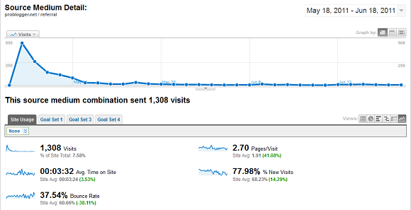
One particular post on Problogger actually drove 400 new subscribers and 1,308 visitors to his website alone. How does Onibalusi optimize his guest posts? He chooses blogs with large followings, offers an incentive to subscribe (an e-book in the Problogger post), and uses lots of case studies to engage readers.
So go find a popular blog in your market, write some amazing content, offer an incentive to subscribe, and watch your email list grow.
Optimize for search traffic
So you’ve published an interesting new piece of content and promoted it well on social media. Great! Enjoy this initial wave of visitors.
Two weeks later…
How many people are still clicking through from Twitter or Facebook? Probably not very many.
Social media is great, but it’s generally a short-term opportunity (except for StumbleUpon!). To get the most out of the content you’ve labored over, you need to find a traffic source that continues sending visitors for months or years.
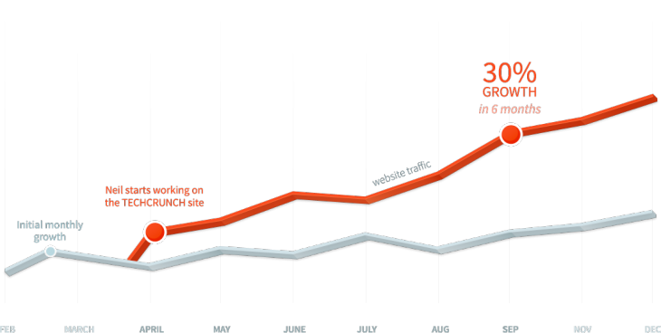
A few years ago, TechCrunch was a popular source of tech news, but most of its content burned bright and died quickly. Looking for a more evergreen traffic source than social media, Neil Patel optimized TechCrunch for search traffic.
He removed duplicate content, optimized on-site factors, and worked to increase page authority. Over six months, this search engine optimization strategy increased traffic by 30 percent – a massive gain for a large website.
What can you do to optimize content you’ve already created for bonus search engine traffic?
2. Converting visitors
So you’ve got some traffic. How many of your visitors actually join your email list? Five percent? One percent? Improving your conversion rate from visitor to subscriber has a massive and ongoing effect on your email list growth, so you’ll want to spend some time optimizing this step.
Create an epic incentive
What’s the value proposition for someone to join your email list? By default, you’re asking someone to take action today (joining your list) for a reward at some indefinite point in the future (when you send a valuable email).
Humans are terrible at investing in the future, so that’s a pretty weak value proposition.
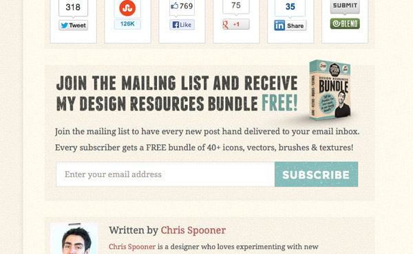
When Chris Spooner started his email list, he decided to improve his value proposition by promising immediate value in the form of a resource bundle. His new and improved value proposition now offers visitors a direct connection between action and reward: Give me your email, I’ll give you a free resource pack.
The result? Between this and a couple other tweaks, Chris’ subscriber conversion rate went up by 10x overnight! For his site, that meant an extra 90 subscribers every day.
Add an exit popup
Where can people signup to join your email list? You probably have the classic sidebar subscribe box, perhaps another at the beginning or end of your post, and hopefully a SmartBar at the top of your page.
That’s all well and good, but how many of your visitors actually notice those placements? If you want to convince a visitor to join your email list, you first have to actually get their attention.
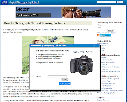
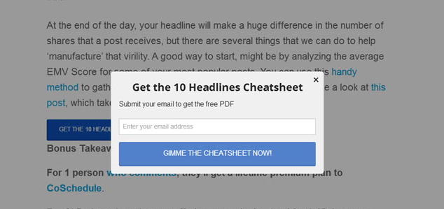
To get his reader’s attention, Darren Rowse installed a popover on his popular photography website. These email forms overlay the entire page, so visitors can’t help but notice them. In his first iteration, Darren just put together a brief form with three reasons to join his email list.
Literally overnight, this single popover increased Darren’s daily new email subscribers 775 percent, from 40 to 350 per day.
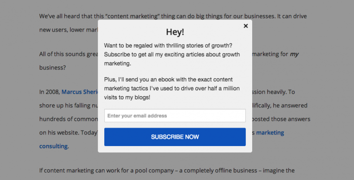
Quite an impressive increase, but wow is that form ugly! Happily, popovers have come a long way since the early days.
I use SumoMe’s List Builder plugin on my personal blog. It looks beautiful and converts about 4 percent of my visitors to email subscribers.
Once you’ve seen the power of popovers, you’ll never want to go back.
Test all elements
What’s the best color for a signup button? The best copy for a promo headline? The best placement for a signup form? Ask any marketer worth their salt and the reply will be the same: “It depends.”
Despite all the case studies in the world, individual results vary widely. The button color that works miracles for one company might do nothing for your audience and product.
Jeanne Jennings knew this, so when a client hired her to increase conversions she decided to a/b test subscribe form placement.
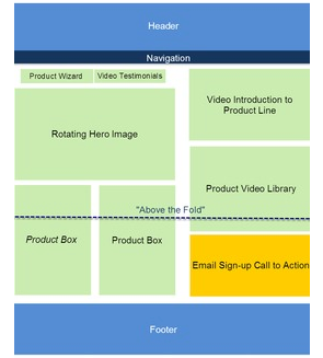
The original signup form was located below the fold (i.e., only visible to people who scrolled), so she hypothesized that moving it higher on the page would probably convert better. At the same time, she knew a lower placement might turn out to be more effective — people might be more likely to signup after reading a bit more of the page.
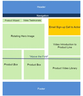
Rather than just going with her gut, Jeanne ran a test to see which of the two placements converted best. After showing both versions to different groups of visitors, she found the higher placement increased email subscribers 30 percent and improved revenue by 27 percent. Pretty good results for a simple a/b test.
Use learnings from case studies to direct your experiments, but test everything for yourself.
Create article-specific incentives
Ebooks and resource packs can improve the conversion rates on your subscribe forms, but these incentives have to be very broadly targeted. After all, if you’re showing this to every visitor to your website, it must be loosely related to every product on your site.
Broad targeting = lower conversion rates.
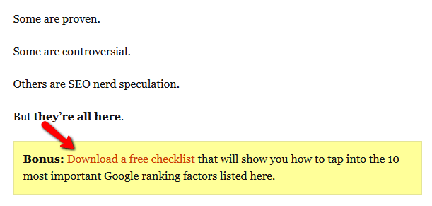
To improve this, Brian Dean decided to test article-specific incentives. If you came to his site to read about SEO strategies, he’ll offer a free SEO checklist, not some random “guide to viral marketing”.
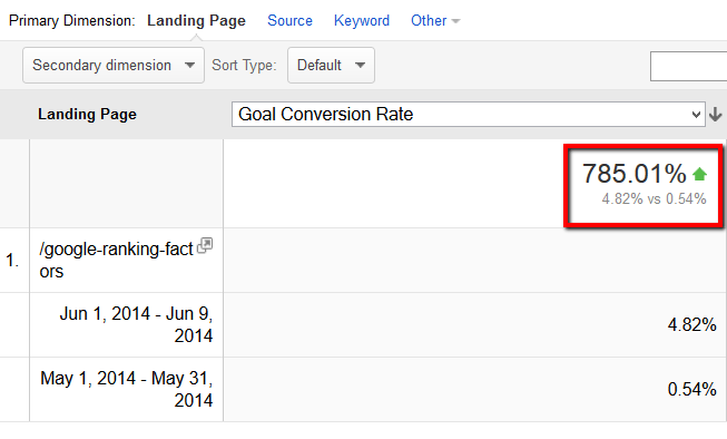
This single improvement to targeting improved his conversion rate by 785 percent month over month. Thanks an increase from 0.54 percent to 4.82 percent visitor-to-subscriber conversion!
Now, this can sound quite complicated. To create article-specific incentives wouldn’t you have to essentially write a new ebook for each article?
Not quite! You actually are probably sitting on incentive gold without even realizing it.
If you’re writing about a new Excel technique, quickly put together a one page list of your favorite formulas. If you’re writing about an event you hosted, simply offer the exact checklist you used. If you’re explaining the secrets of cold emailing, offer some of the exact emails you’ve used successfully.
Armed with your incentive, just install SumoMe Leads on your site, and you’ll be driving new subscribers in minutes.
3. Engaging subscribers
So now you’ve got a massive email list. Congratulations! What do you plan to do with it?
Getting someone to join your list is only half the battle. They’ve given you a brief moment of their attention. Now you need to keep it.
Send more frequently
If you send too many emails, some people will simply ignore them, or even unsubscribe.
It’s the stuff of marketer’s nightmares — paralyzed and suspended from the ceiling in a darkened warehouse while being forced to watch a giant monitor across the room count down your shrinking email list numbers. Terrifying.
So if increasing send volume hurts subscriber numbers, it must be a very bad thing, right?
Actually that’s not true at all. In email marketing (as in all of marketing), it’s not really about reaching the most people. It’s about reaching the right people.
Remember how President Obama raised nearly $690 million dollars through email marketing during his 2012 re-election? During the critical last few weeks of the race, Obama increased his email volume significantly. In response, his email open rates plummeted by 14 percentto a campaign low…yet donations soared!
Obama’s true fans were glad to get more emails, and they showed their enthusiasm with millions of dollars in donations.
So think about your email list for a moment. Who really wants more email from you? The answer is simple…your best customers.
Would you rather keep your least engaged subscriber happy by sending one email a year or make your biggest fan happy by sending killer value three times a week?
Use genuine personalization
We all know that using a subscriber’s name makes them happy, right? Actually, a study of 10 million marketing emails found that fake personalization can have the opposite effect.
The #nofilter generation values realism, and is quick to spot fake personalization. How often have you received an email addressed to “Dear NULL” or “Dear nate d”? We hate being tricked and that feeling extends to the companies that try to trick us unsuccessfully.
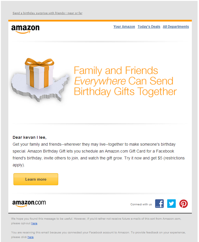
However, that doesn’t mean the power of personalization is lost! The same study found that genuine personalization, such as changing email content based on purchase history or demographic, caused a positive reaction in 98 percent of people.
When you’re first building your list, this level of personalization probably won’t be realistic, but as your list grows look for opportunities to segment subscribers by the types of emails they open and click.
Optimize for mobile
Did you know 66 percent of emails in early 2014 were opened on a smartphone or tablet?
If I opened your most recent email on my mobile phone, would I see a beautiful, responsive design, or would I unveil a hideous creation that should only be seen on a desktop?
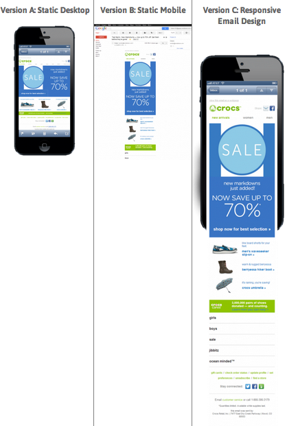
Knowing that an increasing number of its subscribers were reading from a mobile device, Crocs decided to run a test. They put together three email designs: a traditional static desktop email, a static mobile email, and a responsive email which looked good on both desktop and mobile.
The results were quite interesting. The responsive email drove the most revenue per email, as expected, but the static desktop version actually outperformed the static mobile version.
This highlights two important facts about mobile email marketing:
- Designing something that looks good on mobile will translate into revenue.
- Even though 66 percent of people open on mobile, those 34 percent on desktop are still your most valuable customers. (Static desktop outperformed static mobile.)
So go take another look at your email design and make sure you’re not creating a painful experience for two-thirds of your subscribers.
Wrapping it up
To build an effective email list that achieves your goals, grow traffic through targeted giveaways and guest posts, convert subscribers with epic, specific incentives, and engage them frequently using mobile optimized emails.
What’s the most effective thing you’ve done to increase or engage your email subscribers?
Read next: 10 ways you’re running your mailing list like a jerk
Get the TNW newsletter
Get the most important tech news in your inbox each week.
