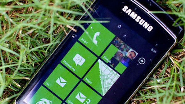
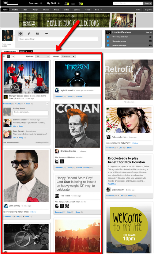
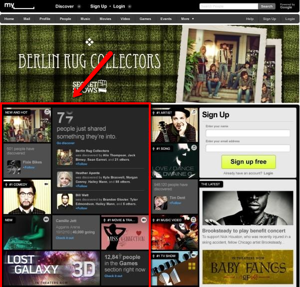
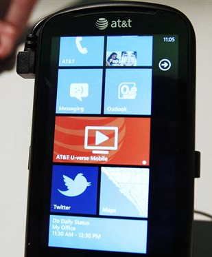
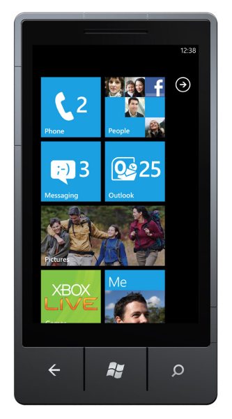
 Now that all the press has broken concerning the launch of the new Myspace redesign, you may have noticed that it shares certain design elements with another newly launched product, Windows Phone 7.
To be up front, we are not saying that they collaborated, that either company ‘borrowed’ from the other, or anything else along those lines. We want to merely point out that both interfaces share a very similar design ethic, something that we find to be positive for both companies.
Don’t let us be the judge, take a look for yourself:
The New Myspace
Windows Phone 7
Get the TNW newsletter
Get the most important tech news in your inbox each week.
