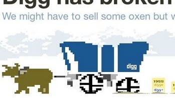
 The new Digg is making splashes all over the world of social media, and many of the waves are not happy. Many, many people from power users to the regular joes are complaining about everything from the new button styles to the layout in the new website.
Fortunately for Digg, the most frequent complaints seem to be very fixable. I have compiled a list of the most common complaints from conversations on Digg, Twitter, and via email with some of my power user buddies. Before we get started, go follow TNW on Digg. Now, to the list:
Bury Button
Bring it back like black in the winter, Kevin. People were damn attached to the ol’ bury button because it was a powerful tool against spam, wayward Digg gods pushing bullshit, and any other weak nonsense. I have agreed with this complaint since the first time I played with the new Digg.
It’s easy, just bring it back. The ‘hide story’ functionality, even if it does the same thing as the old bury is hard to find, and not as compelling. Digg is a wonderful self-policing (for the most part) community who can handle their own dirty work. Let them bury, bury, and bury some more.
Thumbs Down For Generic Buttons
The little things can be big things. You must bring back the thumbs up/thumbs down icons and drop (like they are hot) the up and down arrows. Reddit has arrows. Enough said.
I have to say, this one should have been obvious.
Oh No, Where Is Upcoming?
No seriously, where is it? The new Digg is simpler to navigate, sure. But it seems that that is mostly true because things have been stripped out of the total architecture. If I head over to Top News, click on a category, and try to find the upcoming stories there, I can’t.
Is My News supposed to replace upcoming? It makes a nice addition, but it is no replacement. Upcoming was where many of the most dedicated Digg fans spent time curating content for the front page. By taking it away, you are lowering the ability of Digg users to craft the editorial line of the website, in effect neutering the people who tend Digg and give it its character.
Keep My News, but bring back upcoming for all sections.
Default? No Thanks!
Perhaps I missed it, but I could not find the button that allows me to change my default load page to Top News away from My News. If I missed it, I am quite sorry, but myself and many others would love to change this setting. I am going to use My News, but I don’t want it to be my regular Digg experience, at least not yet.
Let me decide where I go first, it saves me steps and makes me feel more comfortable seeing a familiar landscape even in the new Digg. This is simple, do it yesterday.
Overly Harsh Activity Ban
Muhammed Saleem pointed this out: “Digg’s new ‘itchy trigger’ system completely locks you out of all activity (submitting, voting, commenting, anything) if you participate …” I know that you want to knock down power users some, we all get it, but that is a bit much.
No You Are Not On Drugs, There Are Bugs On You
New launches are always tough, and no one is expecting Digg to be perfect. The number of bugs and errors that cropped up on Day 1 were a little out of control though, even with that in mind. Many people who were on the fence over the redesign were lost in a sea of errors. Nothing is more frustrating than trying to do something, anything, and then having Digg choke and log you out.
In a week V4 needs to be on par with V3 in terms of stability, or many users may begin to drift away.
All in all, that list is not that hard for Digg to accomplish over the next few weeks. People are not complaining about the switch to followers and following, the core of the new Digg, as much as one could have expected. There are some whines about Digg being a mix of Twitter and Facebook, but those complaints are far less rancorous as the list above.
Get to it Digg, you went all-in with the redesign, so listen to your community and win the pot.
Get the TNW newsletter
Get the most important tech news in your inbox each week.


