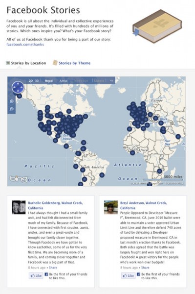
 When Facebook was approaching the half-billion mark, Zuckerberg and crew had some choices to make. How do you go about celebrating such a milestone? What, if anything, should come from it?
The answer to those choices was Facebook Stories.
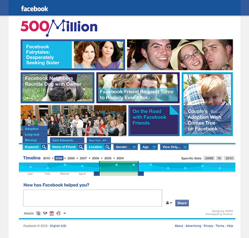
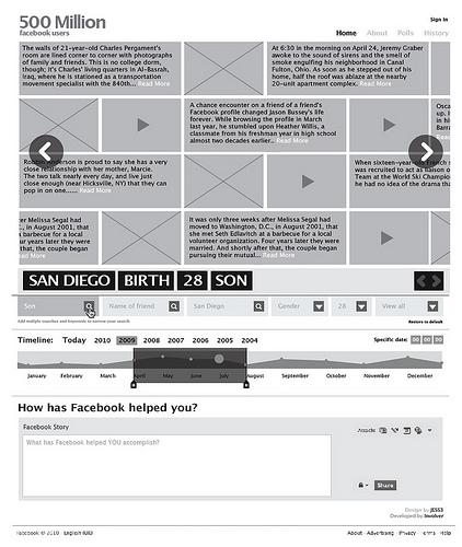
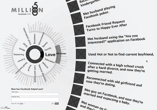
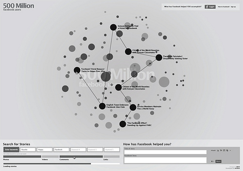
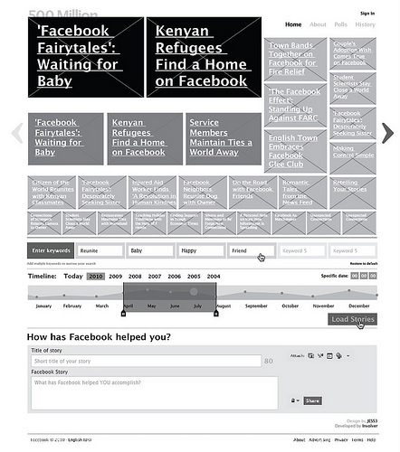
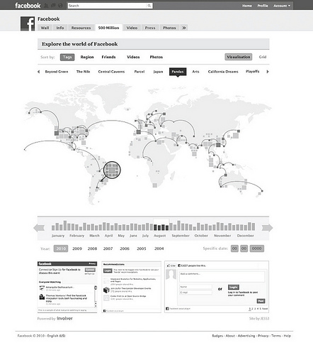
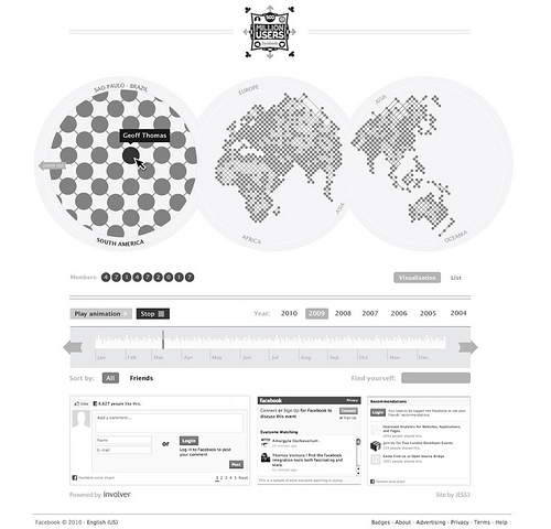
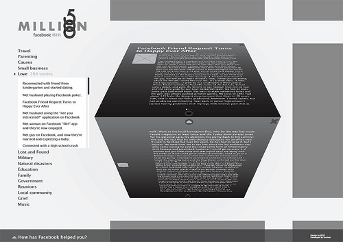
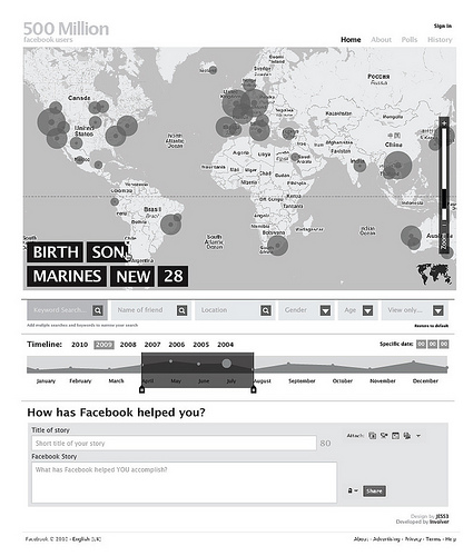
I had the chance to talk with Jesse Thomas from JESS3, the creative group behind the Facebook Stories design. The insights he gave were, to be honest, pretty cool. The part that I’m blown away by, however, are the early mockups and storyboards for the Stories site.
According to Thomas, Facebook Stories was supposed to be a mini-site feature within Facebook. However, as time went on, it was made obvious that the mini-site wasn’t going to be able to encompass what Facebook was trying to portray.

Thomas says that the overall image of Facebook Stories was decided upon to be thankful, rather than celebratory. In the earlier mockups, you can see those changes go into effect. As the site grew into its own, it was decided that it would become a permanent section that would eventually have deeper integration into the site.
On its launch, Facebook Stories became instantly huge. So huge, in fact, that it managed to slow down Facebook. A big part of the reason? Not surprisingly, Justin Bieber fans posting their love for the teenage star.
In the gallery below, take a look at the early shots. It’s a pretty interesting journey through the lifeline of such a big project.
Get the TNW newsletter
Get the most important tech news in your inbox each week.


