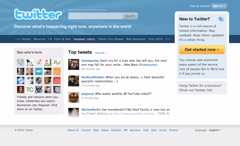
The homepage features vertical scrolling “top tweets”, side scrolling trending topics and a generally much more dynamic feel. Where possible, hovering over trending topics will give you an explanation as to why the topic is trending.
The search field is still placed, slightly discreetly, at the top but still positioned next to the logo to reflect its importance.
The overall look and feel of the site should appeal far more to newbies than in the past. With celebs and popular accounts to the left (which you can hover over by the way) as well as a link to Twitter’s 101 guide – there shouldn’t be too much confusion as to how the service works. That said, the short explanation above the “get started now” button leaves a little to be desired.
The top tweets section is brand new and links to a new “top tweets” account. The account supposedly follows everyone and algorithmically selects and retweets some of the most interesting tweets spreading across Twitter.
In a blog post, Twitter says to expect to see other iterations of the homepage design in an attempt to help users more easily discover “who and what they can find on Twitter, and how they can personalize and filter the stream of rapidly flowing information.”
Log out, and check it out. (note, some users are reportedly not seeing the new homepage. Don’t panic,)
Get the TNW newsletter
Get the most important tech news in your inbox each week.