By now, we’ve all experienced it in one way or another: you’re casually browsing a website when a promo suddenly pops up asking you to sign up for a new service or special offer. But while there’s nothing wrong with a little marketing, recently websites have been growing exceedingly shameless in their promotional efforts.
Fortunately, an anonymous hero has decided to take a stand against this horrendous trend and has created a Tumblr blog called ConfirmShaming, whose sole purpose is to shame the tackiest of promo pop-ups.
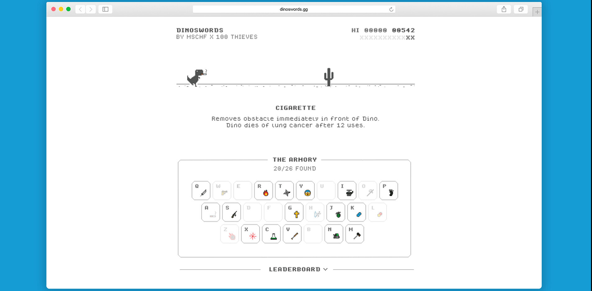
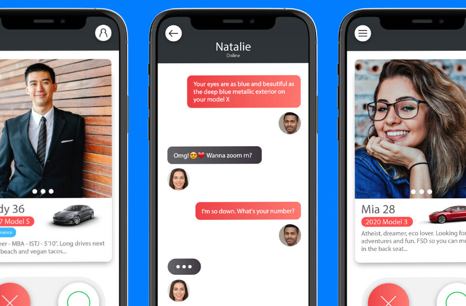
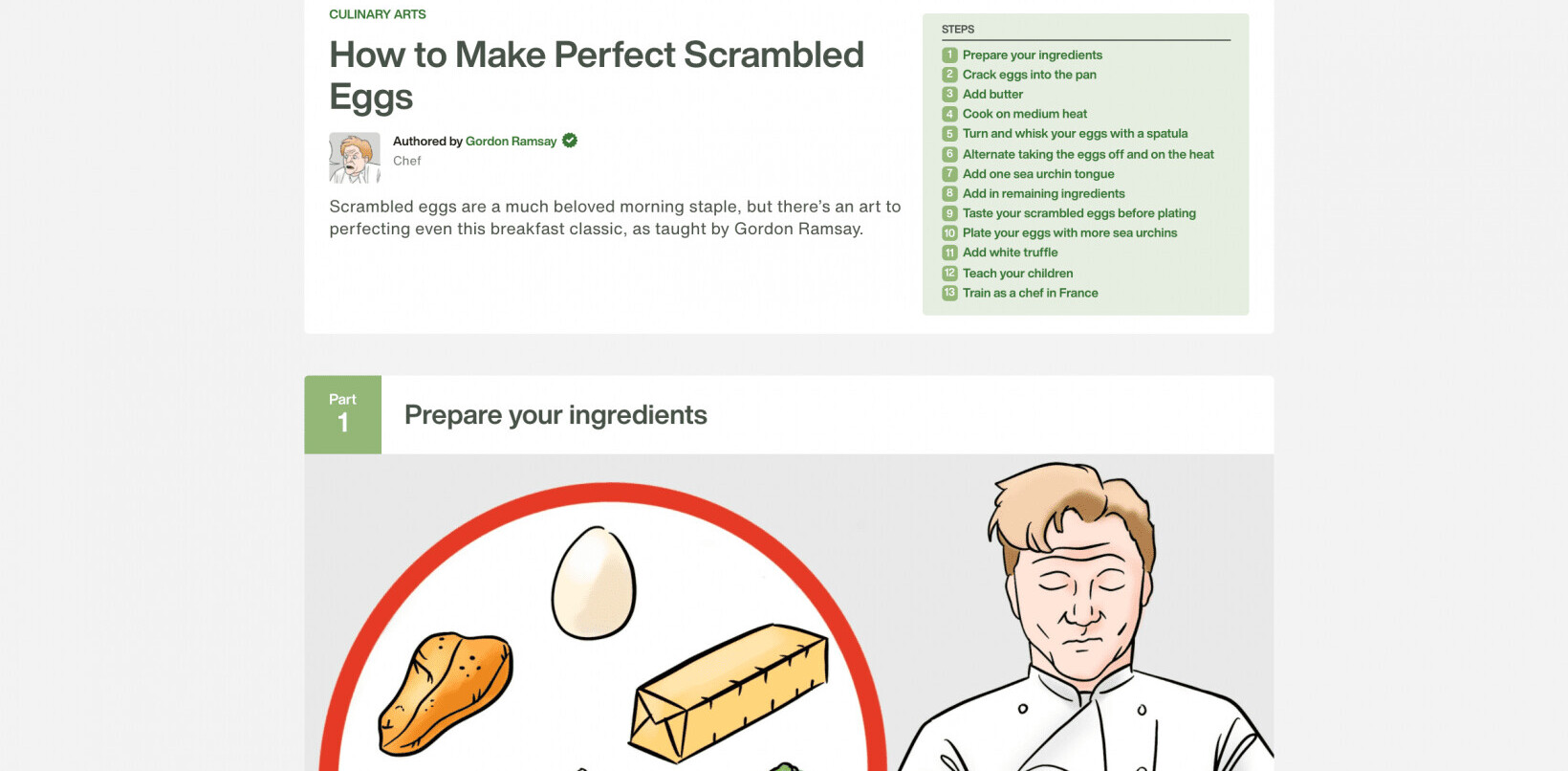
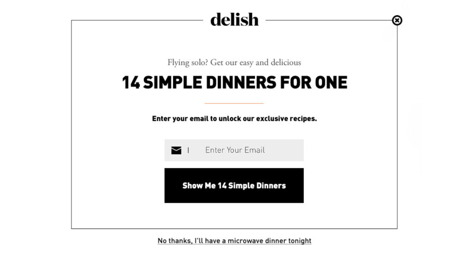
There you can find a huge collection of hilariously overreaching marketing and customer retention efforts like this one:
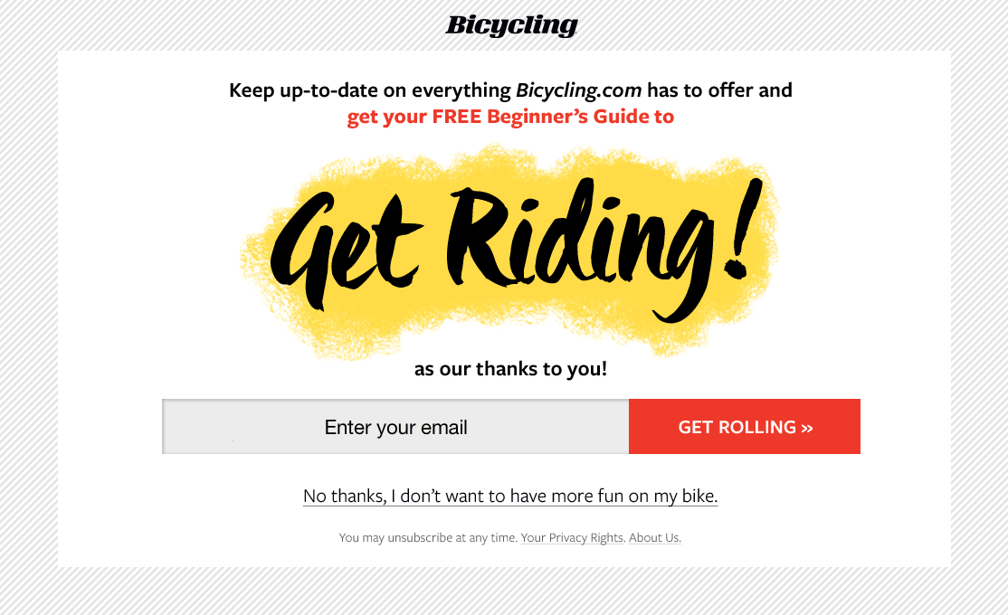
… or that one:

The blog features a wide variety of gaudy pop-up promo examples, but most posts cleverly mock the ever-dwindling size and visibility of opt-out buttons and the tasteless messages that often accompany them.
Go see a bunch of other tacky promotional attempts here.
What’s your experience with pop-up promos? Let us know and share the most shameless examples down in the comments.
via Reddit
Get the TNW newsletter
Get the most important tech news in your inbox each week.

