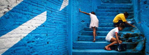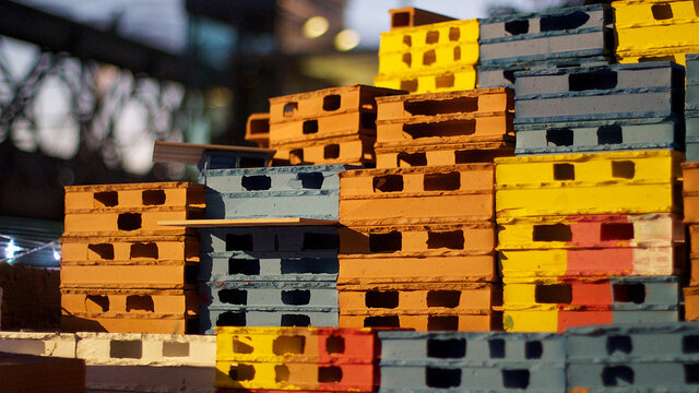
Did you know that graffiti could be used to do good? The Spanish art collective BoaMistura does, and its recent project in Brazil is both beautiful and meaningful.
Spotted by VisualNews, the project took place in a Brazilian slum near São Paulo, the favela of Vila Brasilândia. While it only took a short period of time to complete, it had longlasting effects on the local community, starting with its visual impact.
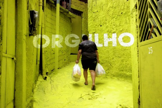
As you can see on the pictures below, the collective used perspective typography to give narrow streets a stunning makeover:
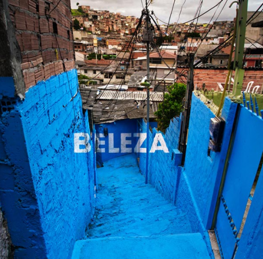
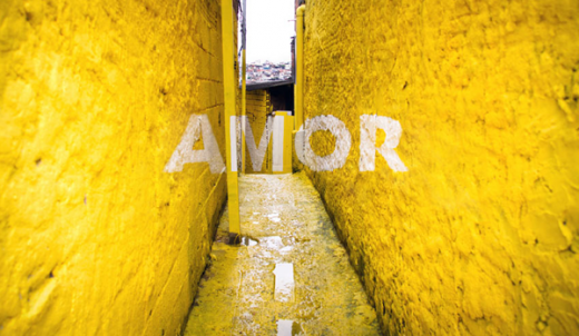

While the results look great, eye candy is only a small part of the project. As you may have noticed, its word selection is quite telling, ranging from ‘beauty’ (beleza) to ‘sweetness’ (doçura) and ‘love’ (amor). Yet, the most important of them all could be ‘pride’ (orgulho).
Get the TNW newsletter
Get the most important tech news in your inbox each week.
